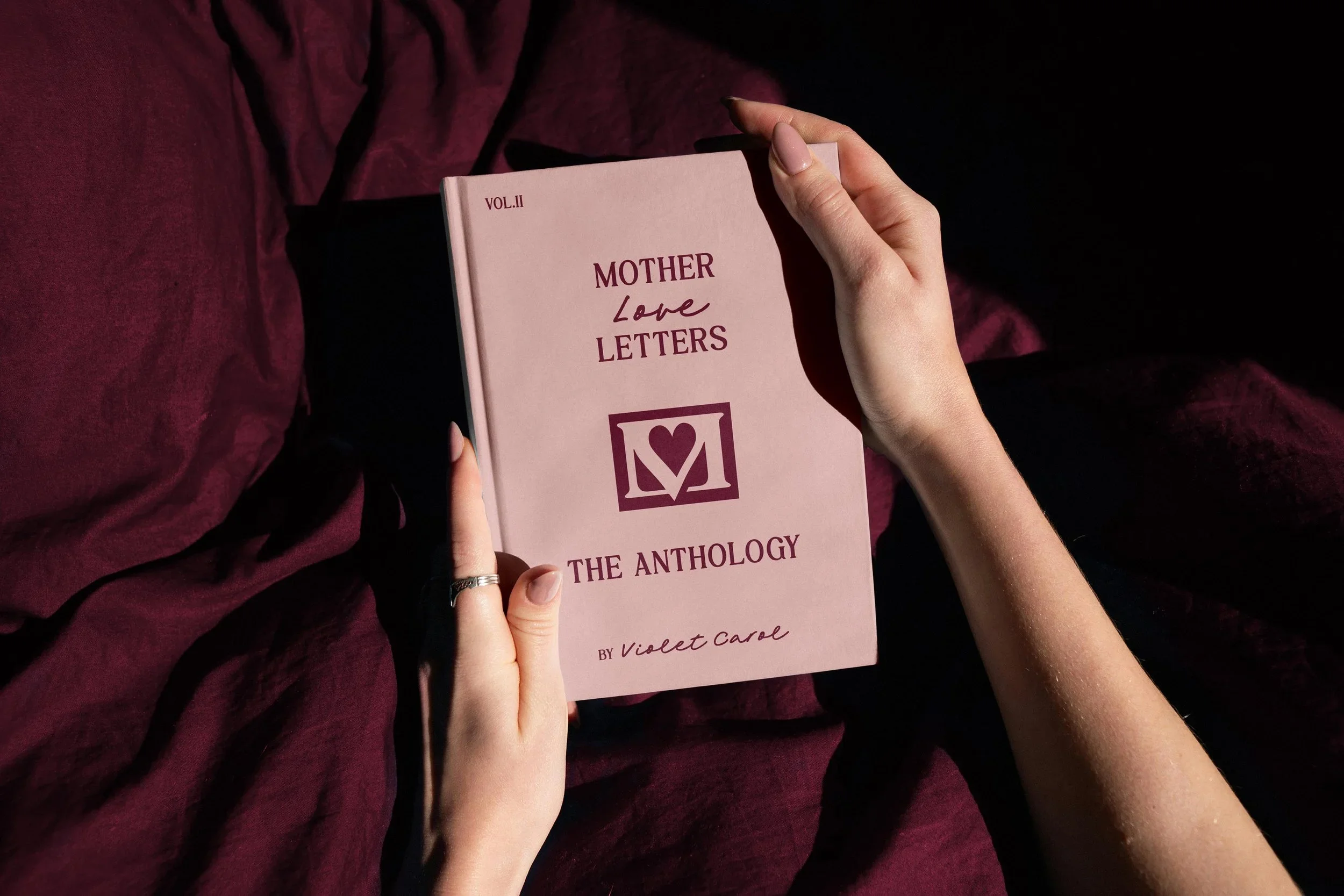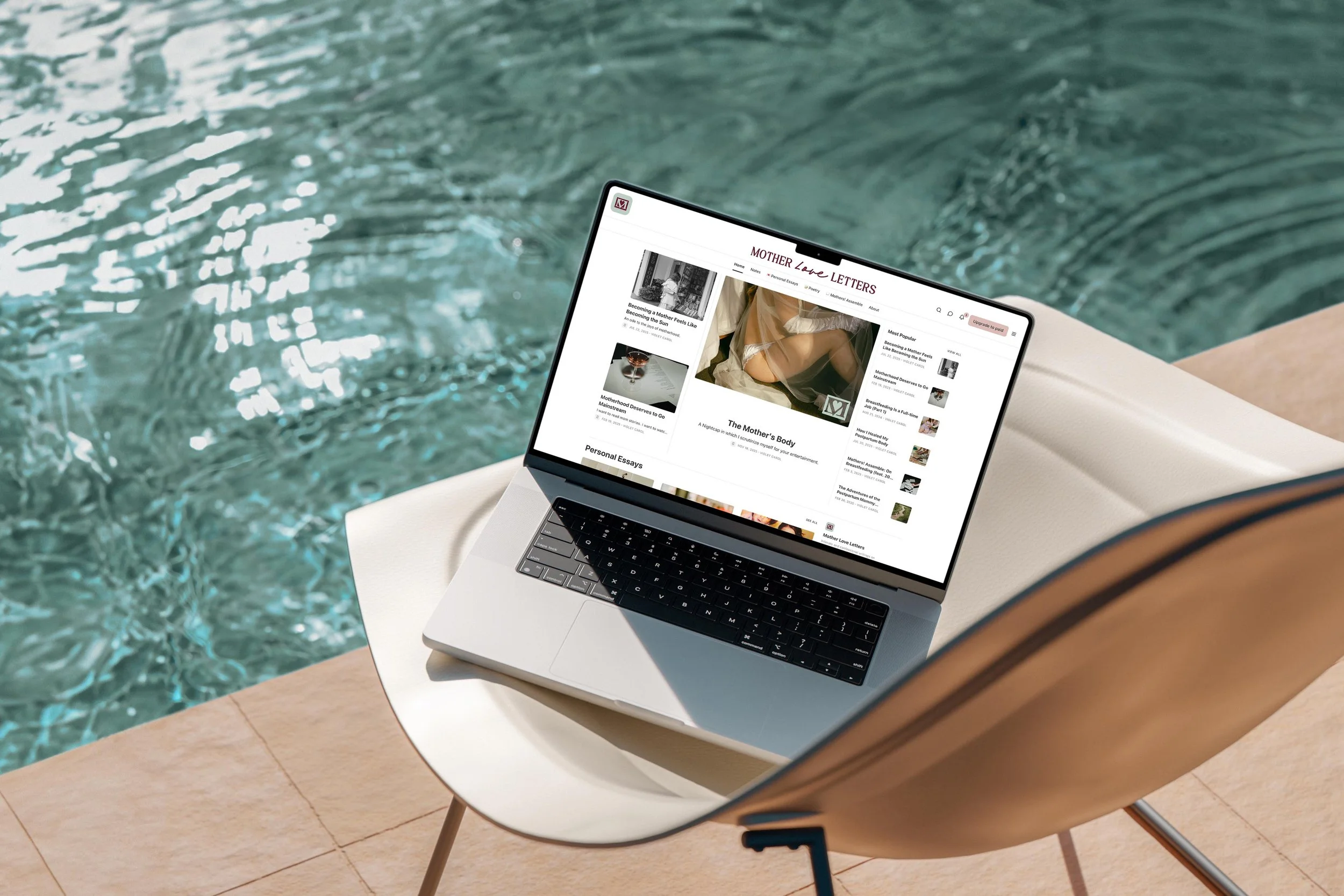
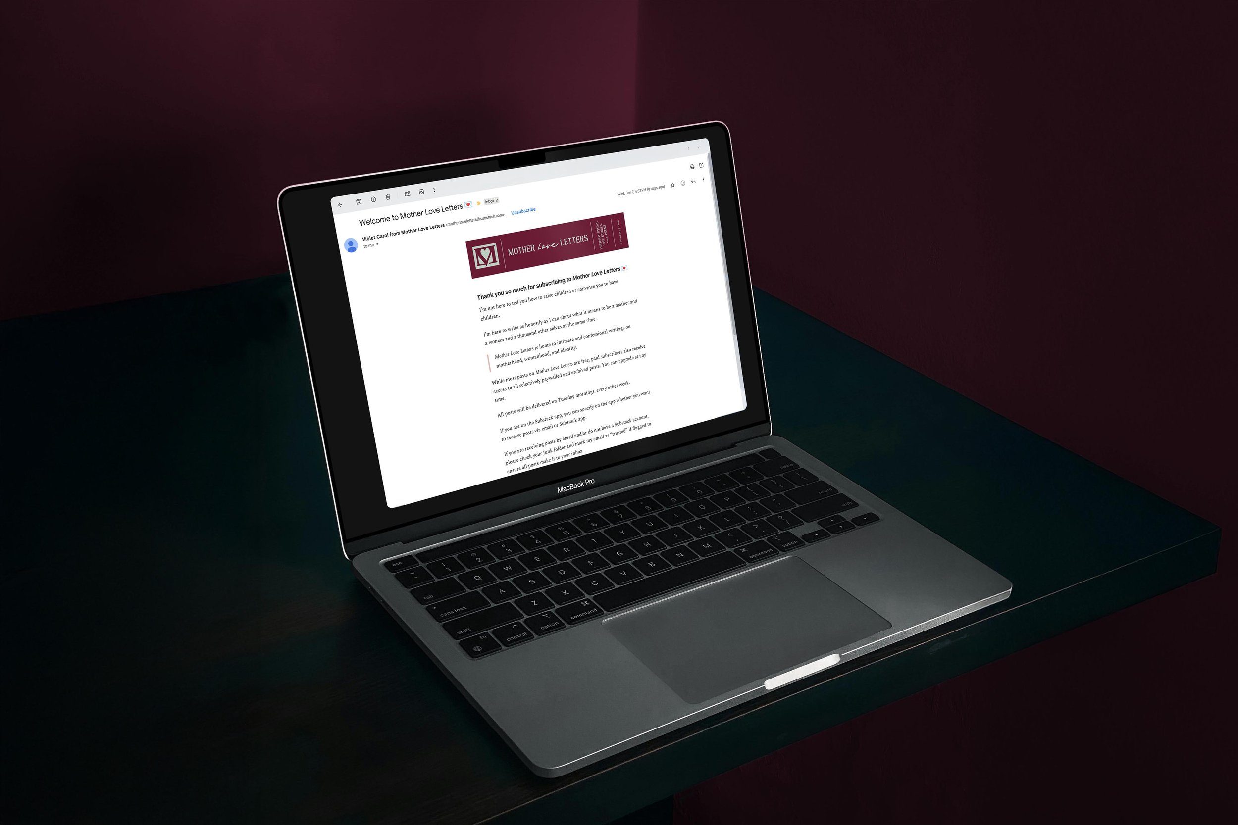
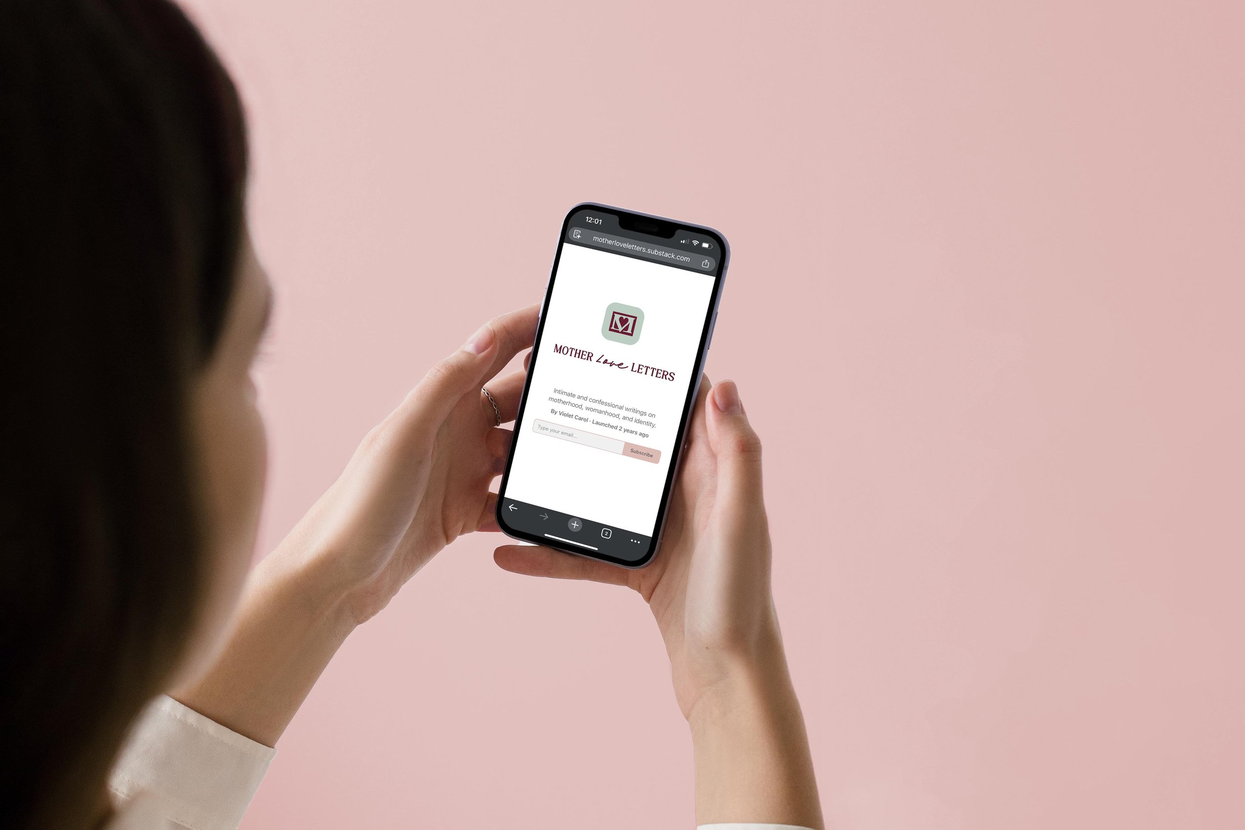
Mother Love Letters
Branding that feels like stepping into an intoxicatingly nostalgic world for author Violet Carol’s Substack.
Project scope
Branding

Mother Love Letters is a publication of short stories, personal essays and poems celebrating the madness and magic of matrescence.
Violet Carol’s literary voice is confessional, intimate, punchy, dramatic, and vivid. She writes about friendship and romance, motherhood and body, time and nostalgia.
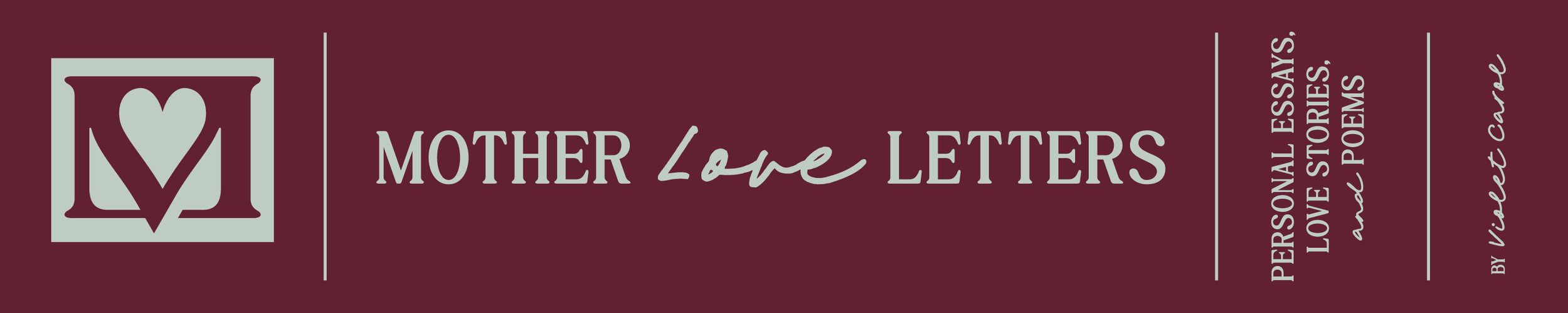
We distilled the “Mother Love Letters” name into a logo that feels like glittery academia.
The final brand design is romantic with an edge, playing with themes of nostalgia, love, and powerful femininity.
Logo symbolism
Mother
Not only is the “M” for “Mother” integral to the icon’s structure, but it also contains a hidden “V” for “Violet.”
Love
The mark is a love letter, with a heart that cuts through the envelope bounds to give the logo a slight edge.
letter
The envelope makes the “Mother Love Letters” name memorable.
roman numerals
Roman numerals reference the academic world, like a literary journal’s volume number, and represent time and nostalgia.
A retro and romantic color palette

Email banner inspired by book spines
“I feel so at ease because my visual aesthetic now matches my writing in the way I want it to feel seen.
Now that there are colors and graphics and cohesive design elements that evoke a set of feelings I want to highlight, I feel freer in my writing because my writing is now all I'm focused on. I love a cinematic moment, a little world-building, and this was my way of doing so on my Substack.”
—Violet Carol, author