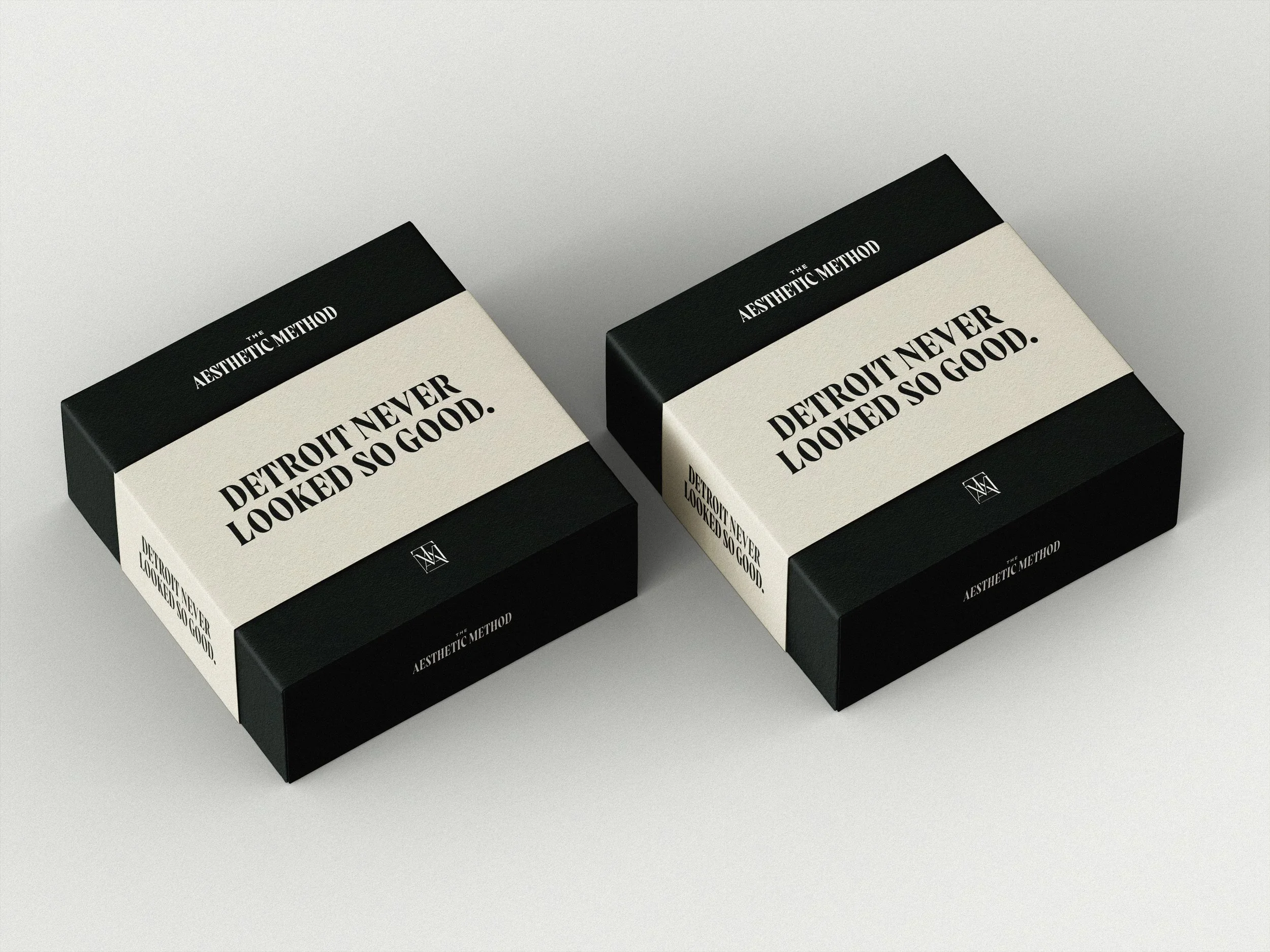
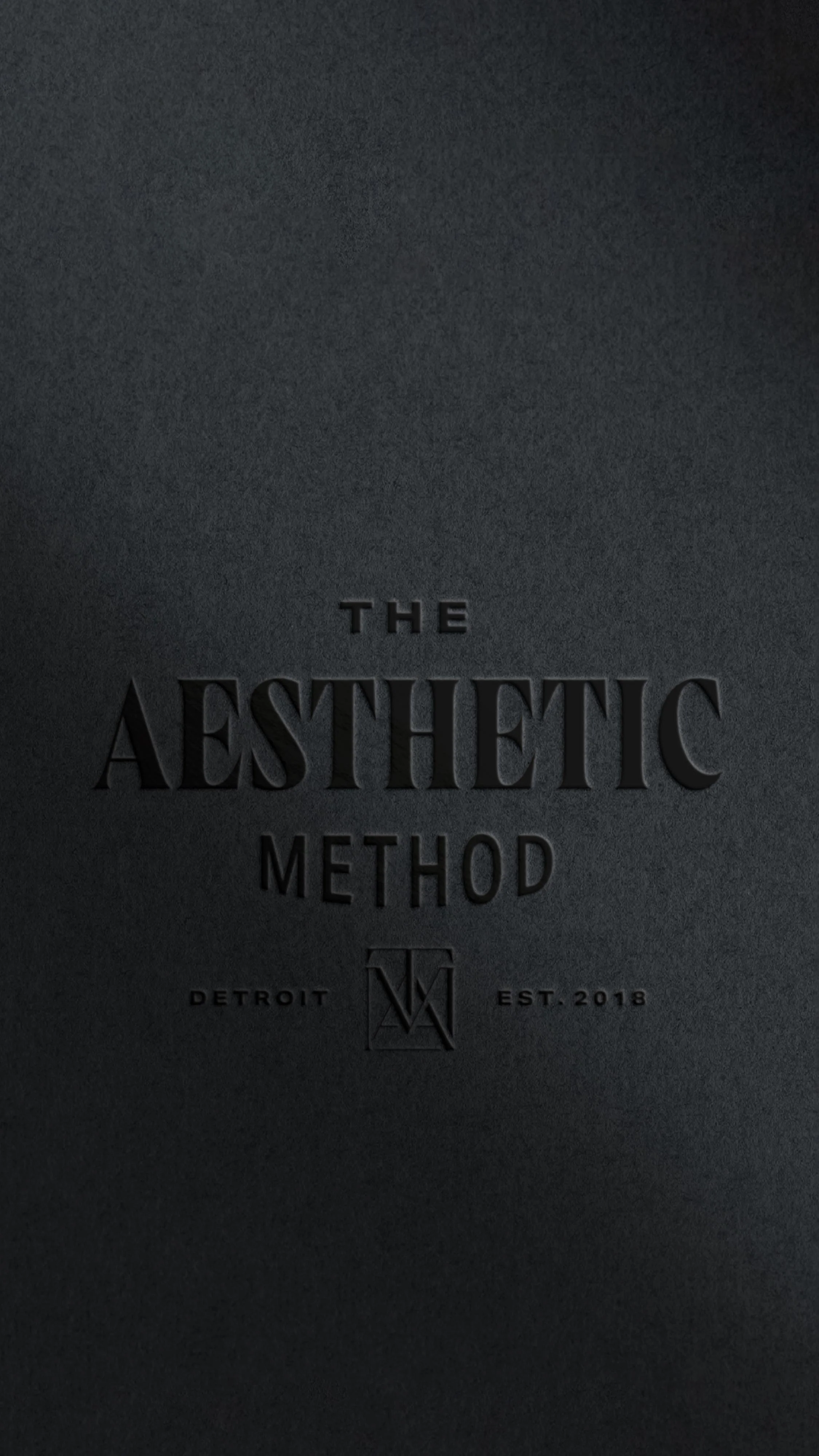
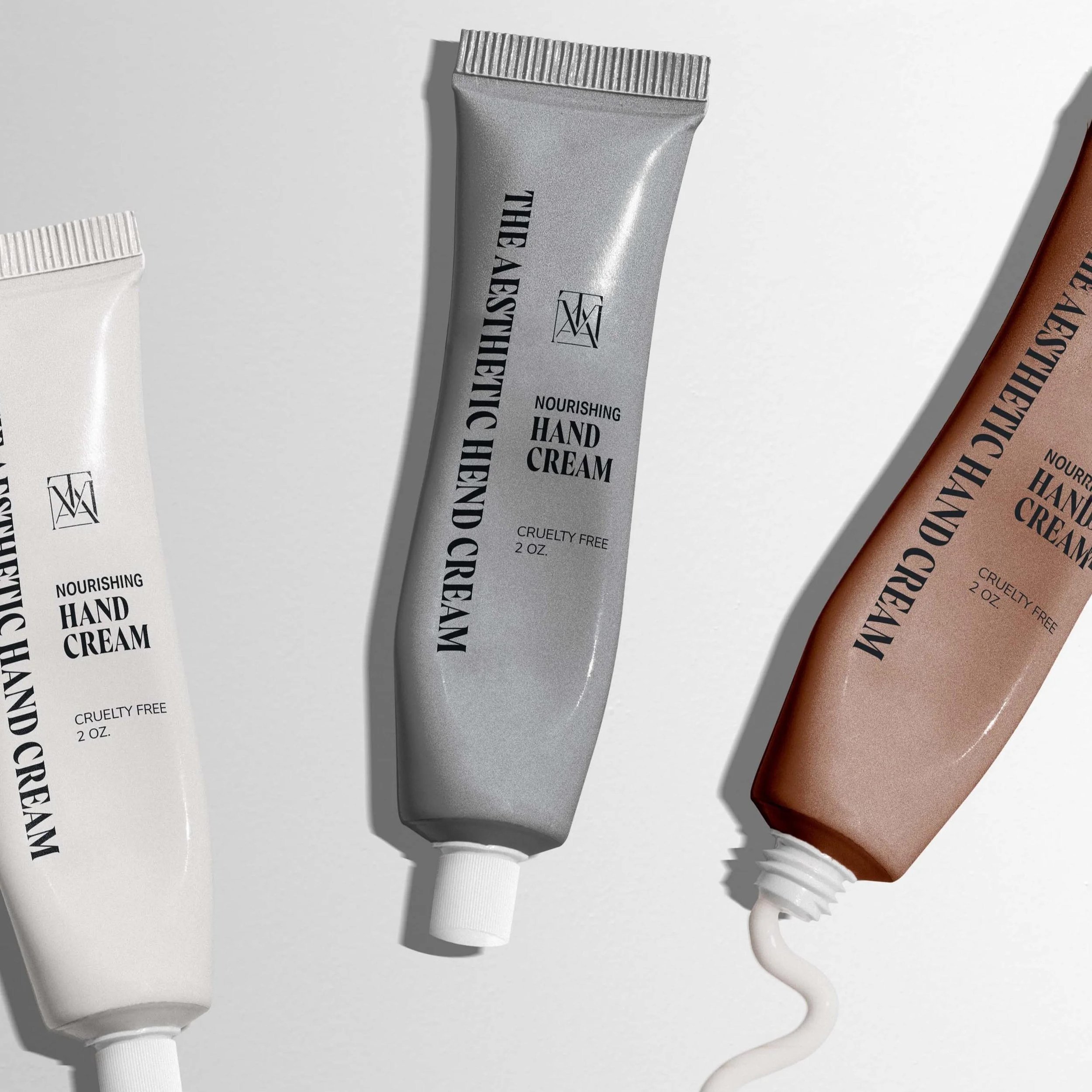
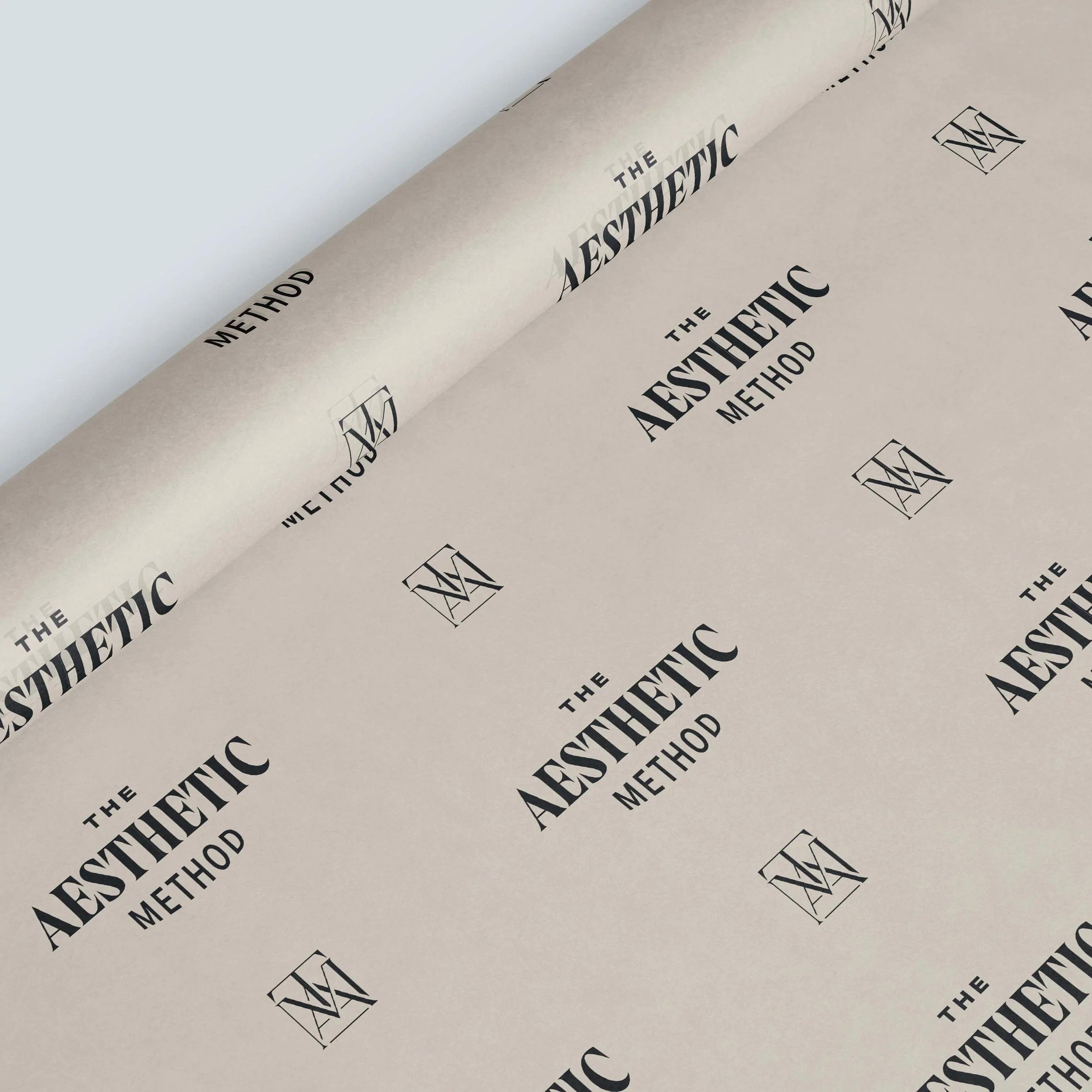
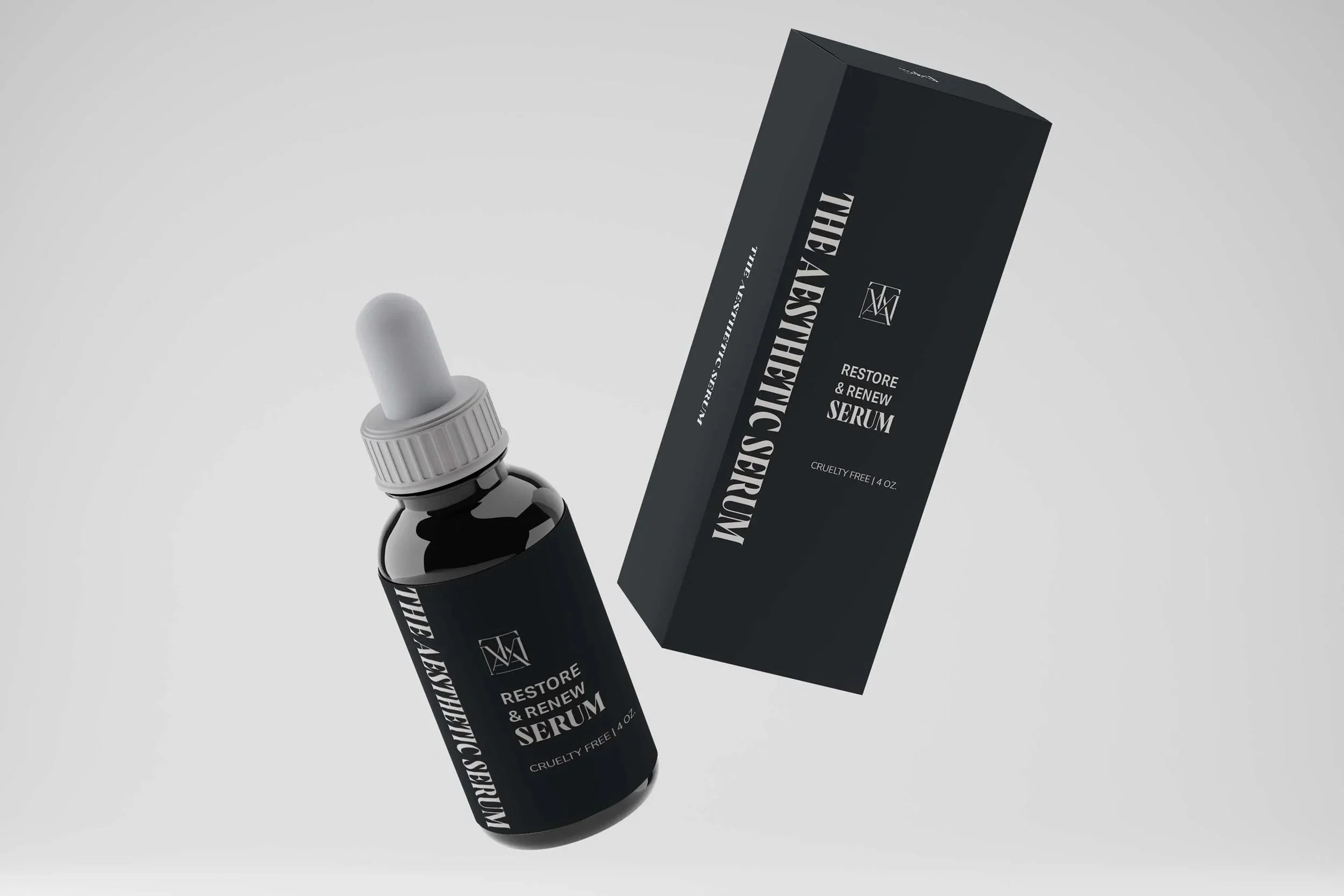
The Aesthetic Method
Neutral but vibrant branding for a Detroit medspa.
Project scope
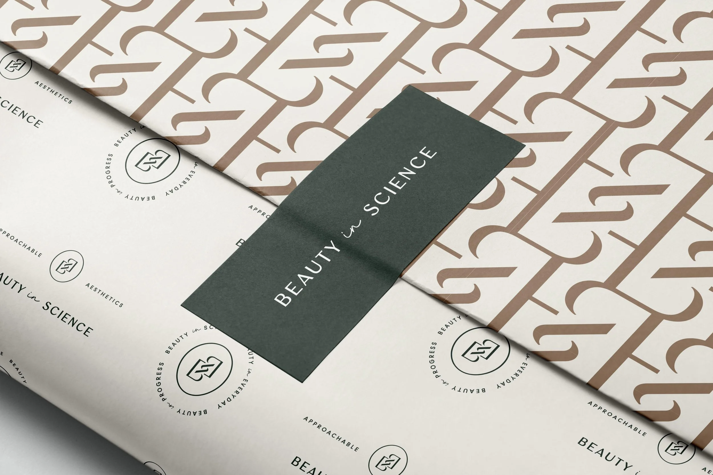
Branding
Custom icons
At The Aesthetic Method, they do things a little bit differently.
Founder Stephanie Stewart, is a CEO and Injector on a mission. Her team aims to rid the stigma of facial esthetics and help their clients use them for personal empowerment and confidence. They came to us wanting to give their branding a facelift, to match the level of service they offer.
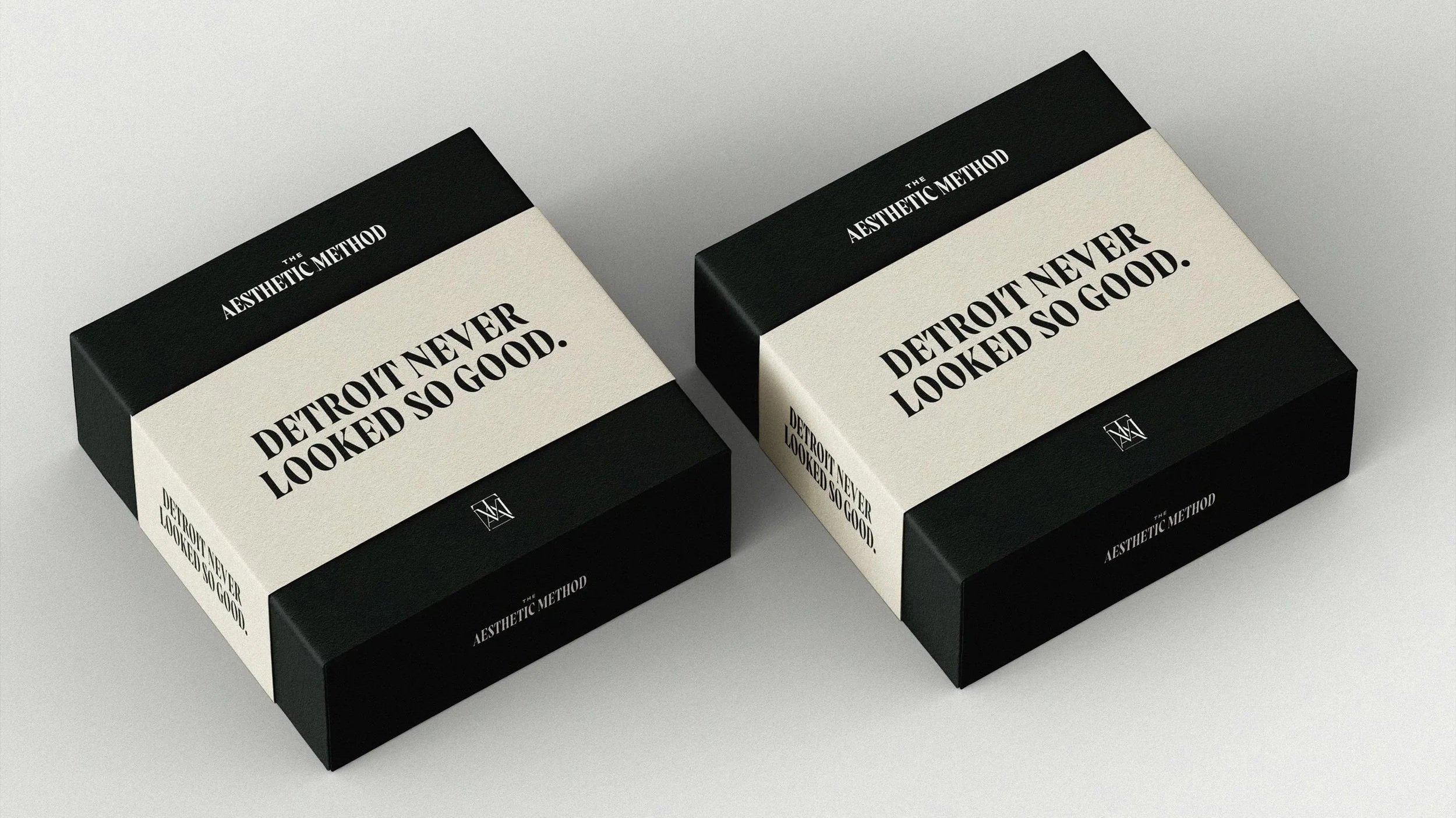
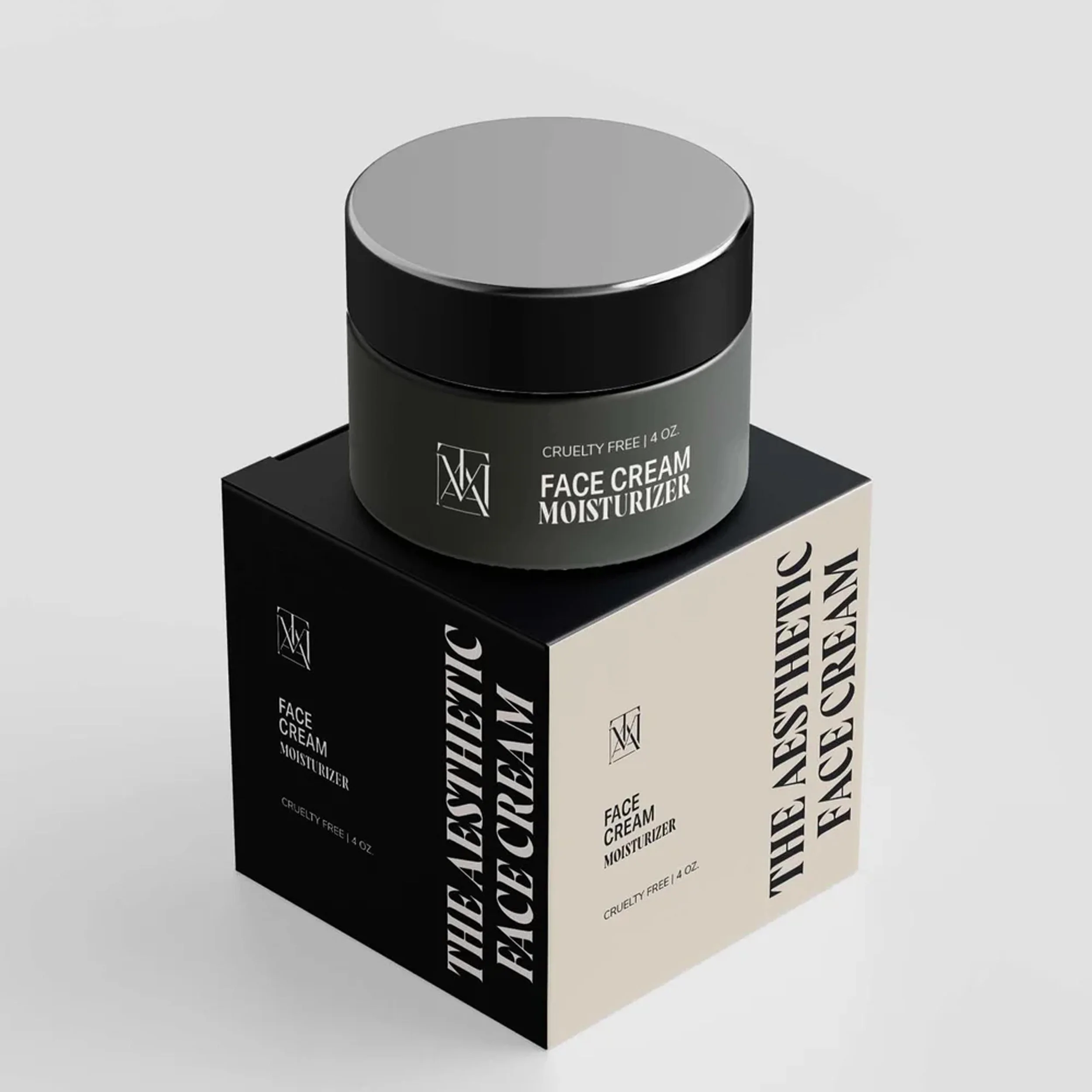
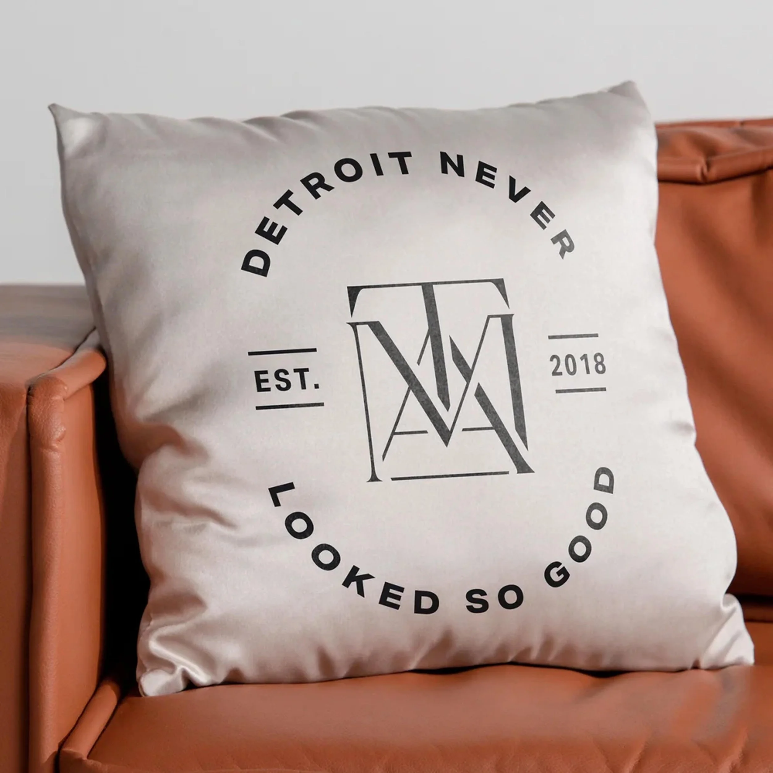
We designed a brand that pays tribute to the city of Detroit, positions The Aesthetic Method as an industry authority, and celebrates their mission.
The monogram fits together in an upward, towering shape to represent the revitalization of historic Detroit. Like the historic structures, The Aesthetic Method approaches injectables with proper technique for the most support and longest lasting results.
Custom icons
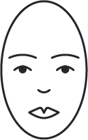
face
A blank canvas and starting point unique to each client and the skin they’re in.
Balance & Support
Two interlocking triangles represent balance, symmetry, and proportion.
personalized plan
A lined notepad is a nod to the tangible, honest plan created for the client.
“Our brand actually matches the level we're at!”
—Stephanie Stewart, Founder & CEO