Beauty in Science Medspa Branding & Website Design
Beauty in Science is a medspa in St. Clair Shores, Michigan, known for their approachable style of aesthetics. They don’t sell intimidating treatments or high-gloss perfection—instead, they’re all about helping clients feel effortlessly polished in a space where they truly belong. Founder Laura Hala came to our agency in need of a full rebrand and website design, looking to match her visuals to the refreshingly real experience she’s created in her spa. She had reached the point that many business owners do, where her in-person experience was far more elevated than her visual brand would suggest. We got to work developing a brand and website design to better align, ultimately creating an identity that feels easygoing and genuine but elevated—polished but never overdone.
About the Beauty in Science med spa brand
As we got to know Beauty in Science, the thing that stood out in every client testimonial was how the providers make every appointment feel like you’re catching up with a friend. This genuine, approachable feeling is central to the Beauty in Science philosophy. No fear or intimidation, they’re all about explaining the “why” behind their recommendations and intentionally creating treatment plans that fit into their clients’ lives and progress toward their goals. Their signature style is polished but never overdone—it’s truly about enhancing natural beauty and helping clients feel their best.
Step one: the Beauty in Science medical spa branding strategy
A luxury medical spa brand design
We started the Beauty in Science branding project the way we always do: with brand strategy. Before we started on logos, colors, or type, we spent time closely listening to Laura to fully understand what makes Beauty in Science stand out. We needed to get to the heart of Beauty in Science, so we could then translate this identity into a beautiful visual brand. Through our discussions, we honed in on guiding objectives, brand positioning, and ideal client avatars.
Project objectives
Our goal was to capture the feeling of being in a comfortable, stress-free, and safe space, while still honoring the professionalism and scientific expertise behind the services. The brand needed to feel easygoing and genuine but elevated—polished but never overdone. We would add lighthearted notes to match the in-person experience. And to harmonize with the spa’s interior design—which is light, airy, and plant–filled—the look needed to be simple and clean without being cold or sterile.
Mission statement
We refined the Beauty in Science mission statement to capture their ethos:
Helping you feel effortlessly polished with intentional treatments that fit into your life and progress toward your goals.
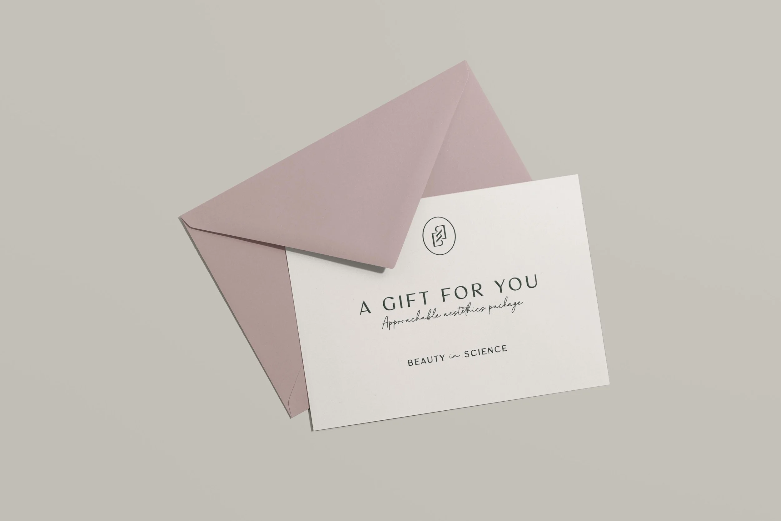
We then developed a tagline set to give plenty of options for fun, branded touches on the website and swag items.
Approachable aesthetics
Polished but never overdone
Everyday elegance
Elevated care / real results
Beauty in progress / Beauty in everyday / Beauty in science
Ideal client
Next, we got to know the ideal client at Beauty in Science, so we could learn exactly who we were designing for.
The Beauty in Science brand needed to appeal to women between the ages of 25 and 55. These clients have lives filled with things they love—families, businesses, and deep involvement in their communities. They’re energetic, fun, genuine, and responsible. Though they embrace the notion of natural beauty versus the latest trends, they feel that they haven't looked their best in a while. They want to know that they’re not too old, that they belong, and that they matter.
Step two: the Beauty in Science spa branding
A sophisticated, science-inspired spa logo design
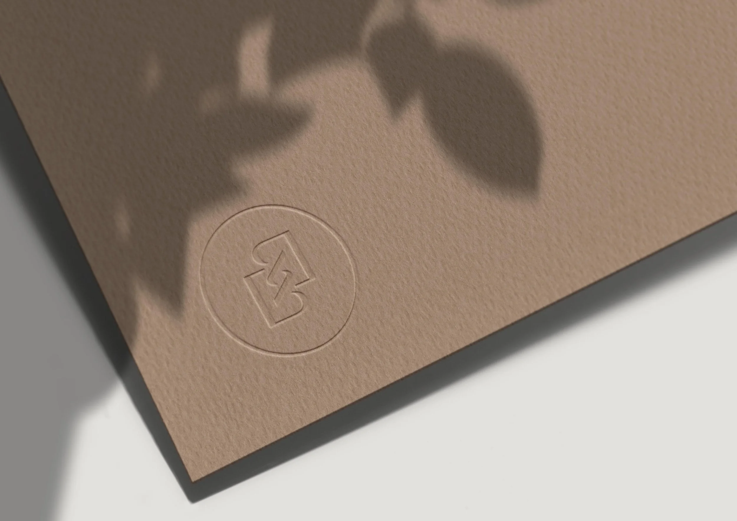
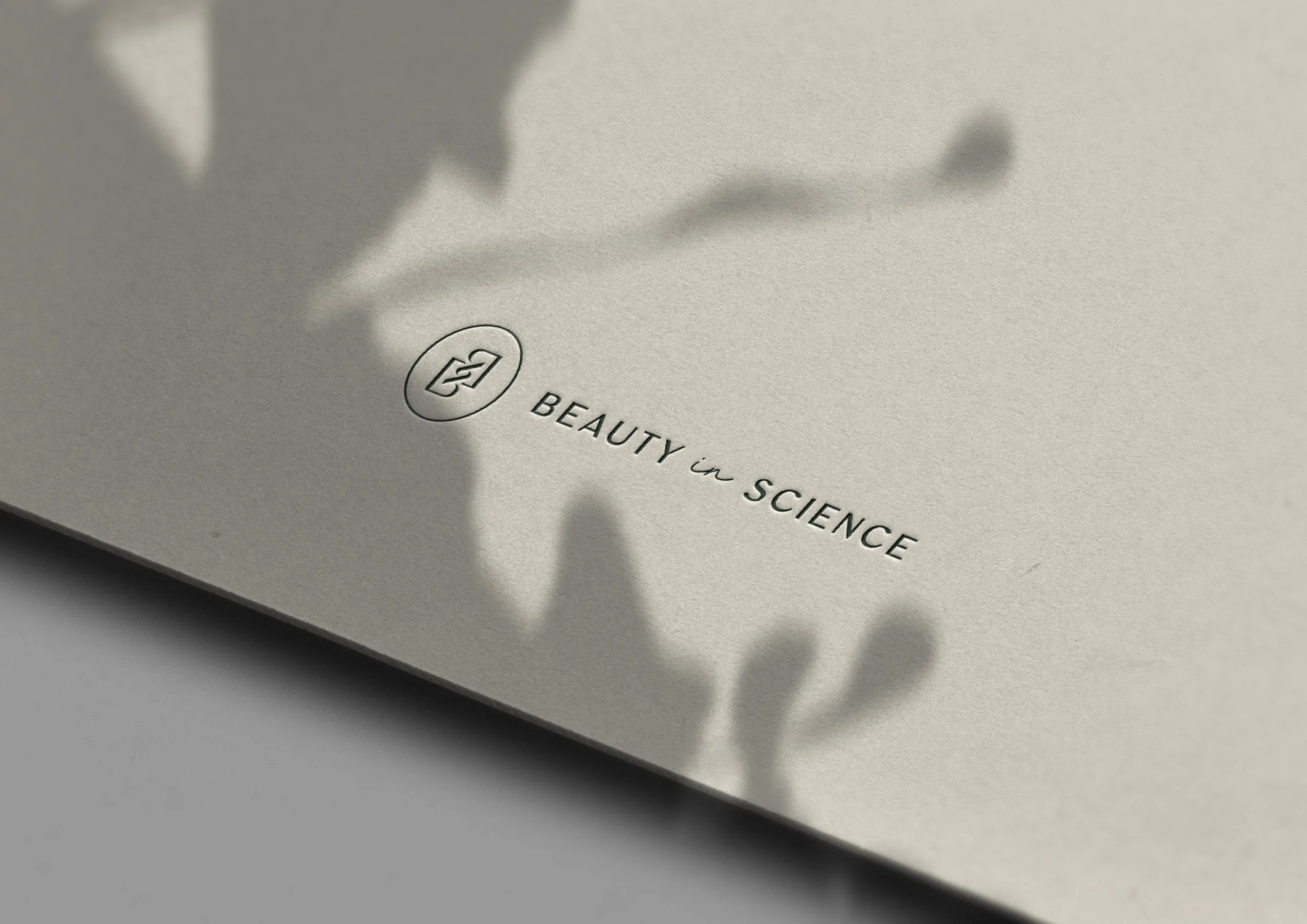
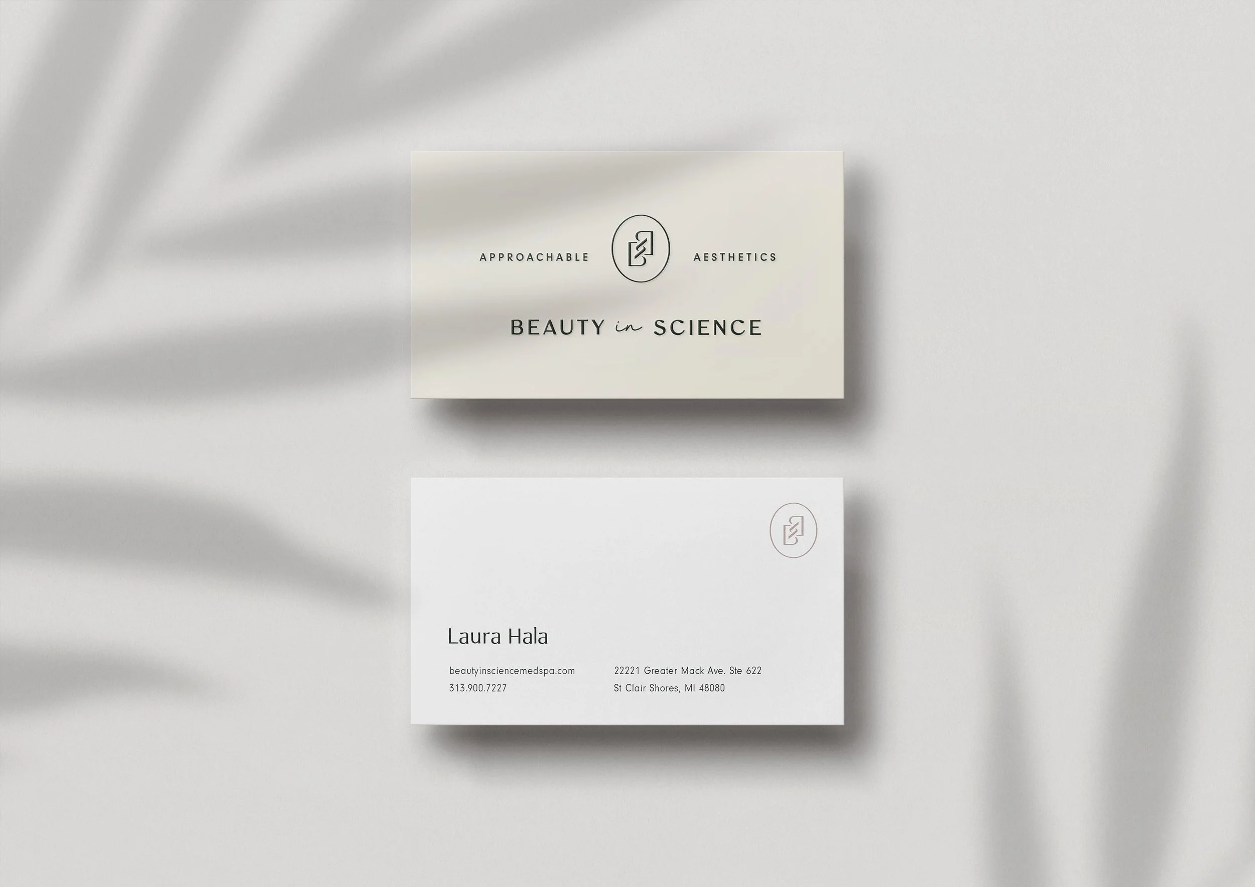
Once we had the strategy in place, we translated it into a logo system rich in symbolism and story.
Logo symbolism
DNA: The monogram center forms a DNA helix, playing into themes of refreshing and revealing the beauty you were born with
Mirror: The mirrored B’s represent reflection—helping clients see themselves as others see them.
Partnership: The two interlocking B’s represent the trusting partnership and ongoing relationship created with each Beauty in Science client.
The visual language
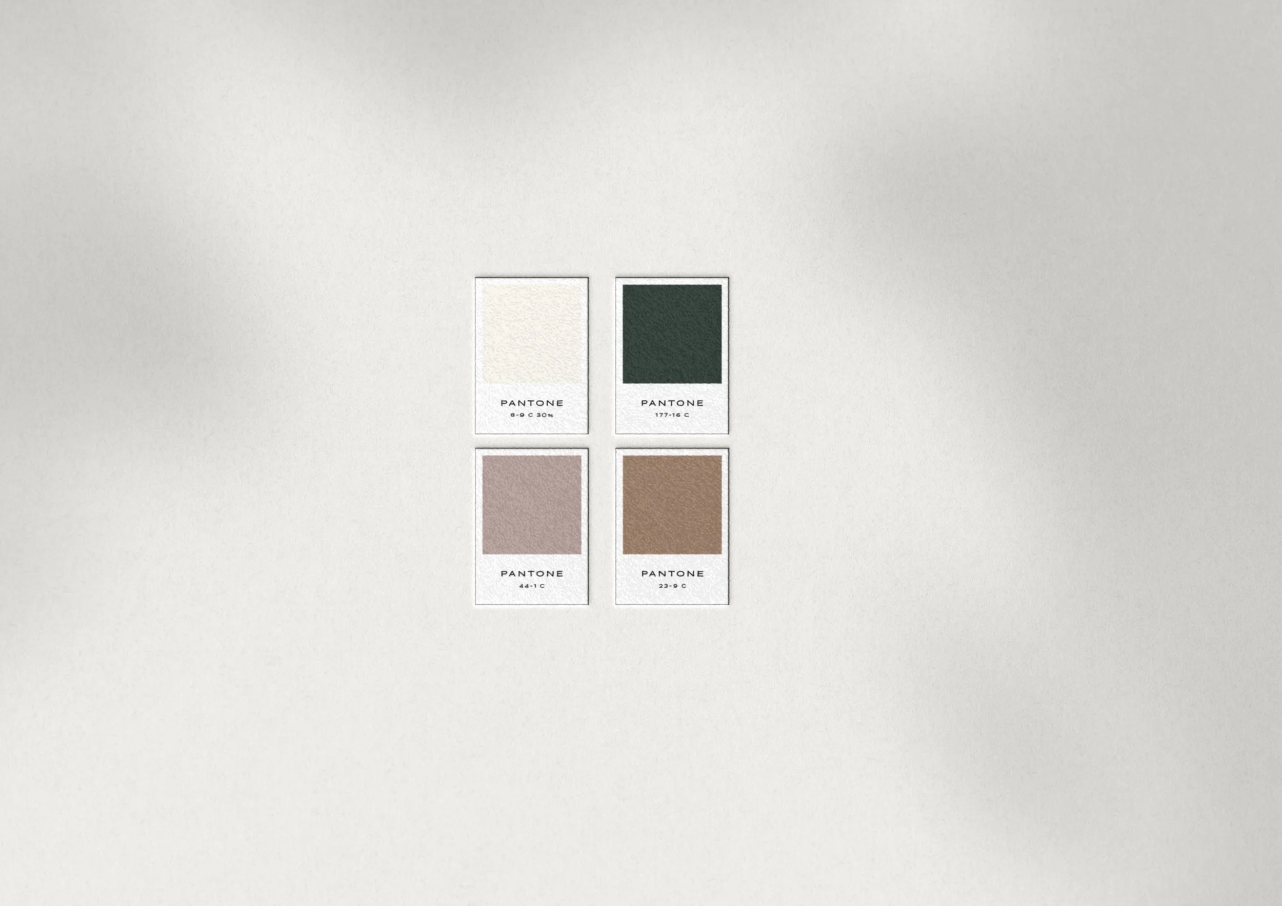
Color palette
We landed on a soft cream and deep pine green to harmonize with the light and airy, plant-filled interior design at Beauty in Science. We added a light brown for a warm, elevated feel and a dusty blush to add approachability and a touch of a lightheartedness. Overall, it’s easygoing and genuine but elevated—polished but not overdone. It feels comfortable, clean, safe, and warm.
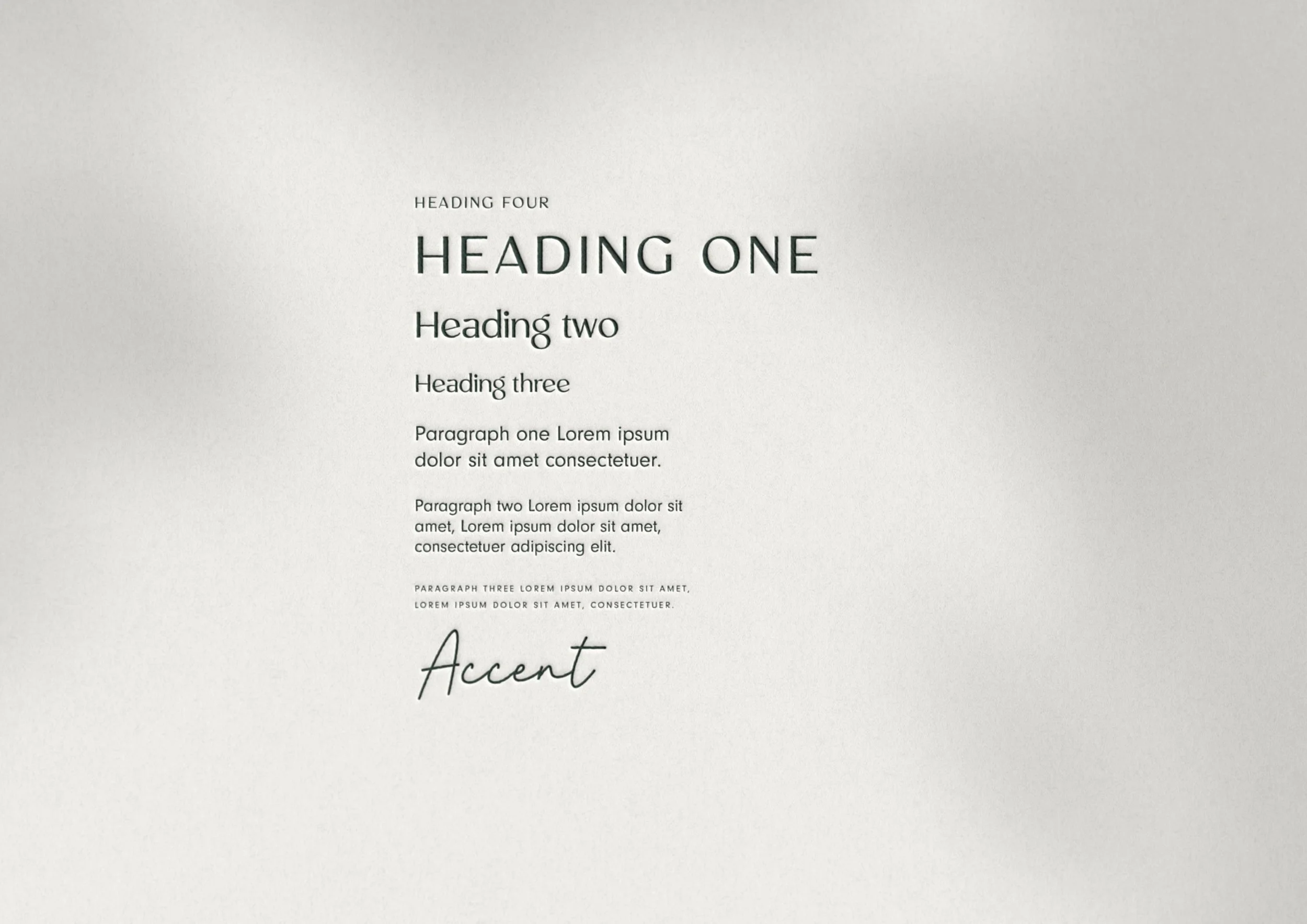
Typography
For the typography, we went with Mosaic as the display typeface. It has a ton of personality, without being busy or overdone, and a touch of an organic feel with terminals that almost look like leaves or hydrating water droplets. We balanced this out with Neuzeit Grotesk for the body typeface, since it’s super clean without being sterile or cold. And for a fun, hand-drawn touch, we added in Purely Woman as an accent script. They all work together to feel polished and clean, yet full of approachable personality.
Patterns
We designed a set of three patterns for use on packaging, social templates, textiles, stationery, etc. We love adding patterns into our clients’ brand toolkits, since there are so many possibilities for how they can be used.
Step three: the Beauty in Science spa website design
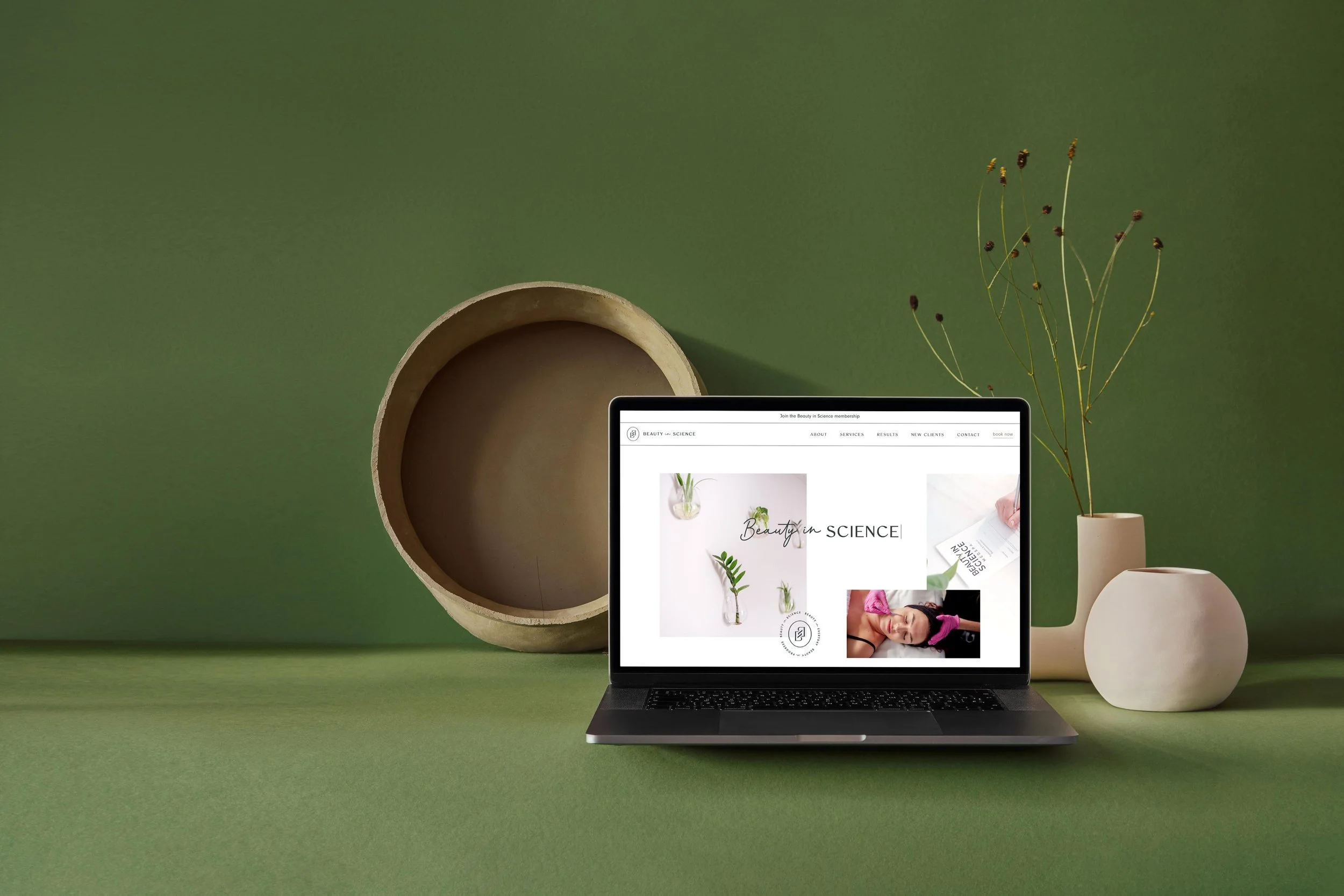
A luxury spa website template
Once we had the branding finalized, we moved onto the website design with our launch-ready website process. We developed this process because, after designing hundreds of custom websites since 2013, we realized that not everyone needs a fully custom site—especially small businesses and those just starting out. The long timelines and high costs were a barrier to entry, and we saw too many people delaying their dream. So we rethought our process designed a set of templates clients choose from, which we then fully customize with their unique strategy and branding. We’re so proud of how our framework gives all the benefits of a website designed by a boutique creative studio, just on a faster timeline.
Honing in on a medical spa website design strategy
Like our branding process, our website process begins with strategy too. Before we could start updating the colors and fonts on the site, we took a step back to design an overall website architecture and flow. What this looks like in practice is called wireframing. We met with Laura to understand all that the site needed to accomplish—the priorities, objectives, and storytelling—then translated these goals into a website structure and page outlines that intuitively guide visitors throughout the site. Think of it like building a house: before painting the walls, you first need to design the blueprint of the rooms, considering how they’re connected and how visitors will navigate throughout the space.
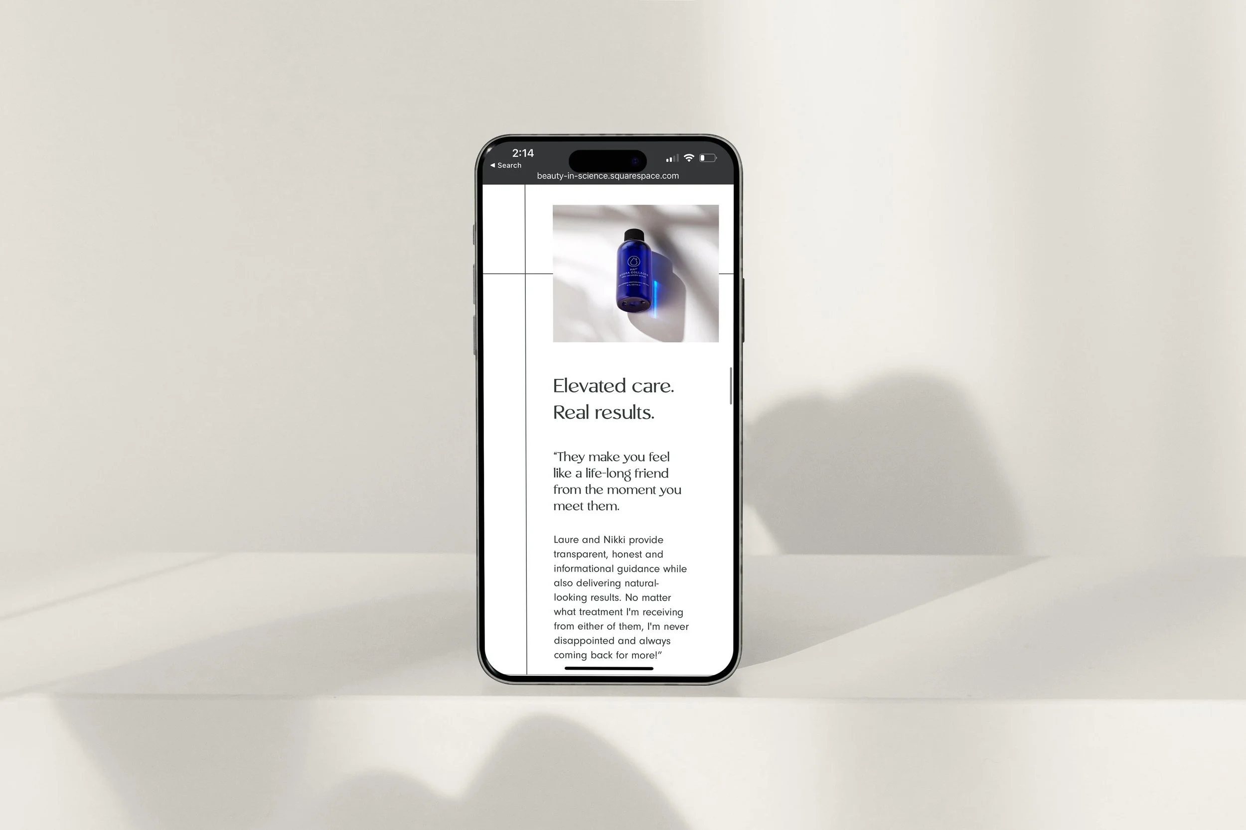
For the Beauty in Science website, our objectives were to craft an online presence to match the in-person vibe: warm, lighthearted, educational, expert, and safe. We needed to share what makes the Beauty in Science approach unique and educate on an extensive menu of services, without overwhelming visitors. And the main goal was to make it easy for visitors to book online.
Polished but personable medical spa website copywriting
When we wireframe, we always include section-by-section prompts so it’s clear what is covered when. This ensures everything intuitively flows together to tell the Beauty in Science story. Laura chose to have us handle the copywriting, so we filled in each content prompt in the Beauty in Science voice. We honed in on a writing style that’s 60% Melissa McCarthy and 40% Ann Hathaway—it’s like chatting with a friend who’s incredibly educated, but has a down to earth perspective, realistic advice, and funny analogies.
Executing the med spa website design
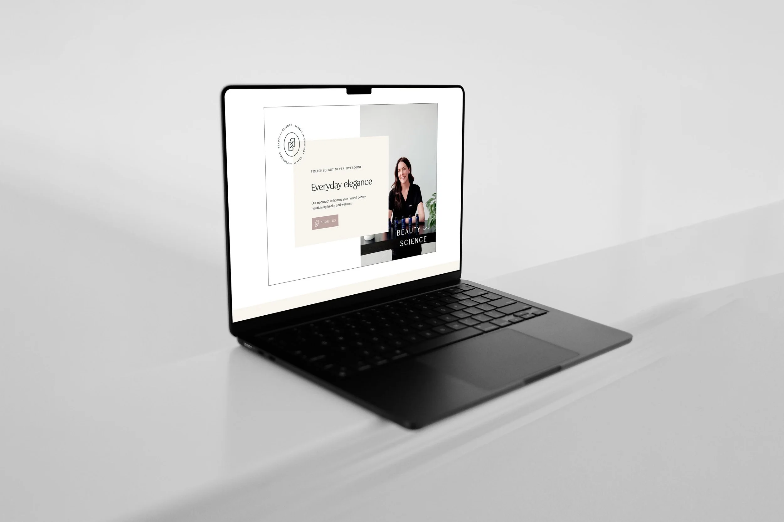
For the website design, Laura selected our Simple Luxe template, which we then customized with her colors, fonts, and logos. Simple Luxe has a super clean look, which is a great fit for Beauty in Science, but we warmed it up a bit by adding blush accents, overlapping script accents, and fun badge layering. We designed a new hero section for when you first land on the homepage, featuring a fun typewriter animation and overlapping photos. The result is something that feels completely unique and fitting to Beauty in Science—but since we weren’t starting from scratch, the whole process was so much faster than a custom build.
The final result: An approachable yet luxury medical spa brand & website design
The final result is a brand and website design that work in harmony to tell the Beauty in Science story. The look, feel, and tone are all polished but personable—capturing that easygoing and genuine personality, but elevated to a luxury experience. View it all live at the Beauty in Science website.
Ready to elevate your brand?
Book a free brand review with our Creative Director, Kathryn Joachim. During this call, you'll have the opportunity to discuss your specific branding needs and goals, as well as learn more about our signature custom branding process. Whether you're looking to refresh your current brand or start from scratch, Kathryn will help strategize on your next steps to crafting a brand and website that truly reflect the essence of your business.