Hoyt Homes Brand & Website Design
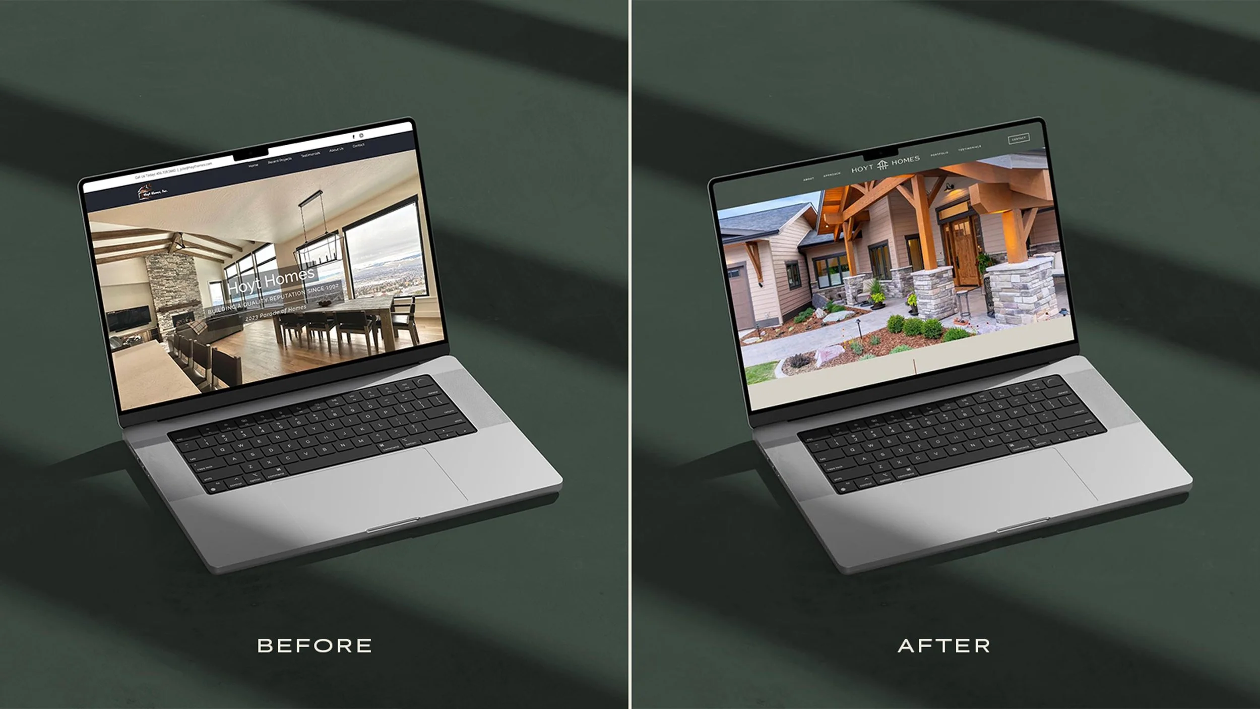
Kathryn and Brandon Rigoni came to us like many business owners do: with a logo and website that just didn’t do their work justice anymore—their visual brand had served them well for many years but they had outgrown it. Hoyt Homes builds thoughtfully designed, exceptionally crafted custom homes in Missoula, MT. They’re known for their signature Mountain Modern style that blends modern lines with natural materials, like wooden beams and stone. Each project is impeccably built with a high level of design, but this just wasn’t being reflected in their previous branding. Kathryn and Brandon knew they needed to elevate their logo and website to match the caliber of their work, but since Brandon’s Uncle Wade had started the business in 1992, it was a huge priority to honor the legacy brand. Our project scope included both branding and website design to bring their visual identity into alignment with their exceptional construction work—without looking unrecognizable or feeling completely disconnected from their roots.
About the Hoyt Homes construction company brand
Hoyt Homes is an award-winning construction company in Missoula, MT, specializing in custom home builds.
The company was founded in 1992 by Wade Hoyt and has built countless homes in the Missoula area since then. They’ve helped define the architecture of the region, with iconic projects like the Canyon River Golf Course Community homes. Wade’s craftsmanship, integrity, and community-focused vision established Hoyt Homes as one of the region’s most sought-after builders, and he continues to mentor the team in his role as Senior Advisor.
Today, Hoyt Homes is known for their signature mountain modern style that blends modern lines with natural materials—think: wooden beams, stone fireplaces, and large windows framing up beautiful Montana landscapes. They’ve won awards both for their craftsmanship and design, and clients consistently comment on how smooth their custom build process is.
Step one: The Hoyt Homes construction company branding strategy
Elevated construction company branding
To kick off our project, we began with brand strategy. We gave the Hoyt team extensive branding exercises to clarify exactly who they are and what they stand for. We then met with the team to discuss their insights, helping them to define things like their mission, brand personality, and goals for the rebrand. This process was essential for us to be able to design with a clear direction, fully aligned with exactly who Hoyt is and where they’re going. It was also completely transformative for the Hoyt team, giving them renewed confidence in exactly who they are.
Project objectives
There are many elements that come together to form the essence of Hoyt Homes—their mountain modern style, the legacy homes they build and legacy brand to honor, their high-end craftsmanship—all of which needed to be represented in the final branding.
To ensure all design decisions would flow into the Hoyt team’s goals and fit into the same design family as their top projects, we outlined a list of key project objectives:
Elevate the branding to match the in-person experience and high-end craftsmanship.
Feel curated, not corporate, to stand out from competitors.
Blend an elevated mountain vibe with timeless design.
Feel warm and inviting while still framing up more sleek, minimalist projects beautifully.
Honor the brand legacy by building off of the previous logo.
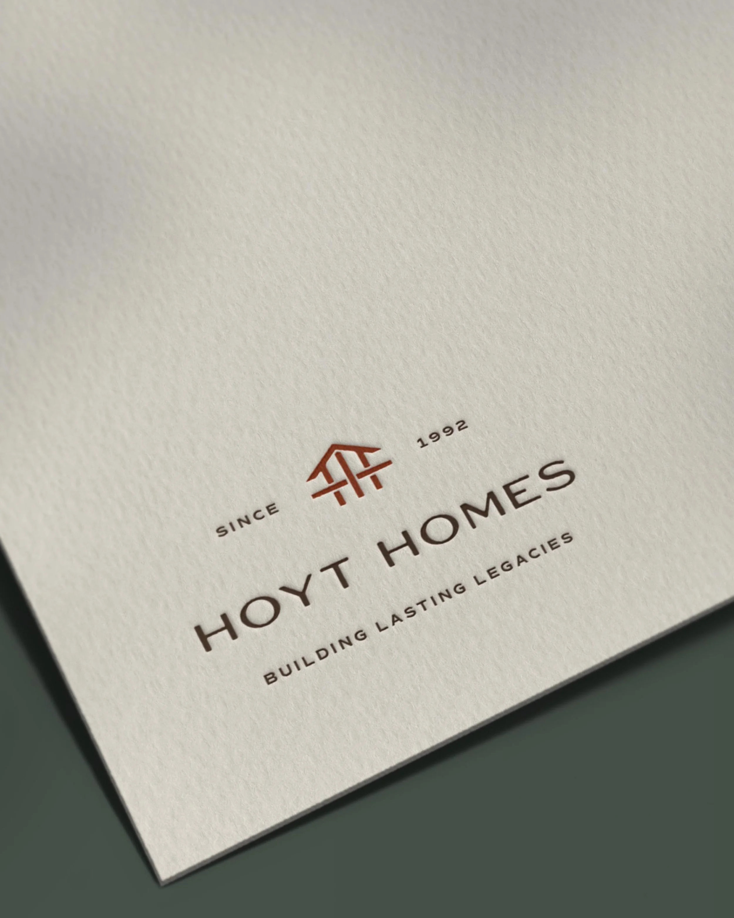
Include a logo configuration with the established year: 1992.
Look to natural building materials and the Montana landscape for color inspiration, especially leaning into warmer tones.
We also made sure to outline the things we needed to avoid while designing:
Don’t go in a completely disconnected direction from the current brand.
Don’t lean too far into the rustic look; this should be a high-end, sleek brand.
Don’t use a cool toned color palette.
Mission statement
Next, we moved on to wordsmithing the Hoyt Homes mission statement and tagline. We especially love the use of “rooted” in the mission statement—it feels in line with Hoyt’s natural building materials without going overboard—and how the tagline highlights both the legacy brand and homes Hoyt builds.
We create custom homes that reflect the lives within them—rooted in thoughtful design and exceptional craftsmanship.
Building lasting legacies since 1992
Ideal client
We then moved on to writing an ideal client avatar to understand who the design needed to resonate with. Kathryn and Brandon helped us fill in the details of their ideal clients so we could understand their motivations, style, and values:
Jack and Lauren are ready to leave California after 20 years of city life in search of more space, more sky, and more meaning. Jack recently sold his mid-sized marketing firm and Lauren is an interior designer. After a few exploratory visits, they fell in love with the quaint and beautiful town of Missoula, Montana, with its vibrant downtown and lovely community vibe. They found a land opportunity to build their dream home on and have a beautiful plan drawn by a well-respected architect. They’re excited to build something lasting—a place where their kids will return to, where holidays are spent, and where their values show up in every board and beam.
Jack and Lauren have a vision for a home that blends elevated mountain living with timeless design. They want their space to feel rooted: warm stone, natural light, a chef’s kitchen for family gatherings, and a covered porch facing the river. While they’re excited to build their Montana dream home, they aren’t in a rush— they want it done right. They trust their builder, ask thoughtful questions, and want to feel seen throughout the process.
Step two: The Hoyt Homes construction company branding
Once we all felt in alignment on the branding strategy and synthesis, we moved on to crafting the brand design to meet the project objectives.
A mountain modern construction company logo
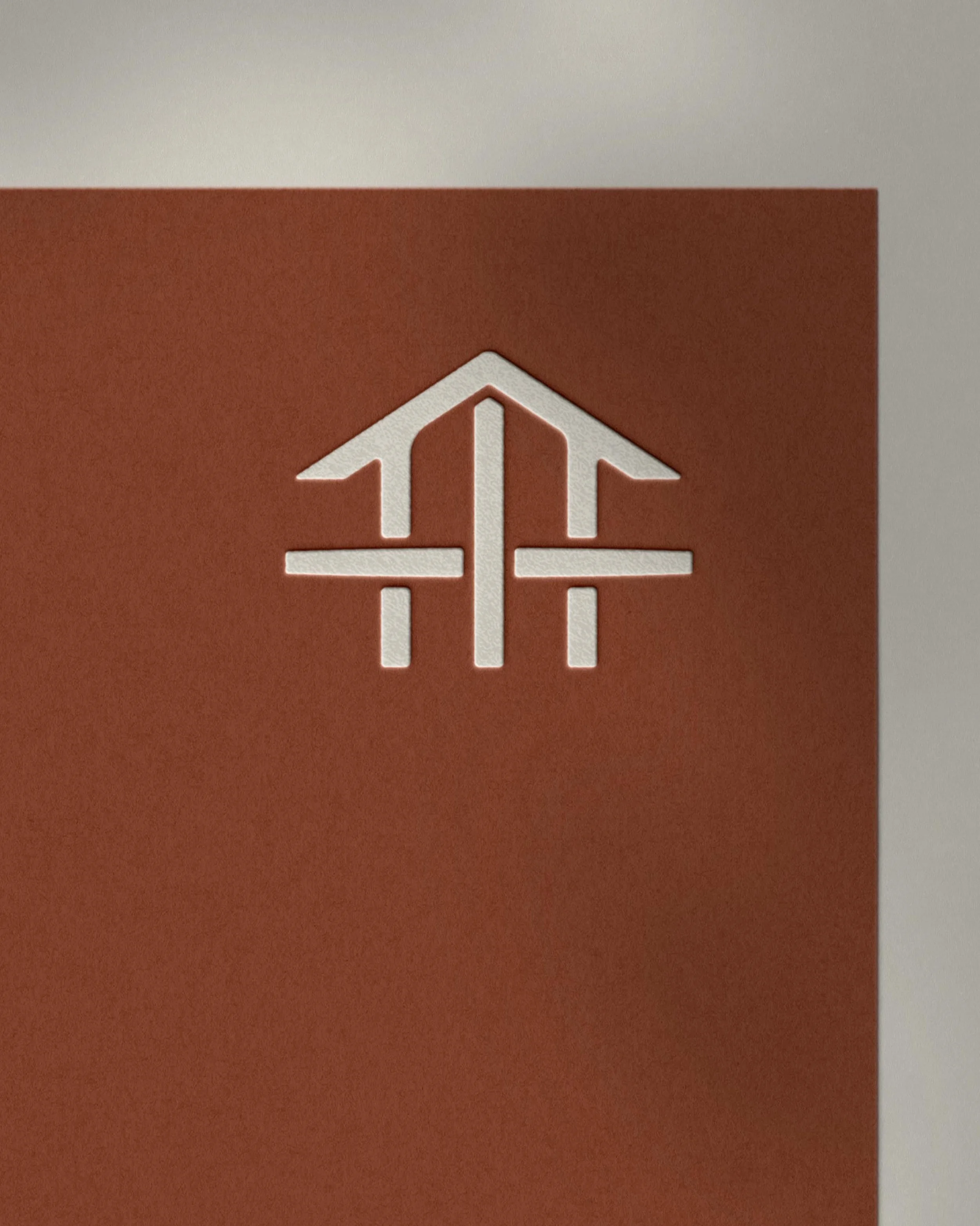
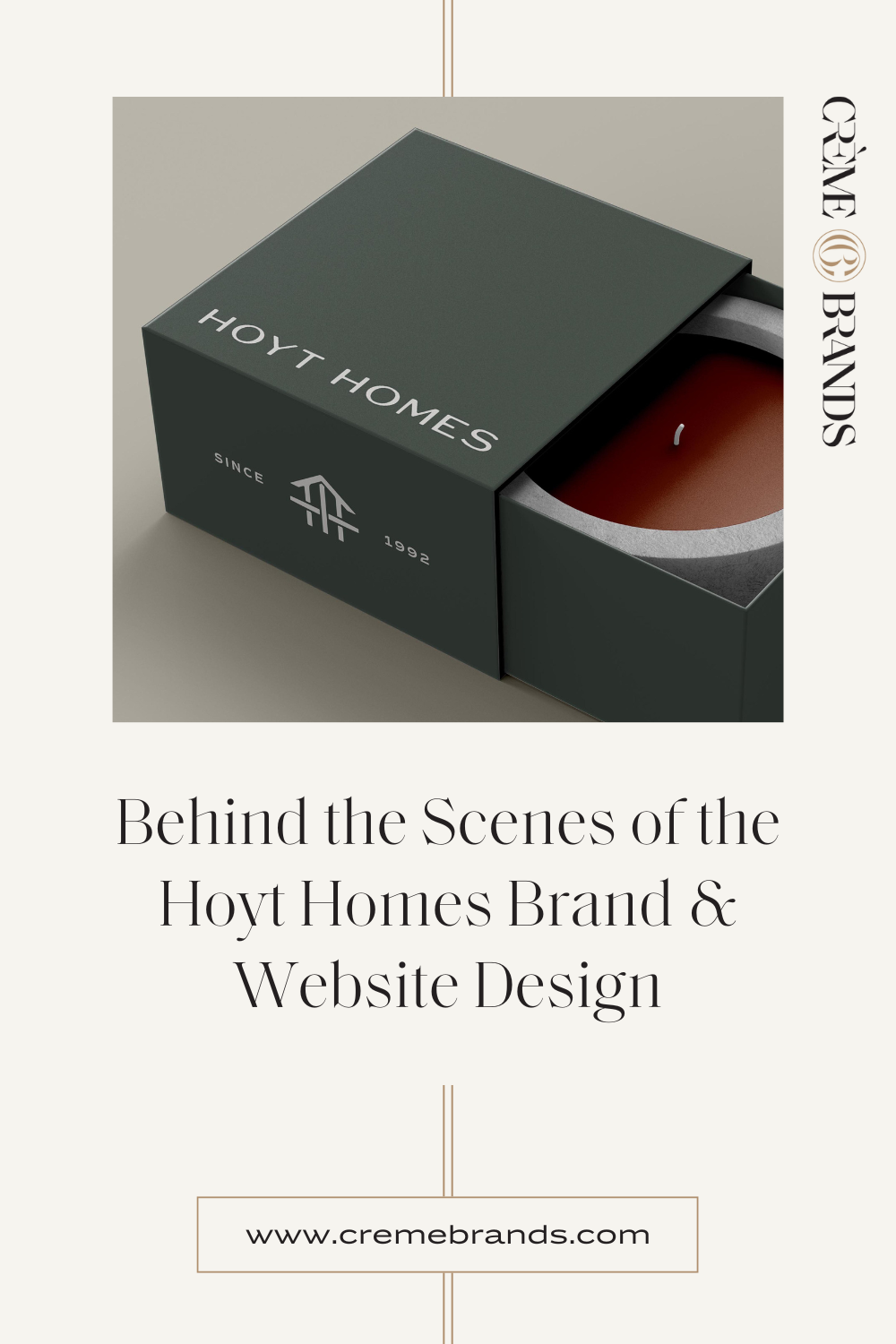
There were many threads to draw on when brainstorming symbolism to incorporate into the logo. We sketched dozens of options and presented a concept with woven beams forming a home icon. Brandon and Kathryn loved the concept but wanted a simplified version to be less of a departure from their previous logo. They sent us a sketch that pared down the original concept, and we all agreed it perfectly encapsulated the core essence of Hoyt!
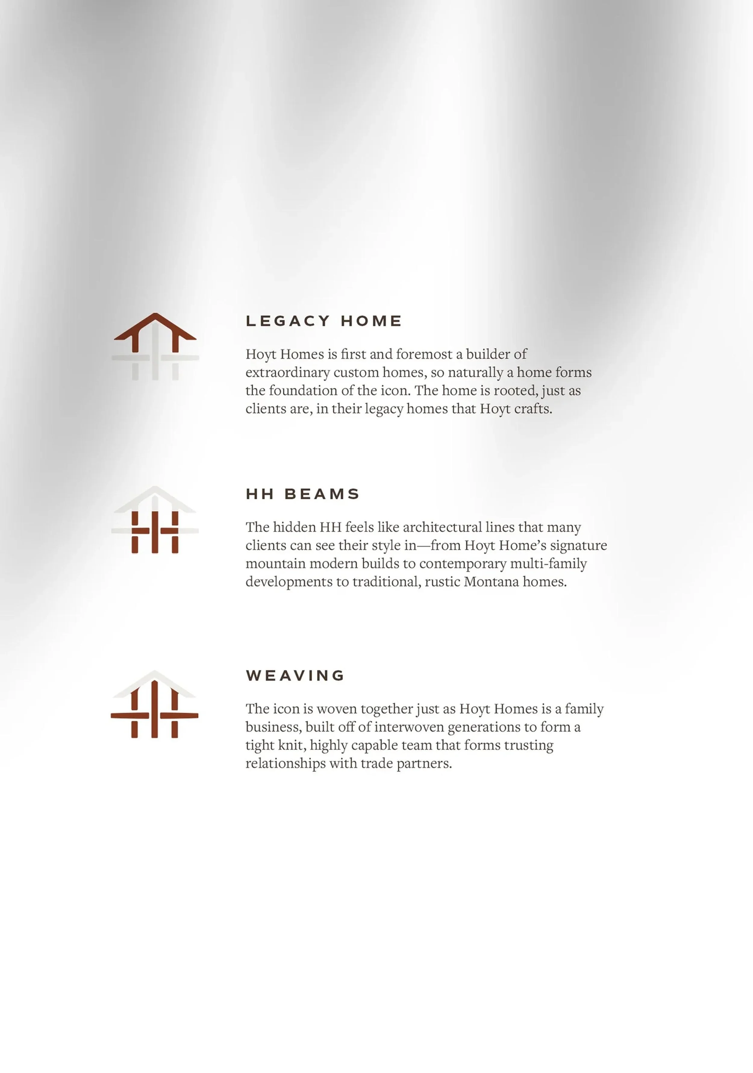
Construction company logo symbolism
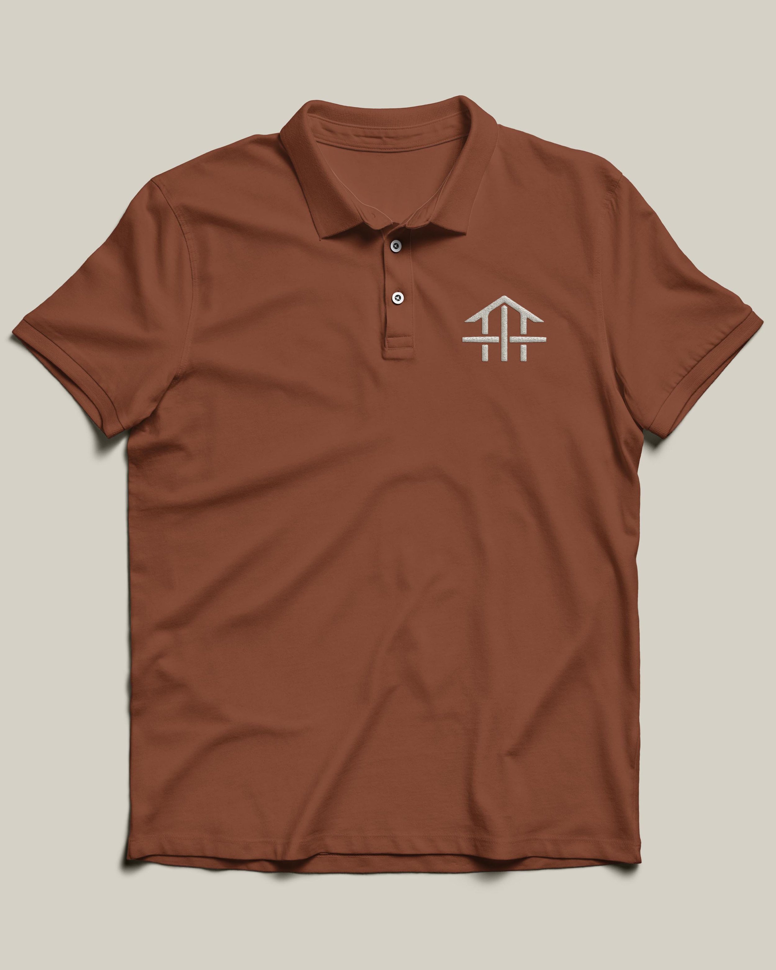
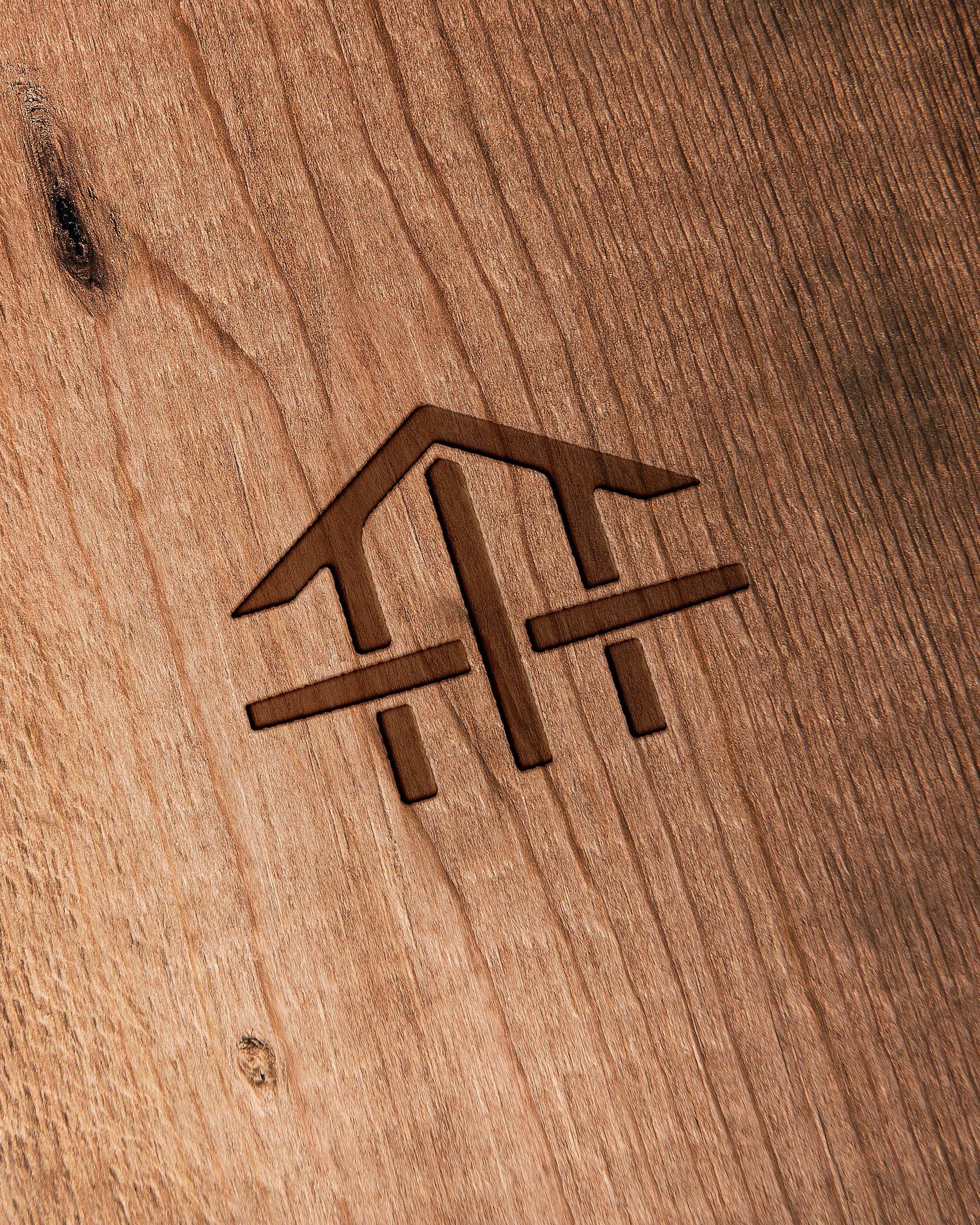
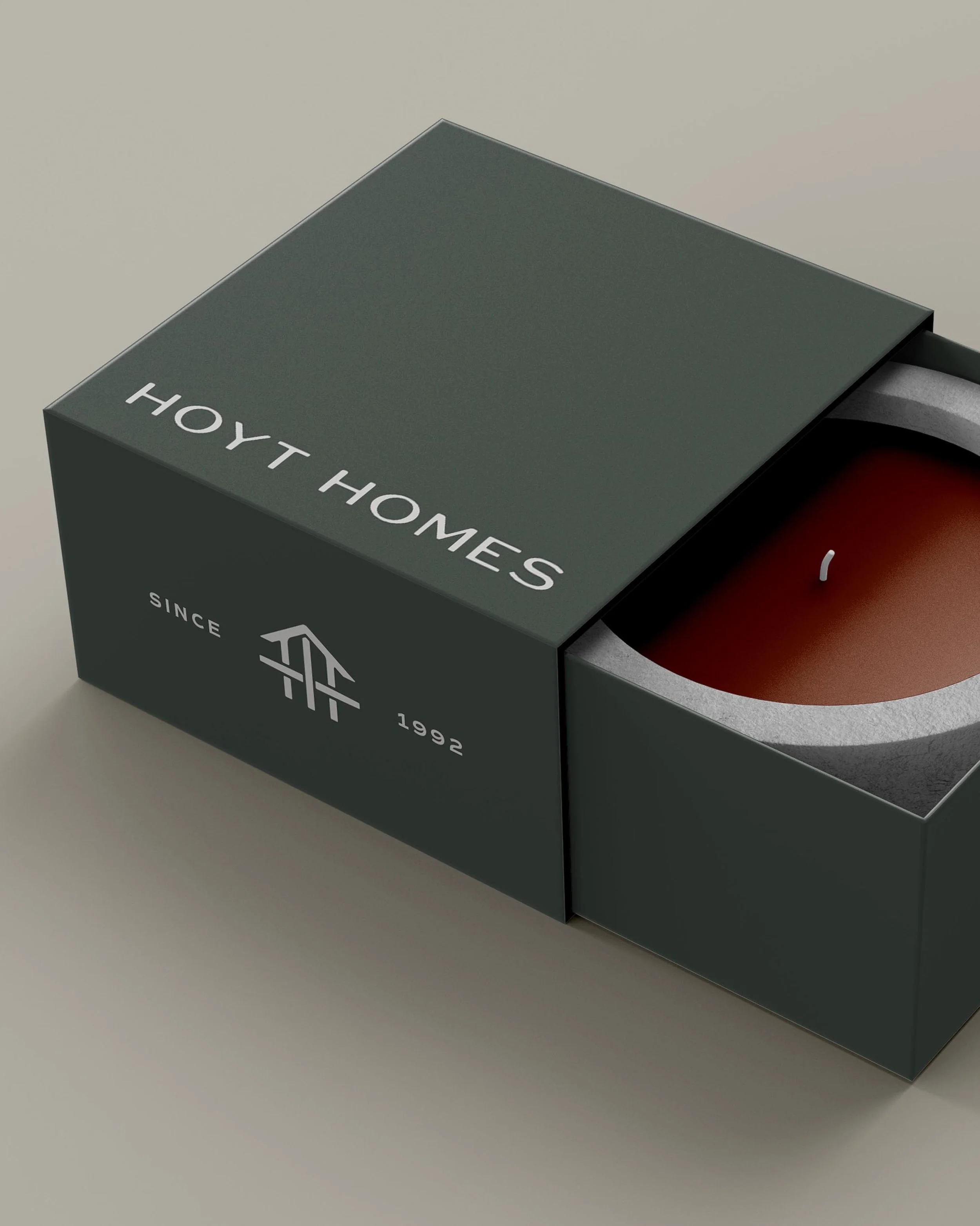
Legacy home: Hoyt Homes is first and foremost a builder of extraordinary custom homes, so naturally a home forms the foundation of the icon. The home is rooted, just as clients are, in their legacy homes that Hoyt crafts.
HH Beams: The hidden HH feels like architectural lines that many clients can see their style in—from Hoyt Homes’ signature mountain modern builds to contemporary multi-family developments to traditional, rustic Montana homes
Weaving: The icon is woven together just as Hoyt Homes is a family business, built off interwoven generations to form a tight-knit, highly capable team that forms trusting relationships with trade partners.
The visual language
Once the logo was finalized, we moved on to building out the rest of the Hoyt Homes brand.
Color palette
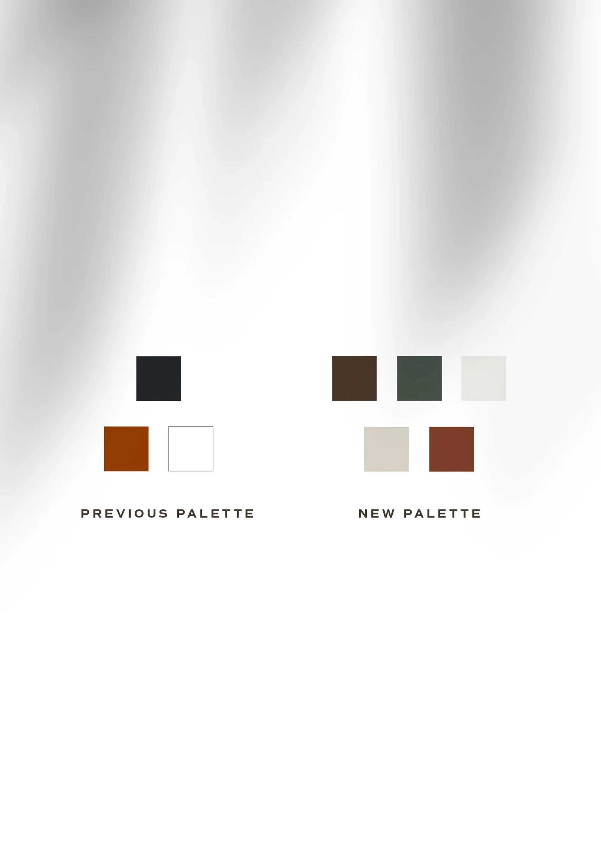
We kept a copper-ish accent color, but shifted the overall palette to be warmer and more reflective of the Montana landscape and Hoyt Homes’ construction work. The final palette is filled with symbolic tones—Aged Lantern Brown, Ponderosa Leaves, Fireplace Stone, Zellige Tile, and Ponderosa Bark—that harmonize beautifully with the project photography on their site.
Typography
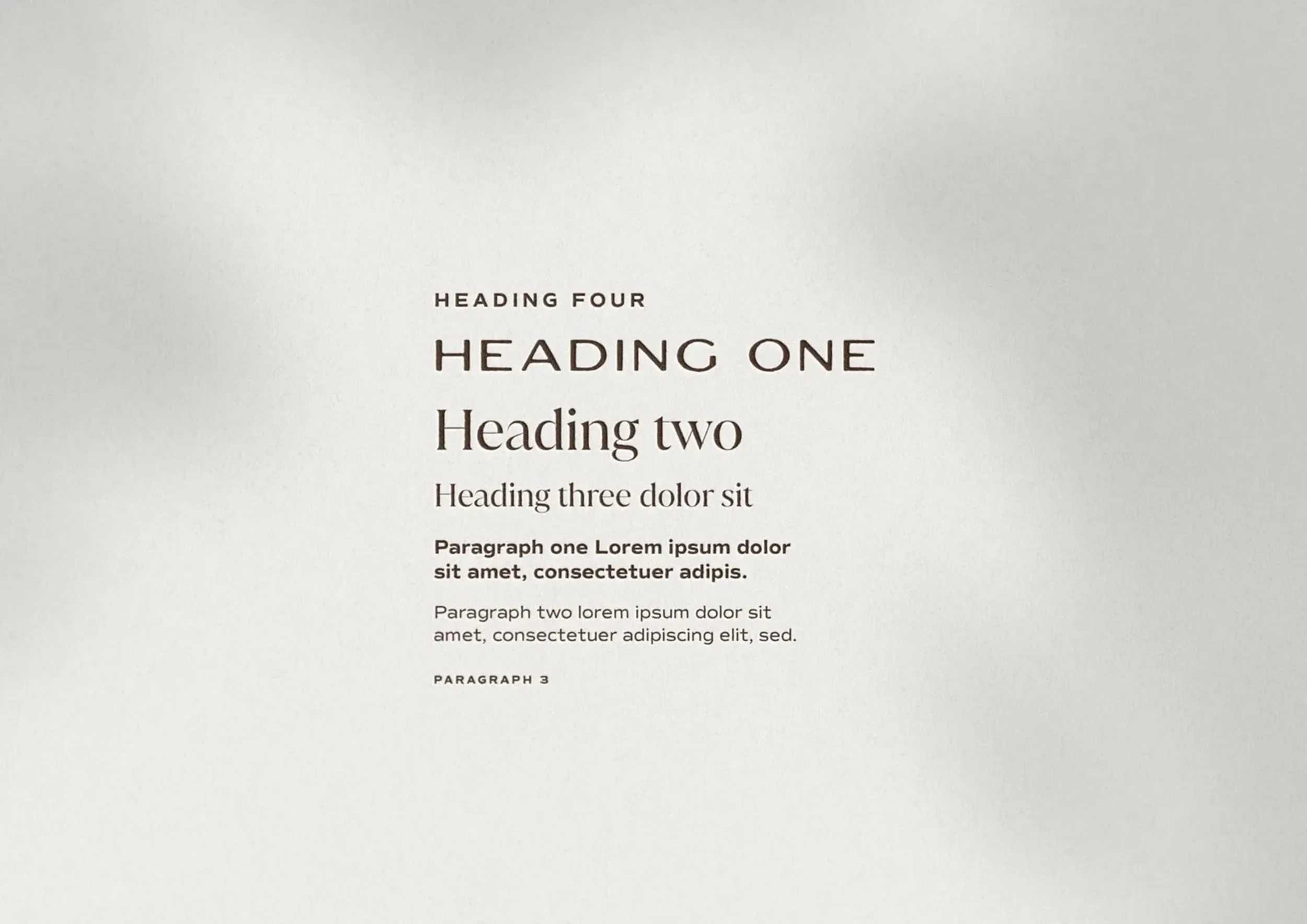
We used a mix of typography styles to capture the Hoyt Homes’ design and build sensibility. The foundation of the type hierarchy is a clean sans serif for a modern, professional feel. We added a display font with a slight Western vibe to bring in that Mountain Modern note, as well as a crisp, stylish serif to highlight the elevated design Hoyt is known for. Just like interior design, using a mix of styles creates a sophisticated look that feels tailored to the Hoyt Homes brand personality without being theme-y or one-note.
Patterns
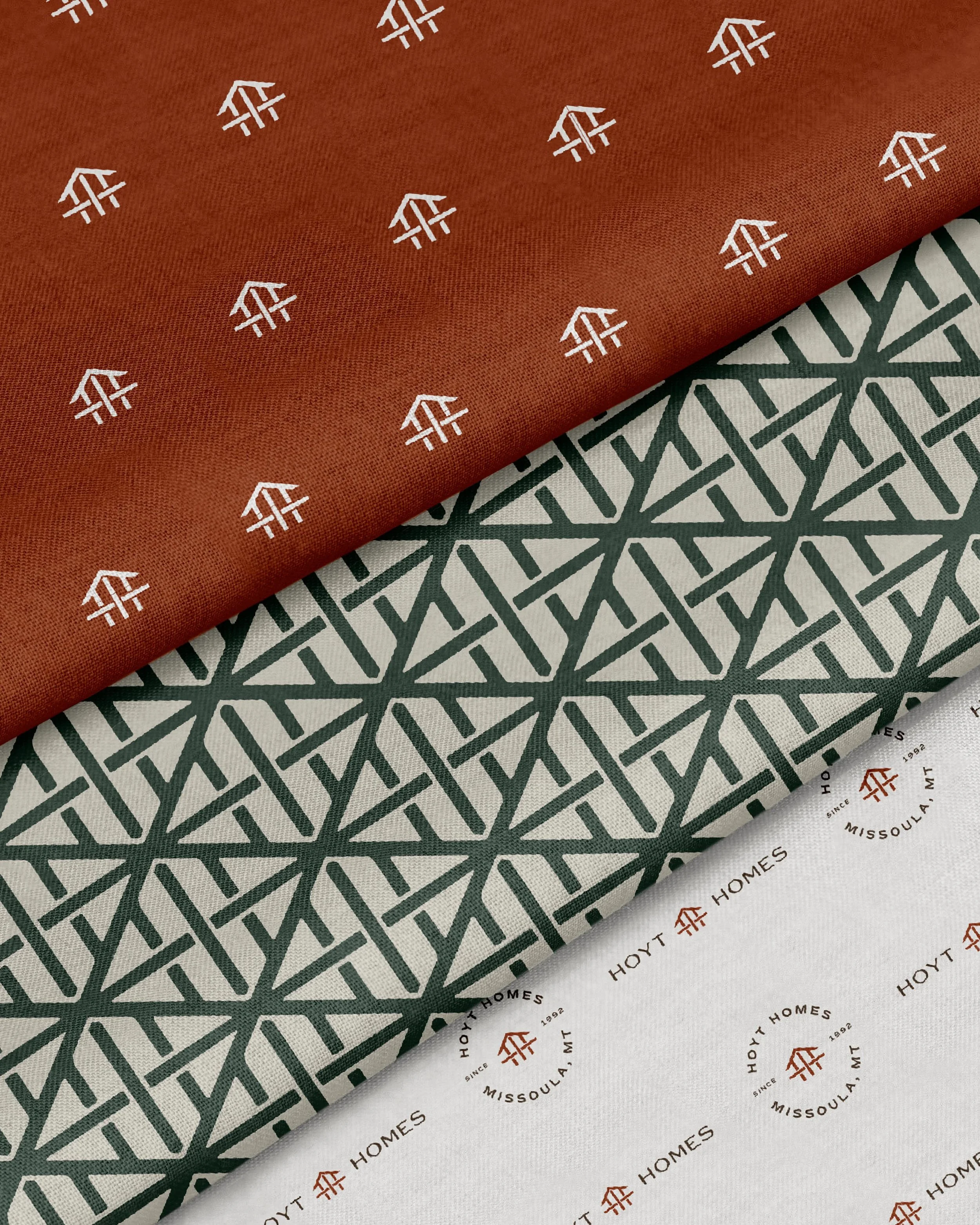
To add depth and texture to their brand toolkit, we created a set of patterns that reimagine the lines from the logo in creative ways. These are great for use on social media templates, textiles for office space, swag items, etc.
How do you maintain continuity in a rebrand?
The Hoyt Homes rebrand brought up a theme we see time and time again: the need to maintain continuity in a rebrand. Business owners often know their brand needs a serious update, but don’t want to become unrecognizable. For well-established businesses like Hoyt Homes, who have been building their reputation since 1992, it’s all the more important to honor the legacy brand.
There are so many creative ways to maintain continuity, and we always want to be intentional about the legacy elements we carry over. It’s crucial to first take a step back and consider what the most memorable aspects of the current brand are, since these are the features to lean into and elevate.
For Hoyt Homes, the most memorable aspects of the legacy brand were the home icon and copper-ish color. Although the legacy brand had navy in the color palette, the copper is really what stuck out since it was used in the logo. So that’s what we kept and built an elevated color palette around. It wouldn’t have made sense to keep the navy for the sake of continuity, when that’s not what people remember Hoyt for! For the logo redesign, although the execution is completely different, it still features a home icon in the copper-ish color. The two designs are completely different, but still feel more like an evolution versus something completely disconnected from the Hoyt’s roots.
This leaves us with some key takeaways for maintaining continuity in a rebrand:
Lean into the most memorable elements of the legacy brand
Embrace the shades of gray between a subtle refresh and a complete overhaul
Build an elevated brand suite to complement the memorable legacy elements
Step three: The Hoyt Homes construction company website design
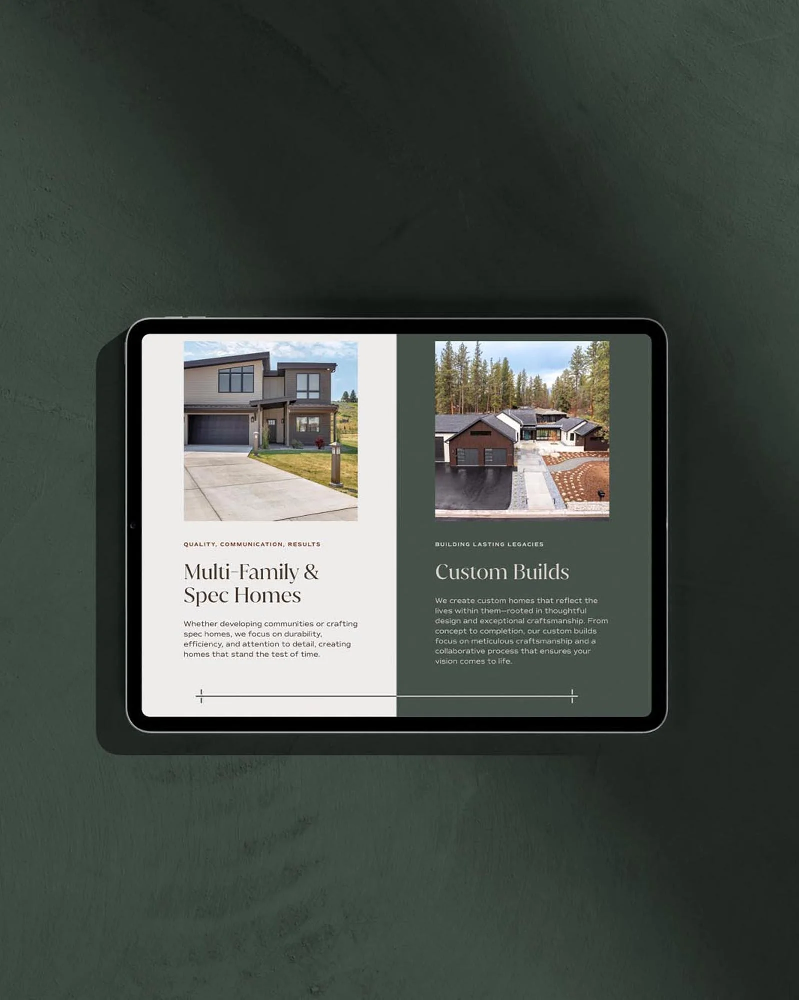
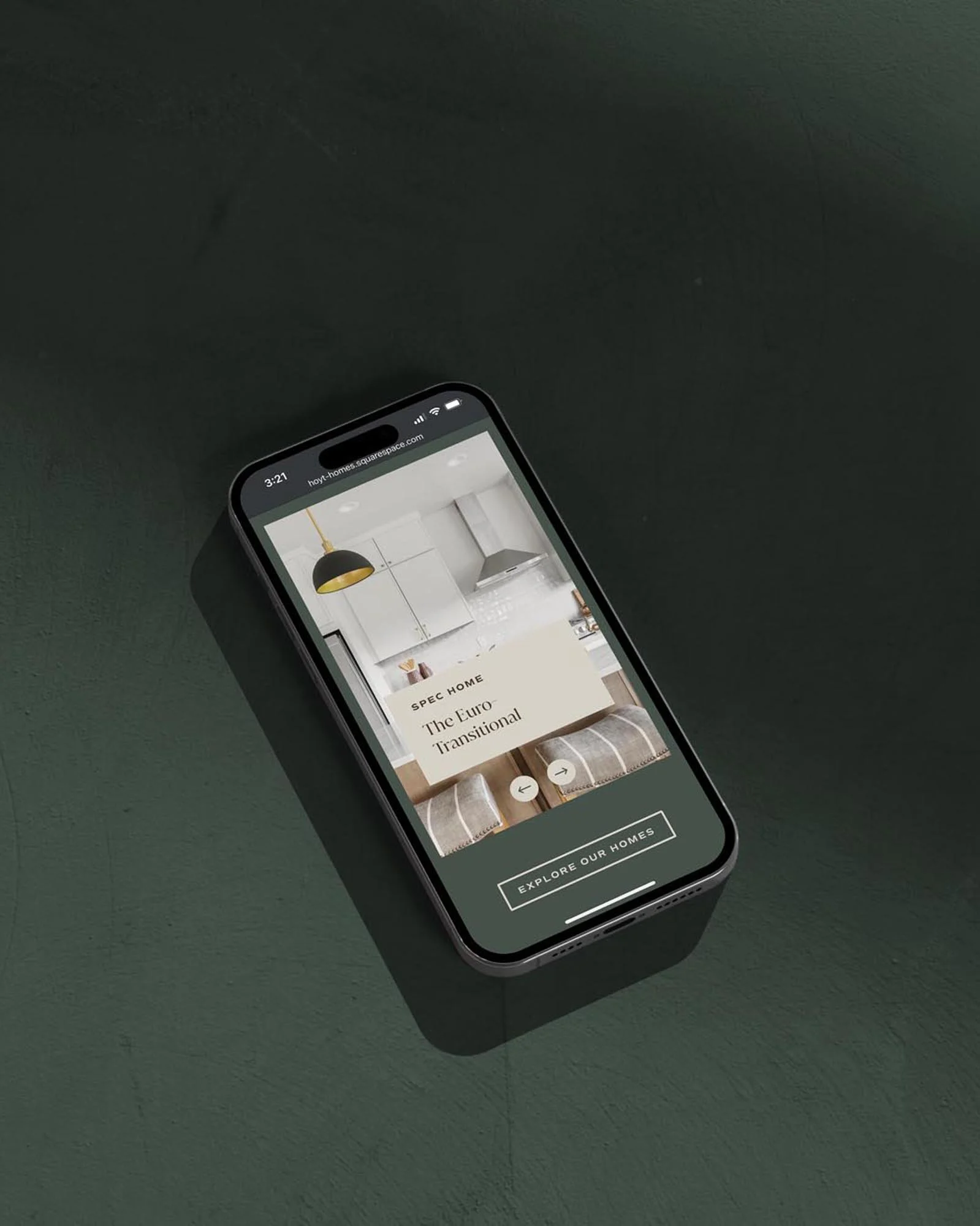
With the branding completed, we moved on to website design. Kathryn and Brandon chose our Launch-Ready Website process, our streamlined service that allows clients to launch faster, with all the benefits of a website designed by a boutique creative studio. Clients select one of our proprietary designs, then we fully customize it with their strategy, branding, photography, and messaging.
Custom website strategy
Website strategy is completely custom in our Launch-Ready Website process—it’s just not something that can be templated since every business has a different story to tell. To kick off the website process, we held a strategy session with the Hoyt team to understand their priorities for the site. We honed in on goals for how they wanted the site to feel: curated, comfortable, impressive, high-end, established—as well their key messaging priorities: quality craftsmanship, excellent communication, and high design.
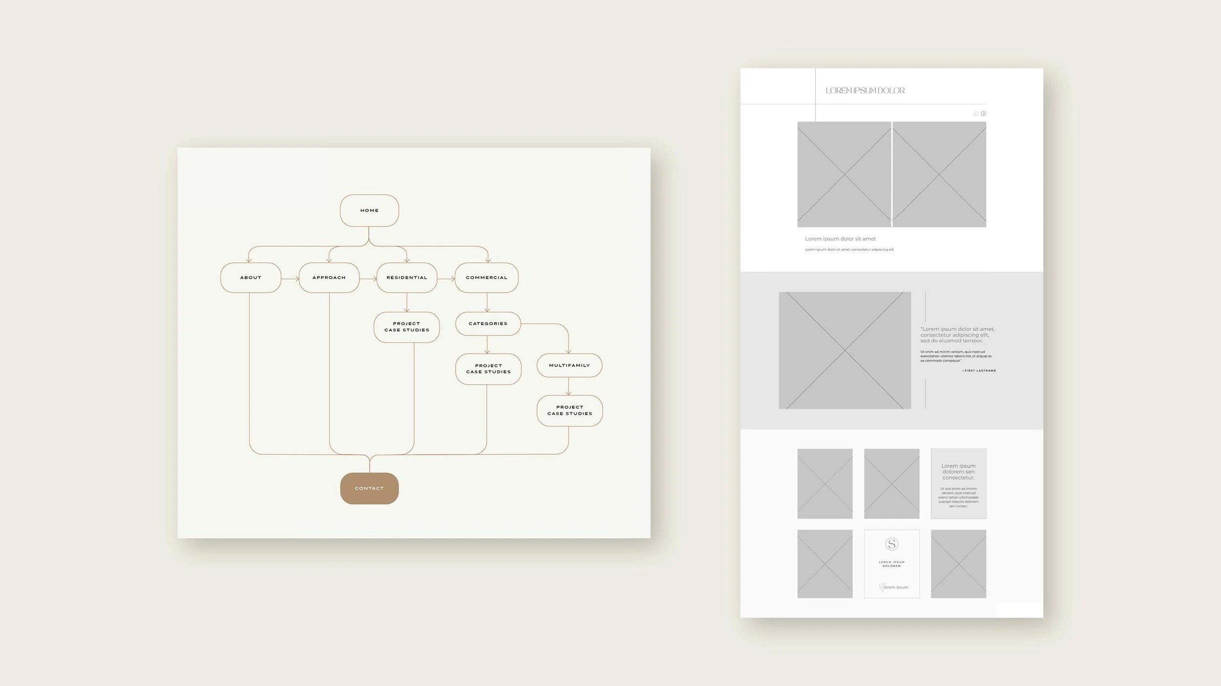
We then put together wireframes based on these goals. Wireframes are basically website blueprints that map out the layouts, flow and section topics—but without any branding or imagery. Here are some examples of features we included in the wireframes to help meet the Hoyt team’s website objectives:
Layouts that prioritized large-scale imagery to show off quality craftsmanship and high design
On the approach page, an interactive carousel to share the custom build journey in an interactive way versus a ton of text to scroll through
An easy-to-browse portfolio that features immersive photography
Testimonials woven throughout and featured on their own page to highlight Hoyt’s excellent communication from another perspective
The company story featured on the About page to share the legacy of Hoyt Homes
We commented out section-by-section prompts in the wireframes to ensure the site hit on all the right notes. This made it easy for the Hoyt team to write their website copy by simply replying to each prompt. The result is an underlying architecture for the site that all comes together to introduce Hoyt Homes, allow visitors to intuitively explore their work and process, and make it easy to book an initial consultation.
An elevated construction company website design
If website strategy is the blueprint, then website design is the paint colors and furniture. In our Launch-Ready Website process, clients select one of our proprietary site designs, which we then completely customize to fit their branding. The Hoyt team selected our Signature Suite template, so we got started updating it with their colors, fonts, and logos. Signature Suite features ornamental linework throughout the site that didn’t fit the Hoyt Homes branding, so we swapped it for some bolder, cleaner linework detailing—pulled straight from their logo design to evoke the feeling of beams. We also upped the line weights a bit and adjusted a couple image border and button styles to better fit the Hoyt vibe. It’s all in the details! The final website looks completely different from the original template and completely fitting for Hoyt Homes.
A streamlined construction company website build
The last step was to execute the site build. With everything already in place, it all came together quickly in just two days! We added in the copy from the wireframes and images from Hoyt’s portfolio. We were so pleased to see how beautiful the photography looked against the brand color palette.
We’re loving how our new website process gives the best of both worlds—a beautifully designed, strategic, and on-brand site, but one that’s able to be launched quickly without the long timelines and inevitable delays of a fully custom build process.
The final results: mountain modern construction company branding
Now, the Hoyt Homes logo and website feel like they fit into the same design world as the beautiful custom homes they build. The branding is full of meaning and feels like an evolution of the original design, and the website tells their story and makes it easy for clients to get their project started. We’re honored to have collaborated with such a leading design and build company and invite you to see the full brand and site in action.
Ready to elevate your brand?
Book a free brand review with our Creative Director, Kathryn Joachim. During this call, you'll have the opportunity to discuss your specific branding needs and goals, as well as learn more about our signature custom branding process. Whether you're looking to refresh your current brand or start from scratch, Kathryn will help strategize on your next steps to crafting a brand and website that truly reflect the essence of your business.


