20 Tips on Construction Company Branding and Website Design
This is a PSA to construction companies: we apologize for calling you out, but there’s just not a gentle way to say that so many construction companies who do incredibly high-caliber work have graphic design that doesn’t do them justice! The good news for you is that this is a huge opportunity to stand out from competitors. After all, design and build go hand in hand! It’s only natural that you have a beautifully designed logo and website. This doesn’t mean anything overly decorative, but a well-crafted logo paired with an easy-to-navigate online space just makes sense. Read on for our best tips for construction company branding and website design, with case studies from real clients to illustrate our recommendations.
First up: let’s discuss your logo and branding.
10 tips on construction company logo & brand design
01. Look to your work for logo inspiration
The design keywords that describe the spaces you build should also describe your logo! There’s endless inspiration to be found in your portfolio—if you build a wide range of projects, look at the type of work you’d like to be getting more of for trends. The design features, aesthetics, and proportions found in your work should be reflected in your logo.
Take stock: does your current logo feel like it’s part of the same design family as your top projects?
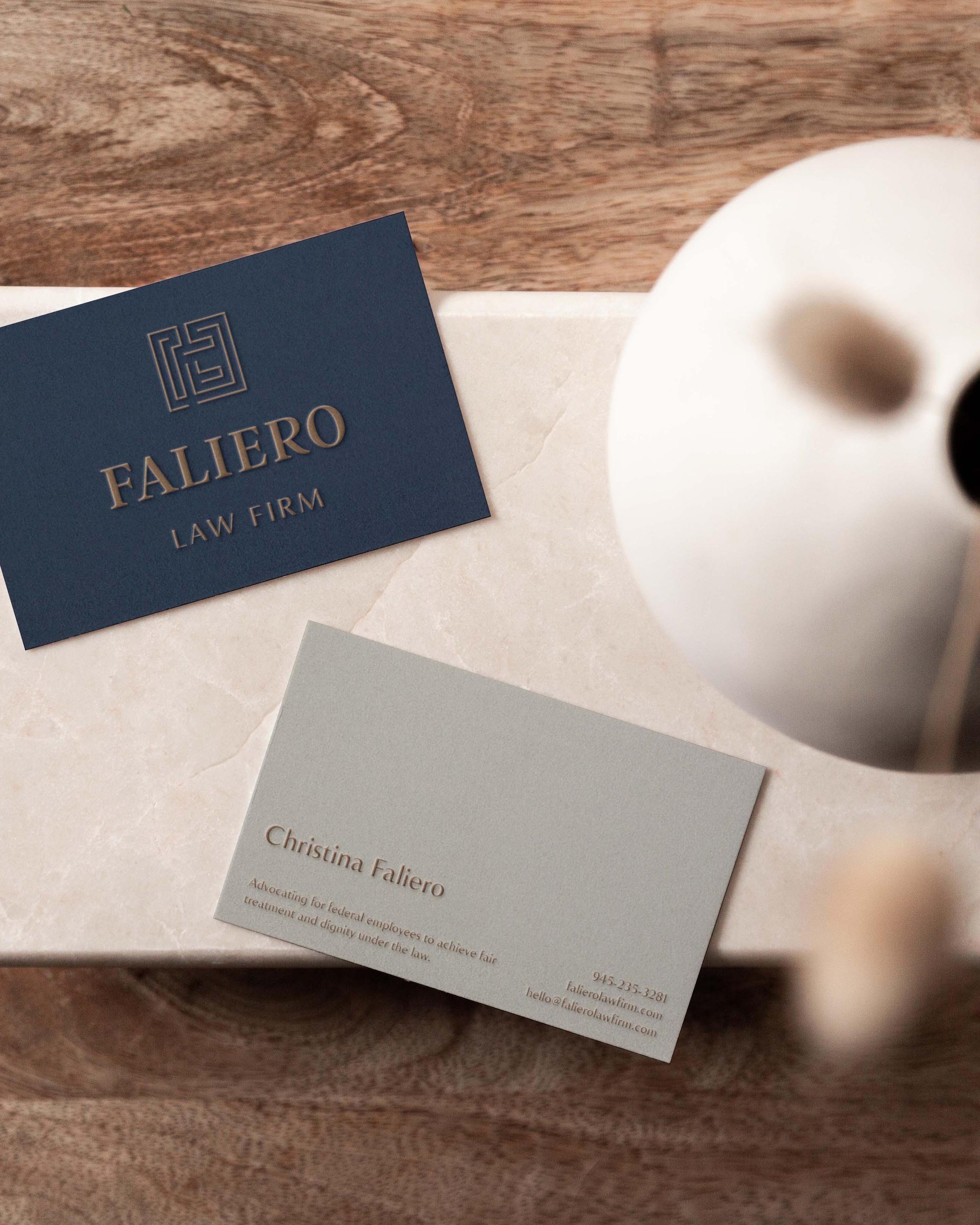
Case Study
Build Construction Management in Naples, FL works on a wide range of projects, from residential to commercial to multi-family developments, but there’s a definite throughline of clean, modern lines found throughout their portfolio. To reflect this, we crafted a B icon with clean lines that both residential and commercial clients can see themselves in.
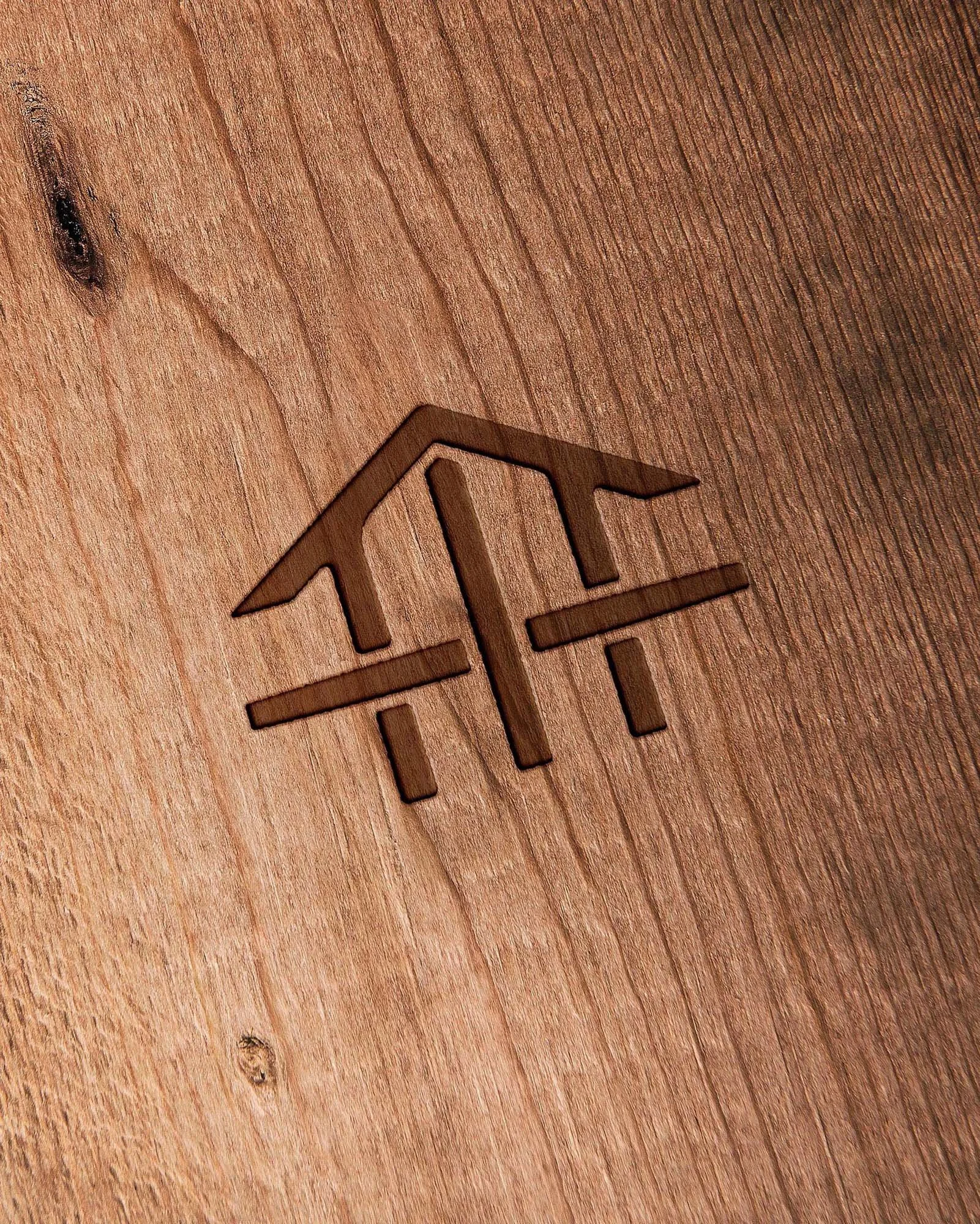
Case Study
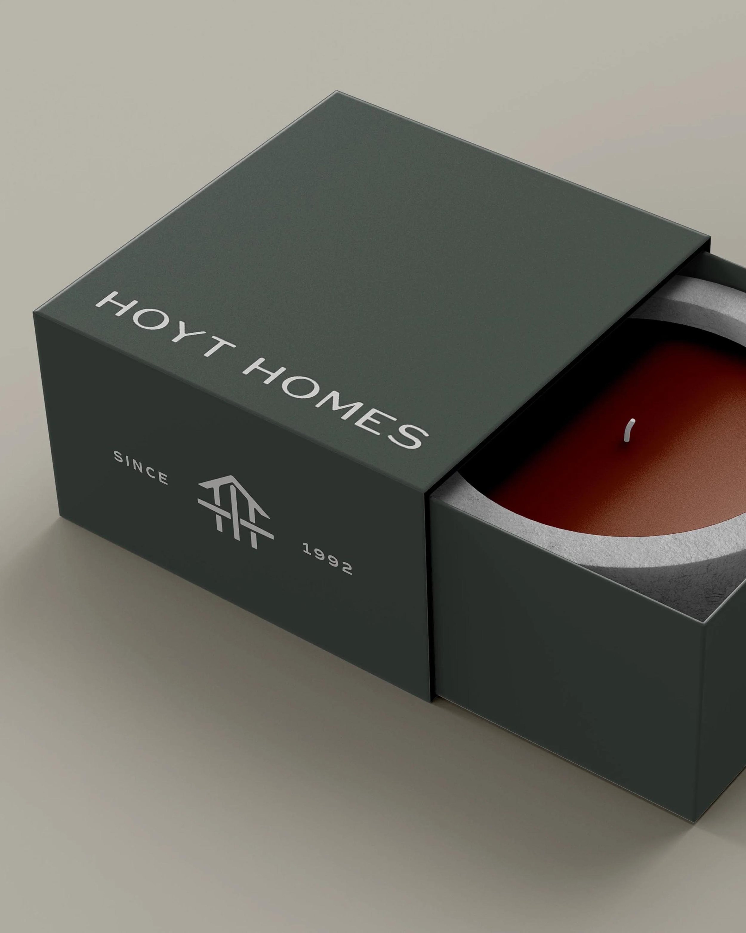
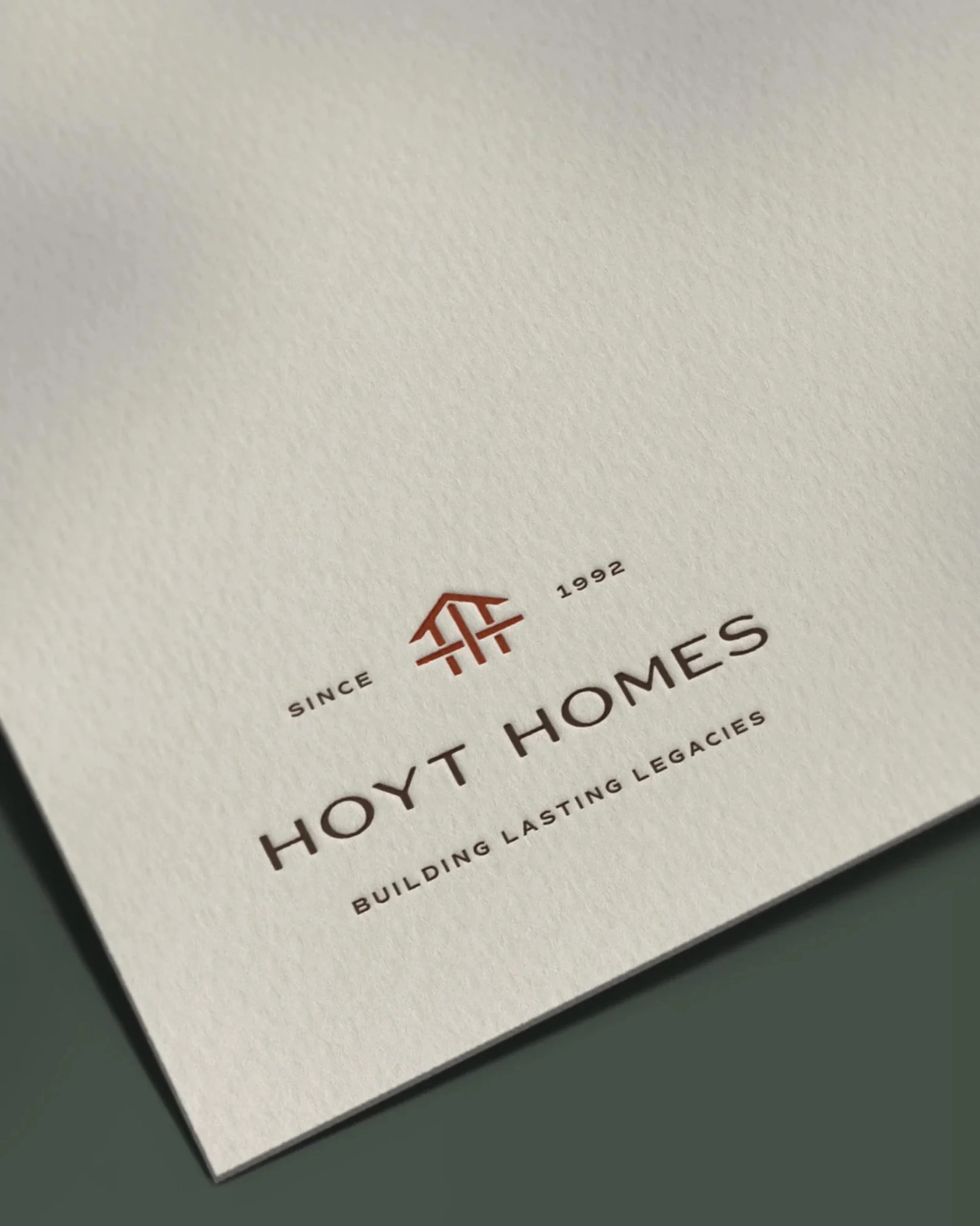
Hoyt Homes in Missoula, MT specializes in custom homes with a signature Mountain Modern style that blends modern lines with natural materials, like wooden beams and stone. Their final logo design incorporates these elements too, using linework reminiscent of beams to depict a home. While the logo has a hint of a rustic feel, the overall execution is fresh and clean.
02. Know who you need to appeal to
Oftentimes, construction company branding can look very strong and powerful, but sometimes it’s a bit too cold. For residential construction especially, it’s important to take into account that you’re working with individual homeowners, so your brand design should have some warmth and approachability to appeal to these clients. You can absolutely have a design that’s pleasing and approachable without being inappropriate for the industry!
Take stock: how well does your branding fit into your ideal client’s world?
Case Study
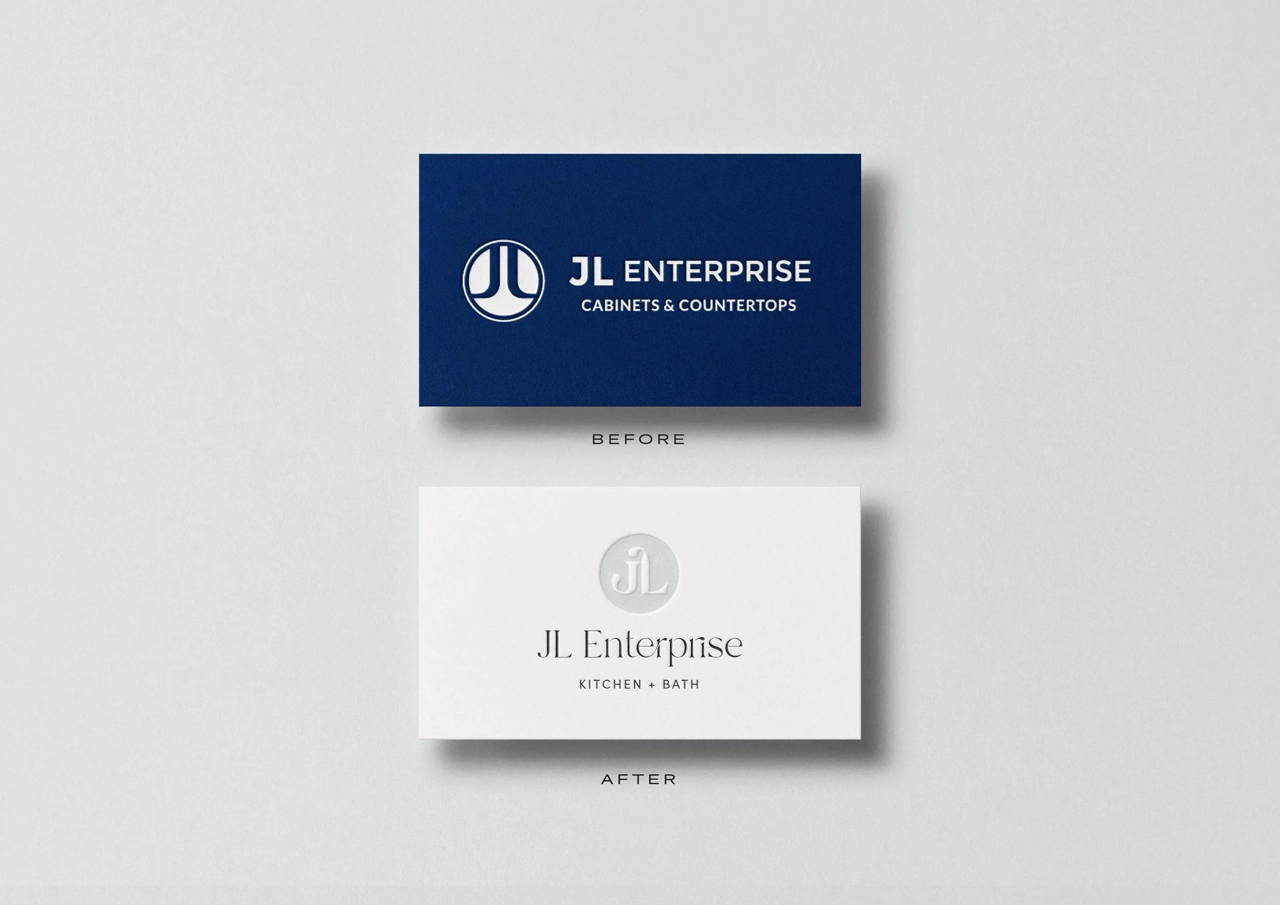
JL Enterprise is a cabinet company located in Greenville, SC, with a showroom that caters directly to homeowners through both design and installation services. Their previous logo was very old school and angular—typical for the construction industry but not the most fitting for their clients or their light and airy design sensibility. Through the rebranding process, we warmed up the look, creating something clean and light that matches the showroom experience and appeals directly to homeowners.
03 Embrace shades of gray in a rebrand
There are so many shades of gray between a subtle brand refresh and a complete overhaul. Usually construction companies come to us with an existing brand and rightfully want to prioritize brand continuity and recognition. Sometimes business owners focus on a desire to keep the logo exactly the same, but we encourage you to first take a step back. Ask yourself (and others!) what the most memorable aspect of your current brand is. Maybe it’s a bold color or a detail about your logo. These are the features to lean into and elevate. You can keep some elements but evolve the overall brand to be more in line with your long term vision.
Take stock: what are the most memorable elements of your current branding?
Case study
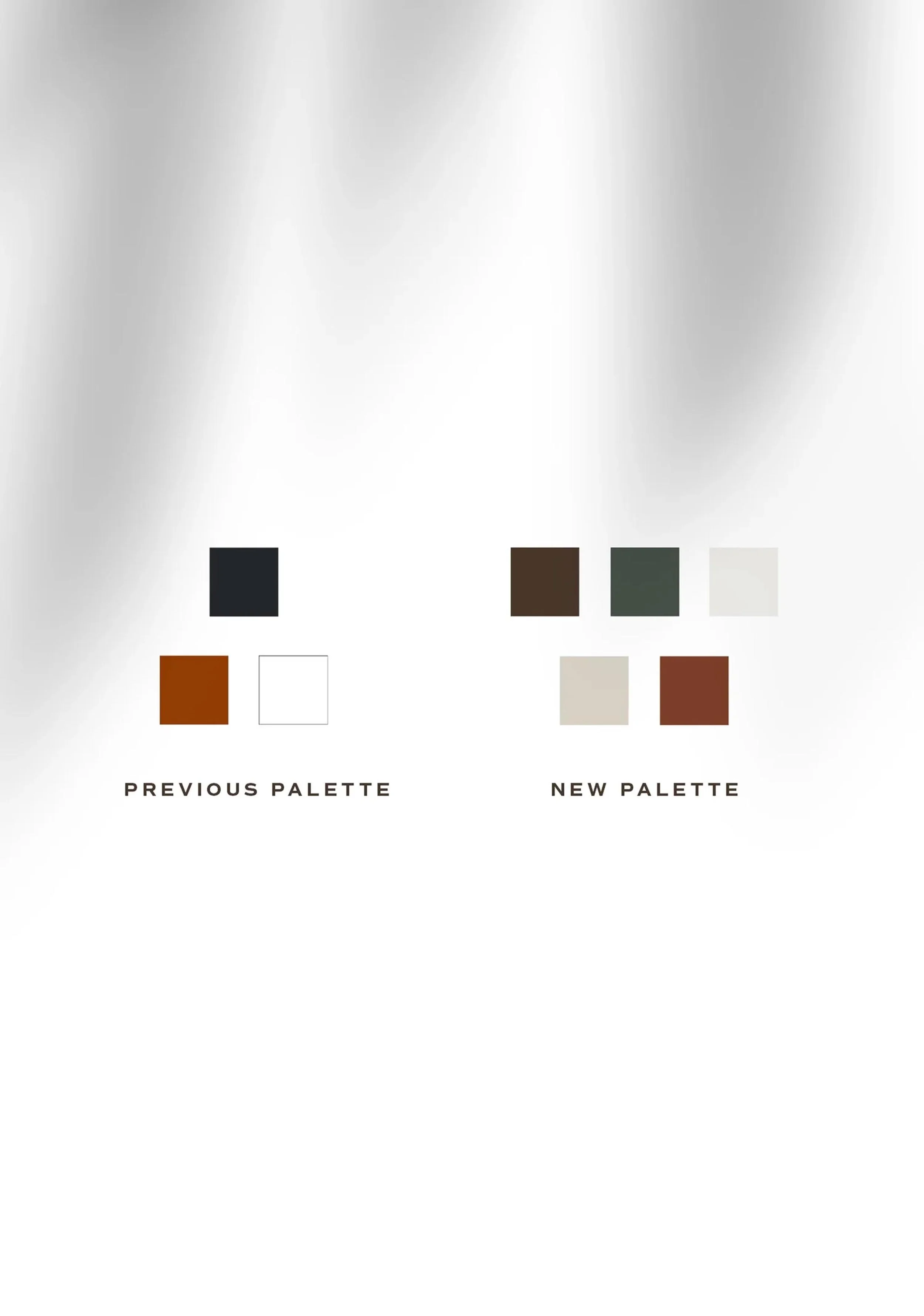
A lot of times, the most memorable element is color. In the case of Build, their signature lime green was super integral to their brand and a non-negotiable to maintain in the rebrand. To elevate and warm it up, we built out a full palette inspired by their coastal location in Naples, FL—warm sandy neutrals, a calming blue, and a strong navy to bounce off the lime green.
Case studies
You can play homage to your previous logo design without keeping it exactly the same. In the case of Build, we kept their signature bracket wordmark, but improved the spacing and added in a B icon to elevate the overall feel. For Hoyt Homes, both their previous and rebranded logo have a home icon in a copper/rust tone, although they’re executed completely differently. And for JL Enterprise, both logos show a J & L in a circle but have completely different overall feels. There are so many different ways to evolve.
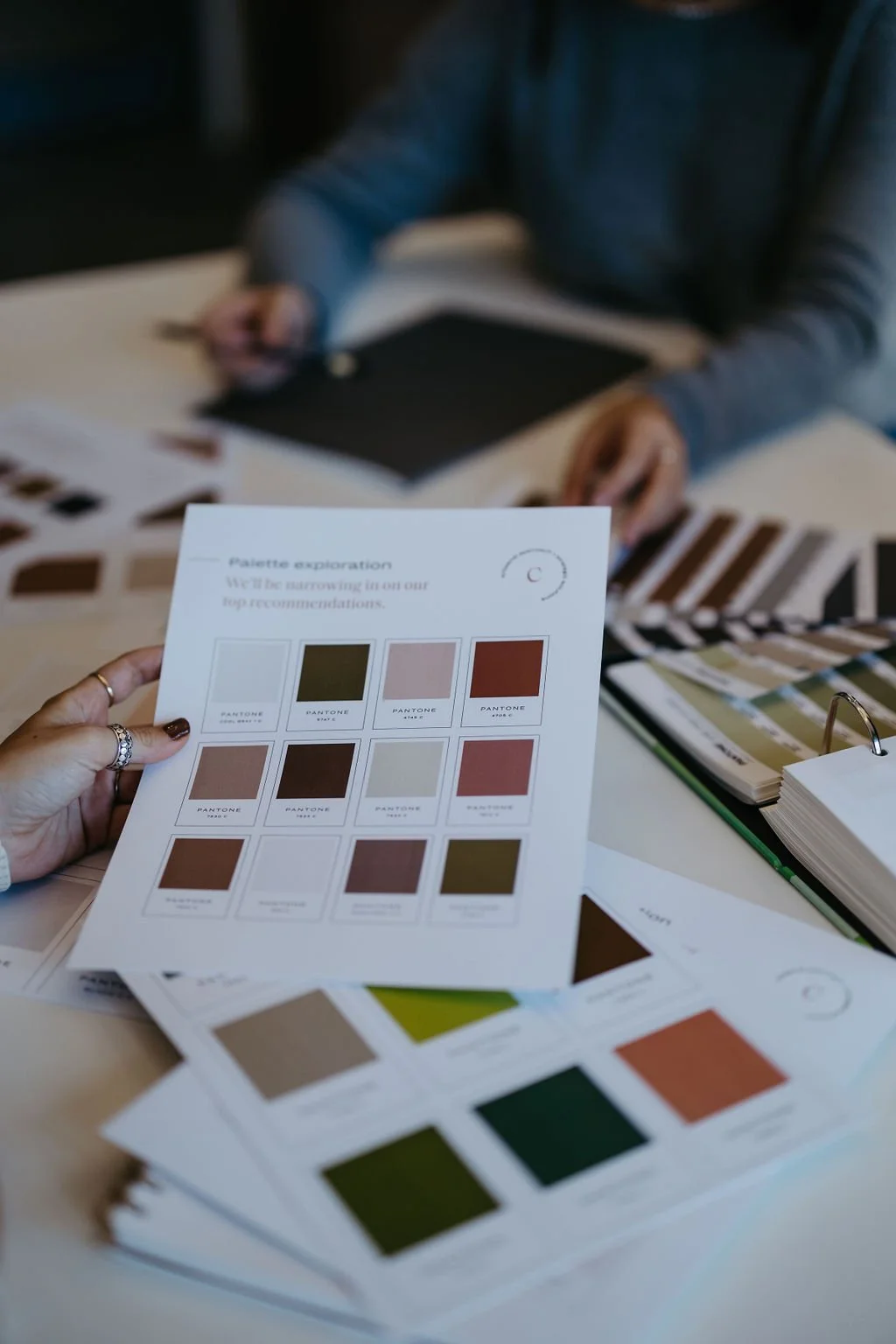
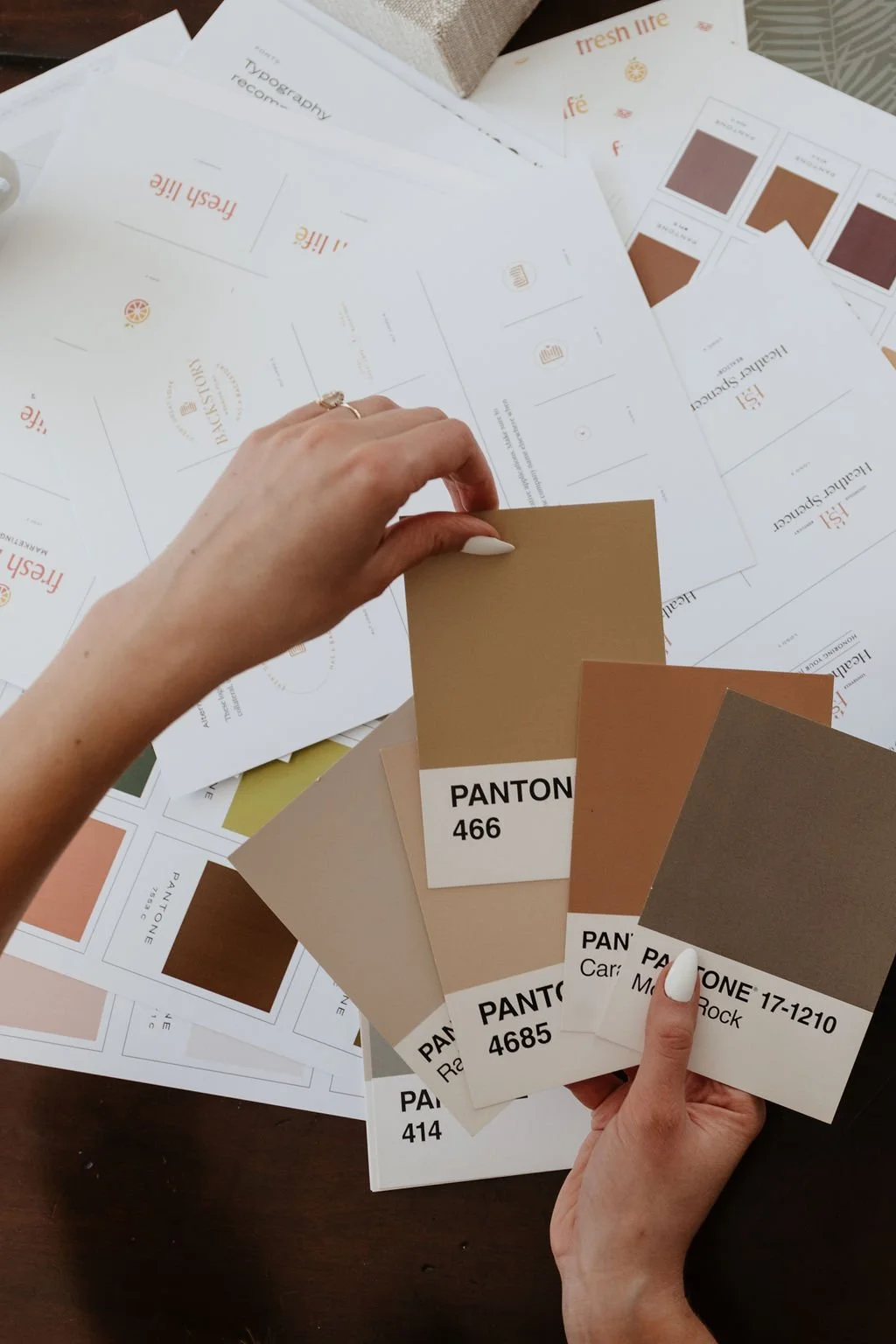
04 Compile photos of your favorite projects into a moodboard to pull your color palette from
This will ensure that the brand reflects what you’re all about and make everything feel cohesive. When you get to your website design, your color palette will naturally frame up your work beautifully. We see a lot of construction companies using super saturated colors that clash with their project photography—instead, a palette pulled straight from your most common building materials will feel harmonious and elevated.
Take stock: does your current color palette harmonize with your project photography?
Case study
For the Hoyt Homes color palette, we shifted the brand palette to be warmer and more reflective of the Montana landscape and their construction work. The final palette is filled with symbolic tones—Aged Lantern Brown, Ponderosa Leaves, Fireplace Stone, Zellige Tile, and Ponderosa Bark—that harmonize beautifully with their project photography.
05 Incorporate symbolism into your logo for an ownable mark
To help you stand out from competitors, your logo should be uniquely yours. We don’t want you to have a generic logo that could be used by any other construction company! The key here is to look inward. Brainstorm elements about your signature style and your brand story, look at your reviews to find common themes, and ask trusted collaborators to help you distill what makes your business unique. These are the exact elements to draw upon when crafting a logo that’s full of symbolism.
Take stock: what sort of symbolism could represent the essence of your business?
Case study
There are three main symbolic elements in the Hoyt Homes logo: a legacy home, HH beams, and weaving. Hoyt Homes is first and foremost a builder of extraordinary custom homes, so naturally a home forms the foundation of the icon. The home is rooted, just as clients are, in their legacy homes that Hoyt crafts. Within the icon, the hidden HH beams feel like architectural lines that many clients can see their style in—from their signature mountain modern builds to contemporary multi-family developments to traditional, rustic Montana homes. And finally, the icon is woven together just as Hoyt Homes is a family business, built off of interwoven generations to form a tight knight, highly capable team that forms trusting relationships with trade partners.
Case Study
Spyglass Construction Company specializes in building custom homes in Naples, FL with a high level of design. In Spyglass’ logo, the engraved style, hand drawn ‘S’ lends a classical feeling. An antique brass colored spyglass symbolizes the company’s namesake and envisioning the results of a custom home build. The reflections on the spyglass evoke the look of lines on columns, representing durability. Finally, a delicate compass in the stand of the spyglass shows off the attention to detail the team brings to navigating their clients through each unique custom build project. By using the nautical symbols of the compass and spyglass, the logo has a nautical feel that’s fitting for their coastal location.
06 Add depth to your brand toolkit with icons
Icons are a great way to add depth and memorability to your brand toolkit. They’re super useful for social media graphics and add nice variety to website design. Oftentimes construction companies have a few areas of work, so these can help communicate exactly what you offer at a glance.
Take stock: how would you distill your work into a couple key buckets?
Case study
Build had three main areas of work to highlight: residential, commercial, and multi-family. We illustrated icons to represent each one based on top projects from each category so that they are completely unique to Build.
07 Incorporate an accent font
We’re all about mixing design vibes here. Just like in interior design, graphic design is so much more interesting and nuanced when you combine multiple design notes. Doing so brings sophistication and balance to your branding and allows you to share more of your personality—nobody or business is one note! For construction companies, we recommend using mostly clean fonts with a professional feel, but don’t be afraid to incorporate an accent font into the mix!
Take stock: what are the key design notes your brand should combine?
Case study
The foundation of the Hoyt Homes type hierarchy is a clean sans serif for a modern, professional feel. We added a display font with a slight Western vibe to bring in that Mountain Modern note, as well as a crisp, stylish serif to highlight the elevated design Hoyt is known for.
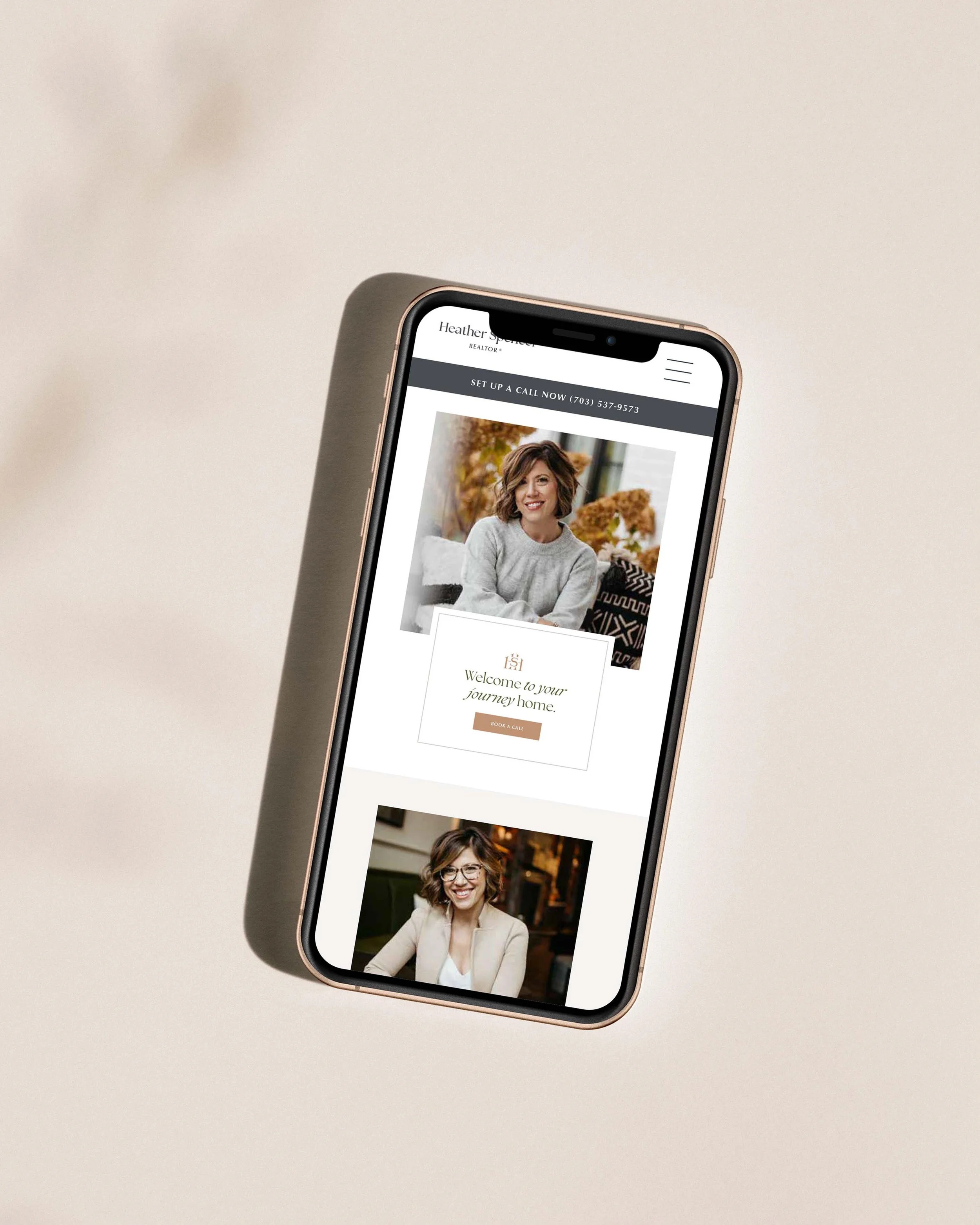
08 Don’t be afraid to tap into emotion with your tagline
For residential construction especially, there’s so much emotion to play into. Homes represent your clients’ dreams, families, and legacies. Taglines are the perfect place to incorporate this sentiment! They’re great to incorporate into different logo configurations as well as website copywriting.
Take stock: beyond constructing homes and buildings, what do you bring to life for your clients?

Case study
Two of our favorite client taglines we’ve helped wordsmith were for Heather Spencer Realtor and Hoyt Homes. Heather Spencer’s, “Honoring your journey home,” taps into sentiment that home is as much a feeling as a place. Hoyt Homes’, “Building lasting legacies since 1992,” highlights the legacy aspect of both the business and the custom home building process.
09 Design with core applications in mind
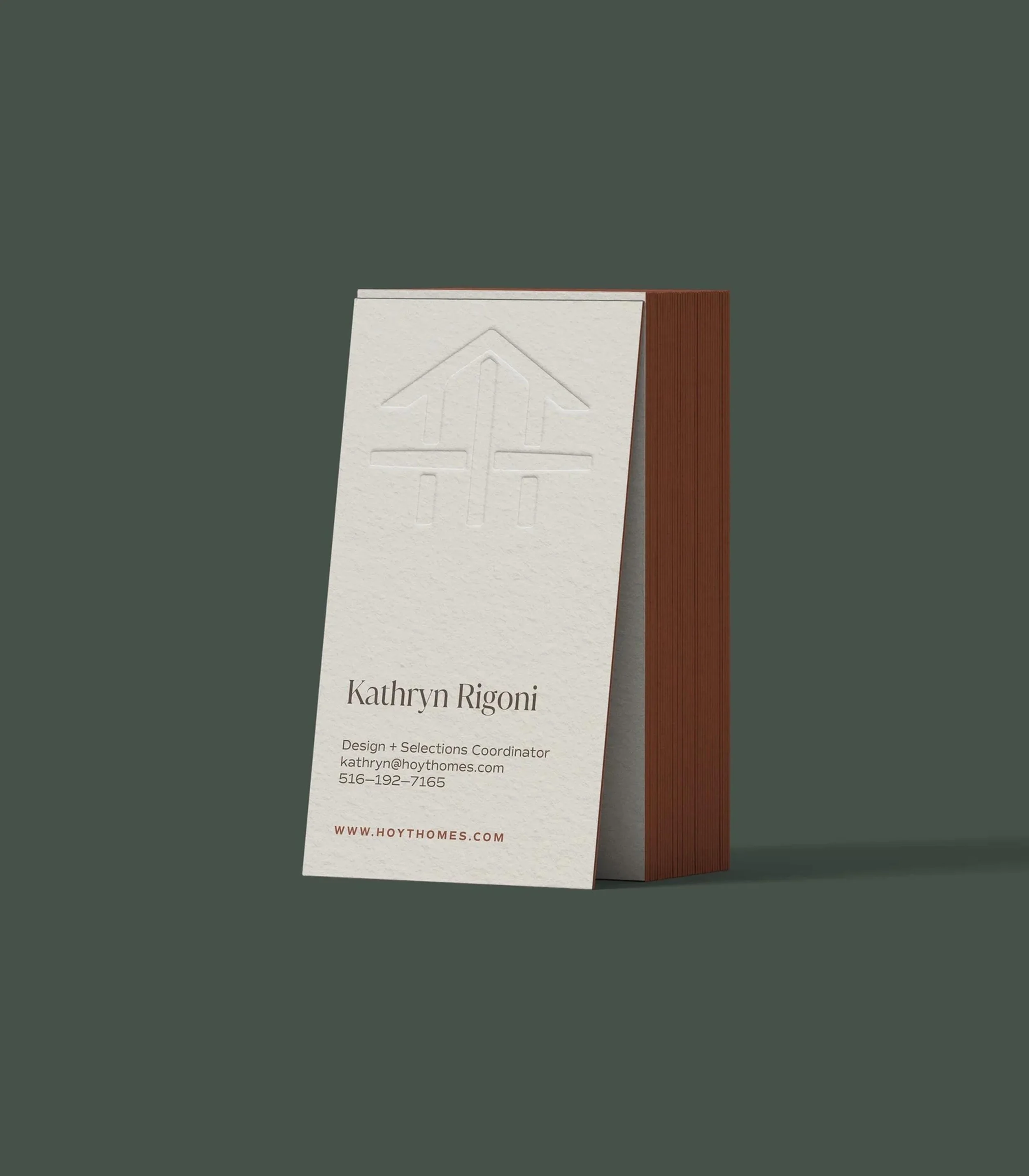
We’ve covered a lot of important emotional, aesthetic, and symbolic elements of logo design so far, but it’s always worth mentioning that your logo must be usable. This means that it can be scaled down to tiny applications like in the corner of a business card and still be legible, as well as being able to scale up to things like signage and still pack a punch. For construction companies, we recommend a strong and iconic mark that will stand the test of time and work for the huge range of applications needed in the industry.
Take stock: how scalable is your logo?
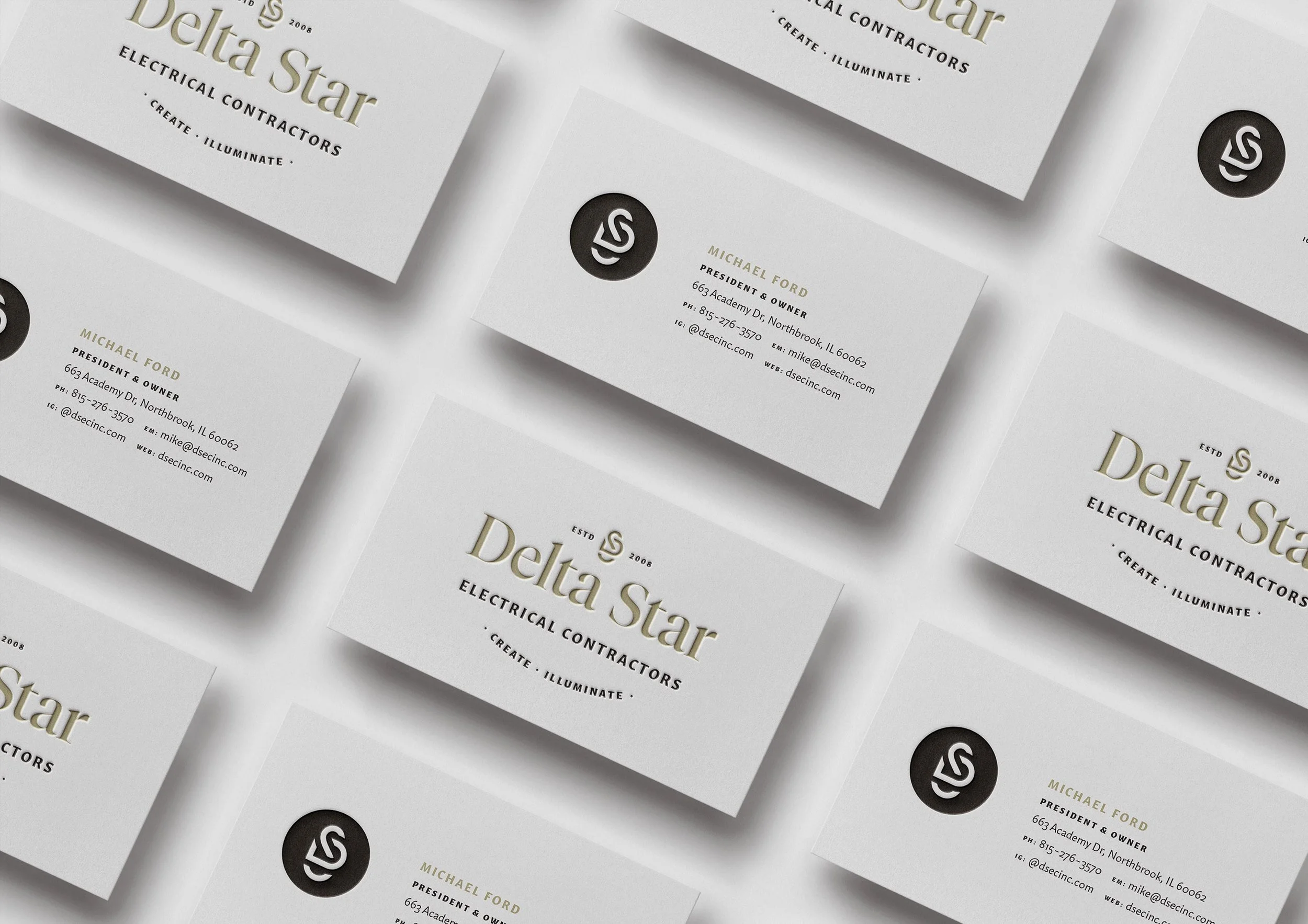
Case study
Delta Star works on high-end home renovations in the Greater Chicago area. Their priorities for a logo design were a strong, striking mark that would stand the test of time and work well on everything from apparel to vans to invoices. The final icon accomplishes these goals—it’s iconic, timeless, and super scalable.
10 Use brand patterns to add texture
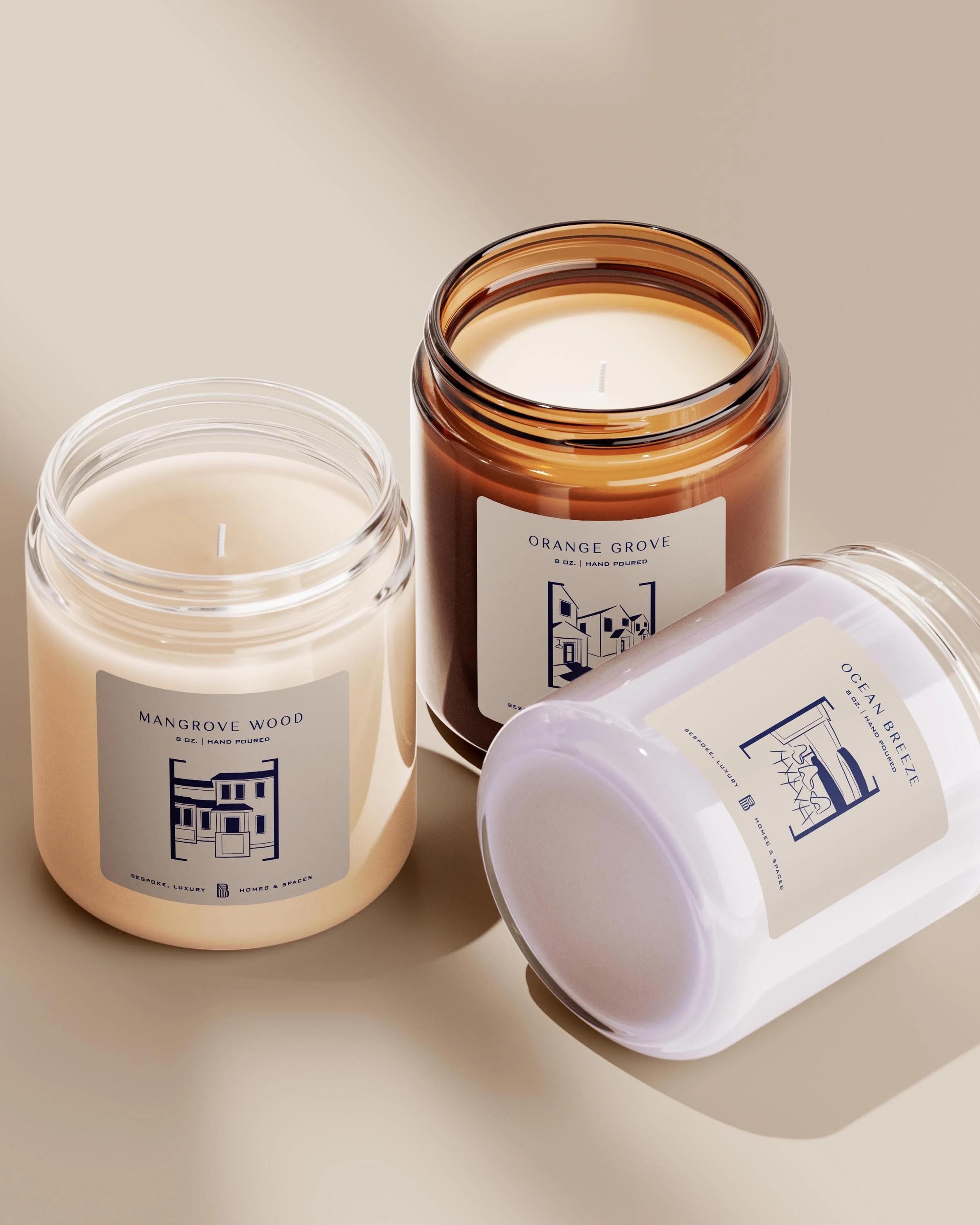
There are a surprising amount of applications for brand textures for a construction company! You can use them on social media templates, swag items, and in your physical office space. They’re another element in your toolkit to help add dimension to your branding.
Take stock: how extensive is your brand toolkit?
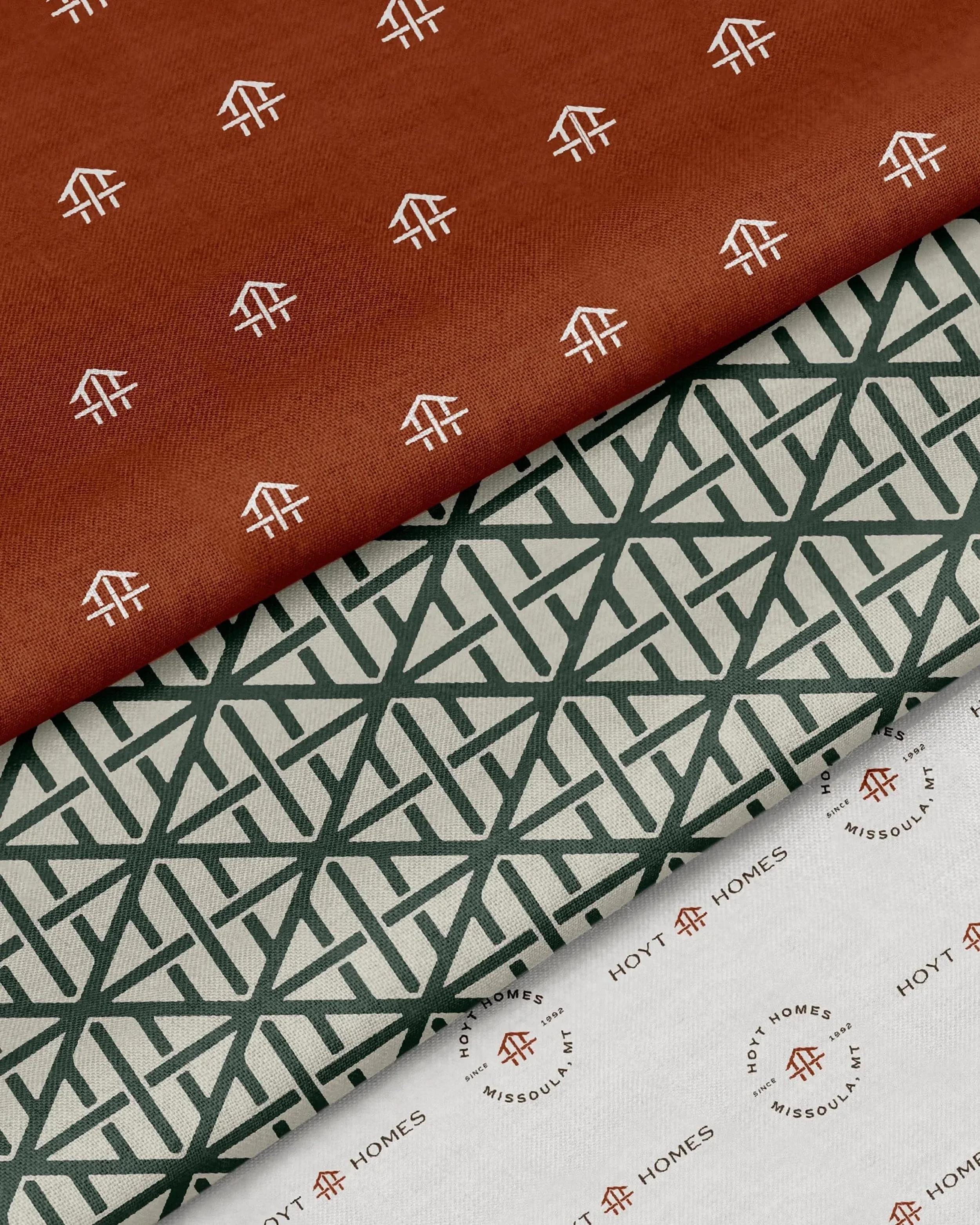
Case studies
On the left, Hoyt Homes brand patterns are used for textiles for their in person office space. On the right, Spyglass Construction Company is using their brand pattern on tissue paper to elevate the client gifting experience. A bottle of wine with branded gift wrapping makes the perfect move in gift for clients!
And now, let’s move onto website design tips, curated specifically for construction companies.
10 tips on construction company website design
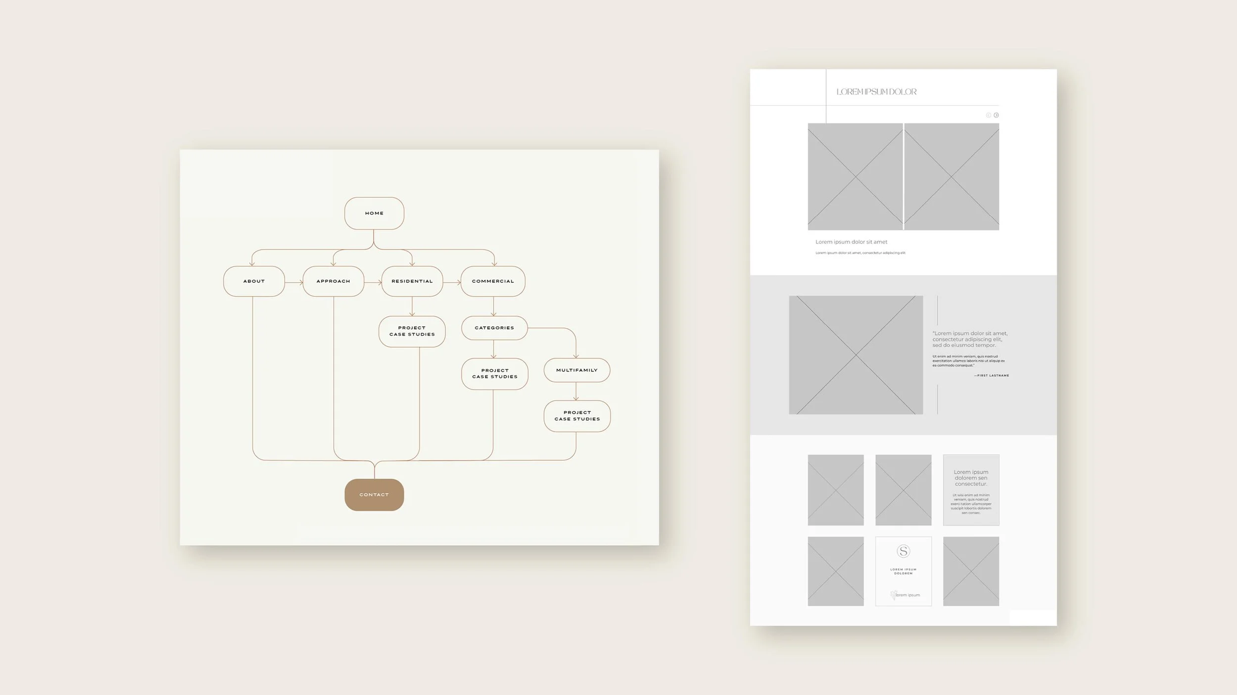
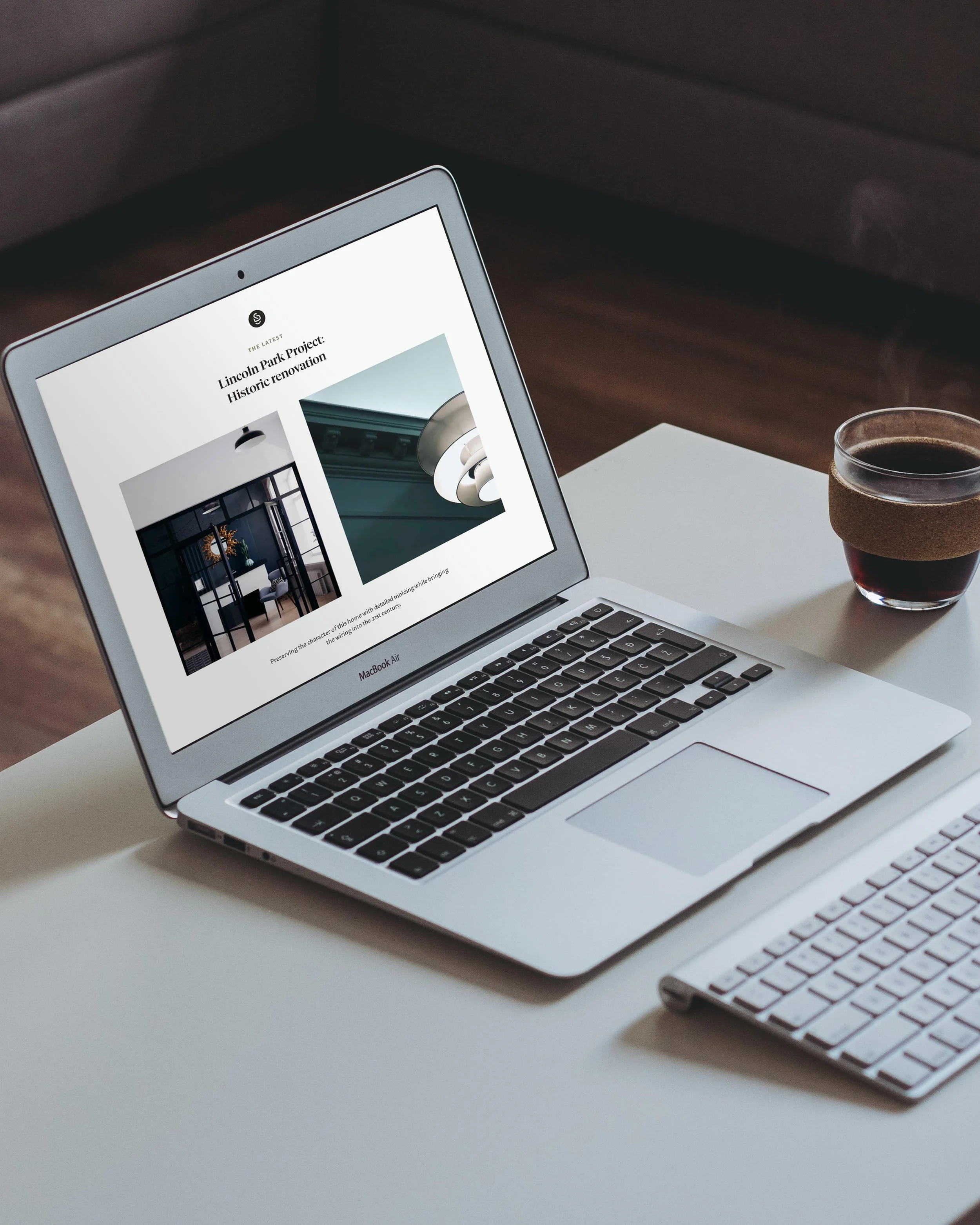
01 Make a blueprint before building
Think of your website design process like you would any build! Start with a blueprint first and then move onto the actual build of your online space. Just like in a construction project, you want to first map out the rooms you need and how they connect two one another, then move onto the floor plans of each one, and finally paint the walls at the end. In a website build you’ll do the same exact process with your web pages.
Take stock: does the overall architecture of your website have an intuitive flow?
02 Make the most of your About Page
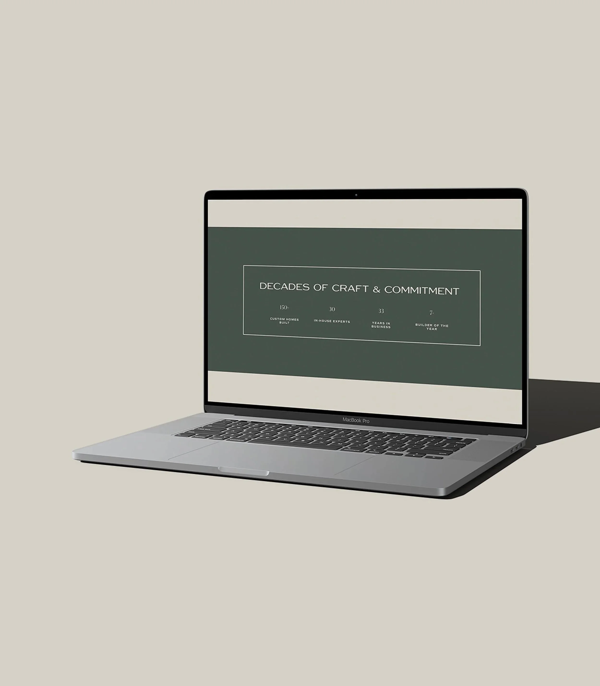
On the About Page, go beyond just sharing team bios to tell your company story. This is a great place to get into the history of your company, share your mission and values, and include interesting infographics such as awards, certifications, impressive build stats. This makes for much more compelling storytelling about who you are.
Take stock: does your About page convey the essence of your company?
03 Address your clients’ pain points
Think of common pain points in the construction industry and speak to how you address them. For example, construction projects can oftentimes feel super disorganized with neverending timeless. You can address this by highlighting your process with an interactive layout such as a carousel slideshow.
Take stock: does your website speak directly to your clients’ concerns?

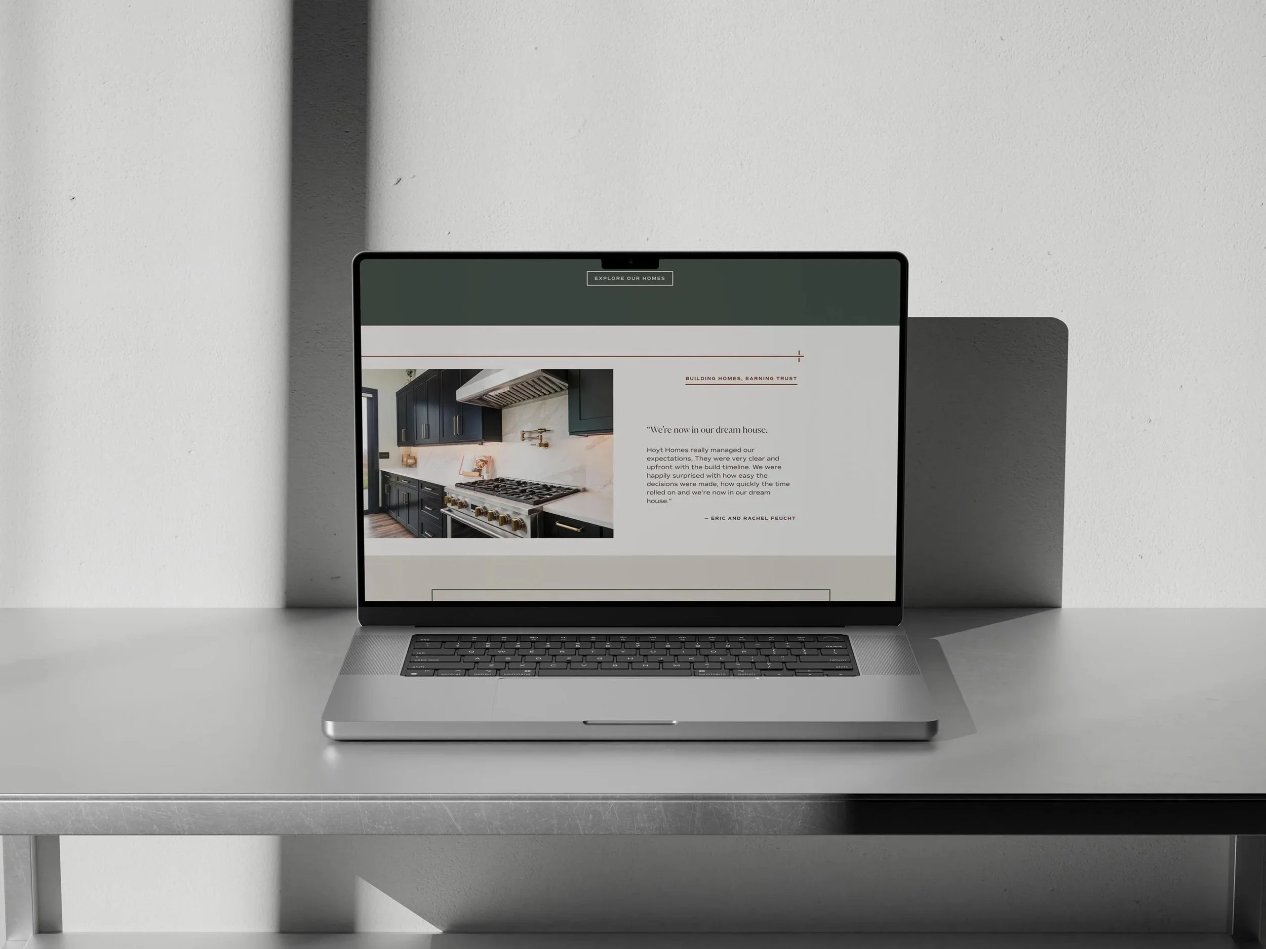
04 Weave testimonials throughout the site
Deciding on a contractor is a big decision, and testimonials can be huge in helping round out a potential client’s impression of you. Select your top testimonials and weave them throughout your website to build trust. Learning about your business from another perspective keeps things interesting and helps make visitors feel confident that they’ll be happy working with you.
Take stock: how well does your website feature testimonials?
05 Focus on results, storytelling, and emotion in your copywriting
Sometimes it can be hard to edit down your website copy since you have so much to say about your business, but we all know that no one actually reads super long blocks of text! To help edit down, keep the focus on telling the story of the results you bring to life. Use short line lengths, especially for headings, capture one theme per section, and speak directly to site visitors (vs. from the business’ perspective).
Take stock: how powerful and easy-to-digest is your copywriting?
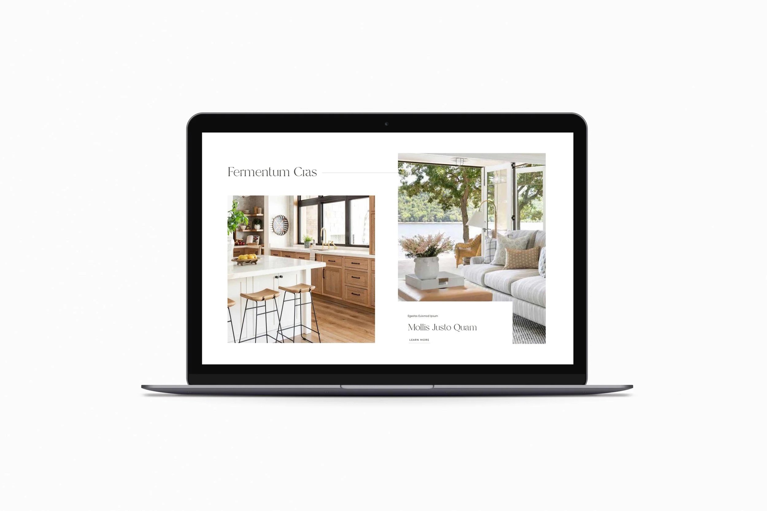
06 Curate a strong selection of images
Take the time to go through your projects and curate a selection of your strongest imagery to showcase your work. You’ll want to showcase the types of projects you’d like to be doing more of and prioritize high quality photos. It’s nice to mix in variety, so make sure you have a wide range of everything from detail shots to exteriors. You can even mix in photos of your team on the job to highlight your craftsmanship. Real estate photographers tend to lean towards landscape images, so it’s nice to request some portrait ones too, since those are great for adding variety into your website layouts and are especially good for mobile.
Take stock: does the photo selection on your website do your work justice?
07 End every page with a call to action
We want to keep users flowing through your site without landing on dead ends! Each page should end with a call to action, usually to visit the next page in your site, with the ultimate goal of leading visitors to your website’s primary call to action. Usually for construction companies, this is to contact you to begin the process.
Take stock: what’s the main CTA for your website and how well do you lead visitors there?

08 Layouts should prioritize large scale imagery
Whether you’re using a website template or going with a custom design, make sure your website layouts prioritize large scale imagery. This helps highlight your craftsmanship and allows potential clients to see your work up close. You can mix in some full width images to create an immersive experience like you’re stepping into the room. Avoid covering your images with design elements or having walls of text with no images breaking it up. We want your work to be easy to view!
Take stock: how well do your website layouts frame up your project photos?

09 Prioritize SEO
We’re strong believers in a website that works for you. The ideal scenario is a website that brings leads right to your door while you’re busy running the business! You’ll want to start with strategy here to figure out exactly which search terms you’re aiming to rank for, but some basics are to feature location information prominently throughout your copy, leverage your portfolio to make your services clear, and don’t forget to fill in all the settings, like page titles and meta descriptions.
Take stock: do you have an SEO strategy in place?
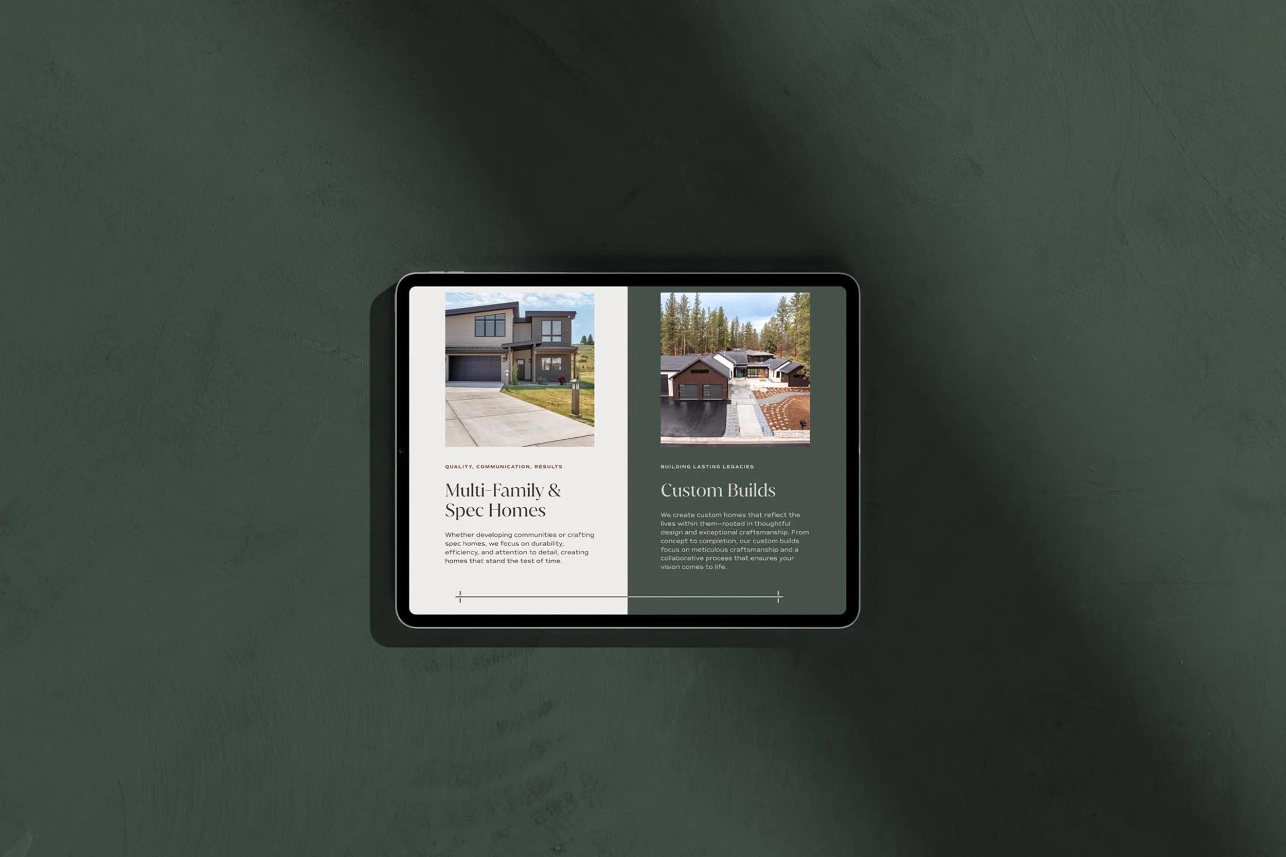
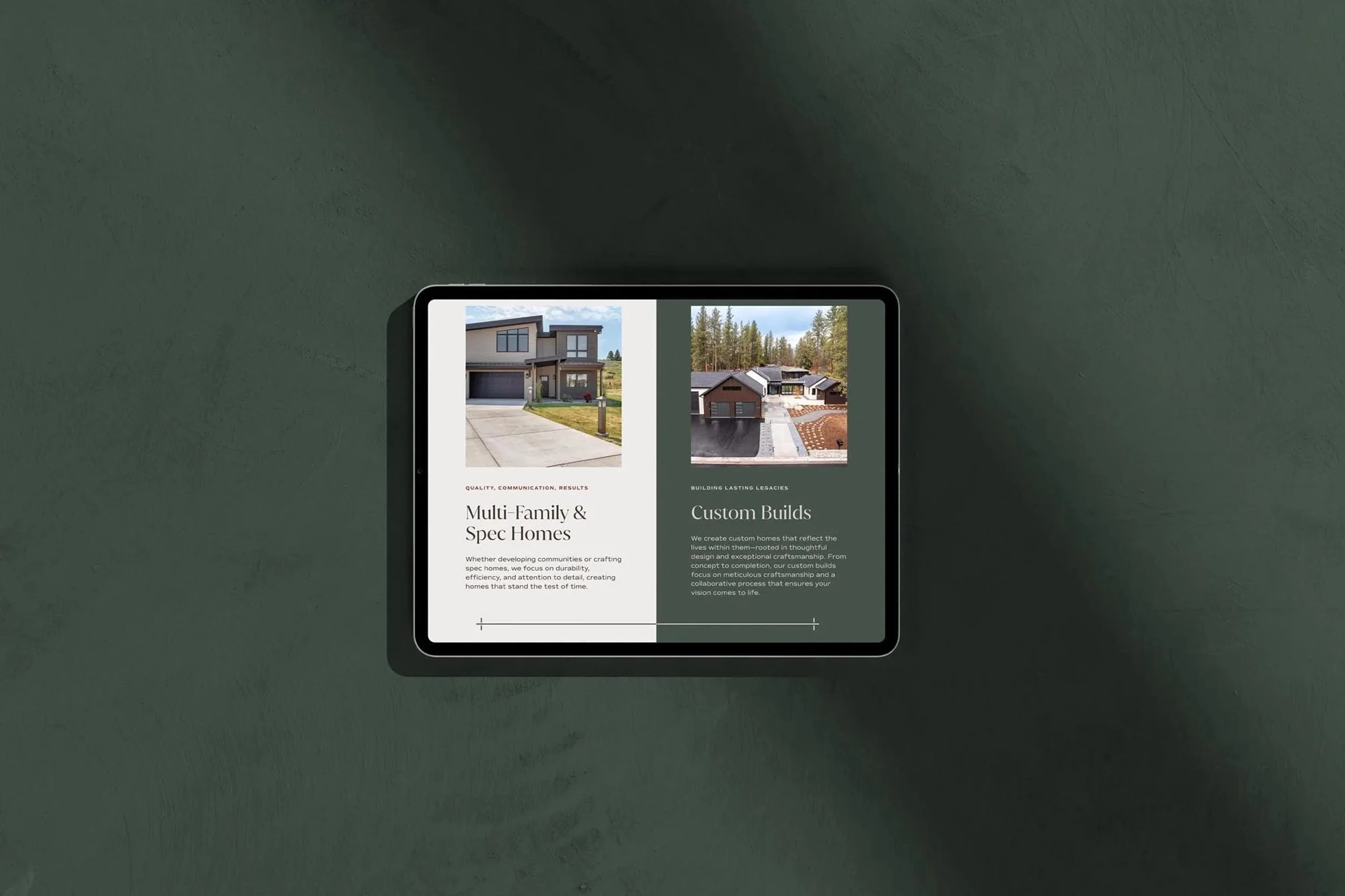
10 Use a “choose your own adventure” layout
If you work in multiple industries or areas, such as residential and commercial, use a “choose your own adventure” layout on the homepage to direct visitors to the parts of your site that will be most relevant to them. Take a few test runs around your site imagining yourself as different client types and see how well you can find the information you’re looking for.
Take stock: how well does your website cater to each one of your client types?
Phew! That was a LOT of tips! Take what works, and leave the rest. We’re always here to chat through any insights or ideas these tips have sparked.

Ready to elevate your brand?
Book a free brand review with our Creative Director, Kathryn Joachim. During this call, you'll have the opportunity to discuss your specific branding needs and goals, as well as learn more about our signature custom branding process. Whether you're looking to refresh your current brand or start from scratch, Kathryn will help strategize on your next steps to crafting a brand and website that truly reflect the essence of your business.