Women’s Cybersecurity Alliance Brand Design
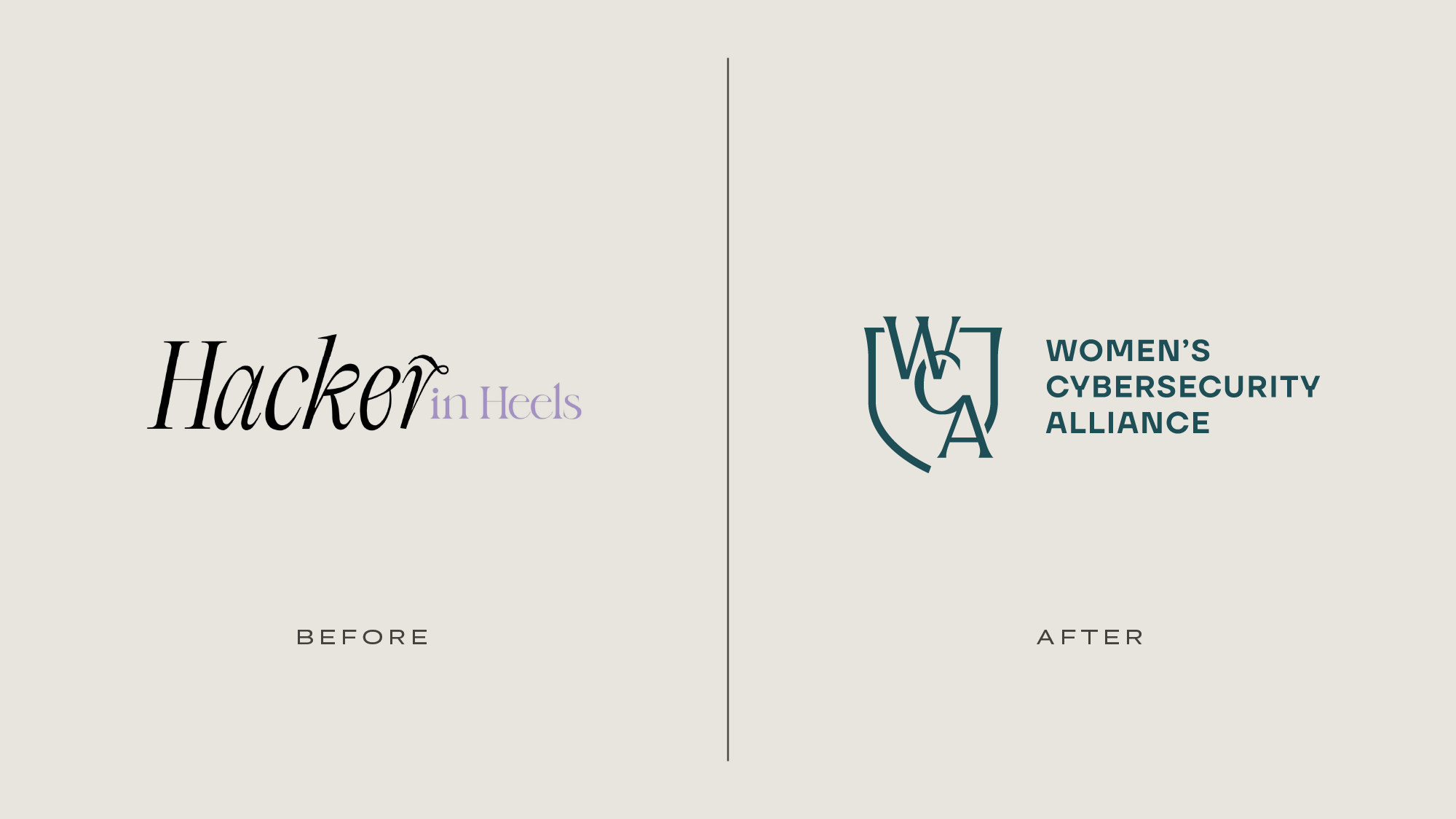
The Women’s Cybersecurity Alliance is a membership organization offering executive leadership development to women in cybersecurity through community, mentorship, study programs, and coaching. Founder Stacey Champagne approached us with an existing brand, Hacker in Heels, she was looking to evolve into the next era with a new name and complete rebrand. While Hacker in Heels was known for being an approachable, safe space for women to receive support at the beginning of their careers, the Women’s Cybersecurity Alliance is geared towards executive leadership development for committed, ambitious, progressive women who are powerhouses at what they do. Through our signature custom branding process, we crafted a logo system, color palette, typography, and supporting patterns to help elevate the WCA into this next chapter.
About the Women’s Cybersecurity Alliance brand
The WCA is a strong community of accomplished women in cybersecurity, working to collectively elevate in the industry. They’re known for their salons, which are private, in-person dinners designed for connection and collaboration amongst members. These gatherings are intimate, powerful events that women genuinely want to attend. Additionally, the WCA offers mentorship, study programs, and coaching to intentionally build authentic connections in service of supporting women in cybersecurity.
Step one: the WCA membership organization branding strategy
An elevated tech brand design
We began the branding process with strategy, asking Stacey probing questions to understand exactly what makes the WCA so powerful. Our strategy sessions are designed for us to gain clarity going into the design phase, but clients always say how they gain so much insight too—it makes them think about their business from a whole new perspective and they gain so much confidence in exactly who they are.
We asked Stacey thought-provoking questions and deeply listened to understand the DNA of WCA, so we could then translate this identity into a fitting visual brand. We synthesized our discussion into project objectives, brand positioning, and an ideal client avatar to ensure everything was in alignment before moving onto the brand design.
Project objectives
We honed in on a list of project goals, based on looking inward at what makes WCA so potent for members:
Evolve the Hacker in Heels brand into the next era with a more sophisticated, accomplished, and premium look.
Balance feeling powerful and energetic with grounded and intimate, giving a rare combination of safety and boldness.
Layer in notes of subtle femininity.
Feel polished and professional yet genuine and creative.
Bring in nods to digital and cybersecurity themes in a subtle, smart way.
And we added guidelines on what to avoid, based on looking outward at what competitors are doing that don’t resonate:
Don’t look like a nonprofit.
Avoid an overly tech-forward look filled with industry cliches.
Don’t feel cold or conservative.
Don’t just put the name in a trendy font; the brand should be custom fit.
Don’t look super contemporary; the brand should have a more transitional design aesthetic that blends timelessness with freshness.
Ideal client
Next, we got to know the ideal members of the WCA, so we could learn exactly who we were designing for. We wrote an ideal client avatar, describing the type of professionals members aspire to be— a visible power player in the industry, looking to amplify her reach and impact with the strength of the WCA behind her. She’s in an executive leadership role, wearing bold blazers and tailored pants, paired with t-shirts and statement accessories, to speaking engagements and networking events with her incredible community of powerful women in cybersecurity.
Mission statement
We worked closely with Stacey to refine the WCA mission statement and tagline to capture their ethos:
We unite women across the cybersecurity industry, transforming individual talent into a collective force that’s elevating women to the highest-compensated and most influential positions—because women’s technical skills, leadership, and innovative security solutions are essential to protecting our digital world.
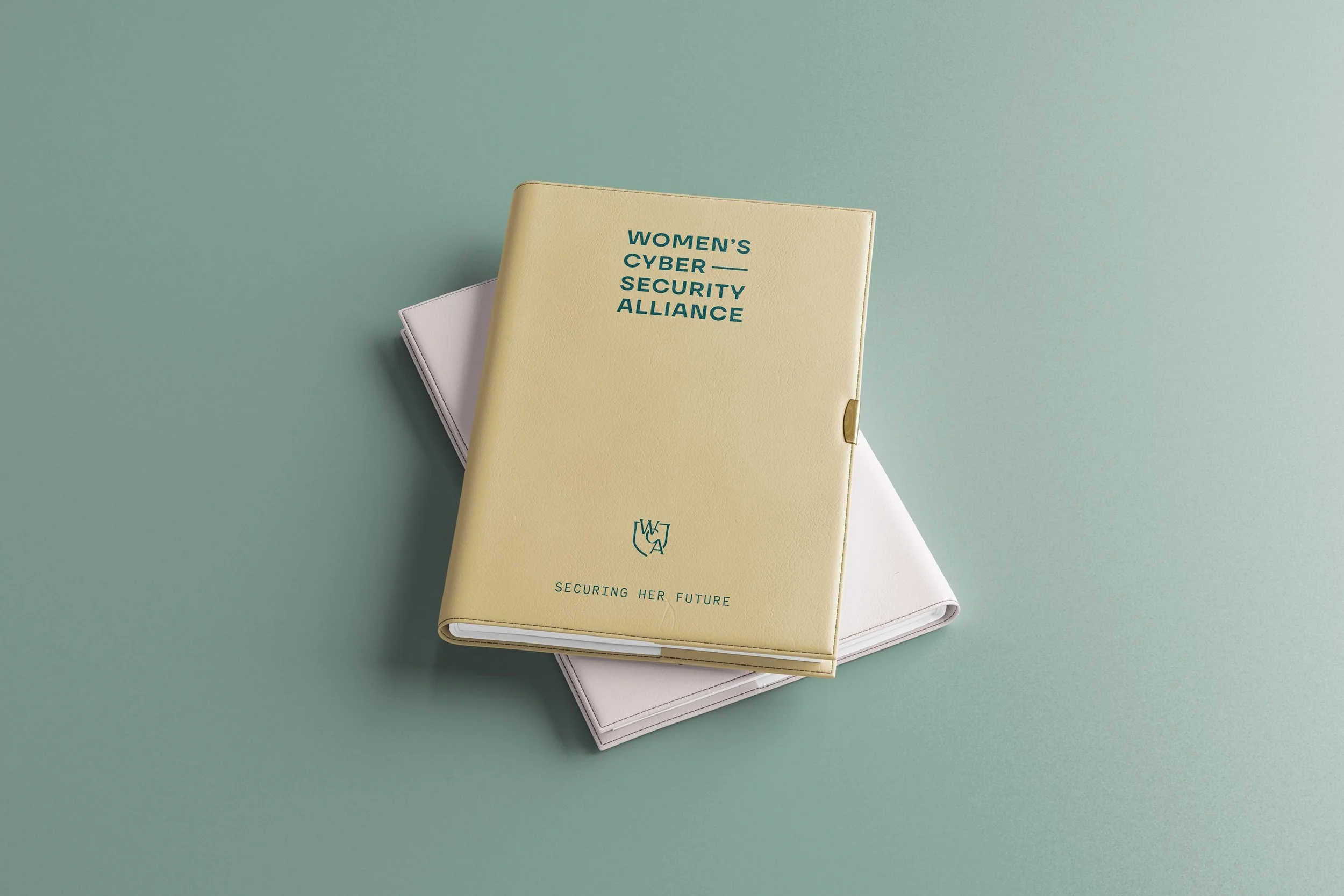
Securing Her Future
Step two: the WCA membership organization logo & branding
Our take on a cybersecurity logo design
Once we had the brand strategy in place, we turned to designing the logo system. Since the Women’s Cybersecurity Alliance is a long name and would be mostly referred to as the WCA, we knew we wanted a monogram that clearly included these letters. We sketched dozens of options combining WCA with symbolism relevant to the cybersecurity industry. The final logo looks timeless, immediately connects to the cybersecurity industry, and provides a sophisticated balance with the more tech-forward logo type.
Cybersecurity logo symbolism
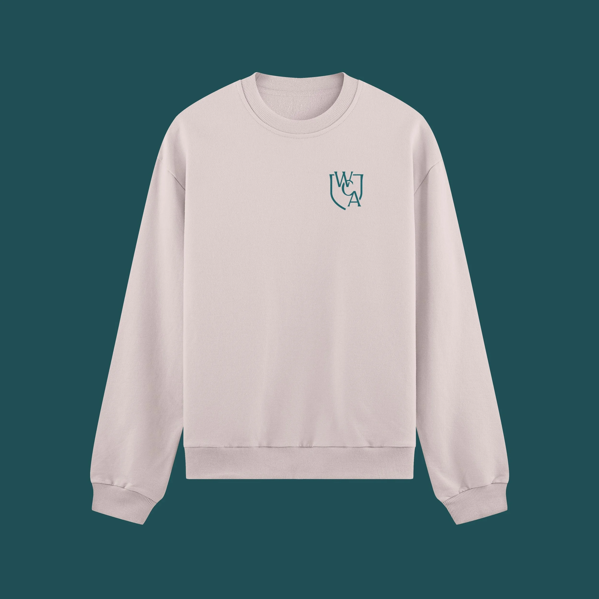
Shield: The monogram is grounded by a shield, giving a powerful feel that underscores the WCA’s seriousness and capability, and immediately connects the logo with the cybersecurity industry.
Links: The W, C, and A are joined like chain links, symbolizing how members of the WCA come together as many individuals to make up a collective that’s strong and protective.
The visual language
Color palette
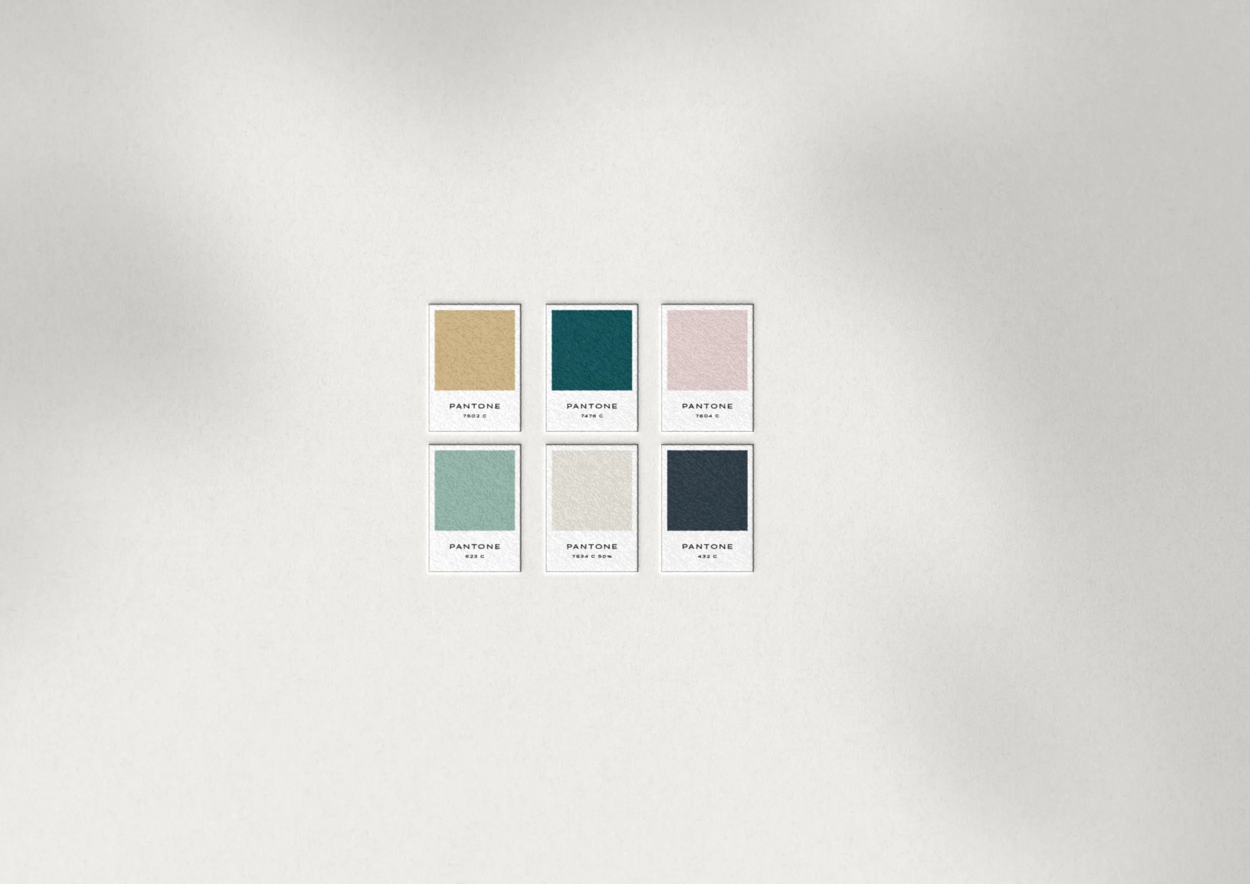
We landed on a color palette that balances professionalism with subtle femininity. The main brand color is a deep teal—a strong, sophisticated jewel tone to ground the palette. We added brushed gold, soft teal, and blush accents for subtle femininity. Cream and charcoal round out the palette for their timelessness. The final palette feels professional yet genuine and creative. It stands out from the neon blues, greens, and purples that are overused in cyber and don’t hit the right tone.
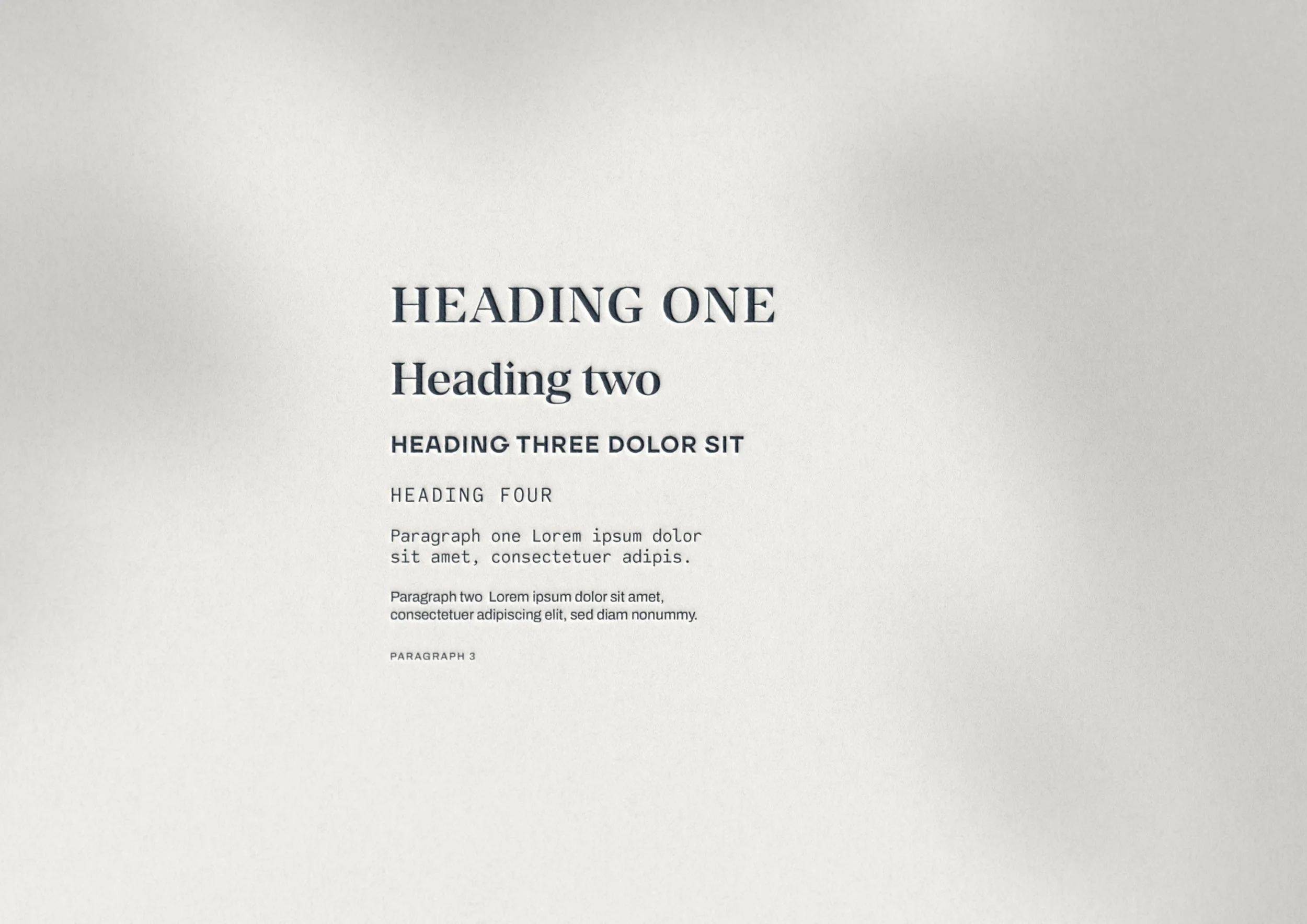
Typography
For the typography, we curated a set of typefaces that mix together many different notes to capture the right vibe. We used the serif Manier for headings, since it has a great mix of feeling timeless, sophisticated, strong, professional, and subtly feminine. The sans serif TT Firs Neue brings in a fresh, professional, clean, tech-forward look, and Code Saver (the monospace font designed for coding) references tech in an elevated way. Finally, we mixed in archivo for a clean, legible body copy.
Patterns
We designed a set of three patterns to round out the brand assets. Our favorite one uses a circuit-board inspired geometric design to bring a subtle nod to digital and cyber themes.
Step three: the WCA professional social media templates
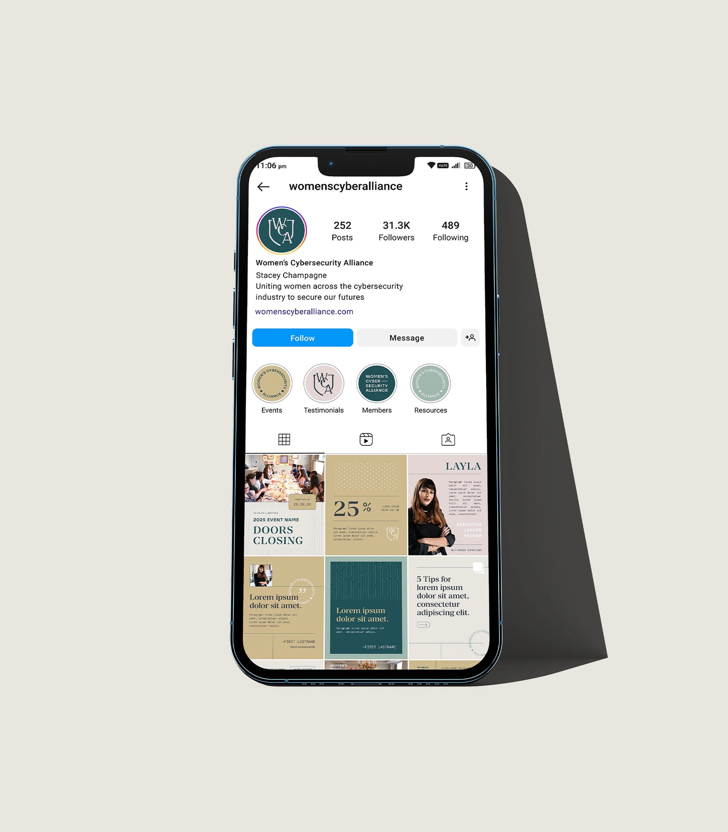
Professional Canva templates for the WCA brand toolkit
Once the branding was finalized, we helped the WCA put it into action with a complete social media makeover. We put together a set of Canva templates, profile pictures, and highlight covers to make it easy to show up consistently and on-brand. This toolkit will help Stacey advertise events, educate, share motivation, and position the WCA as a thought-leader.
The final result: An elevated tech logo & brand design
The final brand supports Hacker in Heels in their glow up to the Women’s Cybersecurity Alliance. It hits the right mix of powerful, professional, and subtlety feminine with subtle tech references and an overall premium feel. We’re so honored to have played a part in this next era and can’t wait to cheer on the WCA’s powerhouse women as they collectively elevate the cybersecurity industry.

Ready to elevate your brand?
Book a free brand review with our Creative Director, Kathryn Joachim. During this call, you'll have the opportunity to discuss your specific branding needs and goals, as well as learn more about our signature custom branding process. Whether you're looking to refresh your current brand or start from scratch, Kathryn will help strategize on your next steps to crafting a brand and website that truly reflect the essence of your business.