Branding for Florists
As brand designers, we couldn’t ask for a more inspiring industry to design for than florists. Nothing breathes life into a space quite like floral design. Arrangements are lush, artful, and even magically transportive—something apart from the everyday. Then there’s the emotional element of florists playing an important role in so many life milestones. It’s sentimental, romantic, textural, seasonal, organic, abundant, and truly artistic work. Our boutique branding agency has been designing custom branding for florists for over a decade, and we still find it endlessly inspiring. Let’s take a look through all the nuances of branding for the floral industry, including what the process entails, our approach at Crème Brands, answers to your questions, and reflections from our years crafting floral branding.
Feather + Bloom Florals branding by Crème Brands
Our approach to branding for wedding florists at Crème Brands
Crème Brands is a boutique branding agency. We’ve been designing custom brands for over a decade, with a specific focus on helping wedding professionals elevate their brand design to match their level of service.
Our logo designs begin in pencil
Especially in an industry so full of life, we often hear there’s a fear that branding can make you look cold or generic. The last thing we want to do is flatten your creative, organic energy into something bland. We’re here to help you stand out.
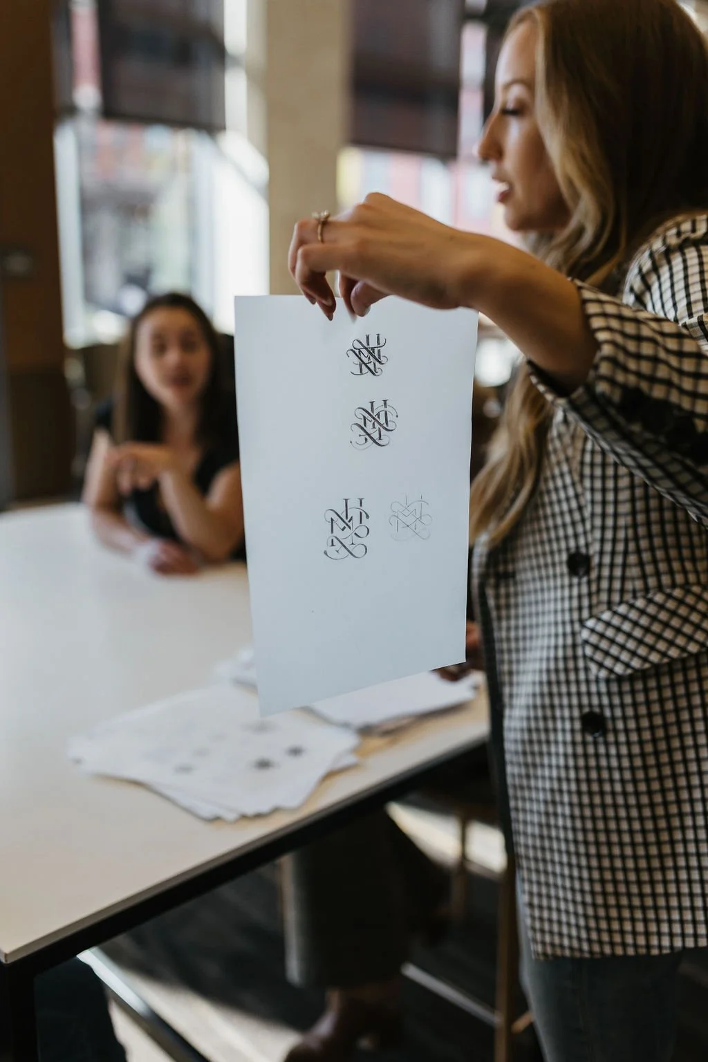
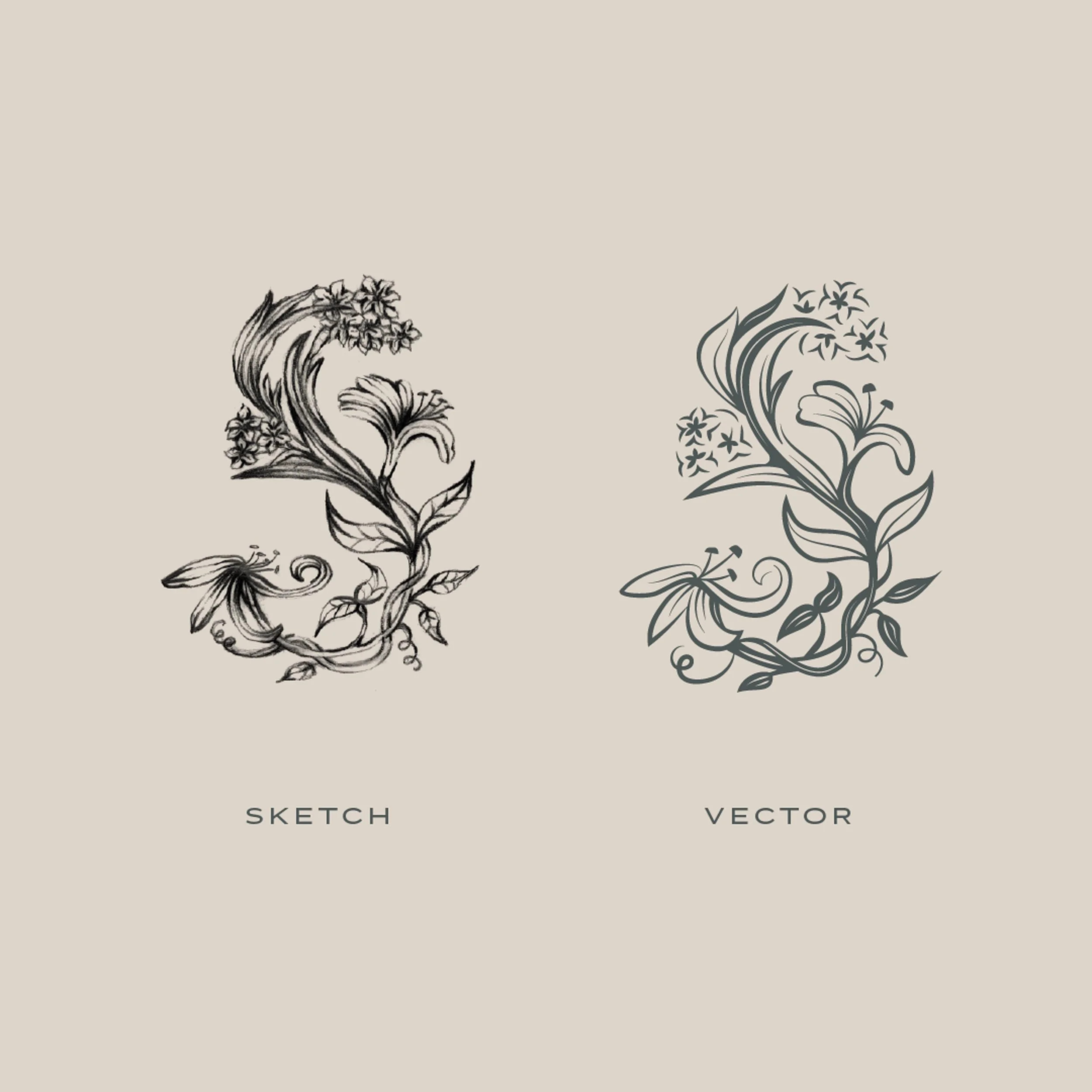
That’s why we begin every logo design with dozens of pencil sketches. This step of the process is where the real creativity happens. It’s how we come up with something no one else could have, incorporating details and symbolism unique to your brand. If another business could use your logo but just swap out their name, it’s not good enough!
Swoon Floral Design branding by Crème Brands
Case study: Swoon Floral Design
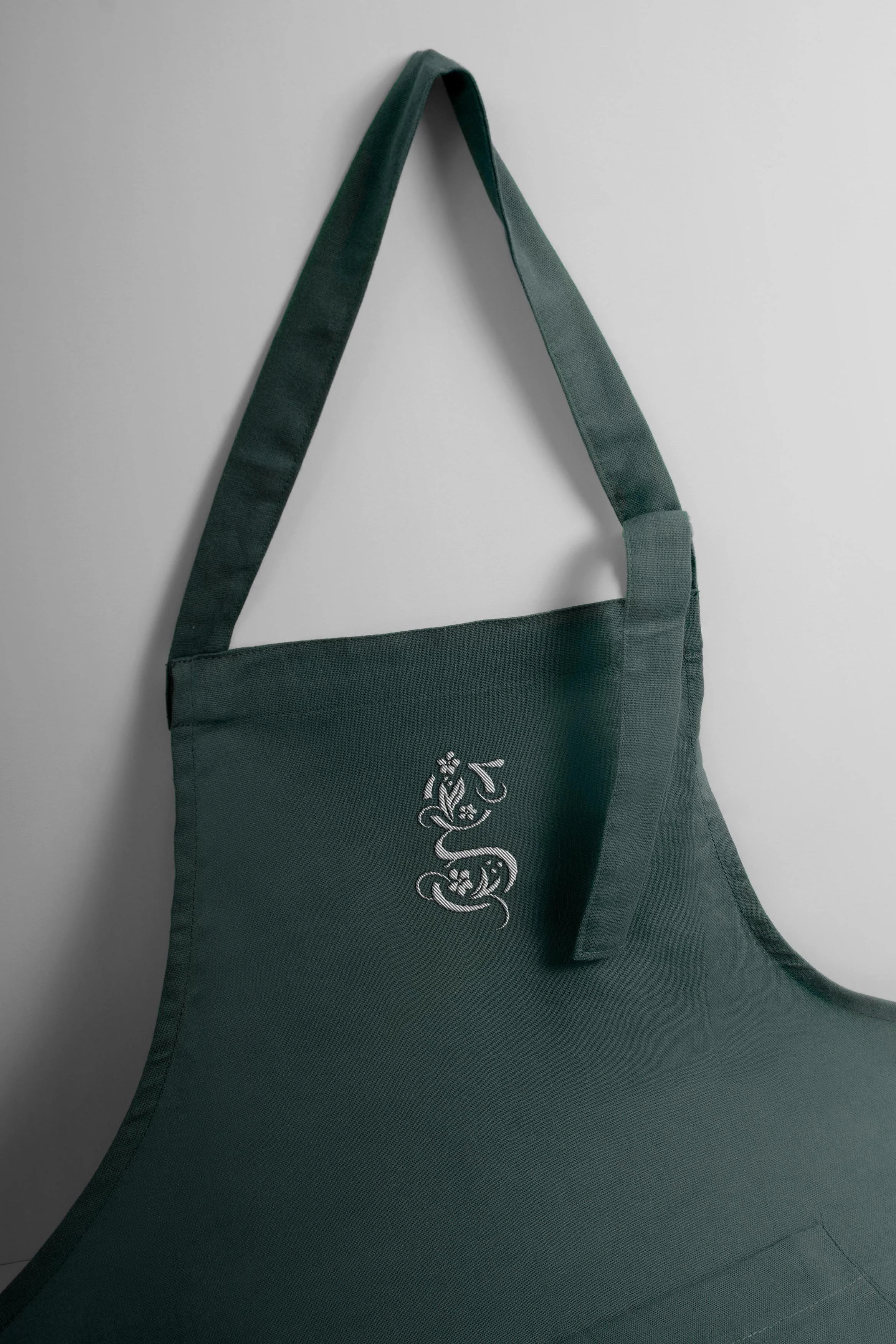
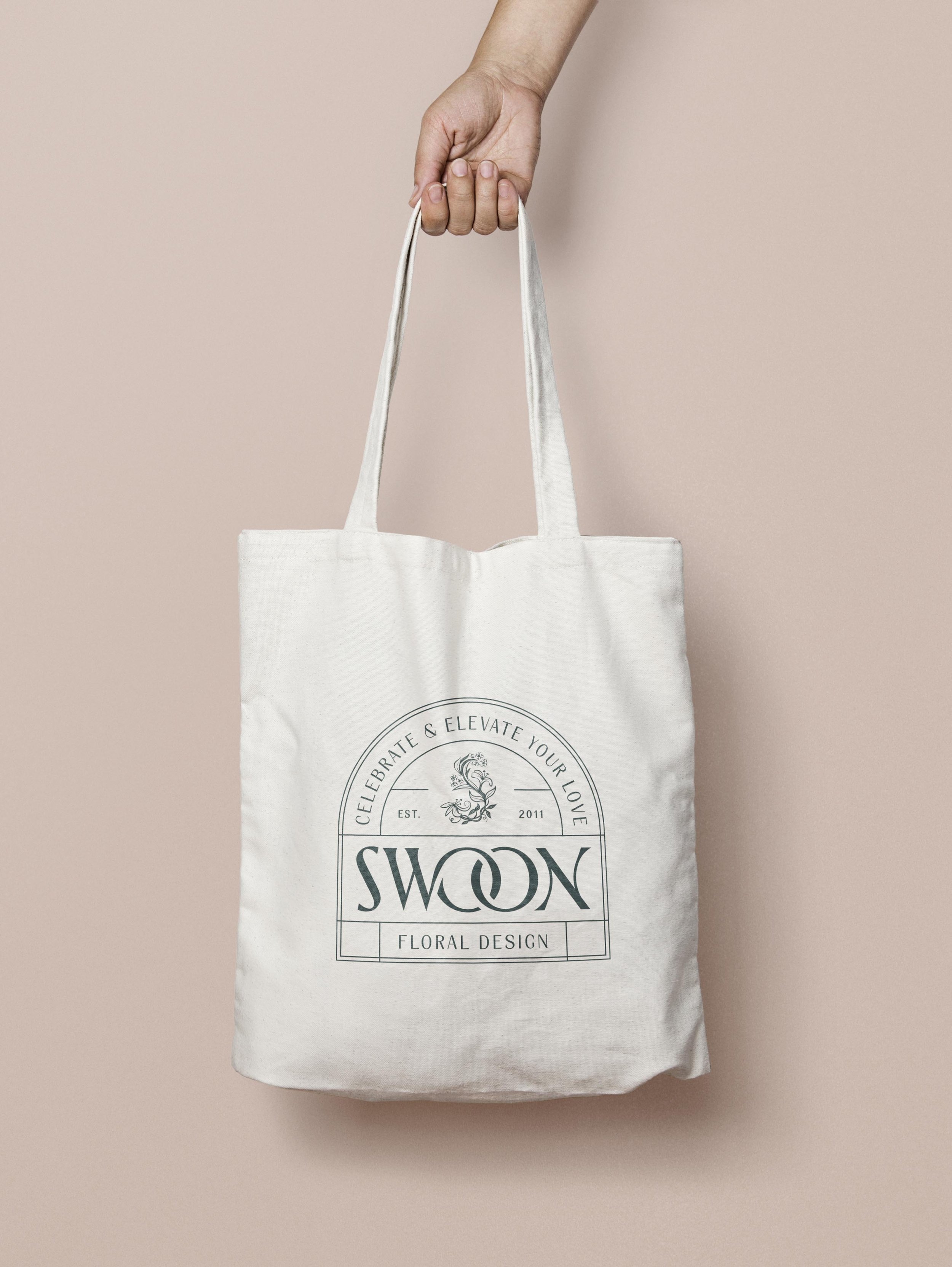
Swoon is a full-service floral design studio in Portland, Oregon. They create dynamic, intentional, and locally sourced floral design that authentically celebrates and elevates their couples’ love stories. When we worked with Founder & Creative Director Kim Dodrill, we were so impressed with her design eye and truly hadn’t seen arrangements quite as stunning before. When we learned about her background as an interior designer, it all made sense! To match her work, we knew we had to create branding you hadn’t seen before. We sketched dozens of options, but ended up with an organic, interesting, detailed floral S icon that’s beautifully offset by the more minimal design of the rest of the brand. Plus, the flowers represent the birth months of her two children for added meaning.
Swoon Floral Design branding by Crème Brands
We design confidence
The best thing you can tell us is that your new branding feels so “YOU.” It’s never about trying to turn you into something you’re not, but rather accentuating what makes you special. Clients often tell us how much more confident they feel showing up for their business now that they have branding that really expresses who they are. Shocking, but it’s much easier to do the work to show off your business when you actually want it to be seen.
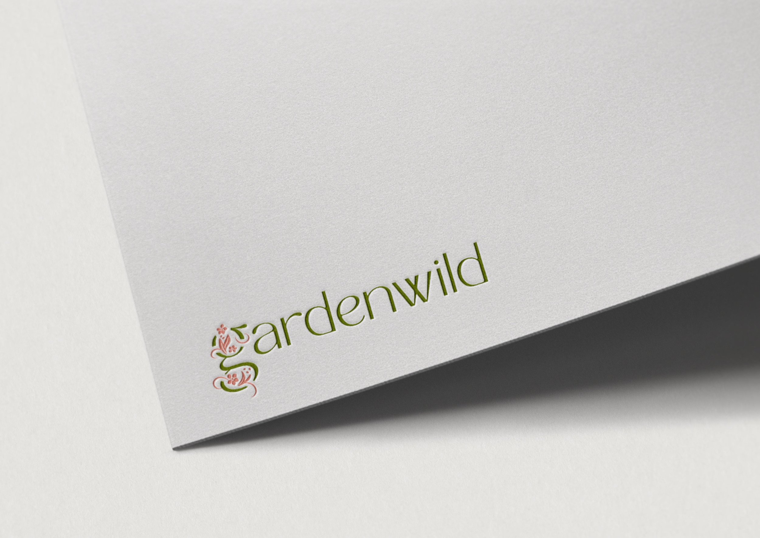
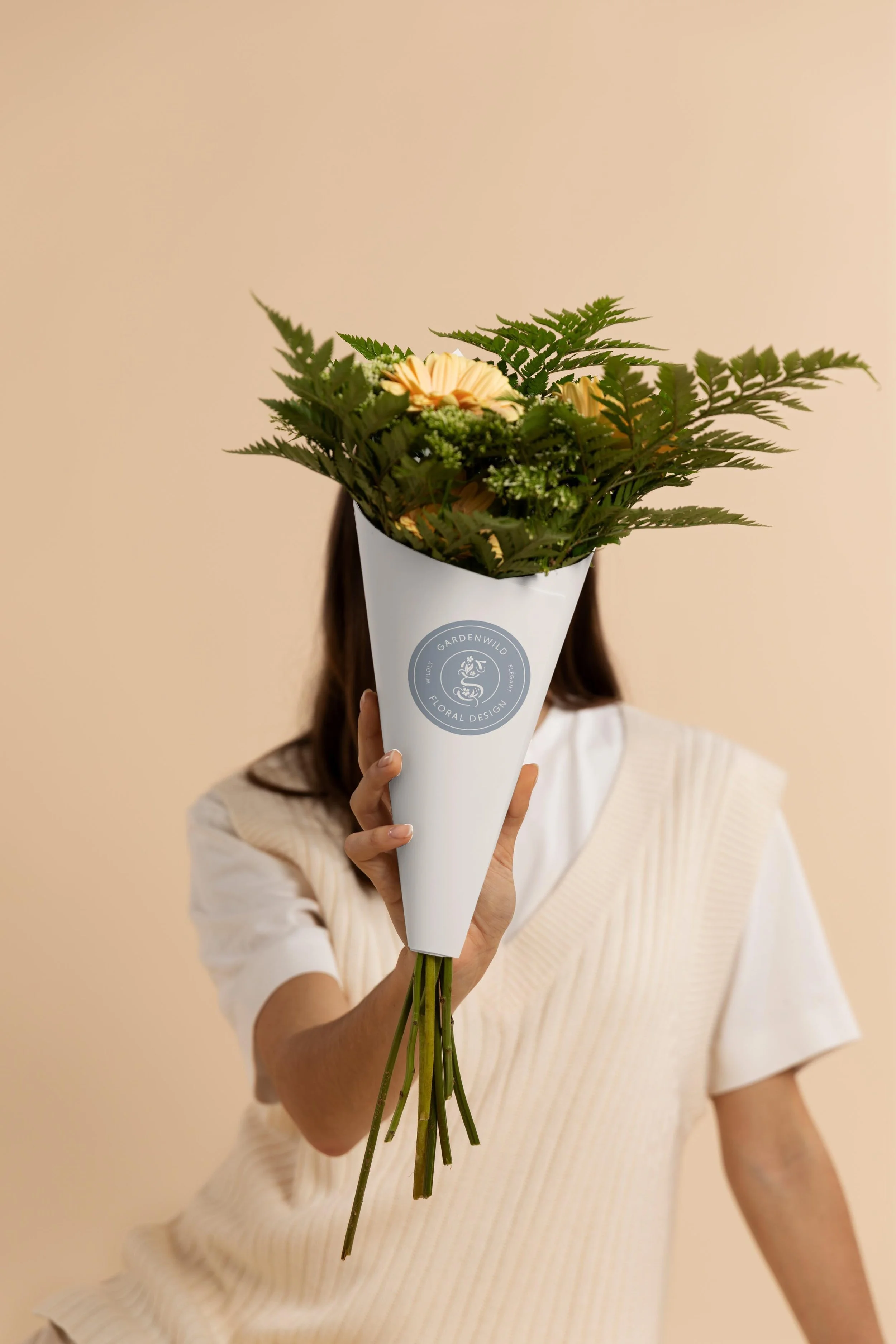
Gardenwild Floral Design branding by Crème Brands
Case study: Gardenwild
Gardenwild is a floral design studio based in Anchorage, Alaska. When we worked with Founder Greta Lewanski, it was an absolute must that her branding felt authentic and aligned with who she is. This was a real privilege for us, as she is a really inspiring person! One of our favorite things Greta told us was, “I want people to feel loved, accepted, and joyful. Let's have some freaking fun in our amazing earthly bodies!”
For the Gardenwild branding we leaned into a cottage garden vibe: wild, abundant, and full of life. In the logo design, vining florals grow around the “G,” capturing a wild and abundant feeling. They’re exuberant, expansive, and even a bit magical. The illustration style of the florals is inspired by printmaking (think: stamps, woodcuts, etc.), adding a beautifully imperfect feel to the mix. For the color palette, we were inspired by how the iconic, moody gray of Alaska’s mountains and skies is set off by bold and juicy colors of Gardenwild’s work.
All of these elements layer together to feel exactly like Gardenwild.
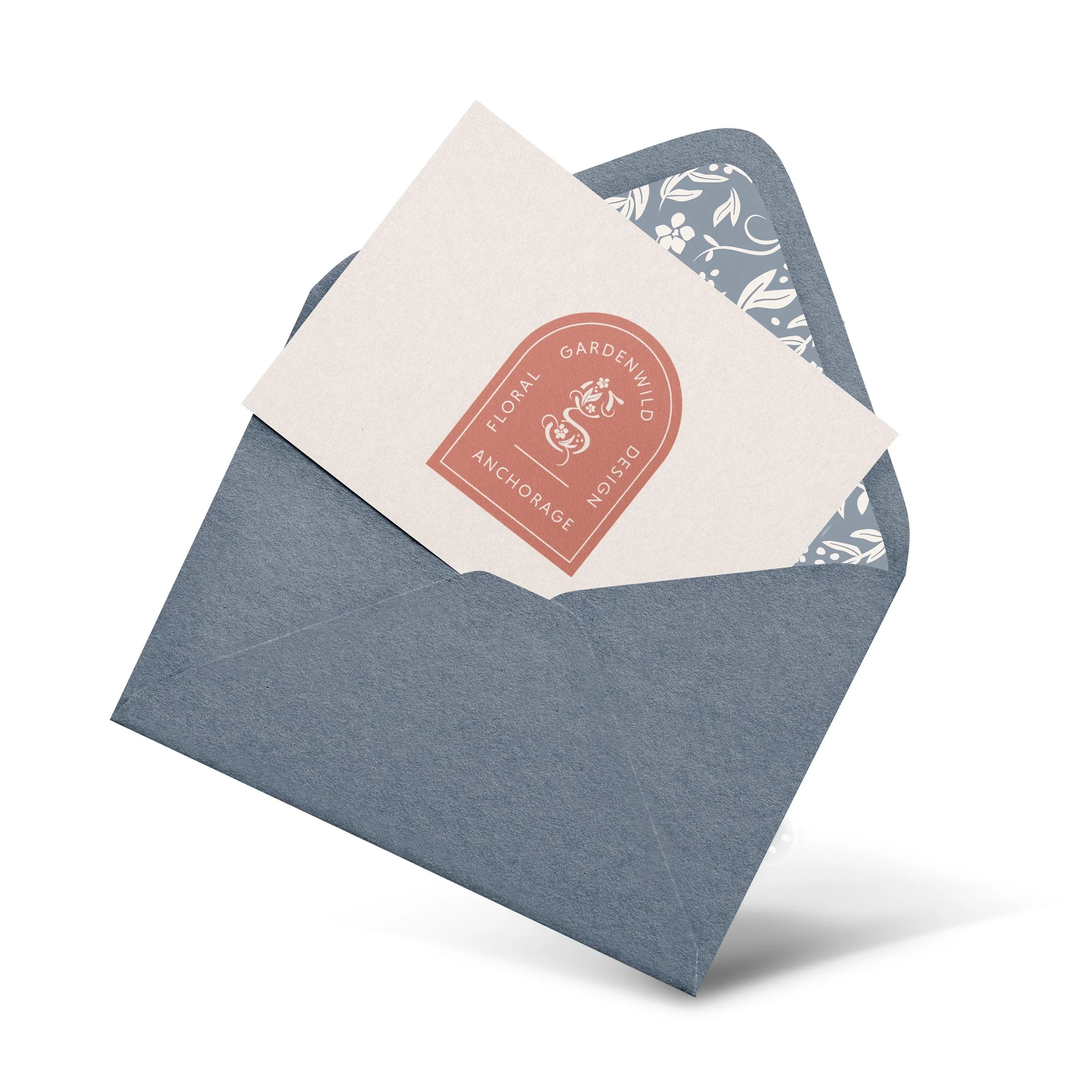
Gardenwild Floral Design branding by Crème Brands
Color palettes should frame up your floral design work
Color deserves special attention in florist branding. It can be really tempting to go super colorful—after all, you are working with flowers as your artistic medium! Our philosophy with brand colors, especially for florists, is that the branding is the frame and your work the focal point. This doesn’t need to mean boring, but it is less about a bold color pop and more about underlying tones that complement your work, without competing.
As website designers too, when we develop your brand palette, we constantly check how your brand colors work as a backdrop to your portfolio photos. We like to keep it interesting and unexpected, without being distracting or scattering your attention.
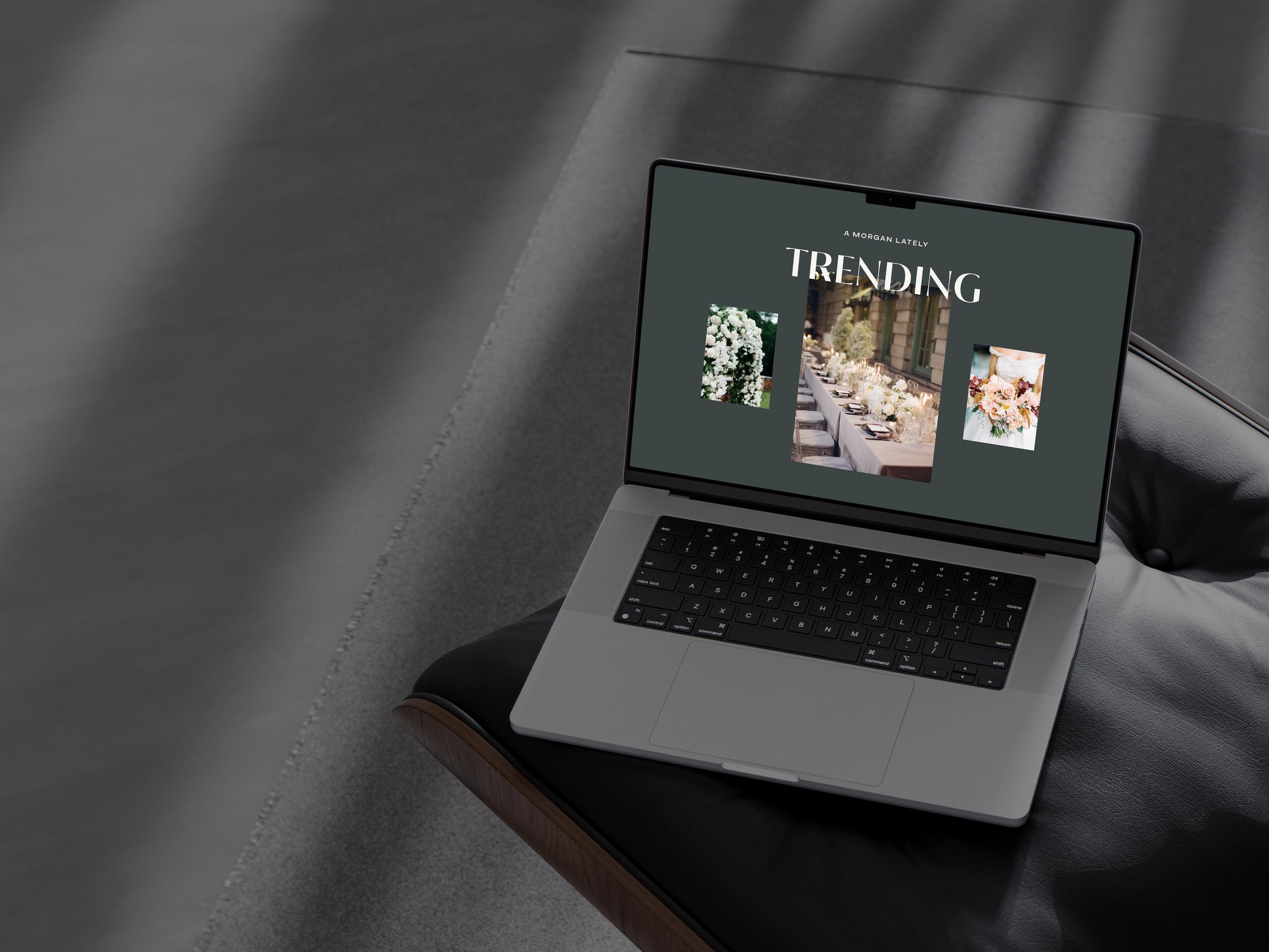
A Morgan Floral Design branding by Crème Brands
Case Study: A Morgan Floral
A Morgan Floral is a luxury wedding and event floral design studio based in Central Virginia. We worked closely with Founder Amanda Lamar and absolutely loved her dark, moody, and romantic vibe. She loves the English Rose Garden style, accented with a note of chic editorial, for a truly immersive experience that feels like you’re being transported to an ephemeral dream garden. For the color palette, we used moody, deep tones that beautifully frame up her portfolio photography, almost like how a floral arrangement in a baroque oil painting pops off the page against a dark background. It adds to the immersive experience and chic vibe, while at the same time, helping accentuate her floral design work.
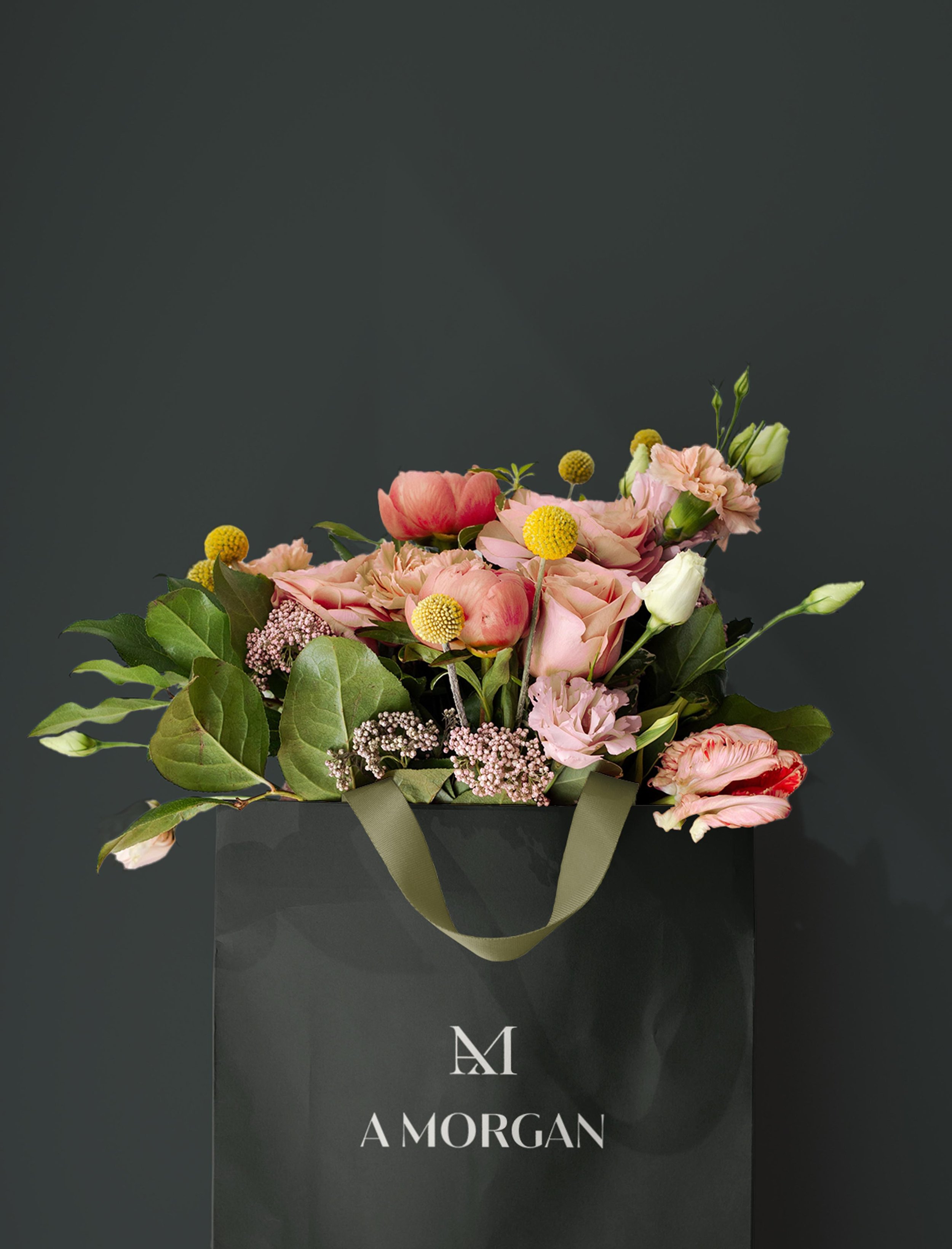
A Morgan Floral Design branding by Crème Brands
“So far it's my best year in 16 years! I'm sure the branding has to do with it, 1000%."
—Amanda Lamar, A Morgan Floral
Elevating your look to match your in-person level of service
We all know that in the wedding industry, there’s no room for error. If you’ve made it in the industry, it means that you give your clients an impeccable experience. Our branding approach is all about signaling this trustworthiness to your clients by presenting you with polish. We like to maintain an inviting, warm feel, while elevating your entire look to be appropriate for the level of service you provide.
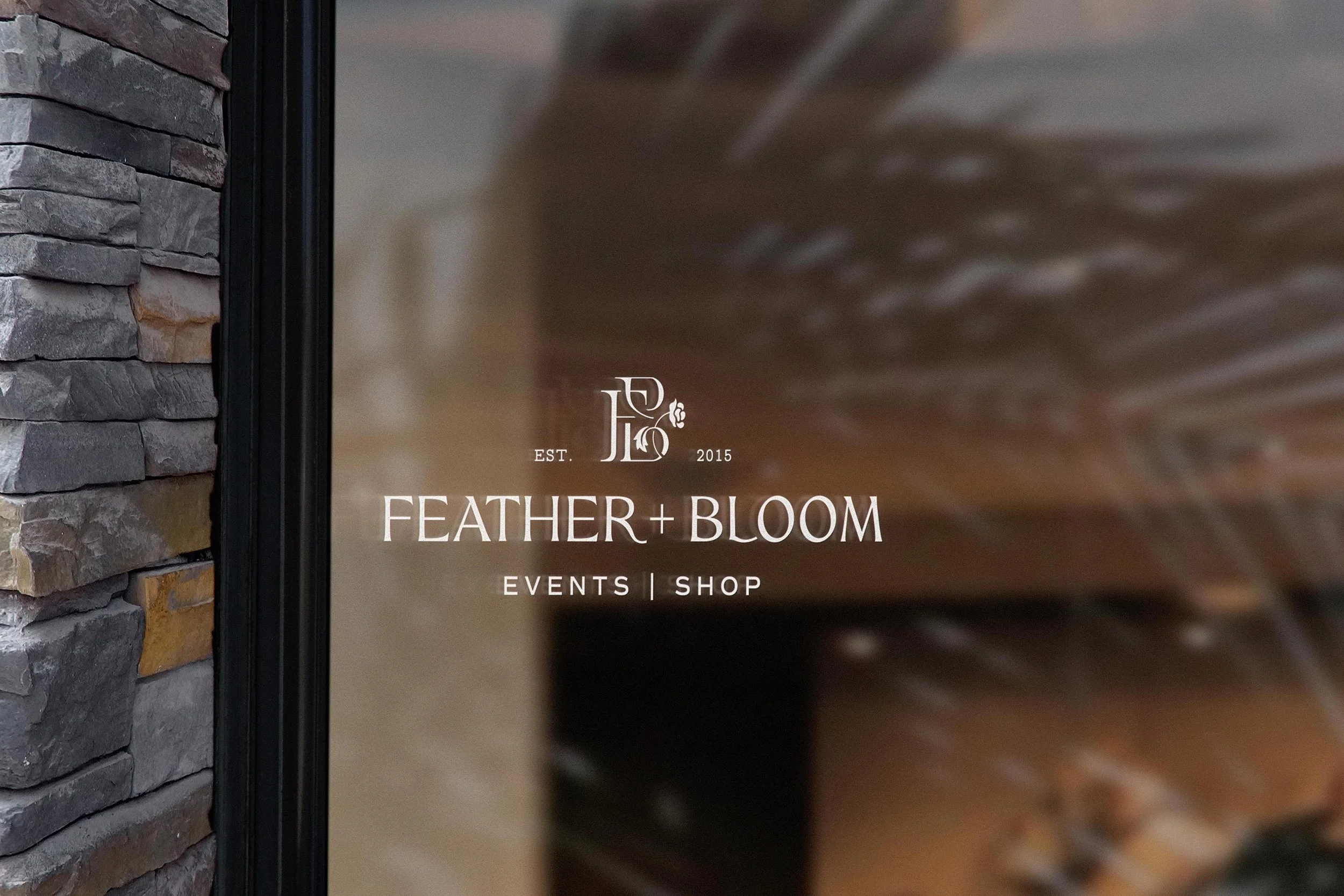
Feather + Bloom Florals branding by Crème Brands
Case study: Feather + Bloom
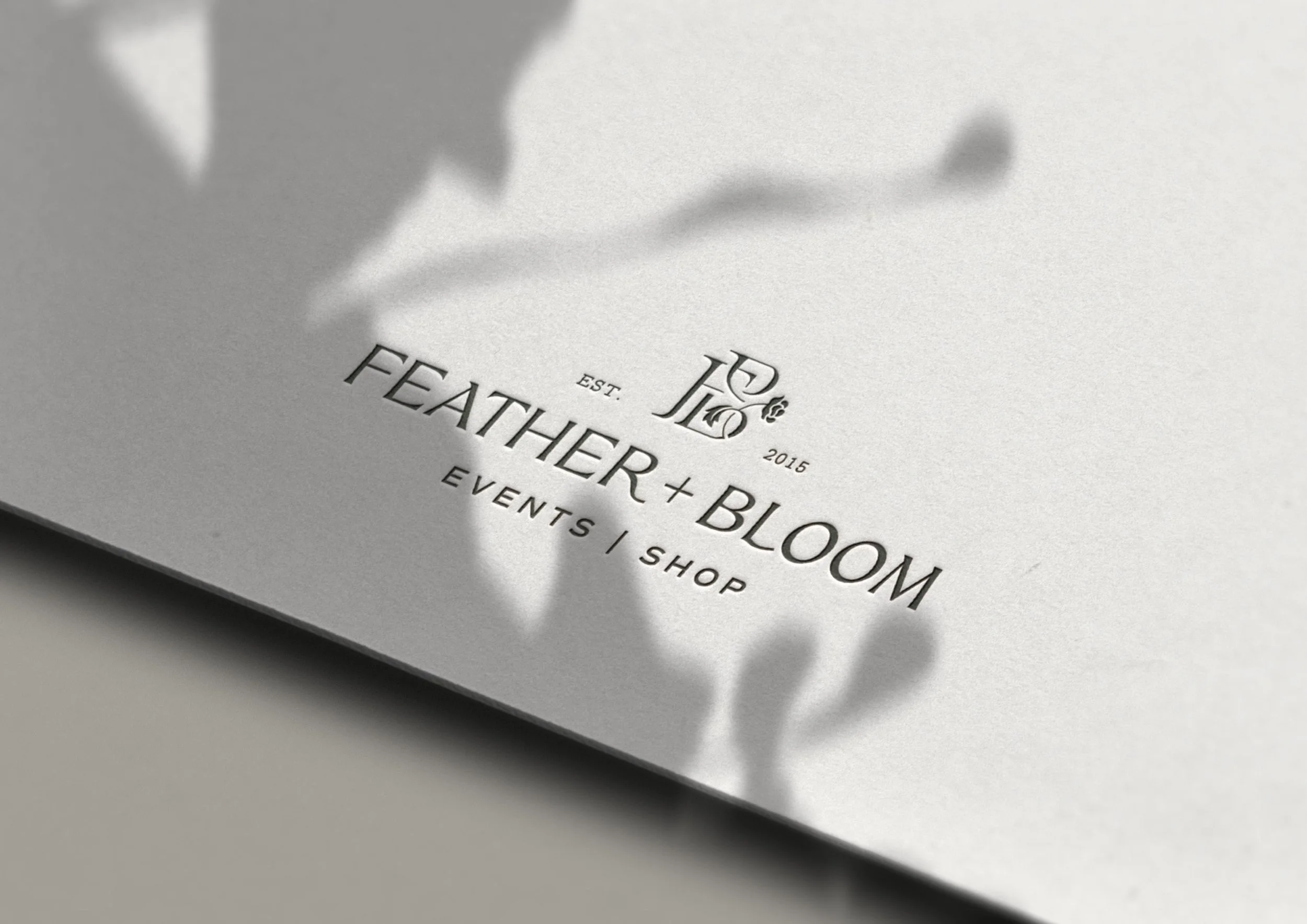
Feather + Bloom crafts custom floral installations for events and has a brick-and-mortar location in St. Augustine, FL. The previous branding for Feather + Bloom felt very homey and organic, so the main objective for the rebrand was to elevate and uplevel the look—taking the visuals to a higher-end place—while maintaining the warmth and personalization that owners Brandi and Josh are known for. To align with an elevated yet warm feeling, we curated a gorgeous palette of 5 colors. We brought in a bold dark green as the primary color, and balanced it out with some softer gray and rose shades. Together, it is a very mature color palette that elevates the brand feeling. With the logomark, we wanted something that was instantly recognizable to the F+B brand and sets them apart from other flower shops. We sketched dozens and dozens of logo options and ultimately landed on this interlocking F and B with a delicate floral illustration. Every element of the branding works together to signal that quality and trust, while still feeling warm and personal.
Reflections from over a decade of branding for wedding florists
With all our experience designing branding for florists, we thought it would be fun to share some reflections and advice as you take on your branding project. Basically, if we had a florist friend doing a rebrand, these are a few tidbits we’d share.
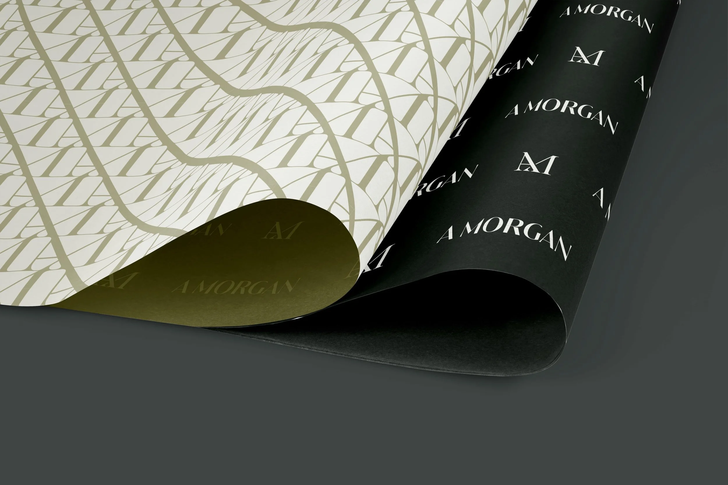
A Morgan Floral Design branding by Crème Brands
Color is everything
Color sets the emotional tone of your brand. The right combination can create an immersive experience, just like a beautiful floral installation can. Instead of bright colors that would compete with your portfolio photography on your site, think more along the lines of interesting combinations, unexpected backdrops, and beautiful frames that enhance your work. Less about one memorable brand color, and more about an elevated palette that creates the right feeling.
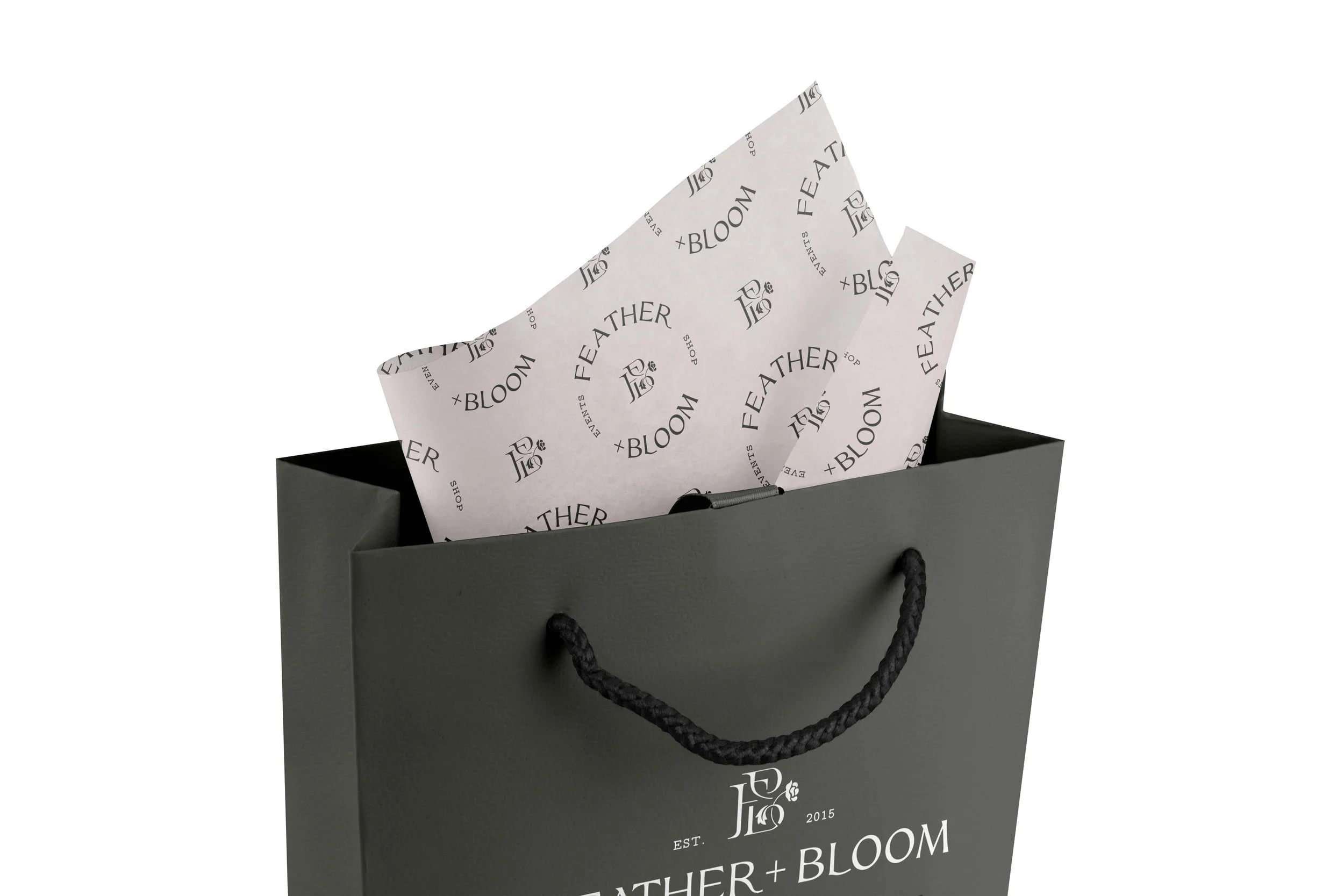
Feather + Bloom Florals branding by Crème Brands
It’s ok for your logo to have a flower in it
To be clear, it’s also ok if it doesn’t! But we’ve found that clients often get tripped up on this decision in the early stages of a branding project. You’re a florist, so it’s absolutely great to signal this with a flower in your logo. It’s all about execution and there are infinite ways to design a floral logo. Just because you have a flower in your logo, doesn’t mean your branding will look youthful (or romantic, or whimsical, or delicate)! Focus less on a yes/no decision, and more on the feeling you’re hoping your brand creates.
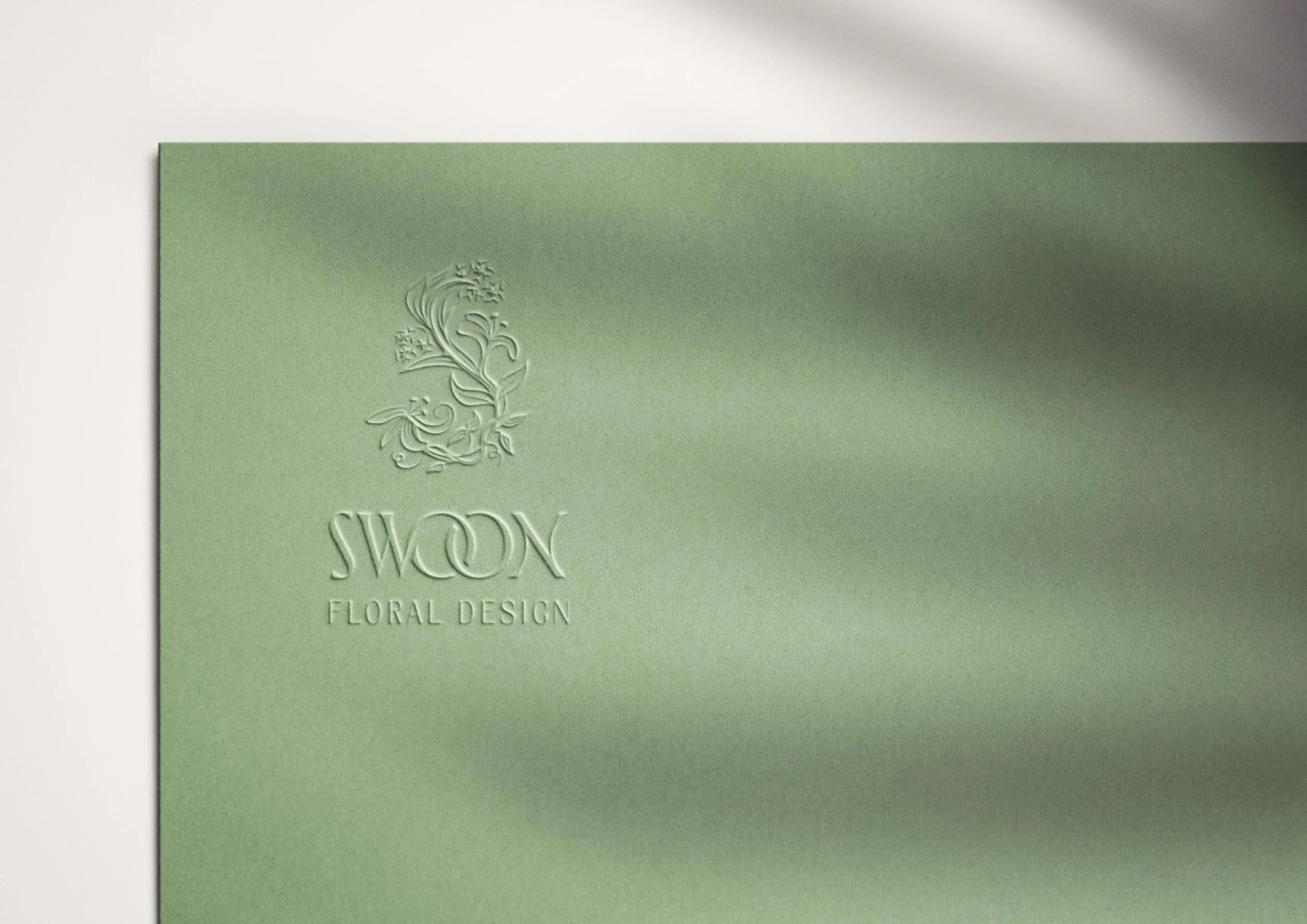
Swoon Floral Design branding by Crème Brands
Typography should be textural
A lot of the same elements that apply to floral design apply to brand design. Just how the first thing people notice in an arrangement are the blooms and colors, the first thing they’ll notice about your branding is the logo and color palette. Then there are the more subtle elements, like texture, that work in the background. Your average client may not be able to describe exactly why she loves an arrangement so much, but can recognize it has something special.
Typography in your brand design works just the same. Think of it like mixing textures into your floral designs. It’s not so much that your fonts should be over-the-top, busy, or ornate. More like they should mix in nuances and style notes to help fill in your brand world with texture.
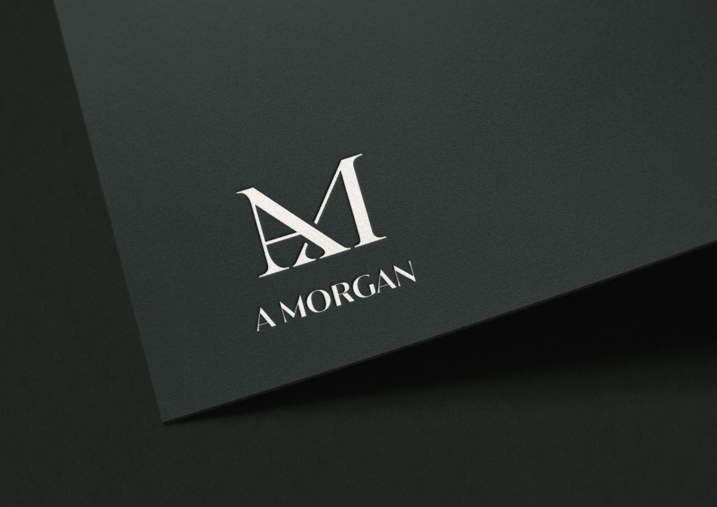
A Morgan Floral Design branding by Crème Brands
Case study: A Morgan Floral Design
A Morgan Floral Design’s style is all about mixing the romantic English Rose Garden style with moody, editorial accents. For the brand typography, we brought in a chic typeface that almost feels like it could be a fashion magazine logo. It brings texture and finesse to the brand design, mixing in styles to help achieve that dreamy drama feel.
Gardenwild Floral Design branding by Crème Brands
Find a brand designer that’s a good fit for YOU
It can feel uncomfortable to be on the other side of things, being the one in the market for a service provider for a change. Not to mention, it’s a huge deal putting your business in someone else’s hands! Especially when you’re a creative yourself, you want to make sure you’re working with someone you really trust to capture your vision.
When you’re looking for a brand designer, take your time to find someone you feel excited to work with. Look at prospective designers’ portfolios and read their case studies. They should explain a bit of the decision-making that went into their final branding projects. You’ll want to find someone who’s work you think is beautiful AND whose creative thought process resonates with you.
When you find someone whose portfolio impresses you, get on a consultation call. See how you mesh with the designer. You should feel comfortable to ask them questions, and they should be asking YOU good questions, too! It’s all about finding someone you can trust to be invested in your business (almost) as much as you are. You deserve to move through the process feeling secure and confident.
He Loves Me Flowers branding by Crème Brands
How do I know it’s time for new branding?
Hot take, but we actually think you already know the answer deep down. But if you need more validation, or a framework to think it through, read on!
Branding should match your level (and help you elevate)
Oftentimes our clients come to us with logos they’ve far outgrown. Usually it was a DIY solution that worked for a while, but they’ve now reached a new level in business where there’s a mismatch. In the floral industry, it’s easy to end up with a youthful look (think: watercolor florals, colorful line art, bouncy scripts) that doesn’t quite capture your level of artful finesse. We’ve worked with a lot of floral designers who are working on luxury weddings, pushing the bounds of floral installations and providing impeccable service to their clients. Their old branding just didn’t reflect this in-person experience.
If there’s a misalignment between your branding and the actual experience of your business, that’s the surest sign it’s time for new branding. We love a rebrand that matures and elevates a business.
Gardenwild Floral Design branding by Crème Brands
What’s included in branding services for florists?
Yes, branding is about creating beautiful visuals for your business—and especially when you’re a florist, brand designs can be truly stunning—but the process is actually much deeper than that!
Good branding starts with strategy
Strategy is a branding project’s guardrails, keeping everything on track and moving in a PURPOSEFUL direction. It ensures the final branding aligns with who you are, resonates with your clients, and helps you create your next level in business.
Leaning into what makes you unique
Branding is all about reflecting your unique essence into beautiful visuals. But, what is my unique essence?? Good thing is, it’s not on you to have it perfectly figured out. Any reputable brand designer will help you uncover this during the strategy phase of a branding project. At Crème Brands, we absolutely love our strategy sessions, where we get to talk deeply about your business and really pull out what it is that makes you so special. It’s a true privilege to get to know you to the level where we can actually get to the heart of what makes you unique. Clients often tell us they were surprised by how this part of the process made them see their business in a whole new light. It can be super re-energizing, especially if you’ve been in business a while!
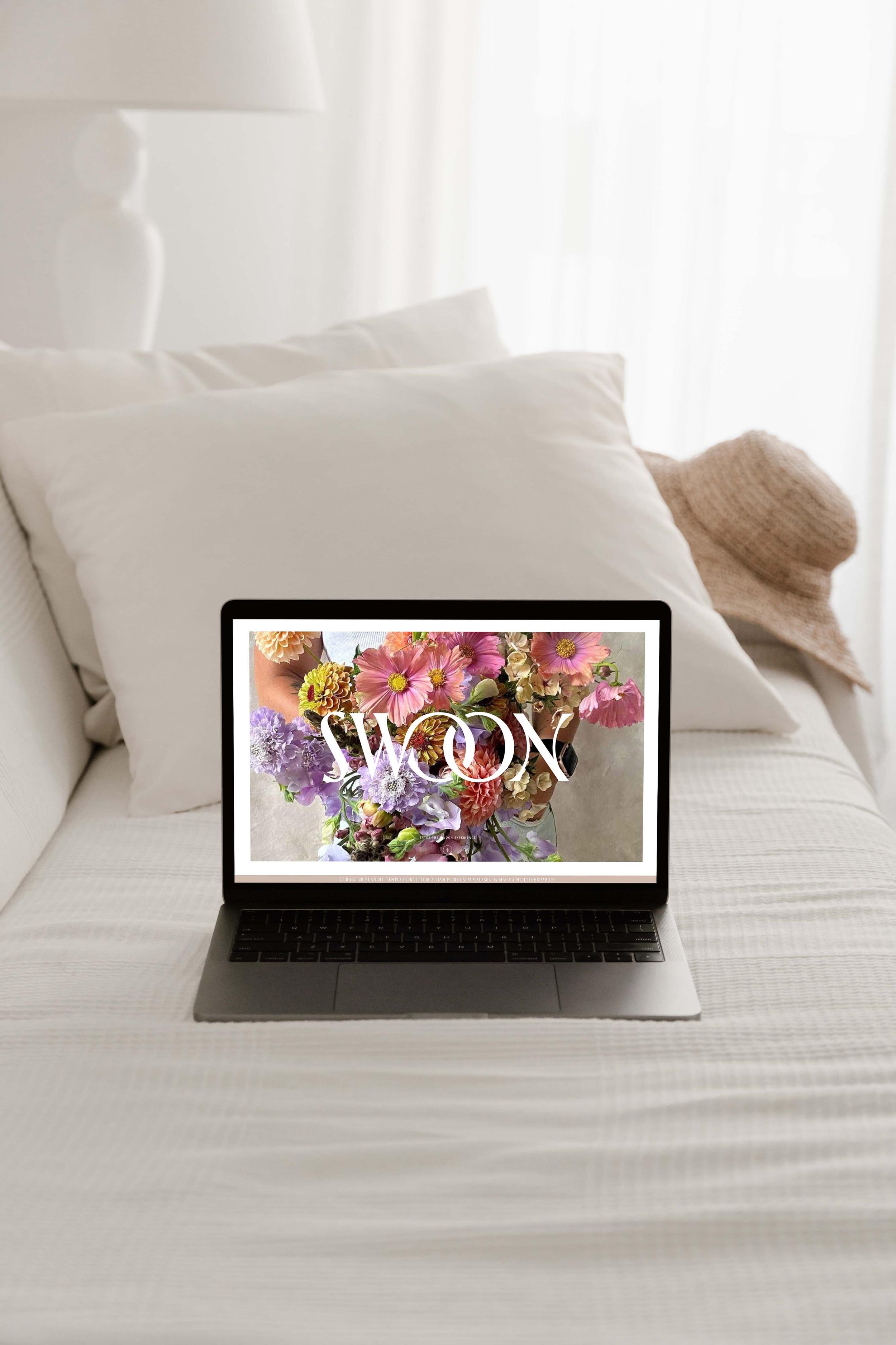
Swoon Floral Design branding by Crème Brands
Tip
When you’re looking for a brand designer, get on a consultation call before committing. Ask about how their process incorporates brand strategy. But also, just see if you vibe! You’re going to be putting your business in someone’s hands which can feel super vulnerable. It’s something we don’t take lightly, by the way. You want to find someone you feel comfortable with, so you can speak honestly about your business. This will lay the foundation for great branding results.
Your branding should resonate with YOUR clients
Prospective clients should land on your website and immediately connect with the vibe of your brand. In order to achieve this, the branding process includes getting to know exactly who your clients are. And it’s specific! It’s not just “couples getting married,” it’s more like “Mid-thirties professional; lives in a city on the West Coast; knows she wants something a little different than what’s on her Pinterest board, but unsure what that looks like; shops at Revolve, Anthropologie, and Nordstrom.” Your brand needs to fit perfectly into your client’s world, so they immediately get the feeling that they’re in the right place. Taking the time to deep dive into understanding your clients during the strategy phase ensures the final branding speaks to them.
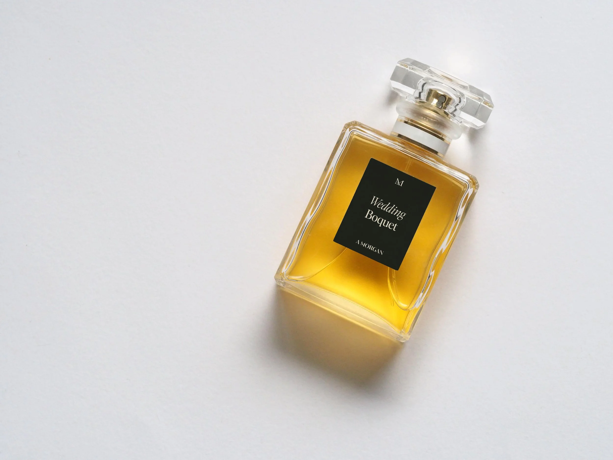
A Morgan Floral Design branding by Crème Brands
Mission statement, tagline, and positioning are all part of brand strategy too
You should ask prospective designers about their process, but at Crème Brands, we help our clients wordsmith their mission statements and taglines. Not only does this help distill their positioning and give inspiration for design, we absolutely love including taglines in different logo configurations and badges.
Here are some of our favorite taglines we’ve helped wordsmith over the years:
Swoon Floral Design: Celebrate and elevate your love
A Morgan Floral Design: Romanticizing every moment
Gardenwild: Wildly elegant florals
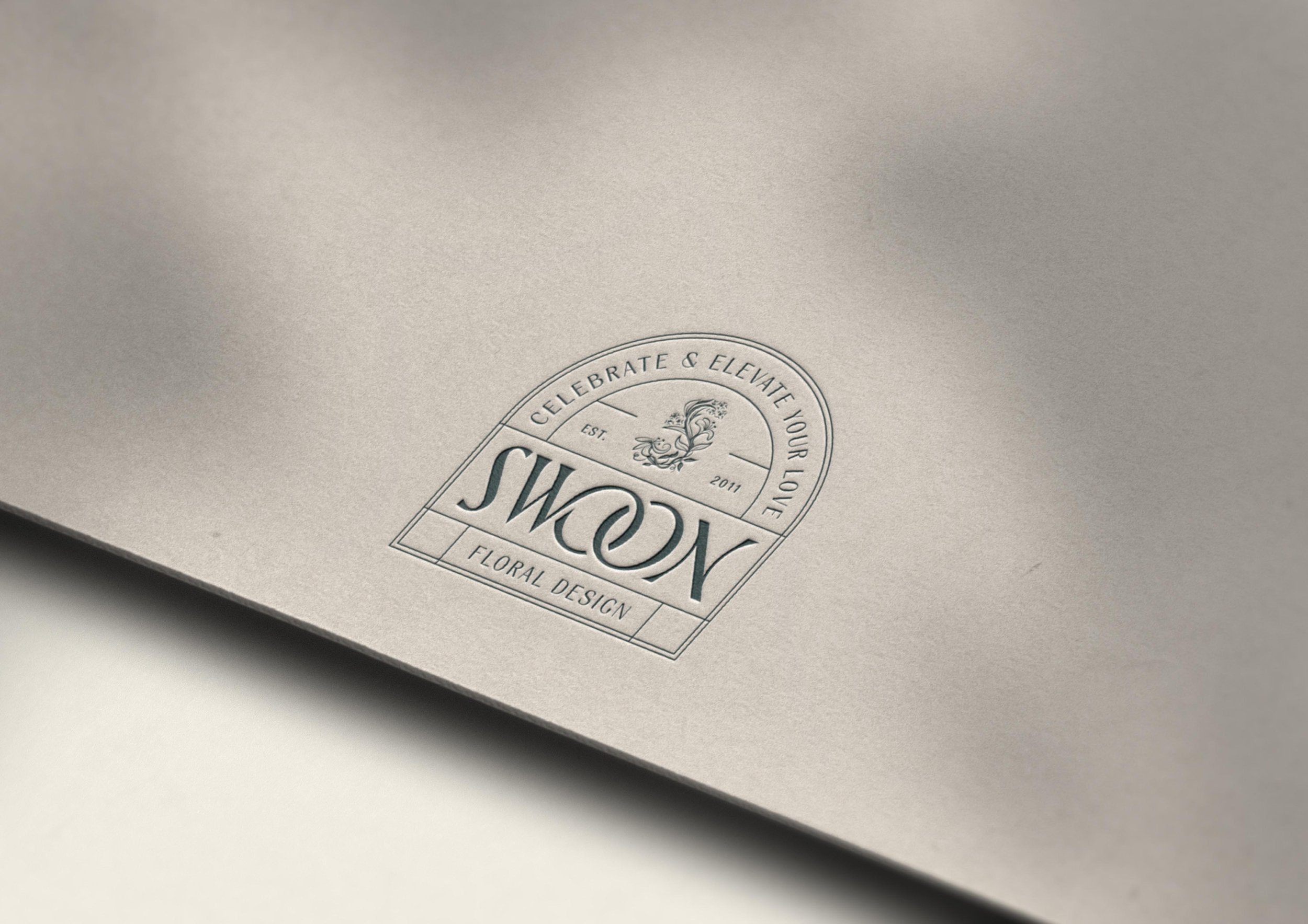
Swoon Floral Design branding by Crème Brands
Ok, but what are the final deliverables I actually walk away with?
Branding goes beyond just a logo to create an entire brand world. If you’re wondering about the actual nitty-gritty details about what branding entails, here are all the elements that work together:
Logo system
In today’s world, you need a 1:1 aspect-ratio logo that looks good at small sizes for your Instagram photo. You need a horizontal logo that works well in your website header. Something that looks nice on your aprons. Sleek configurations to elevate your stationery.
In other words, you need a logo system—not just one logo design—so you have different configurations to work for different contexts. You’ll walk away from a branding project with a folder of all your logo configurations exported for print and web for any application you may need.
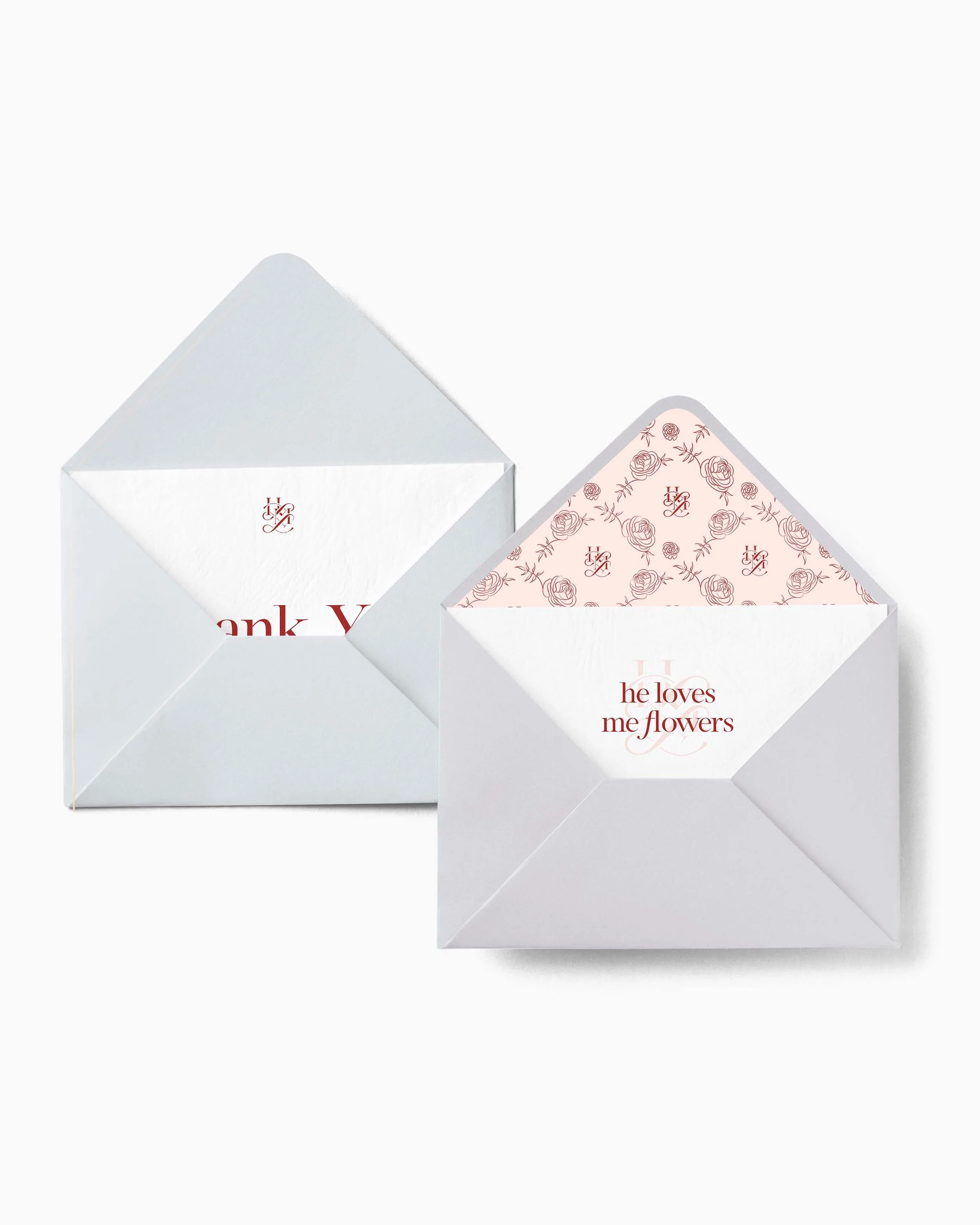
He Loves Me Flowers branding by Crème Brands
Color palette
You need a palette of beautiful colors that combine to set the right emotional tone, AND they also need to be functional. You need colors that work as background fills, colors that work for text, and combinations with an adequate amount of contrast so they are accessible to your site visitors.
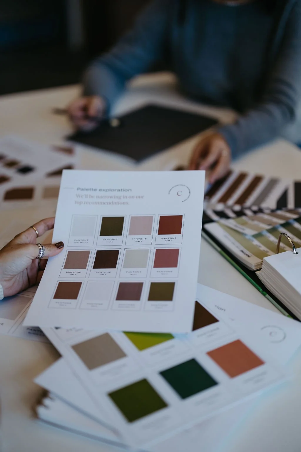
Your final color palette deliverables look like color codes for your palette in all the color systems you may need (CMYK, RGB, HEX, Pantone). Basically, anywhere you’d be asked for a color code, be it Canva or a professional printer, you’ll be able to give the right info so everything matches perfectly.

Feather + Bloom Florals branding by Crème Brands
Typography
The typography in your logo needs to communicate your vibe AND you also need a full hierarchy of heading and paragraph styles for use on your website and printed collateral. At Crème, we provide all the font styling details for a full hierarchy of four heading styles and three paragraph styles that directly correspond to website design, that way everything works together beautifully. We all know it’s all in the details!
Patterns & supporting elements
Supporting touches round out your branding into a full toolkit. Whether it’s a pattern that makes ordering branded tissue paper a breeze, a custom illustration that adds texture to your website, or a circular badge design you can use for stickers, your brand designer will take into account your needs and build out useful elements that can be used to add thoughtful touches throughout your brand experience.
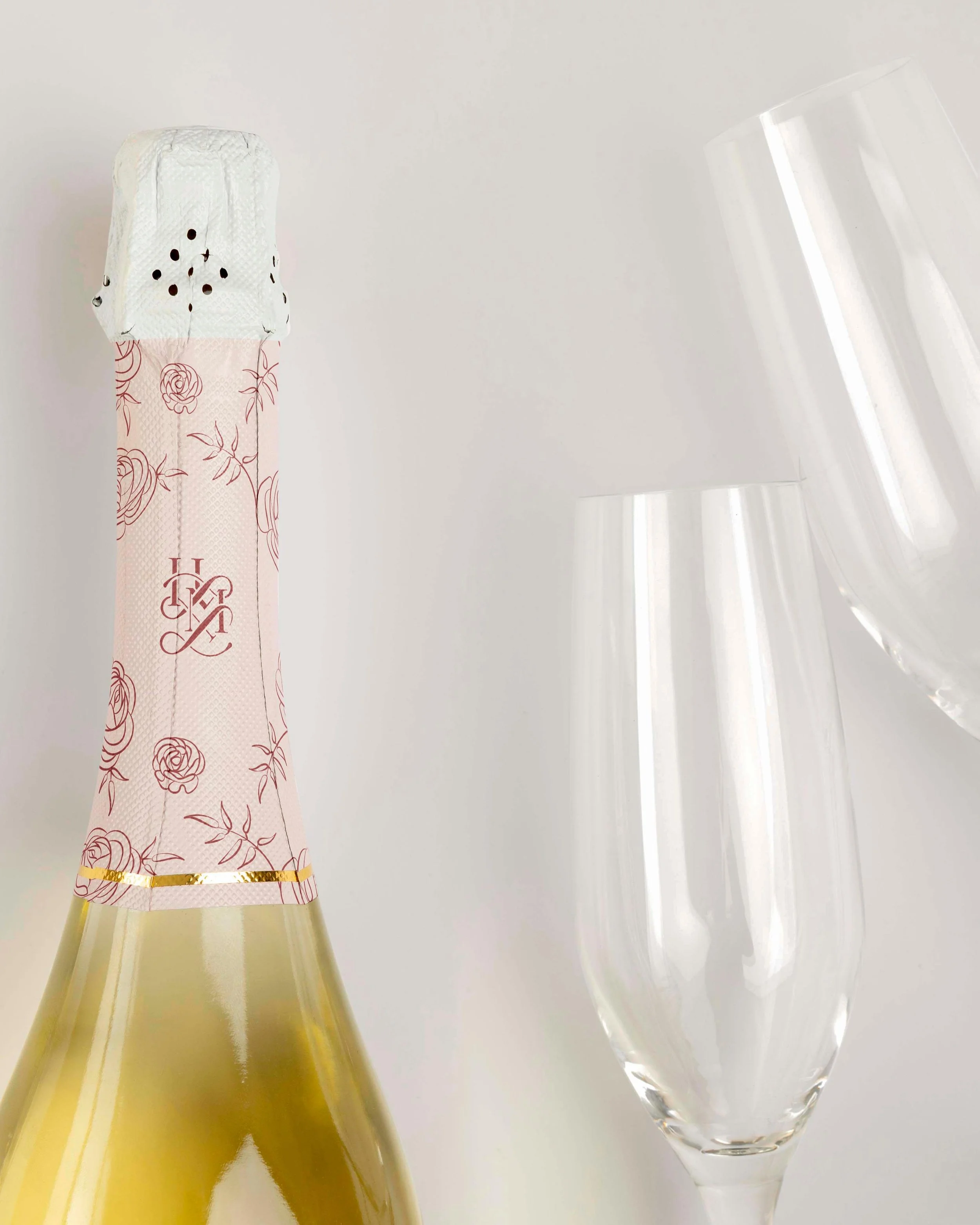
He Loves Me Flowers branding by Crème Brands
An entire brand world
It all comes together to create the right feeling for YOUR business. Good branding should help you feel more like yourself, giving you that confidence boost that comes from knowing exactly who you are, then sharing that with the world. With the right strategic foundation, branding becomes another way to communicate with your clients and work towards your goals. And when the industry is as inspiring as floral design, the final branding results can be truly stunning.
Ready to elevate your branding?
We’d love to hear about your floral studio! Grab a spot on our calendar for your free branding consultation. You’ll chat 1:1 with our Creative Director, Kathryn Joachim, all about your business and branding goals.