5 Branding Tips for Consultants, Advisories, and Firms
Your CPA, consulting, or law firm branding is a key asset in your business strategy. In these professional industries that are often associated with tradition, visual branding and logo design can often lean outdated. This is a huge opportunity for you to stand out and be remembered! There are absolutely ways to feel trustworthy and professional without blending in with your competitors. By incorporating symbolic logo design, color psychology, personality differentiators, thoughtful language, and intuitive website design, all elements of your brand identity can work in tandem with your strategic business goals. Read on for the top five branding tips for consultants, advisories, and firms, from our luxury branding and website design agency.
First up: let’s discuss logo design.
Tip 1: A clean design can still be rich in symbolism.
Often advisory and consulting firm logos are super minimalist and "business-y," but they lack depth of meaning. Just because your logo has a clean, professional look, doesn't mean it needs to be generic. By incorporating symbolism into a custom logo design, you'll have a mark that reflects your firm or company distinctly—something that wouldn't be able to be swapped in for a competitor. In the eyes of your potential clients, this helps make you differentiated and memorable.
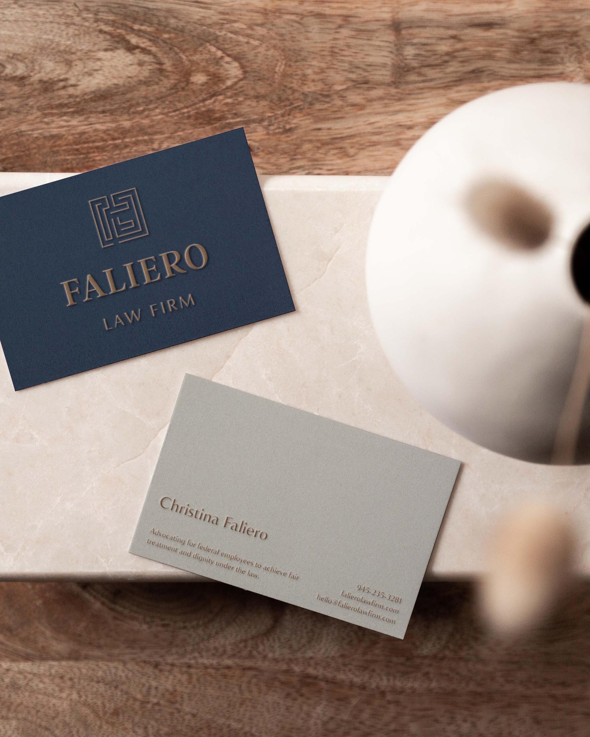
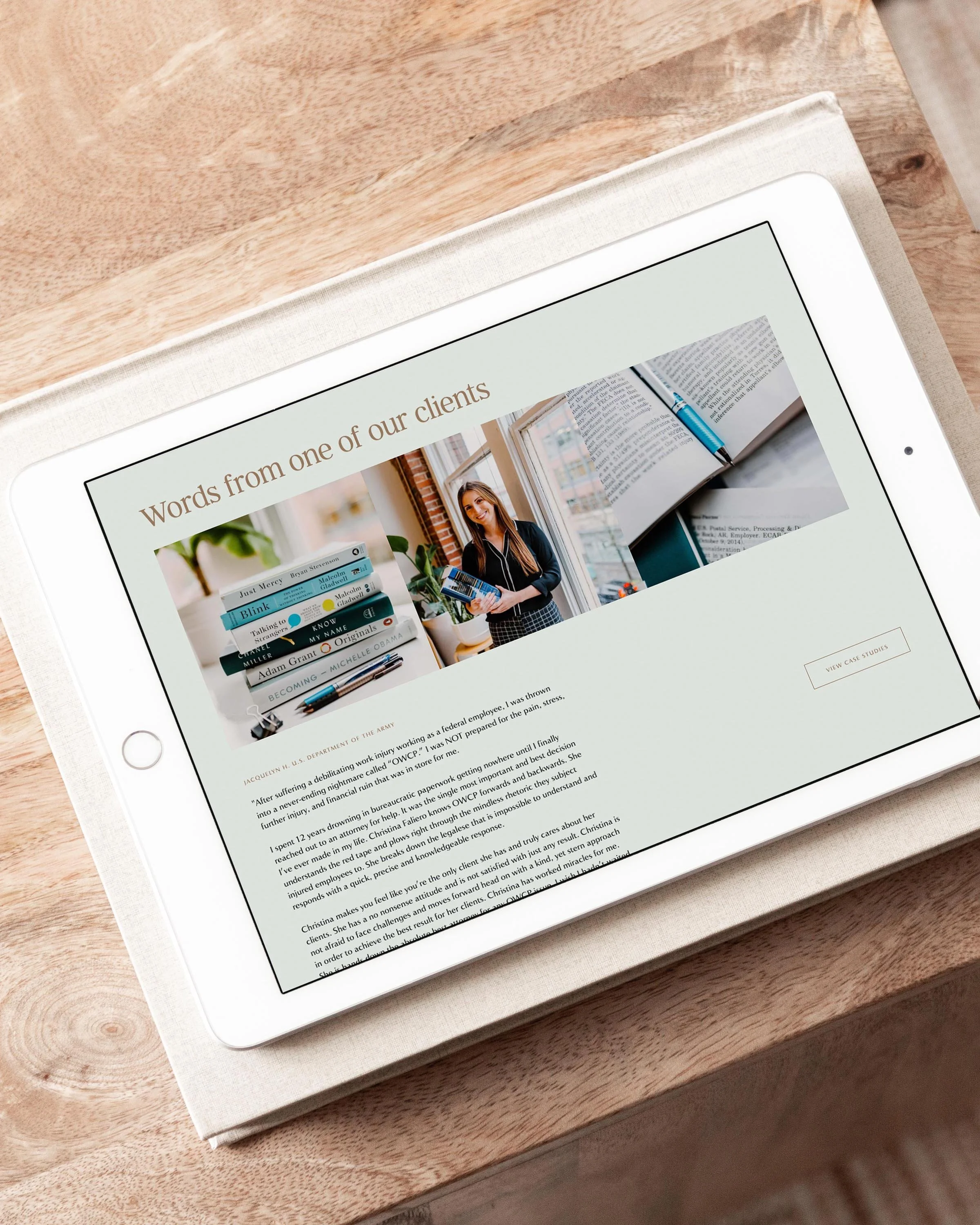
Case Study: Faliero Law Firm Logo
Faliero Law Firm advocates for federal employees to achieve fair treatment under the law. It is their mission to help make clients feel protected and believed in. When we were brought in to design their law firm logo, a primary objective was to position Faliero as credible and trustworthy. This did not mean it had to be boring or generic! The final Faliero Law Firm logo design feels safe, sturdy, and reassuringly balanced. But the design goes beyond only aesthetics to incorporate rich symbolism—the maze lines that form the F and L in the monogram represent working through legal mazing and providing clear solutions. The result is a design that feels clean and appropriate for a law firm logo, yet no other competitor could use it since it's so tailored to Faliero Law.
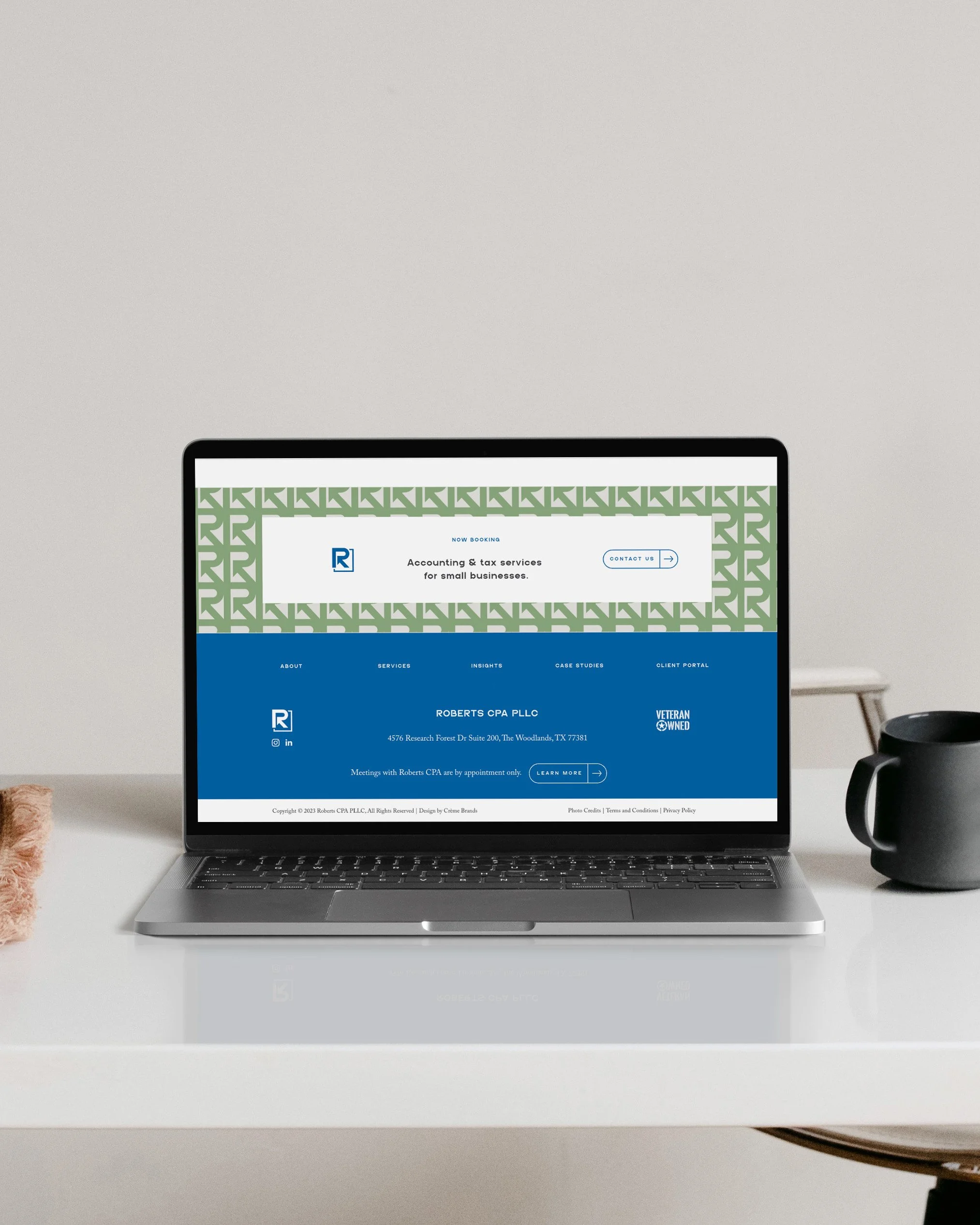
Case Study: Roberts CPA Logo Design
Roberts CPA is breaking the mold of traditional firms, with subscription-based accounting and tax services tailored to the needs of small businesses. We worked closely with founder Aaron Roberts to craft a custom brand identity that aligns with his fresh approach. The final Roberts CPA logo design feels bold and mold-breaking, while still being industry-appropriate. The reverse arrow represents how Roberts CPA helps clients find success with an upward trajectory and get back to the beginning on what they love by clearing up the numbers. The broken square symbolizes how Roberts CPA breaks the accounting box with ongoing support, clear communication, and strategic planning—going against the norm by breaking typical hourly-based models. The Roberts CPA logo proves that it's possible capture the essence of what makes you stand out, while still looking clean and professional.
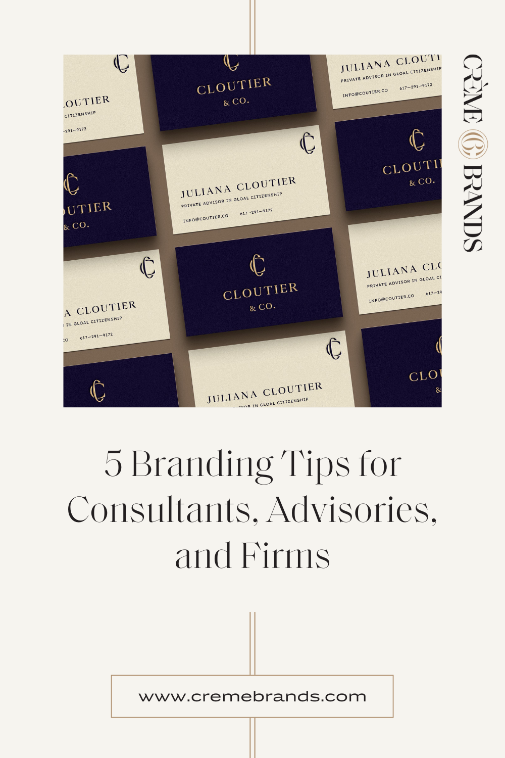
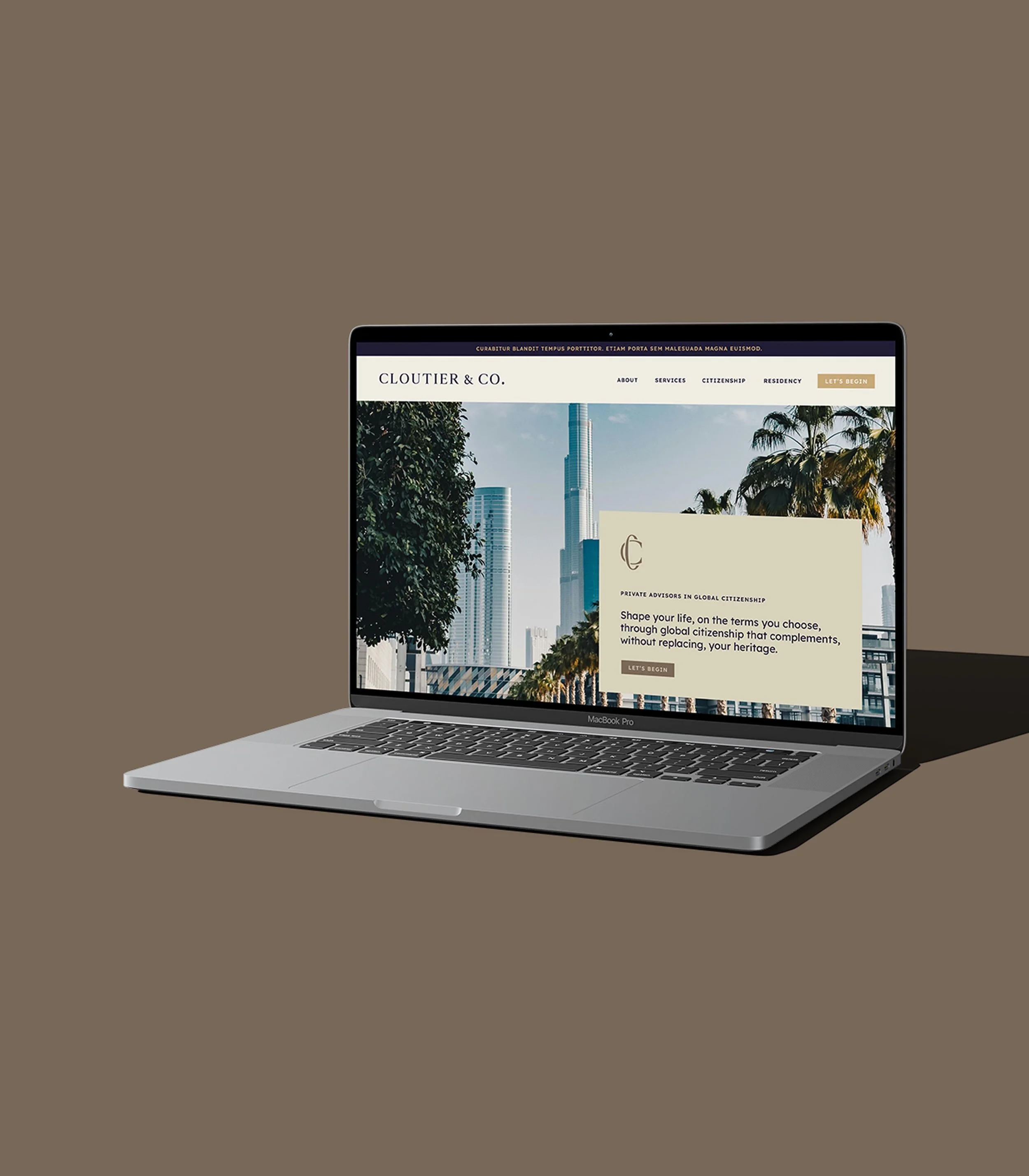
Case Study: A Pared Back Consulting Firm Logo for Cloutier & Co.
Cloutier and Co. is a private advisory in global citizenship, guiding clients from all around the world to obtain a secondary citizenship to diversify their personal and financial freedom. Founder Juliana Cloutier came to us looking for a minimalist design that still felt elevated and ownable. In the final consulting firm logo design, there are no decorative elements or embellishments. It's super understated and sleek, yet it has deep symbolism specific to Cloutier & Co. The two C's represent a client's current and new citizenships as two complementary, interlocking pieces, and the overall composition has a sense of movement that feels like spinning a globe around, representing the freedom to effortlessly cross borders. The symbolism feels perfectly in line with the main pillars of Cloutier & Co.'s mission. Even if your logo needs to be clean and understated, Cloutier & Co. shows that is can still have unique meaning.
Explore more
Tip 2: A professional color palette doesn't have to feel cold.
Your brand is how you make people feel, and color is arguably the most powerful lever in the emotion you elicit. Oftentimes, professional color palettes lean cold and impersonal, but this can leave a psychological mismatch. If part of what makes you stand out is your thoughtful approach and reassuring expertise in an area usually associated with stress and confusion, then the colors you choose should reinforce this feeling. Think of how you want your clients to feel—is your current color palette in harmony or contrast?
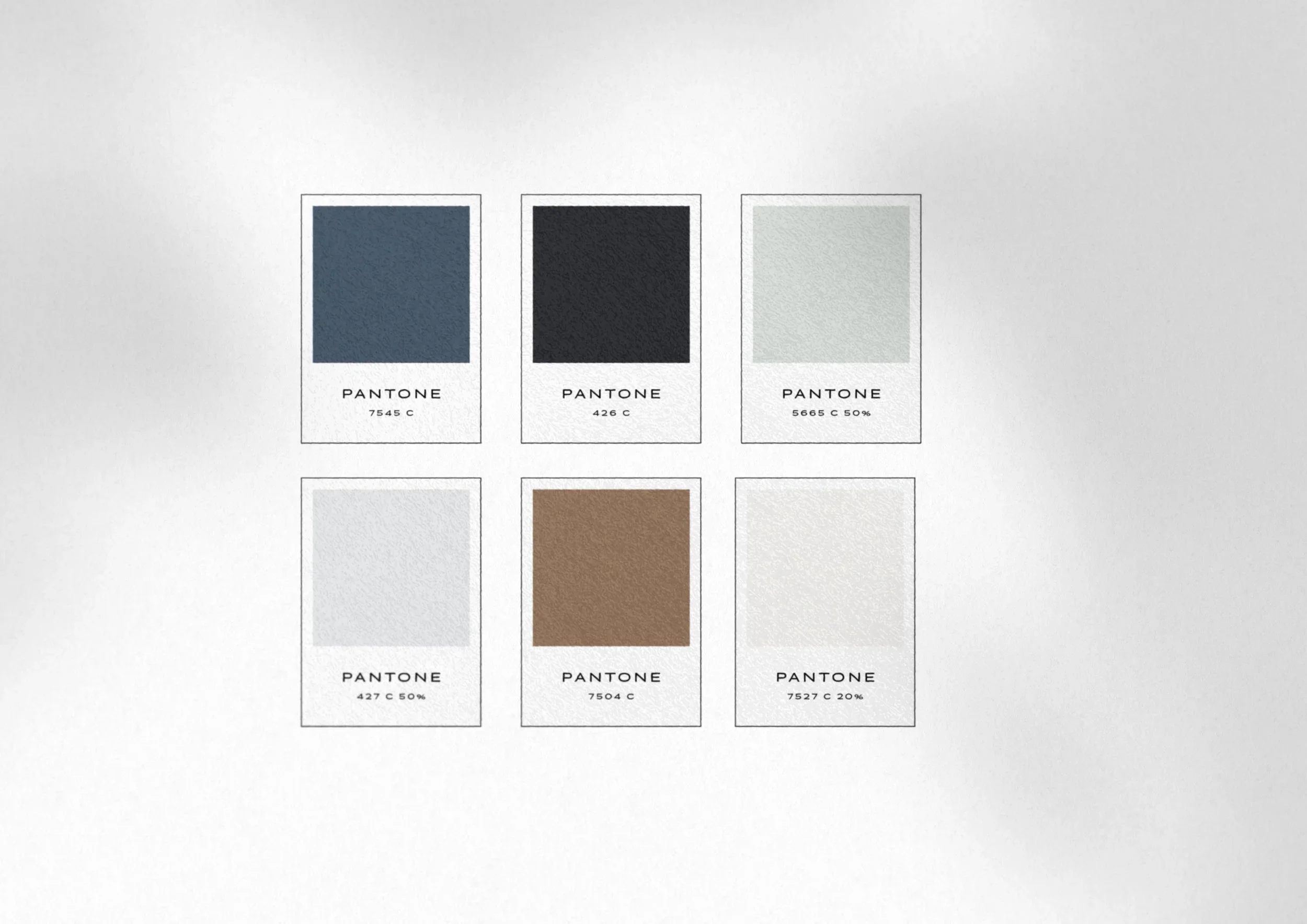
Case Study: Faliero Law Firm Branding
We've noticed a trend in law firm branding, where firms will look to tradition or competitors for inspiration. Especially in color palettes, the same primary colors seem to be on repeat (think: bright reds and blues). When we designed the Faliero Law Firm branding, we didn't want to choose these expected colors that would reinforce the harsh, stressful feeling associated with legal cases. Instead, we designed the Faliero Law Firm color palette to evoke a sense of calm to help reassure clients that their matters were being well taken care of. The color palette is professional and trustworthy, but warm and safe—exactly how it feels to work with Faliero Law Firm. By first zooming out to define goals for how the brand needed to resonate with prospective clients, the color psychology that guided this brand became clear. The final color palette in the Faliero Law Firm branding stands out from industry competitors by aligning with the emotional experience of working with the firm.
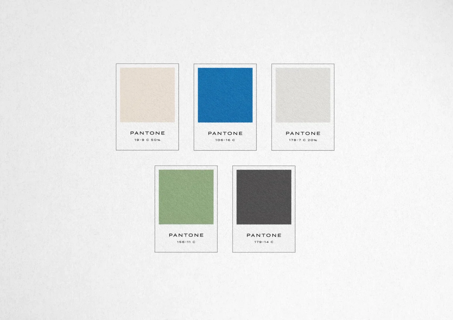
Case Study: Roberts CPA Branding
From a branding perspective, the accounting world has many parallels with law firms. In accounting firm branding, you typically expect outdated looks and harsh colors, like black and red, that evoke negativity and stress. When we designed the brand identity for Roberts CPA, we took this industry context into account. Since Roberts CPA is bringing a fresh approach to an industry associated with being outdated, his color palette needed to feel distinct from competitors. The final color palette is confident, positive, and energizing, while still being solid, dependable, and professional—the perfect fit for Roberts CPA's positioning. The warm neutrals give the palette a warm and approachable feel, while the green and blue mix in a fresh energy. The final brand design shows that you can have a professional color palette without being cold or boring.
Tip 3: Lean into your personality.
You can still be "professional" while playing into what makes your brand unique. It makes strategic sense: you want to differentiate yourself from competitors, attract the right clients, and be remembered long after your first impression. The best way to do this is to look inward at what makes you unique, instead of what's already been done in your industry.
Case Study: Amy Stuttle Consulting Firm Logo
Amy Stuttle Consulting helps medical professional with the business side of building thriving clinics—drawing from her years of experience as founder and CEO of Victory Men's Health. Amy's personality is strong, bold, and confident. She gets big results and is self-assured in her strategic expertise. We designed the Amy Stuttle Consulting Firm logo to capture this empowering feeling. The icon represents data in motion, giving the feeling of energetic momentum and positive growth. Whereas you might expect a consulting firm logo design to lack personality, the Amy Stuttle Consulting logo fits hers to a T—while still incorporating industry-appropriate symbolism (i.e., the bar graph) that will resonate with her doctor clients. This makes Amy stand out from competitors and become a no-brainer for her ideal clients.
Tip 4: Craft your language thoughtfully.
Like your visual brand, your language needs to fit your business goals and priorities. When naming your business or crafting your tagline, start by defining your goals, competitor terrain, and business context. For example, a niche industry would want to prioritize clarity and educating about what exactly their services are, whereas these considerations don't apply to law or accounting firms.
In professional industries, there's still room to play! Little shifts can have a huge impact, such as the difference in feeling between "Next Gen Collaborative" and "Next Gen Consulting." The same branding principles and strategies—capturing the right emotions, setting yourself apart from competitors, and making decisions based on your unique goals versus what’s expected—apply to language too.
Case Study: Cloutier & Co. Business Tagline
If your speciality is niche, prioritize clarity. In the case of Cloutier & Co., advising clients on obtaining a secondary citizenship is an uncommon service, so the branding needed to help communicate and educate about what they do. During the brand strategy portion of our process, we helped wordsmith the Cloutier & Co. tagline. We landed on the primary tagline, "Private advisors in global citizenship" to convey the Cloutier & Co. services. We also crafted a secondary, more creative and clever tagline, "Diversify your personal and financial freedom," that speaks to the results Cloutier & Co. achieves for their clients. This tagline configuration is great for collateral design, like on the corner of a business card or to add detailing to a website. How well-understood are your services? This will let you know how you should prioritize clarity in your language.
Case Study: Next Gen Collaborative Business Naming Consultation
Just as you want to carefully consider the emotions you're evoking with your color palette selection or logo design, you'll want to carefully craft your business name to capture the right feeling. When we worked with Jenny Dinnen & Katie Rucker, they were founding a new consulting business to empower 2nd generation business owners to confidently step up and lead their family-owned businesses by honoring the past and innovating for the future. We consulted on their business name, analyzing dozens of options, and brainstorming everything from symbols of metamorphosis like dragonflies to symbols of family like arrows, batons, apples, and trees. We considered all the ways to tinker with the name, such as using "collaborative" vs. "consulting." The final name, "Next Gen Collaborative," sets the consultancy apart from stuffy, generic firms—instead, the name captures feelings of impact, collaboration, generosity, approachability and authenticity. Whatever feelings you'd like to evoke, if you have the opportunity to name your business, take the time to analyze, wordsmith, and tinker with all the elements so you can craft something that resonates.
Tip 5: Have a singular, prominent call to action on your website.
We've looked at a lot of small business websites over the years. It's surprising how many are missing a simple but foundational element of strong website design: a prominent CTA (Call to Action)! This is the next step you'd like prospective clients to take after they browse your website. It could be scheduling a free consultation call or filling out your contact form to get started. Whatever it is, you want to make it easy to work together, without any guesswork. Don't bury your email or have visitors write a vague message—instead, make prospective clients feel secure in your process. As for the language, you can level up from "Contact us" to include active language, such as "Get started" or "Schedule a consultation." This CTA should be placed prominently throughout your site, such as in a button in your website header and at the end of pages, so that when visitors reach the bottom, there's a clear next step to take instead of a dead end.
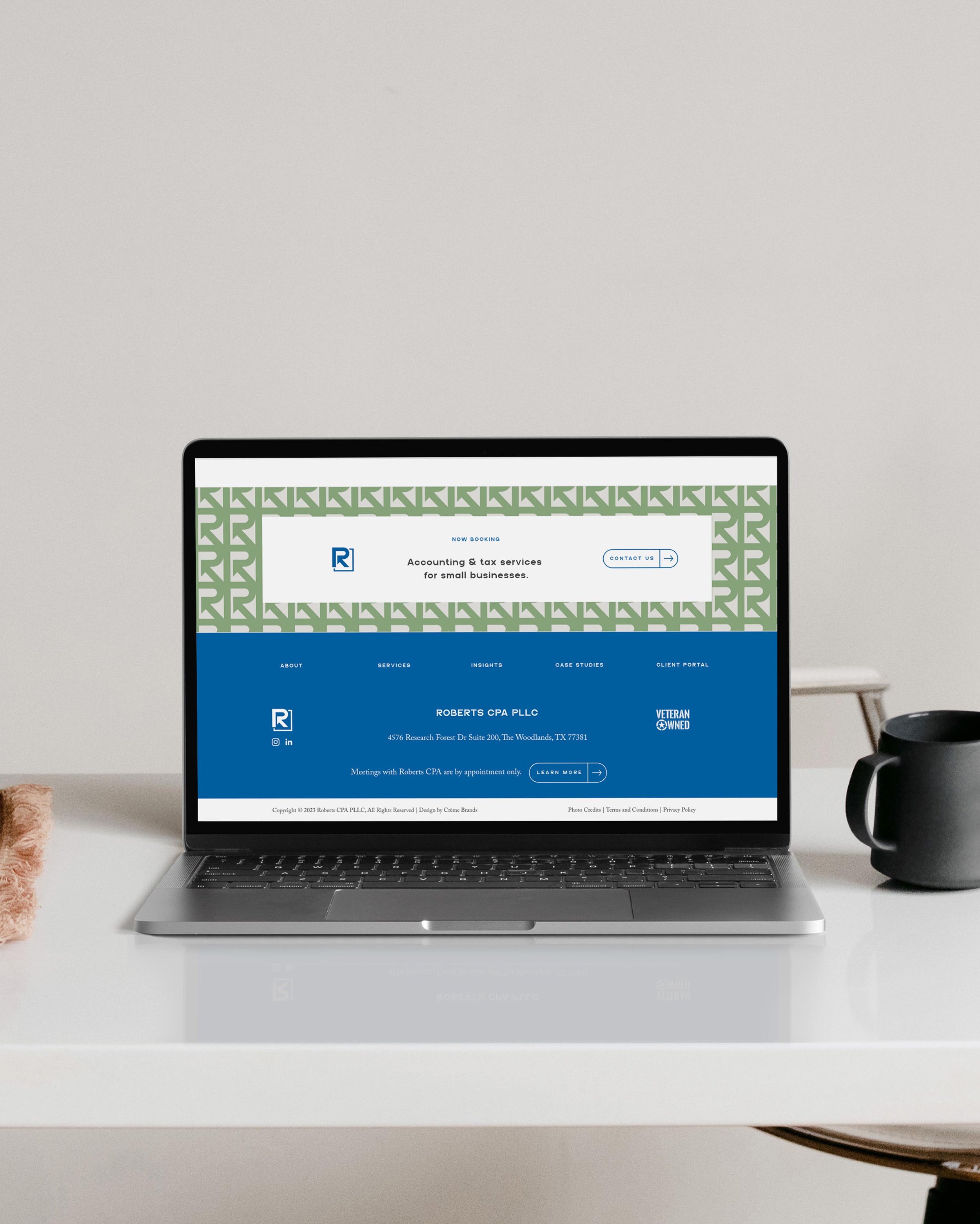
Case Study: Roberts CPA Website Design
In the case of the Roberts CPA website design, one of our primary goals was to make it easy for prospective clients to start working together. We accomplished this with a prominent CTA to contact the firm throughout the site. The website header features a unique CTA button design that stands out from the rest of the navigation items, and we incorporated eye-catching end-of-page CTA sections throughout the site to eventually funnel all users to the contact page. On the contact page itself, the form has a few key questions—not too many to overwhelm visitors and create bounces, but enough for the Roberts CPA team to get the information they need and for the visitor to know they're giving the right info without any guesswork. Once a user fills out the form, they're immediately redirected to a page where they can schedule a consultation call with an embedded calendar of available appointment slots. Because of this strong CPA website design strategy, the user is guided step-by-step to begin the process of becoming a client. And on the Roberts CPA side, the website is functioning like a member of the sales team—constantly adding meetings with prospective clients to their calendar.
The bottom line: Good branding makes strategic sense.
In each facet your business, thoughtful strategy is the key to powerful branding and website design. From your color palette to your logo design to your business name, the way to stand out is to lean into what makes you, you. You can absolutely achieve a unique logo, brand, and website design in a professional field, while still being industry-appropriate. The nuances of branding for professional consultants, advisories, and firms require careful strategy and sharp analysis—things that you're well-positioned to take on!

Book a free consultation
Wondering if your law firm, advisory, or accounting group could benefit from a rebrand? Looking to open your own solo practice? Book a free brand review with our creative Director, Kathryn Joachim, to strategize. We'll audit your branding or website and discuss next steps for bringing your visuals into alignment with your goals.