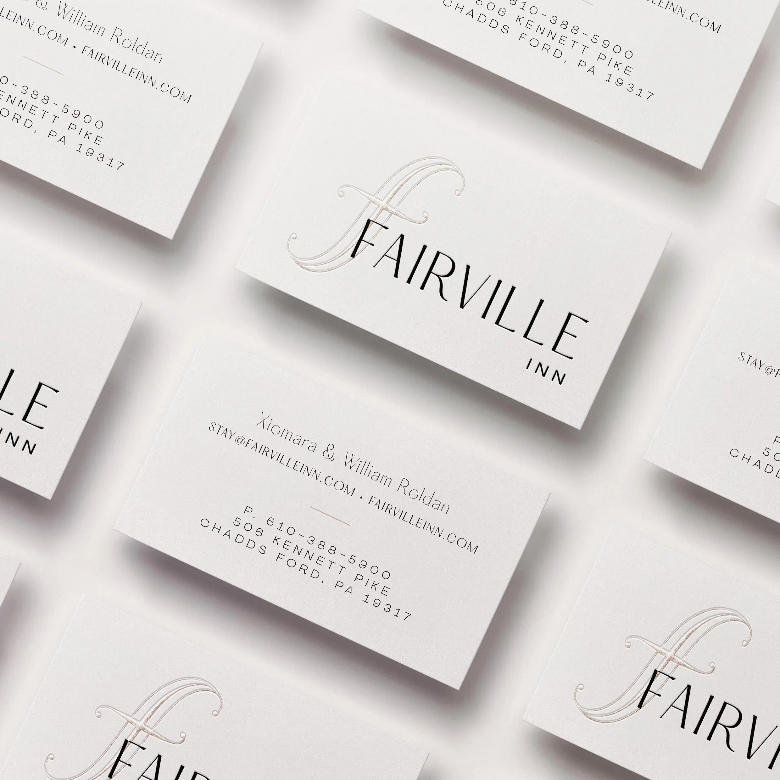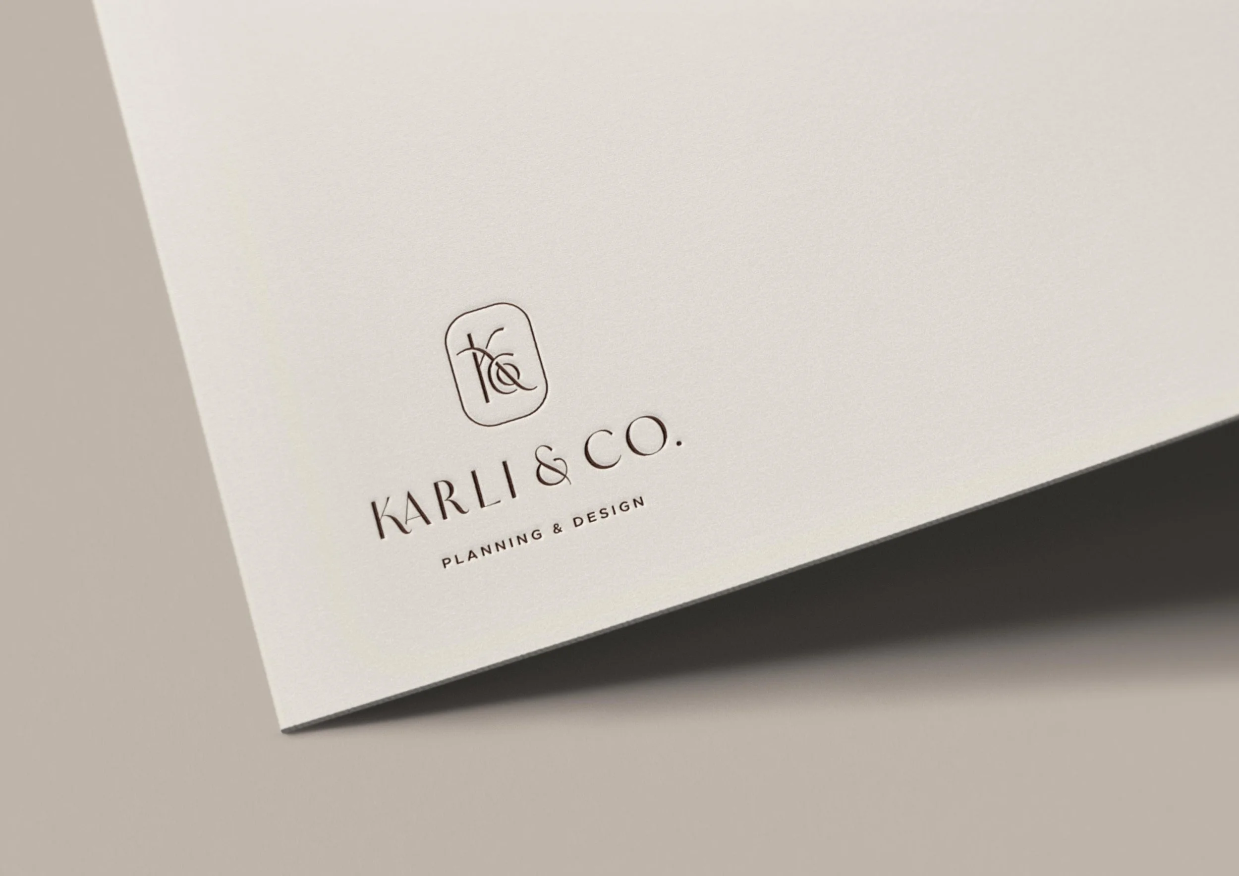
Karli & Co.
Chic, airy branding that feels lived-in and effortless, just like Karli & Co.'s wedding planning approach.
Project scope
Branding
Website design
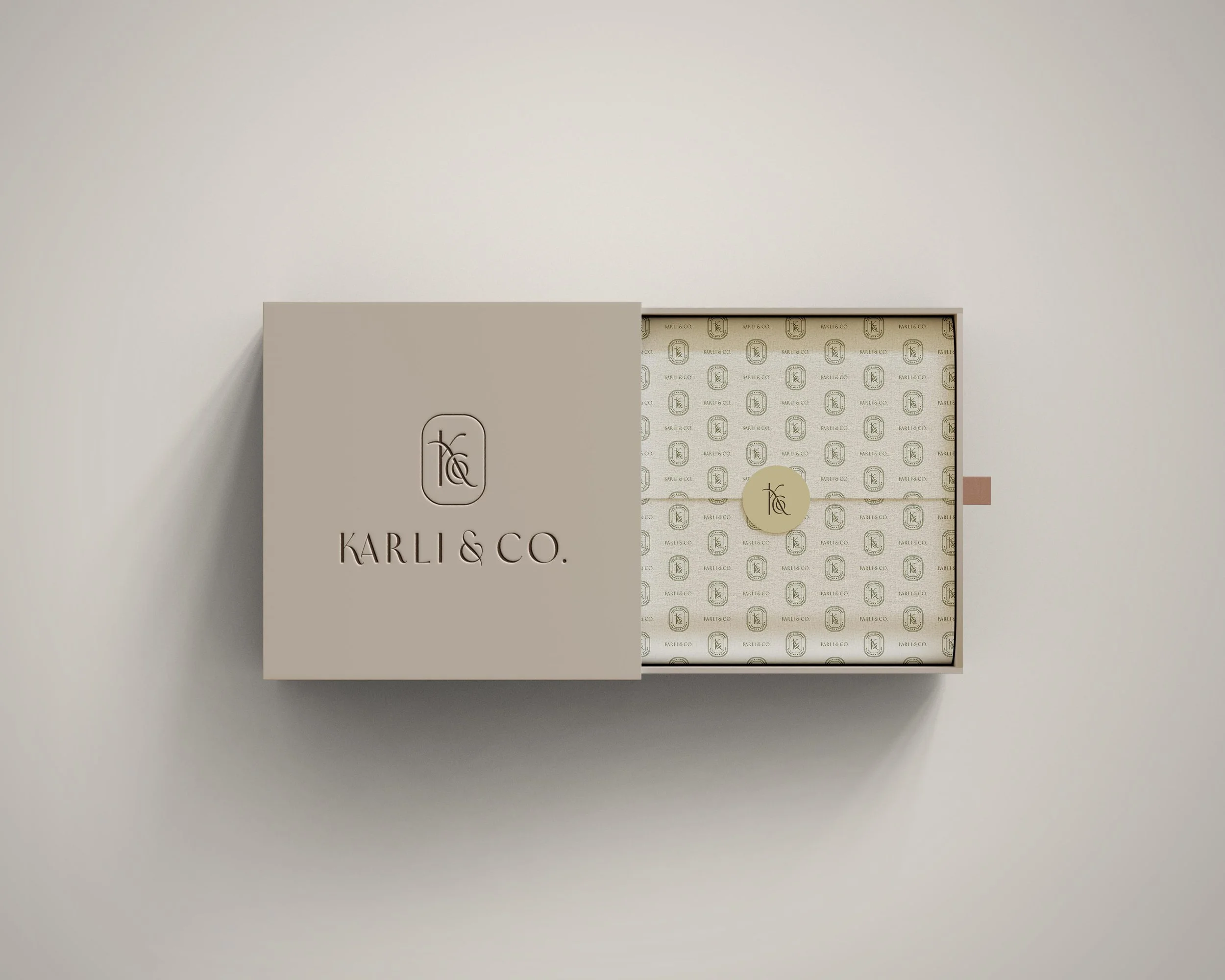
As one of the first wedding planners in Vail, Colorado, founder Kelly Karli has been setting the standard for full-service planning and design since 2008.
She’s known for producing events where every moment feels beautifully considered. Her calm but confident demeanor gives clients a wedding experience they can live in.
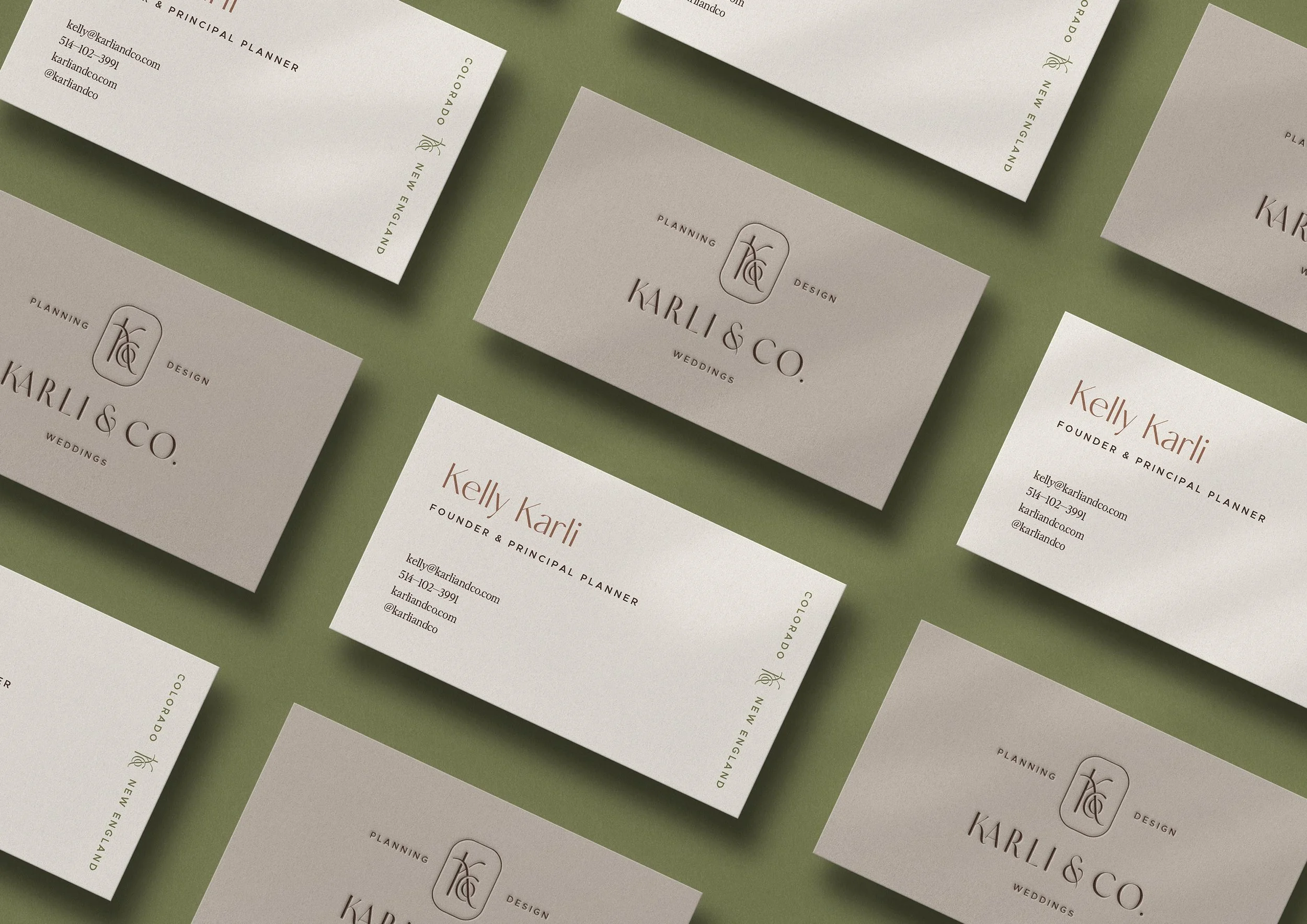
As Kelly entered the next chapter of her business, expanding from the Rocky Mountains of Colorado to the coast of New England, she was ready for new branding to help her stand out.
She needed something that fit her so well it couldn’t be confused for anyone else. Like her wedding planning style, the new branding had to be calm but confident, pushing creative boundaries while still feeling understated.
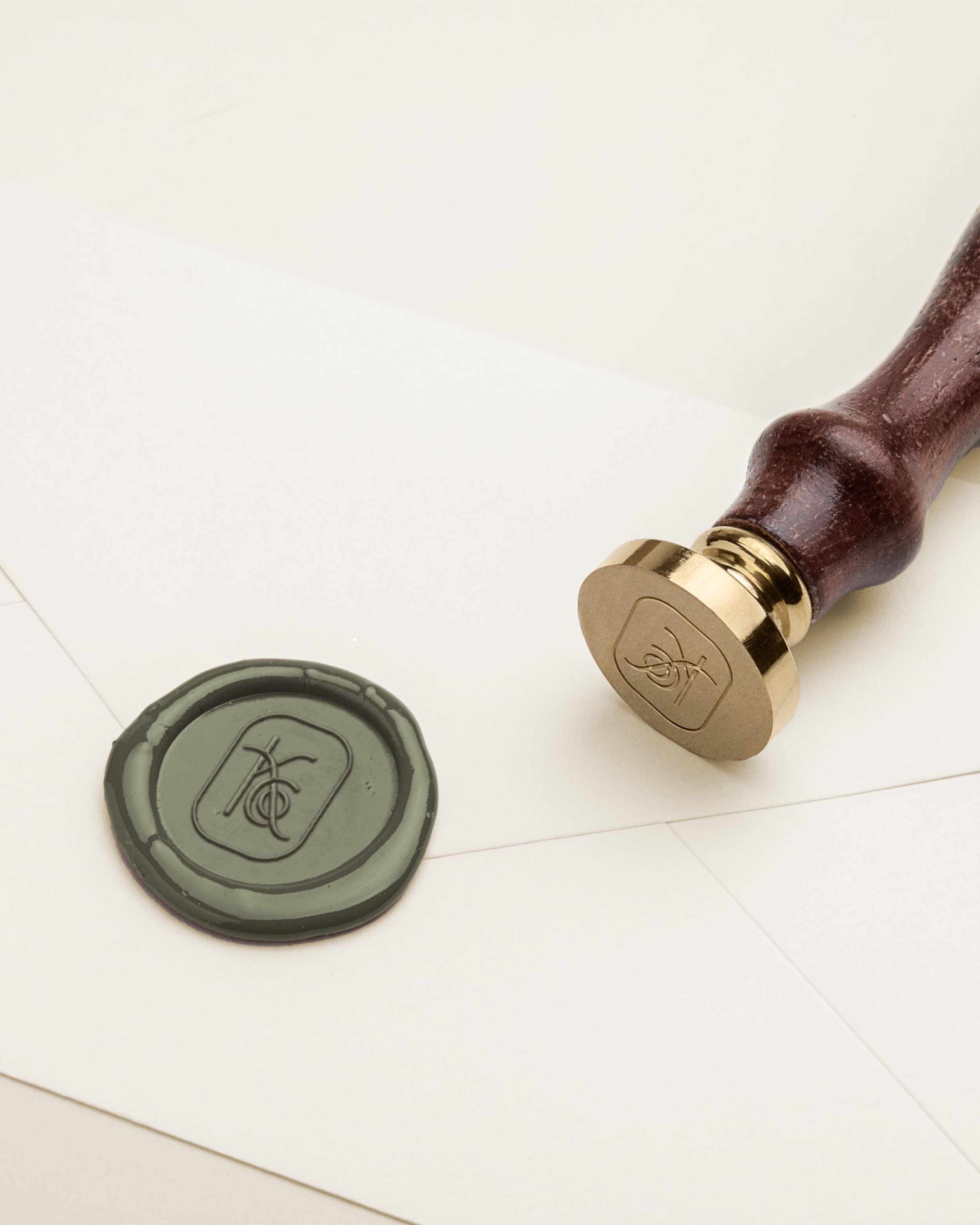
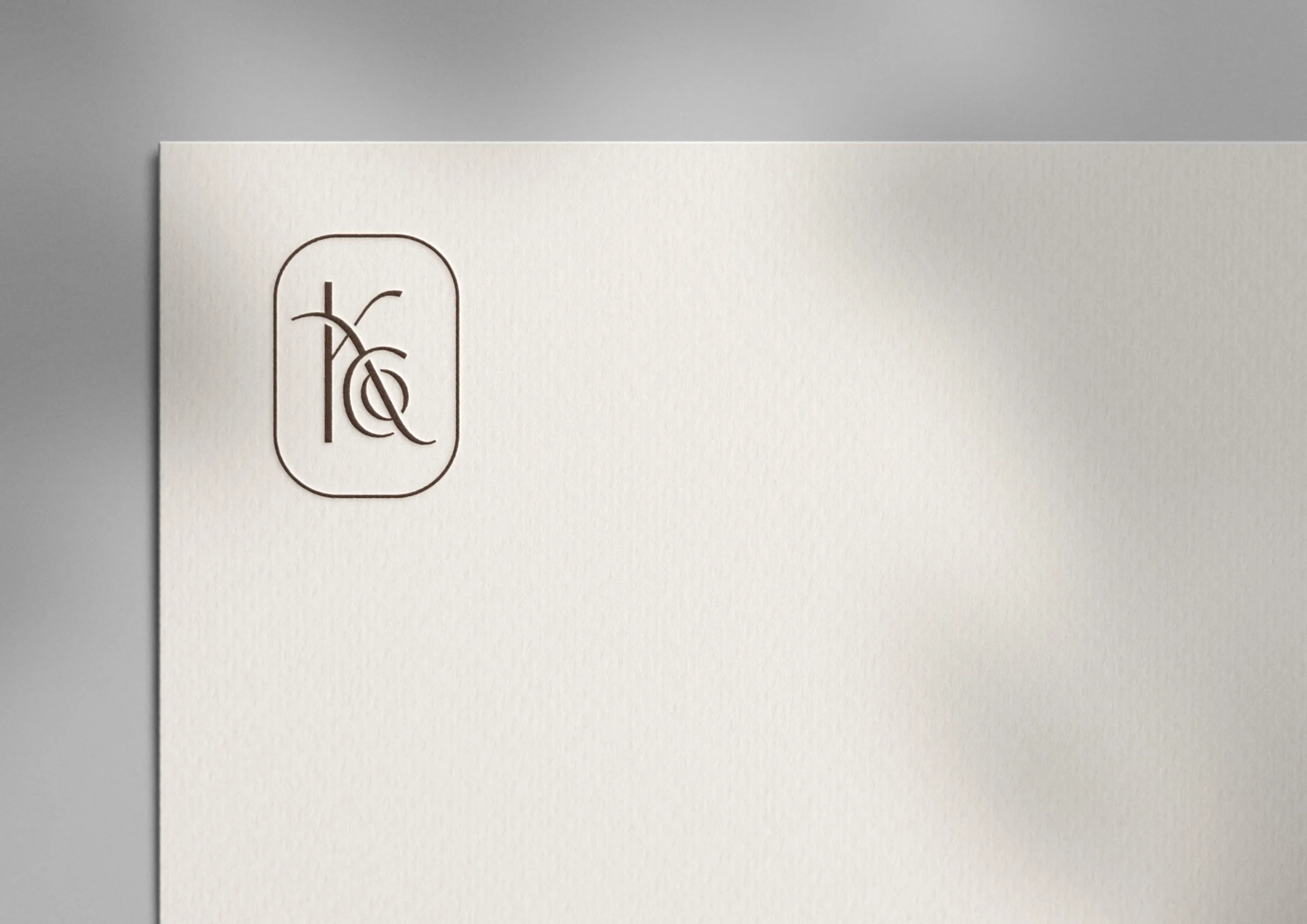
Logo symbolism

mountains
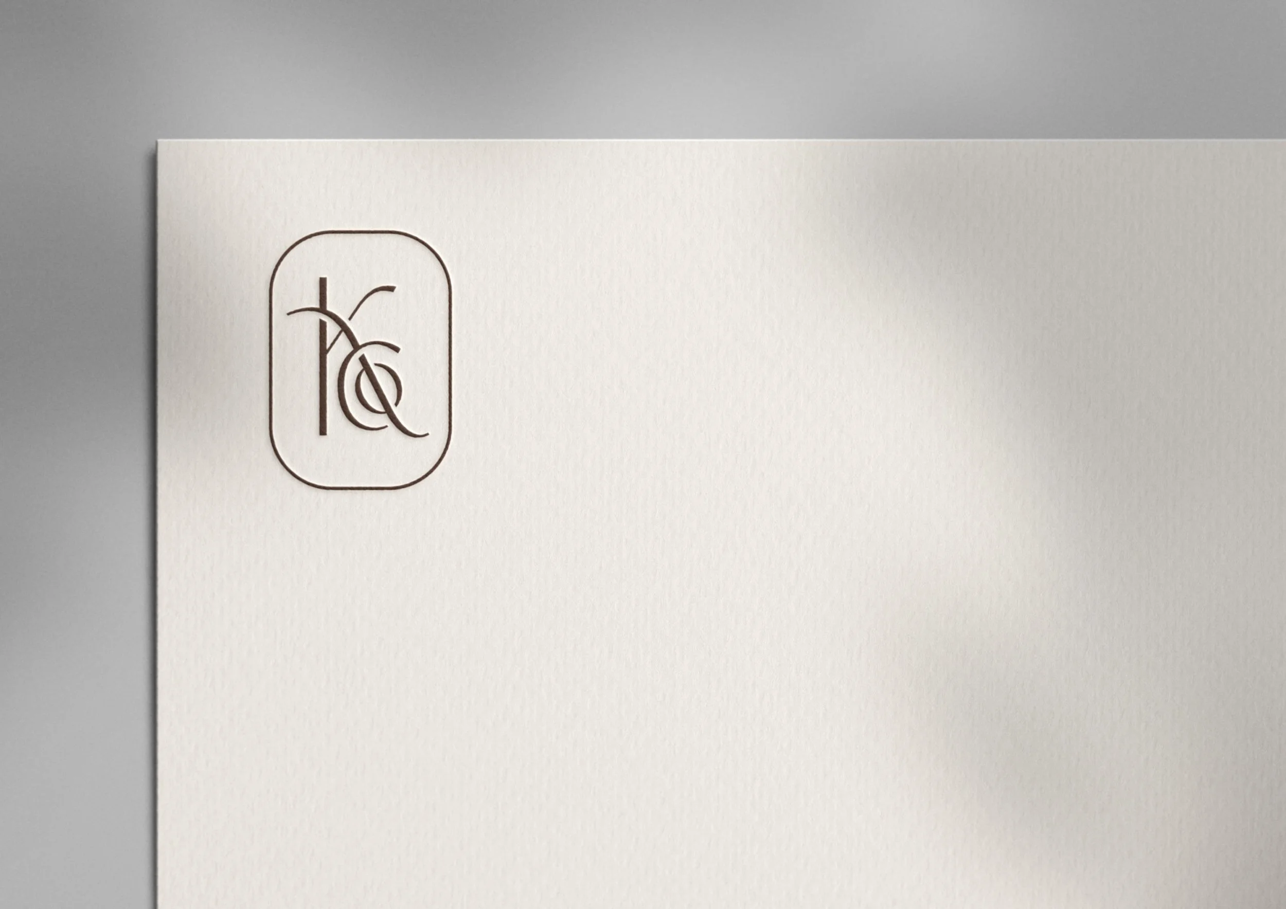
The K is inspired by the lines of a mountain, representing the Colorado Rockies where Karli & Co. was founded over a decade ago and continues to compose breathtaking weddings.

water
The nested "Co" evokes the feeling of ripples in the water, representing coastal New England where founder Kelly Karli is originally from and the next chapter of Karli & Co. will unfold.

flow
The overall execution has a sense of graceful ease. It feels lived in and effortless, just like Karli & Co's events and planning approach.
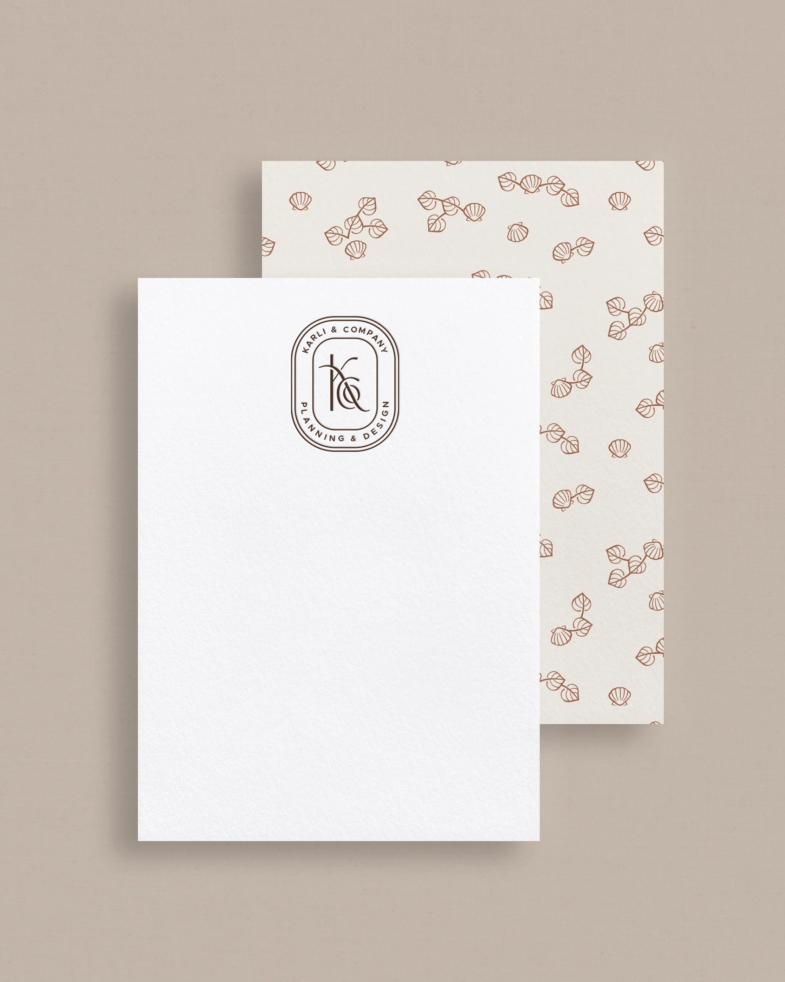

A warm, nuanced color palette



We took paired rich browns and warm, almost golden, greens from the Colorado landscape with dusty blue and sandy neutrals from coastal New England. The palette feels elevated and interesting, and will beautifully frame up Karli & Co.’s portfolio photography.
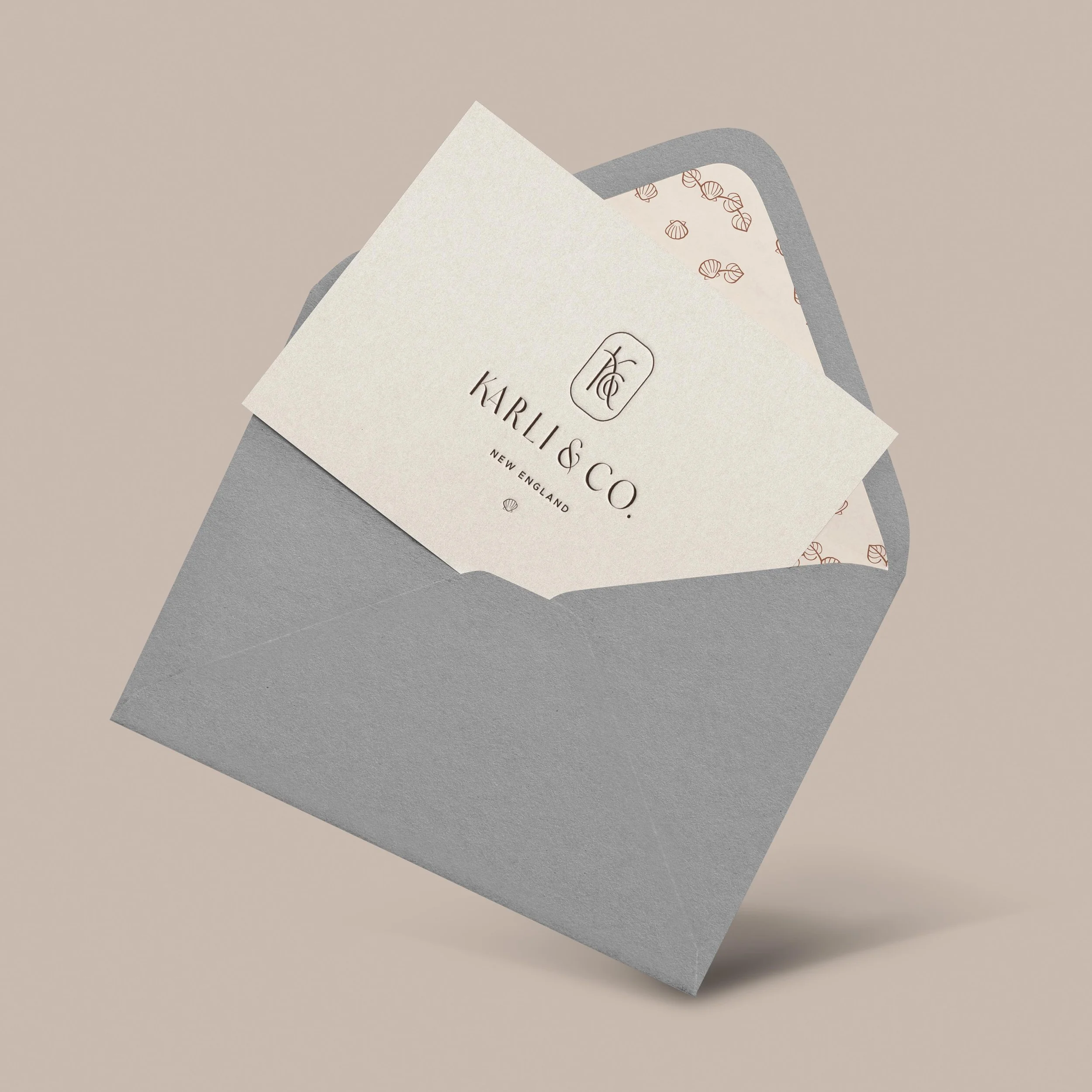
Custom icons
A custom icon for each market—an aspen leaf for Colorado and a shell for New England—adds thoughtful detail to the brand system.

Colorado

new england


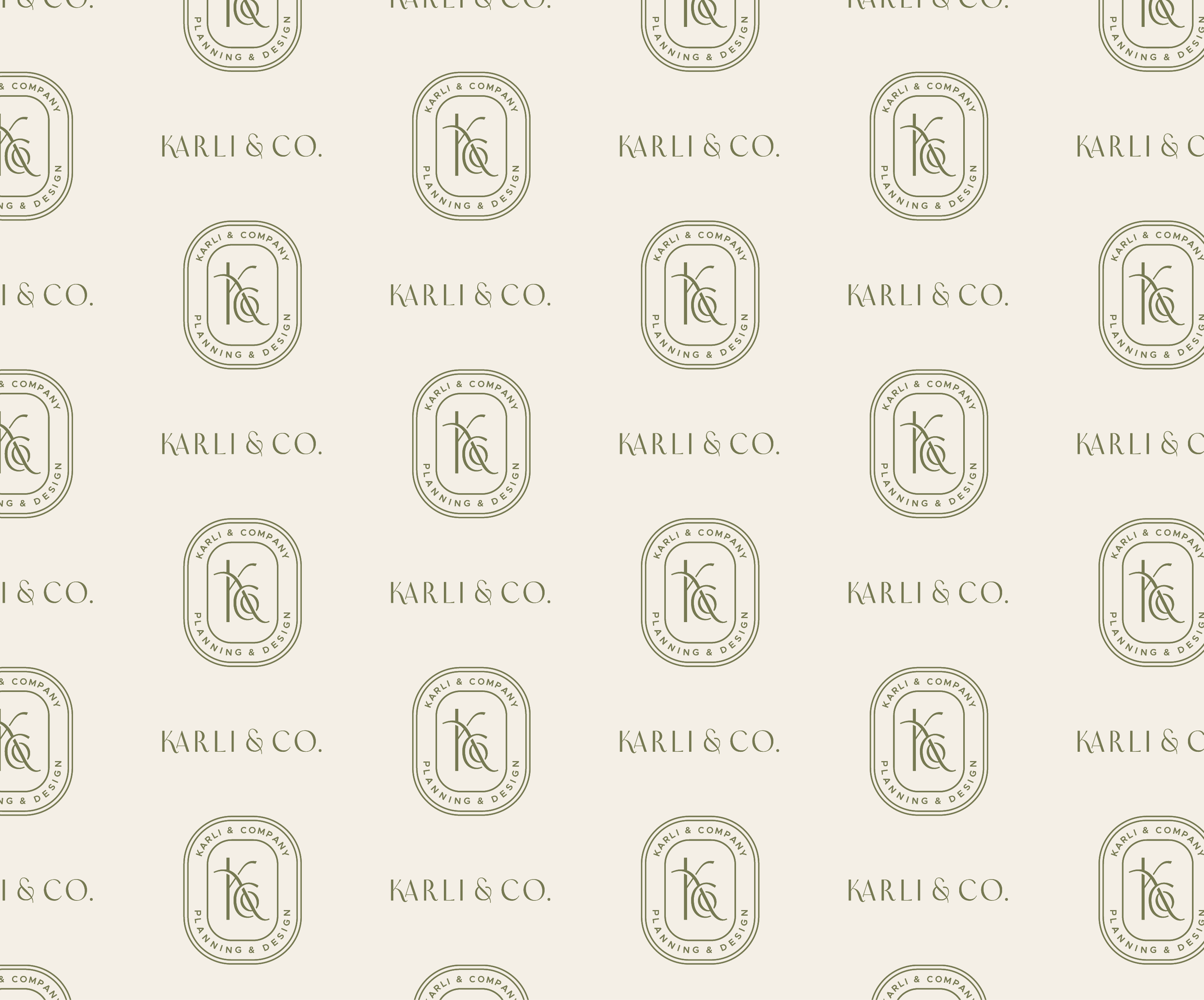
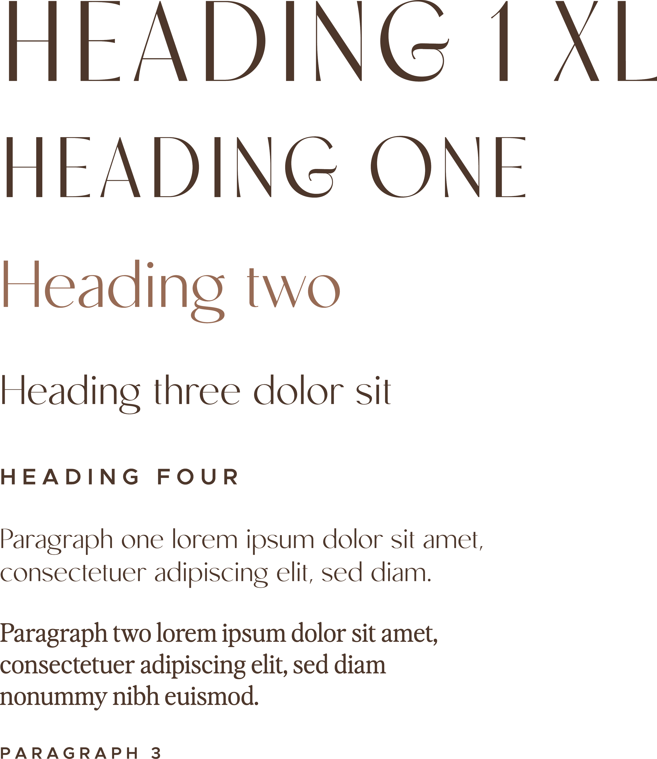
Curated typography
We selected a mix of heading styles that feel both flowing AND pared back. The serif for paragraph text brings in a chic, editorial note.