Fresh Life Marketing
Award-winning brand and web design to represent a marketing agency’s fresh personality.
Project scope
Branding
Website design
Fresh Life Marketing offers content repurposing with a twist.
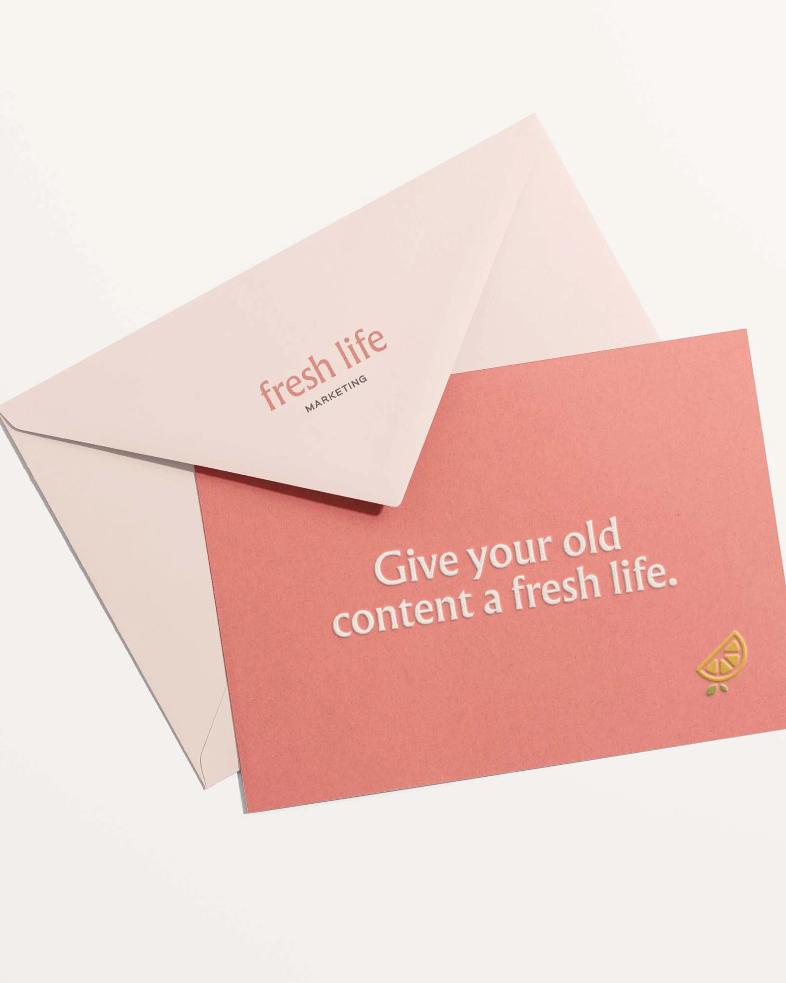
Founder Renee Dick is the wiz behind Fresh Life, working with brands to take old content and turn it into multiple pieces of something new. We crafted a brand and website design for the agency that went on to become an award-winning design at the Louisville AIGA 100 Show.
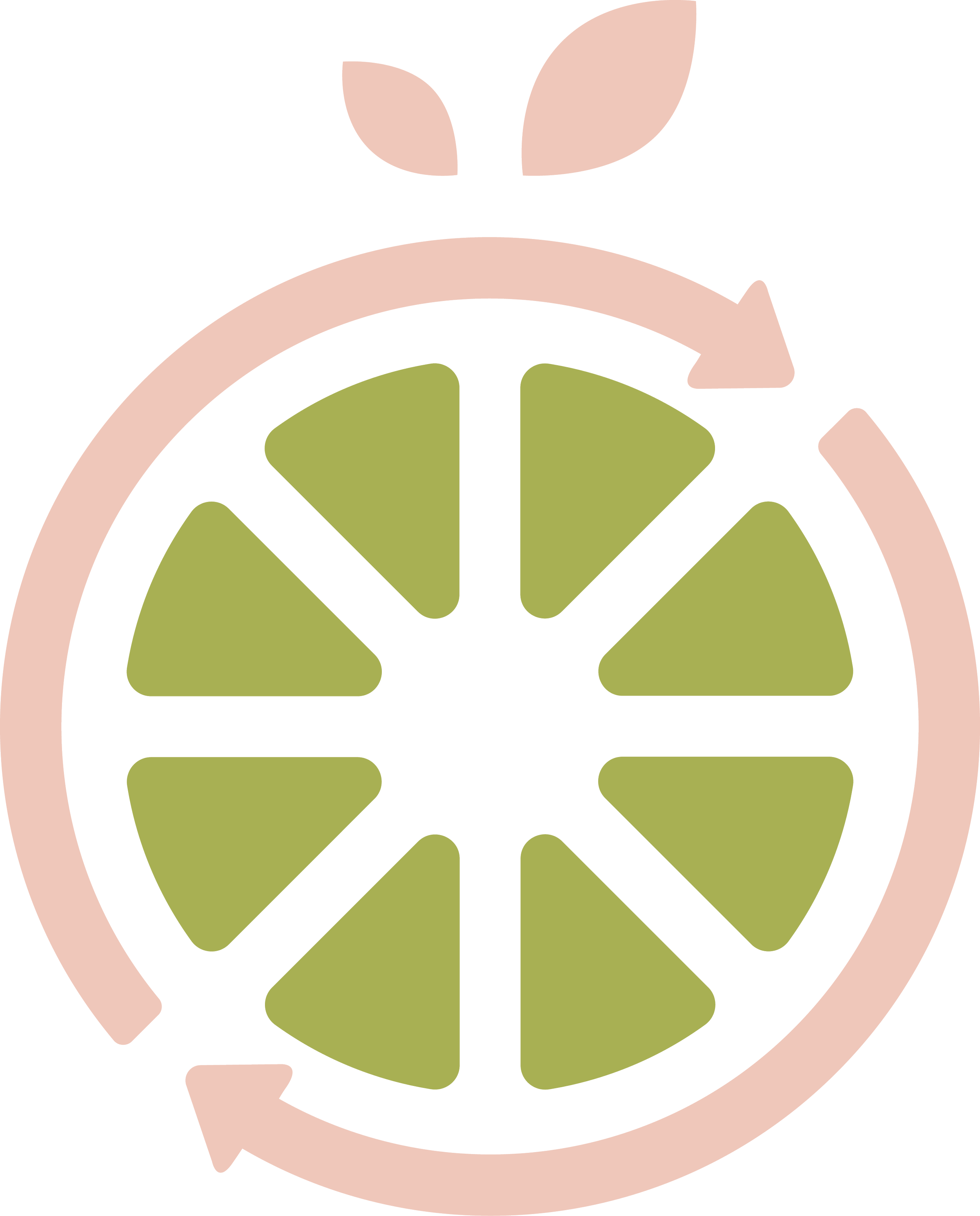
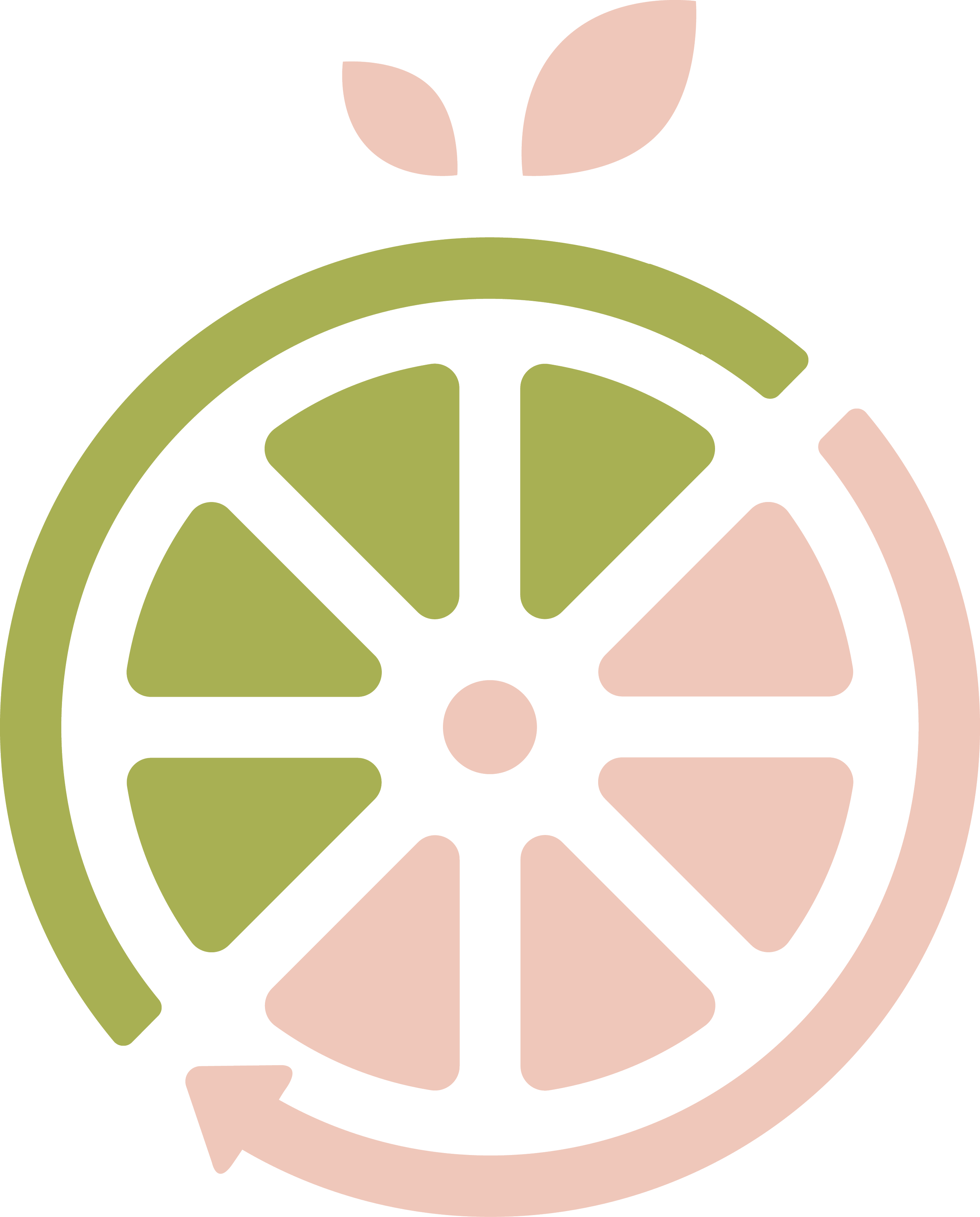
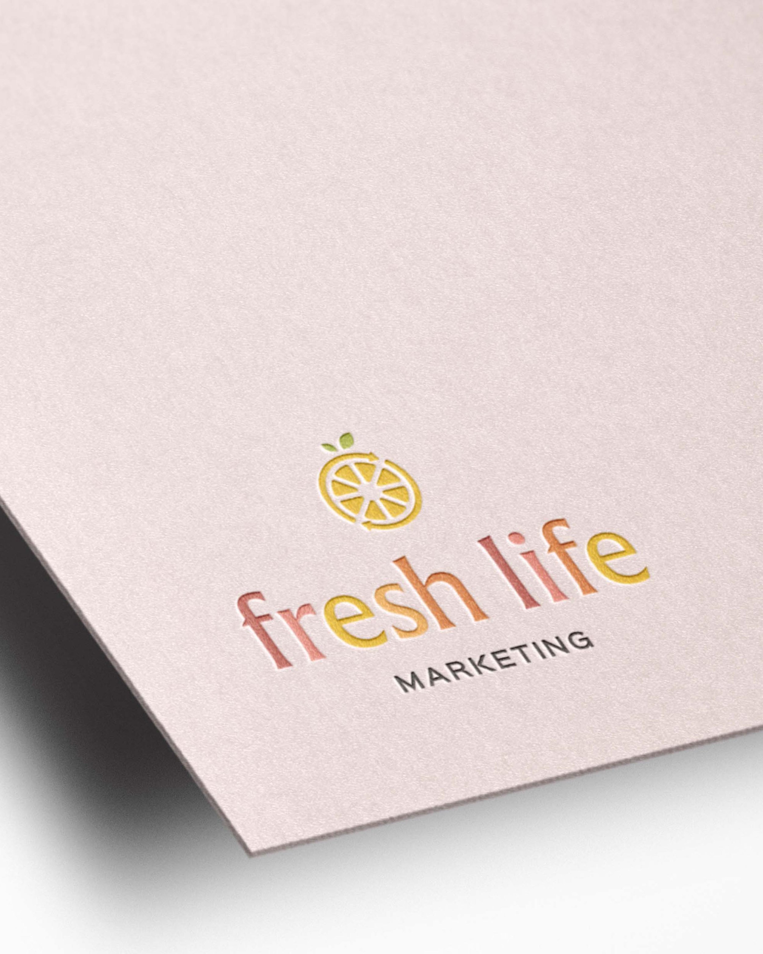
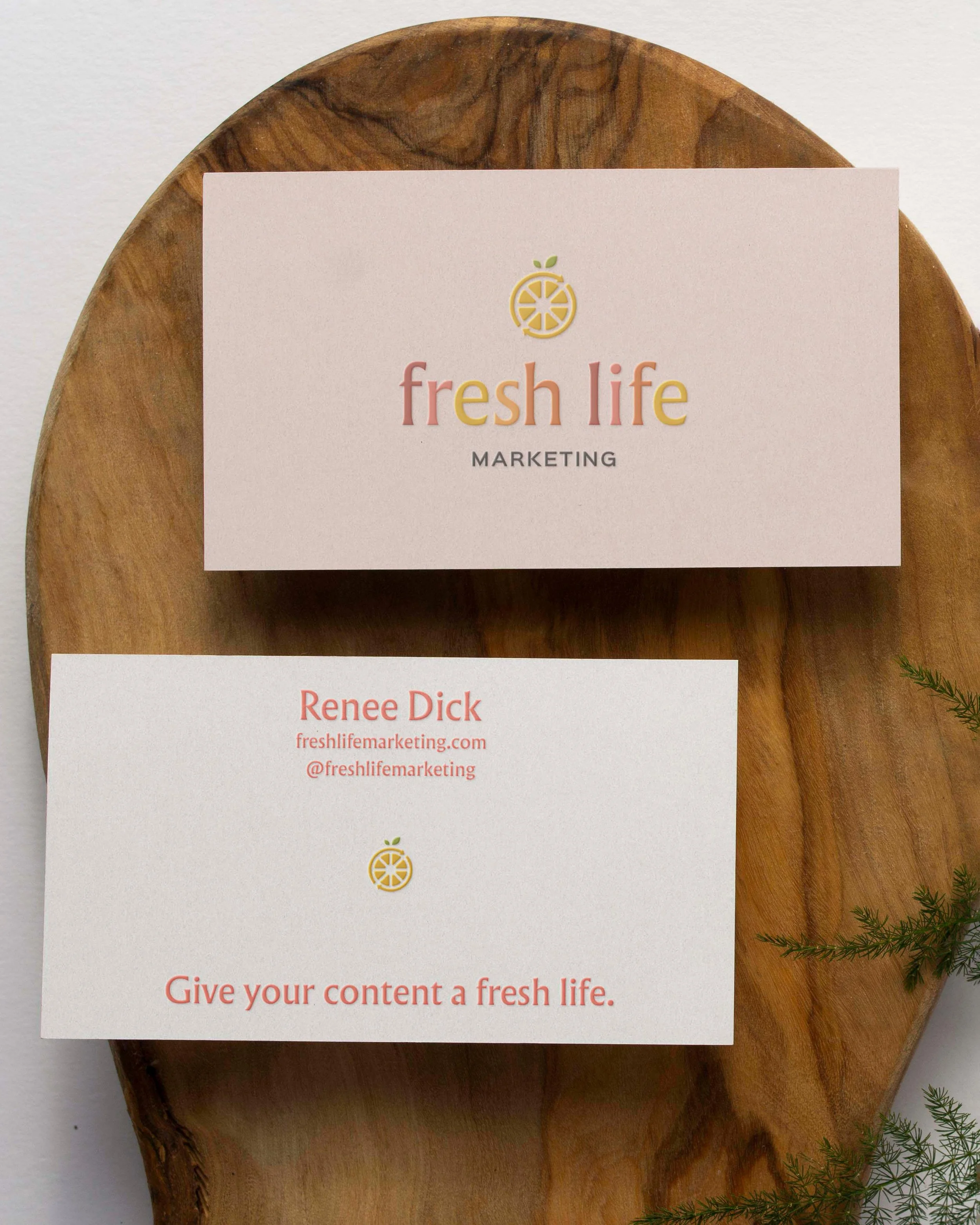
For the logo design, we took the concept of “repurposing” literally, using citrus symbolism to represent the process. It starts with one slice to represent a single piece of content. When we take that apart and dig in, we can see how the brand brings fresh content to life.
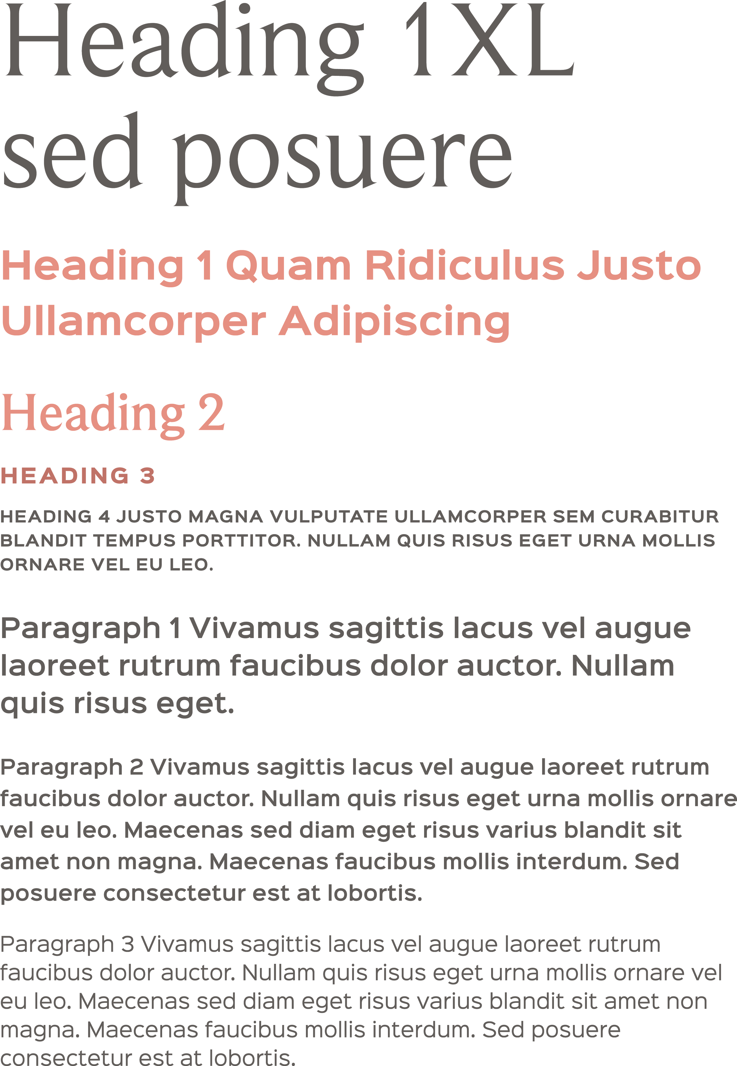
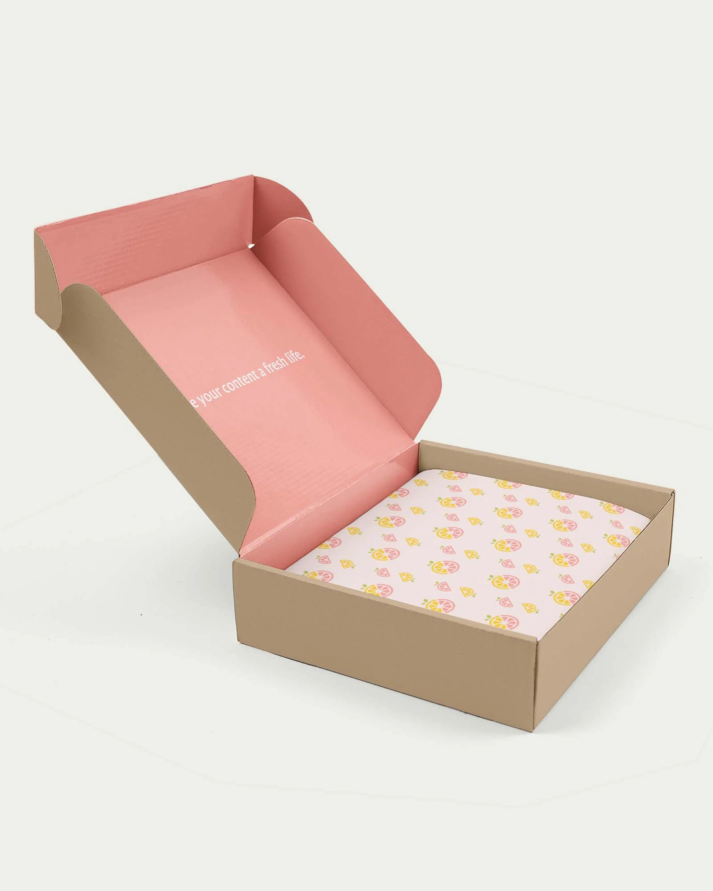
To lean into this “good vibes” feeling, the entire brand suite has a playful and upbeat tone, from the fonts to the brand illustrations to the color palette that reinforces the fresh citrus theme.
Logo symbolism
growth
Leaves represent the audience growth content re-purposing facilitates.
Splitting content
The citrus slices represent splitting content into new pieces.
freshness
Twi indidivudal citrus slices are within the mark, representing freshness.
repurposing
The arrows that create the rind represent ongoing sustainability and replenishment.
Color
Typography
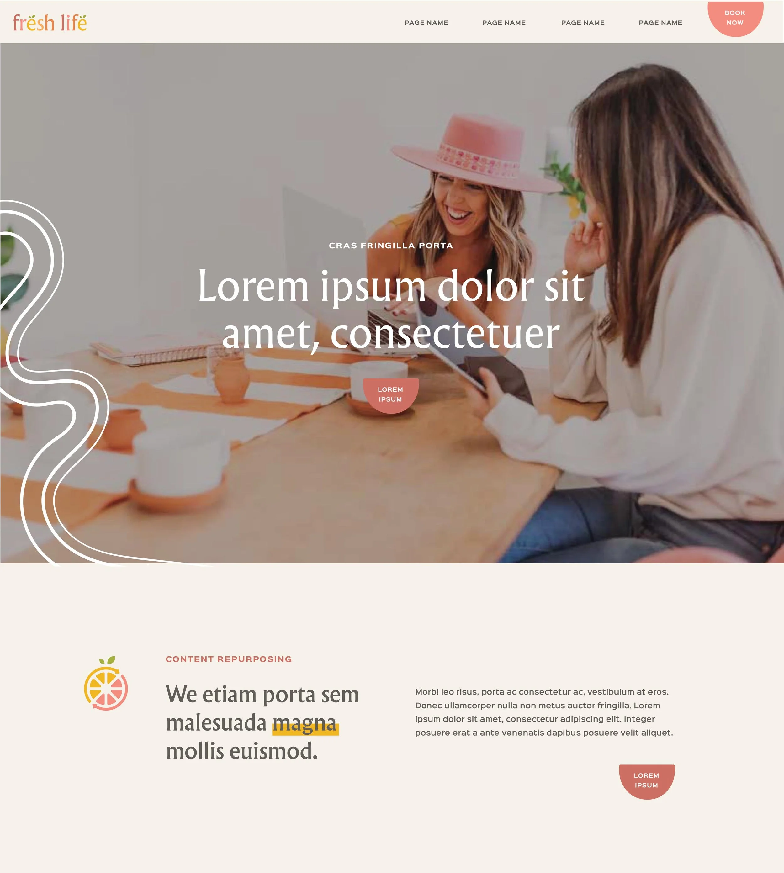
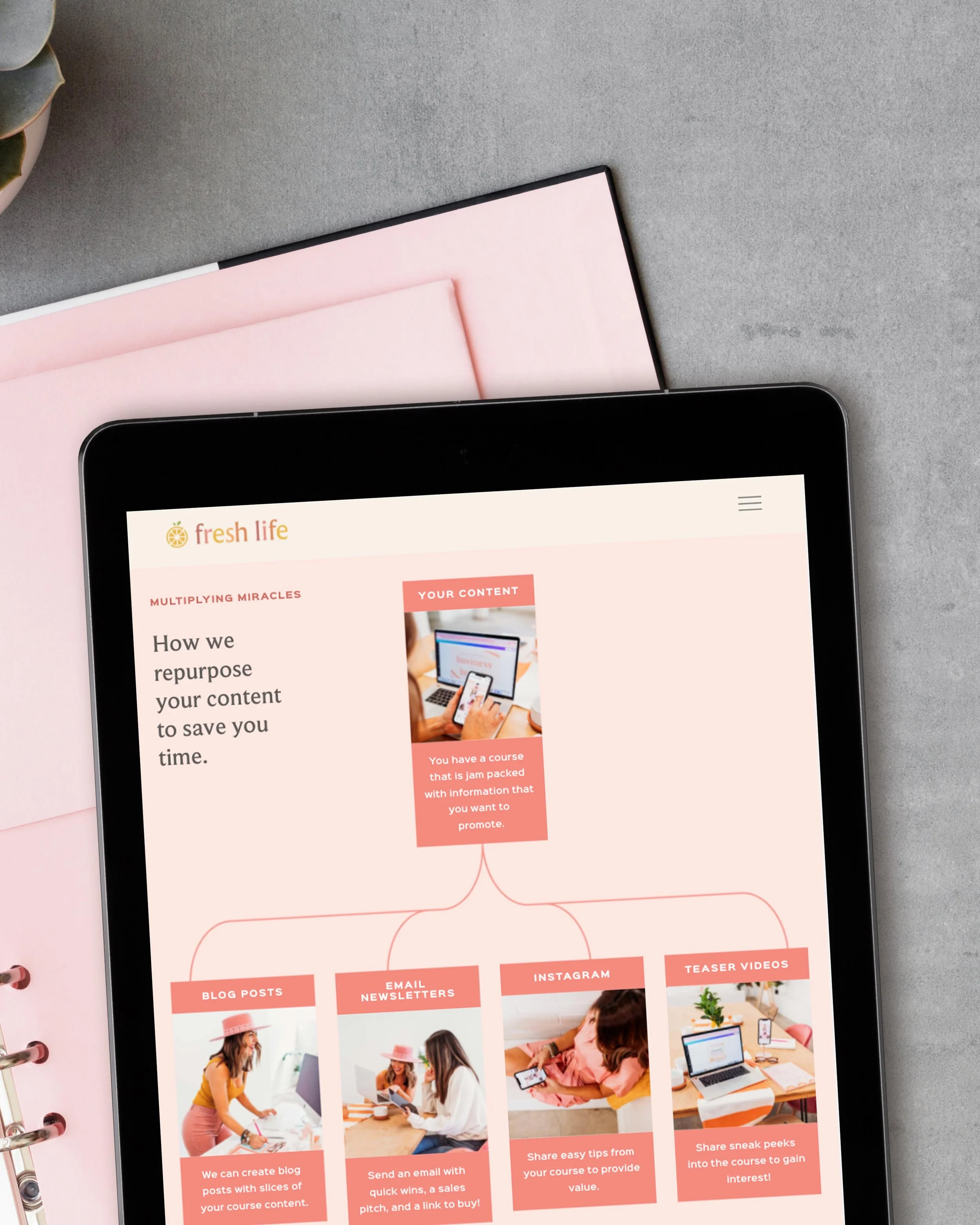
A fun marketing agency website design
We knew Fresh Life’s site needed to match the branding’s playful spunk. The final site features five pages, a blog, and tons of fun details.
“I LOVEEEED working with you, Kathryn and all of your team!
You are truly talented and you process is incredibly efficient, professional and exciting. Thank you for being a pure joy to work with!”
—renee dick, FOUNDER

