Is Your Website Turning Customers Away? 7 Website Fixes to Make
Are you wondering why visitors aren't sticking around on your website? Let’s dive into common website mistakes that could be driving potential customers away. By identifying and fixing these issues, you can transform your website into a customer magnet, ensuring a more engaging and fruitful experience for your audience.

Seven mistakes that could be causing visitors to click away and how we can spruce things up.
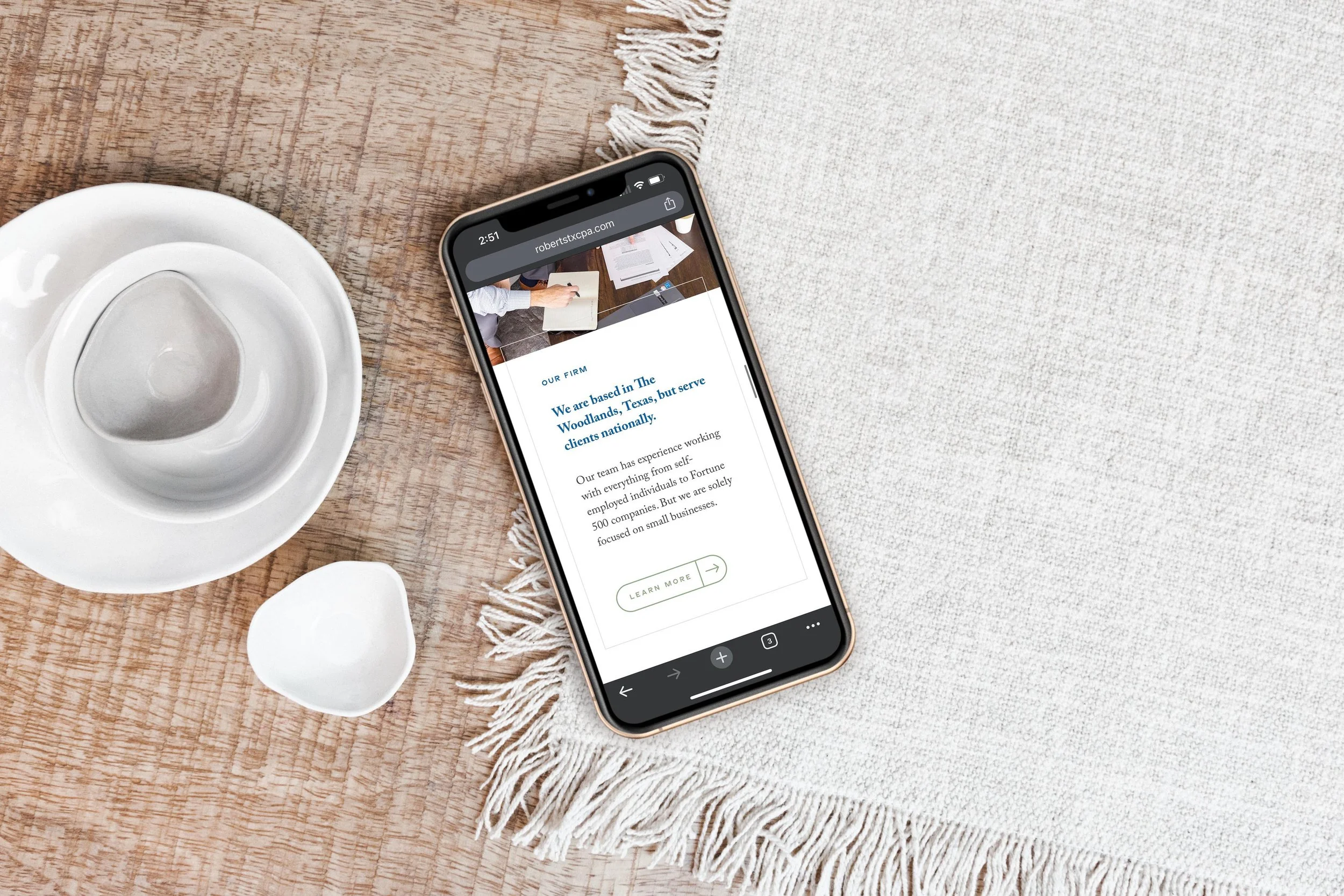
Website Mistake 1: Unimpressive imagery.
Solution: Use brand photography for websites to elevate your business
Be careful not to use photos on your site that don’t show the type of work you plan to do in the next 2 years or that make your product or service look cheap.
Are your images not quite capturing the essence of your work? Maybe they're making your products or services look less amazing than they truly are. It's crucial to ensure that the visuals on your site truly reflect the quality and uniqueness of what you offer.
Use visuals to shape your brand perception, showcasing product/service quality and uniqueness.
Captivate visitors with engaging visuals to keep them interested and exploring further.

Tips for planning a brand photoshoot
Does the idea of planning a brand photoshoot sound daunting? It did for us too, right before our Team Retreat last year! So, here are 4 quick tips that helped guide our shoot (and we're in LOVE with how the photos turned out – check out our brand photos in action!).
Photographer
Work with a photographer who has branding images in their portfolio. You want to ideally see examples of behind-the-scenes, process, and details shots in the mix.
Location
Pick a location that fits the main keyword descriptors for your brand. Prioritize lots of light, or a studio shot against blank walls or solid colors might be a good fit for your brand as well.
Clothing
We love using clothing rental services for branding shoots, such as Nuuly or Rent the Runway. Search for pieces that incorporate your brand color. You don’t need an exact match, but keeping it close will help you make things cohesive!
Compile a list of the “scenes” and stories you want your images to tell. Your photographer may ask for a more detailed shot list or inspiration board, but follow their lead and let them guide you in this!
Frequency
We recommend getting brand photos at a minimum every two years, but depending on the nature of your business and your marketing plan, you might want to schedule a branding shoot as often as once a quarter. This will give you plenty of content for social media and website updates!

Ok, now back to website mistakes and solutions!
Website Mistake 2: Incomplete Storytelling
Solution: Show the entire experience of your product or service.
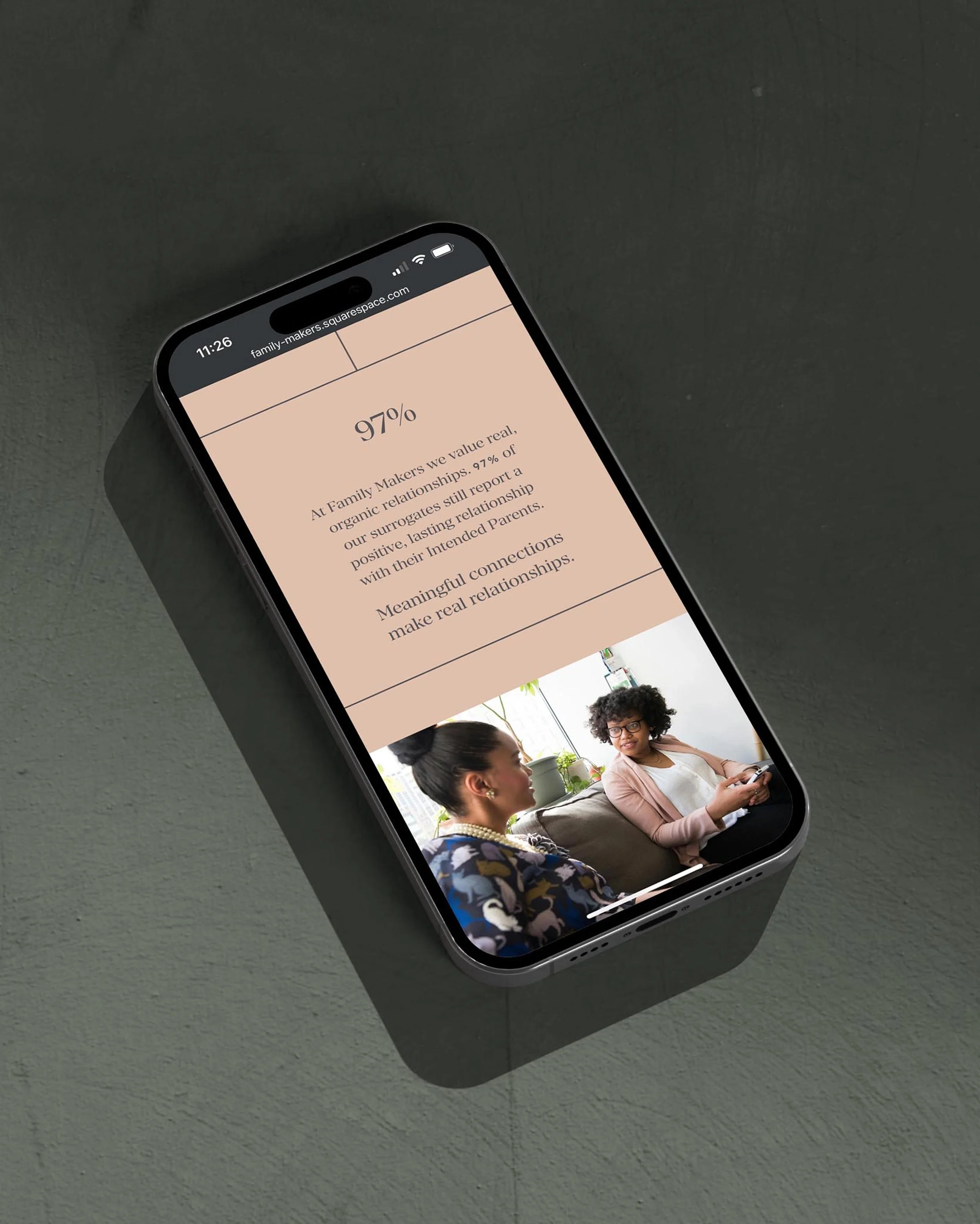
Sometimes, we forget to tell the full story of our products or services. Are there missing pieces, like customer reviews or a complete photo gallery? Let's make sure our website tells the whole story to keep visitors engaged.
Provide a comprehensive view with complete stories, reviews, extensive photo galleries, and before-and-after images.
Help customers make informed decisions by presenting the full picture of your offerings.

How to effectively use galleries across industries:
Medspa: Consider adding a before and after carousel or gallery of images, organized by treatment type.
Photographer or wedding planner: Don’t just put your favorite images from across clients and various types of work onto one long “portfolio page.” Show the best 12-25 images from at least 6 different galleries (i.e. tell the entire story of what your clients experienced with you).
Retail store: Show off product features in a carousel with a small amount of text accompanying each shot to make it easy to absorb.
Lawyers/accountants/consultants: Don’t have visual representations of your work? List case studies instead and focus on a problem-solution format. Be sure to include a list of services provided as well!
Tips for strategically using reviews on your website
Make sure you have permission to use them! You can add a statement to your contract to protect yourself going forward.
Gather reviews through an interview-style questionnaire to get more pithy and persuasive testimonials.
Never list a price or starting rate before first sharing a review.
Don’t dump long reviews onto your website — keep them short and sweet (just one short line is best!) to make sure they get read.
Sprinkle testimonials across website pages in short snippets. A reviews page doesn’t often get clicked, and certainly doesn’t get read much.
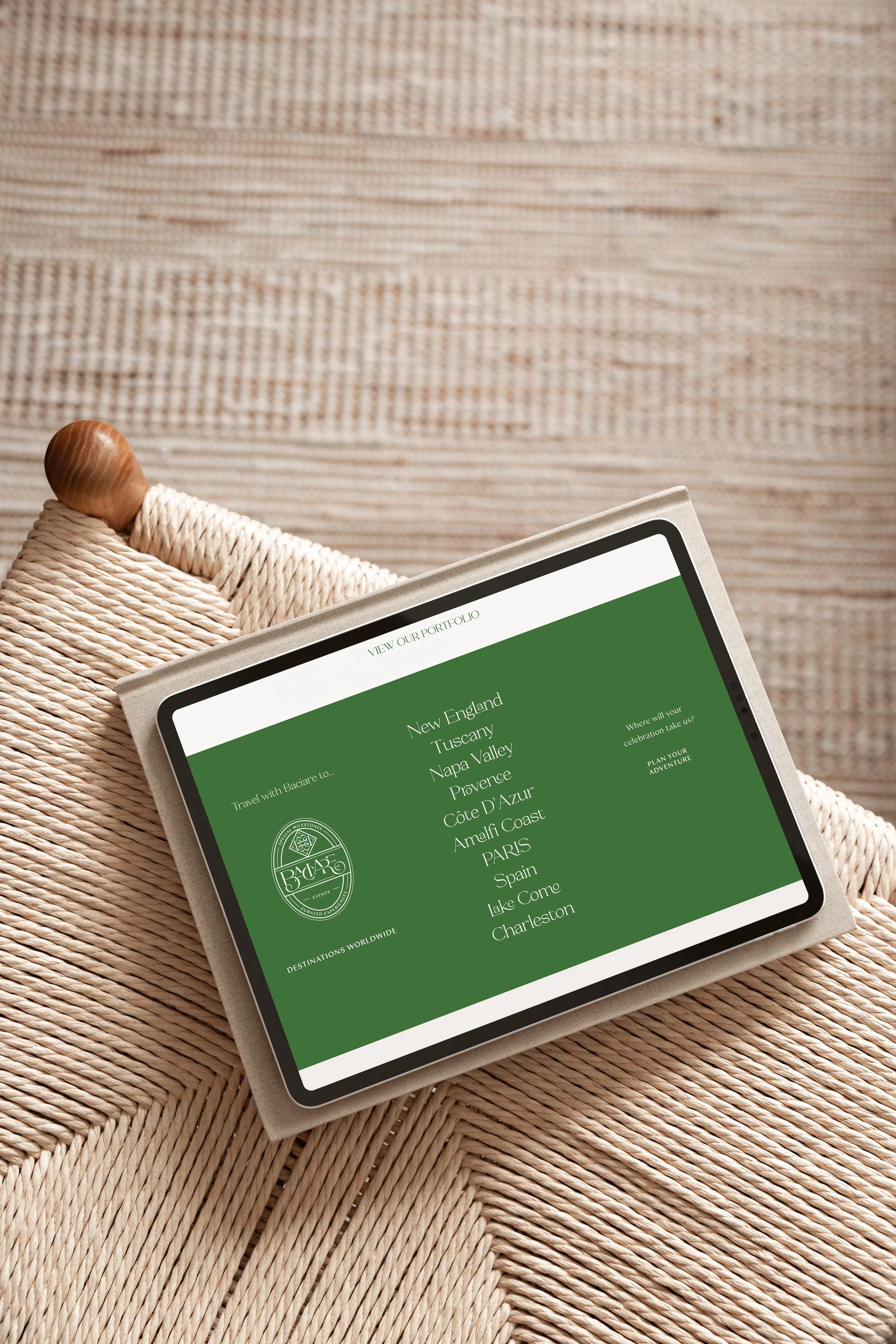
Website Mistake 3: Missing Local Flavor
Solution: Make use of local SEO strategies for small businesses
If you don’t have geographic keywords on site, people won’t even find you — and definitely won’t know if they are in the right place.
Ever thought about adding a touch of where you're based? Forgetting to include your location might make it harder for local folks to find you. Incorporating your geographical info into your website can help attract nearby customers.
Incorporate geographic keywords to optimize website for local search.
Ensure local customers easily find your business by including location-specific keywords.
Some tools you can check out for Keyword research are Keywords Everywhere, Ubbersuggest, and even asking ChatGPT!
When we build websites, we consider SEO from the start. Our website planning phase involves an in depth SEO plan and research, content prompts, image guidance, user experiences, and animation recommendations. Read more about how we seamlessly blend design, technical, and SEO aspects to bring websites to life.
Ideas to improve location targeting of your website:
Create an alternate version of your homepage, but swap the wording and images to be relevant to a specific geographic location. For example, you could title this [Your Service or Industry Niche] in Chicago, and on this page you could highlight the top 3-5 most common reasons that would prompt someone to buy your product or service in that area.
Whenever a business is targeting a different geo, creating general content is a great place to start. Blog posts like "Things to do in Cincinnati" or "[Related business type] We Love in New Jersey" are great.
If there are partnerships already made in the geographic area you’re targeting, reach out to business owners and see if they'd be willing to do a blog feature on their website to introduce you and your business (You can even whip the draft of the post up for them to make it easy and include geographic keywords throughout!)
Link any content you create for your website to Pinterest.
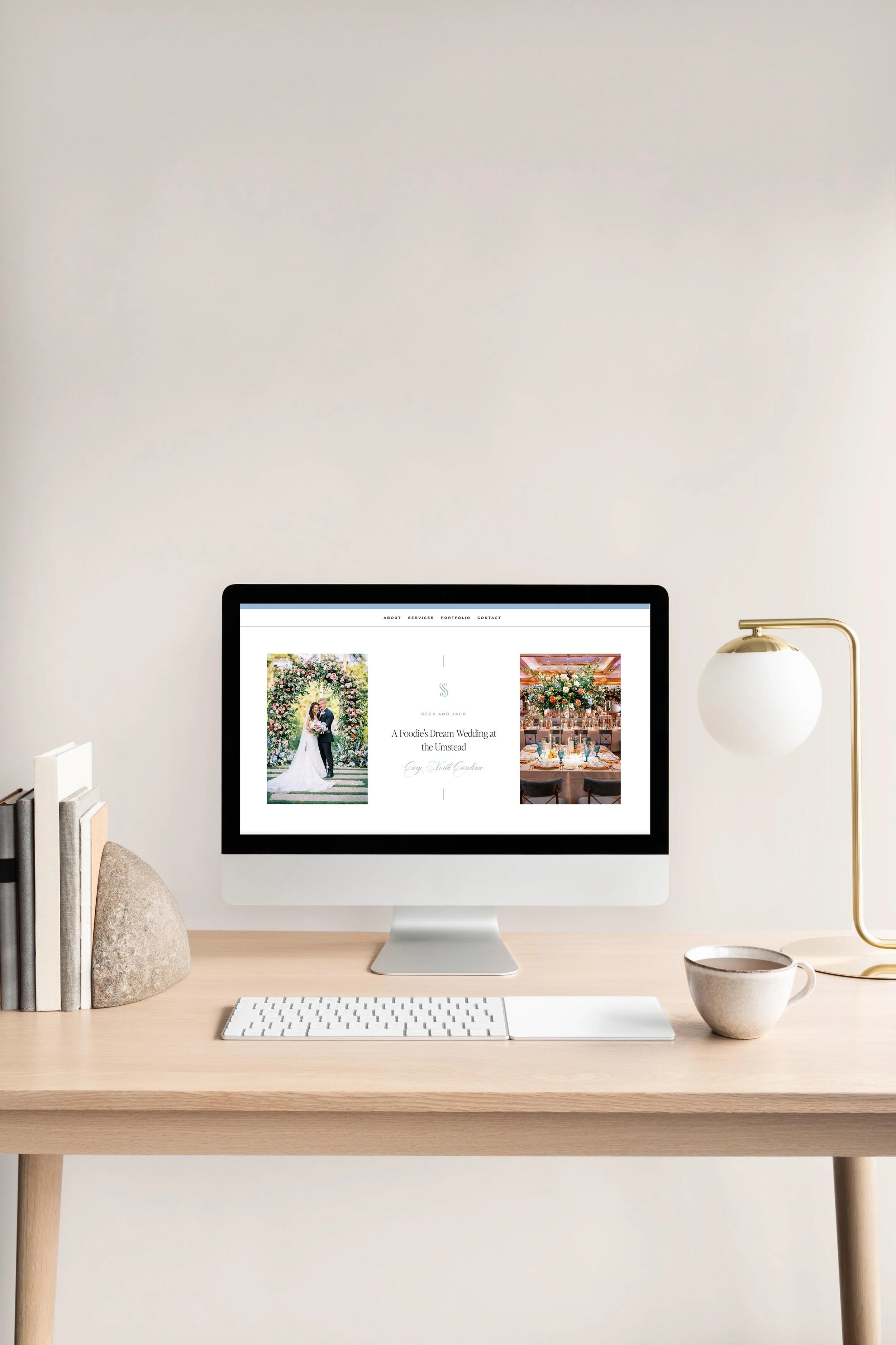
Website Mistake 4: Website Overwhelm & Confusion
Solution: Improve website user experience with intentional and effective website layout strategies
Is your website a bit chaotic? Too much text, a messy layout, or unclear directions can confuse visitors. Let's boost website engagement by streamlining the site, keeping it simple, and guiding visitors smoothly through their experience.
Streamline your website's design and content to prevent overwhelming visitors.
Guide visitors smoothly through your offerings with a clutter-free layout.
We recommend keeping things easy to navigate with the following rules of thumb:
500-1000 words of copy on landing pages
One primary call to action (link or button) that leads users to go to the next page of your website at the bottom of every single page of your website.
A footer organized with all the links to the main landing pages of your website as well as a prominent call to action to do the main goal of the site (i.e. shop, sign up, or inquire).
A homepage that serves up short snippets that invite visitors to click into sub-pages of the site and learn more.
Website Mistake 5: Keeping Prices and Offers a Secret
Solution: Include transparent pricing on websites
Don't you hate it when websites don't mention prices? Let's avoid that! Share your prices and any special offers upfront to keep visitors interested and excited about what you offer.
Build trust and interest by transparently displaying “starting at” pricing.
Encourage visitors to engage more by providing clear details and different options for buying from you.
3 elevated ways to add transparency to your site
Add a pricing average statement to your services page like “Our average client invests around $xxxx in [service name].”
Add images to a product carousel that show various components of all items included in an offer. Show different angles or detailed shots with the text “Look inside!” or “Explore our product.”
Add a gateway-free info product like a lead magnet PDF ebook, worksheet, or tip sheet that helps guide visitors to your paid product or services via an opt-in form.
Website Mistake 6: Lack of Personal Connection
Solution: Personalize your website with team photos and brand storytelling
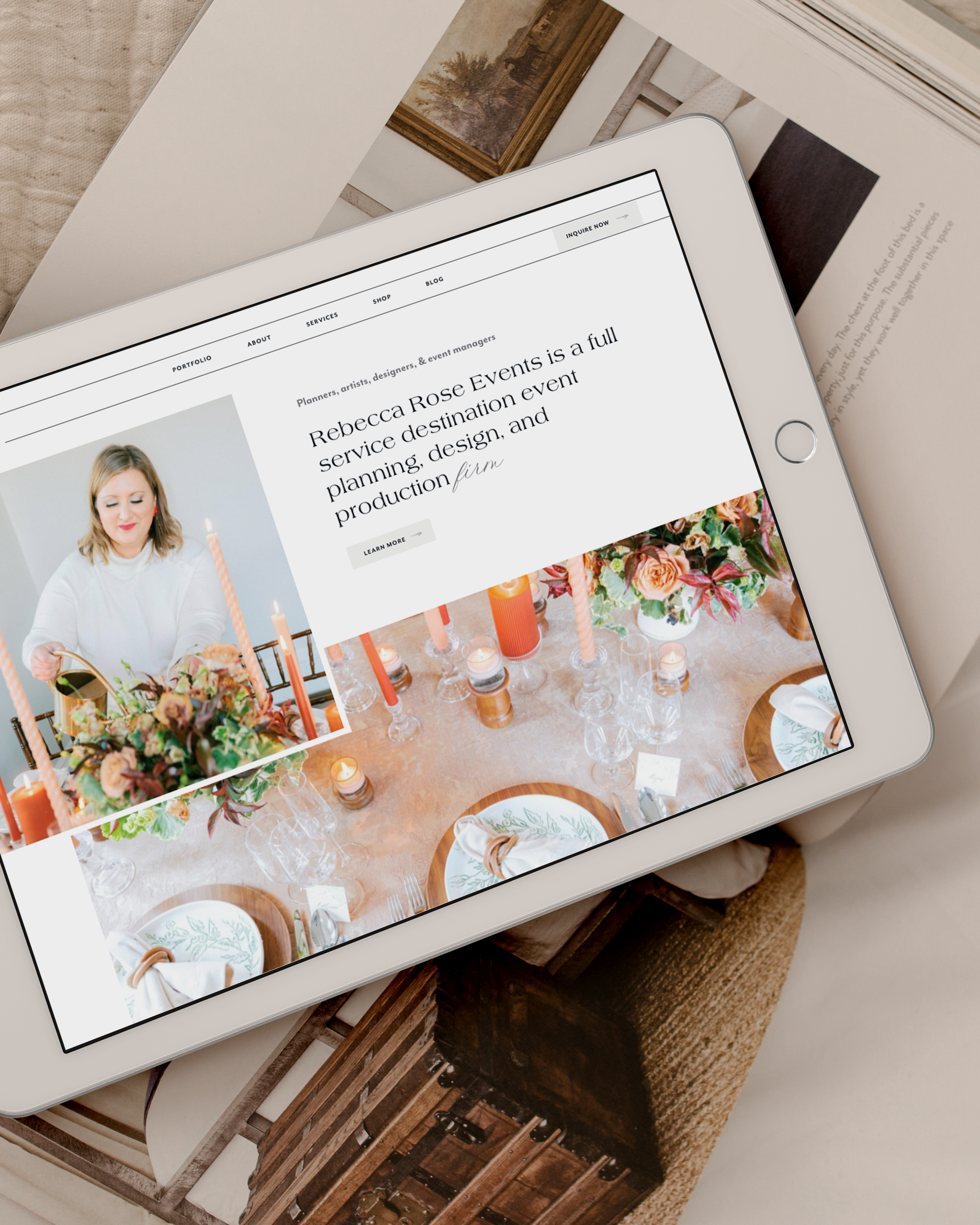
People love knowing the faces behind the business! Not showing yourself or your team might make it hard for visitors to connect with your brand. Let's introduce ourselves and let them see the amazing team behind the scenes.
Introduce Your Team: Share photos and bios of yourself and your team members on the website.
Tell Your Story: Create a compelling 'About Us' section to give visitors insight into the people driving your brand.
Checklist for images that will effectively personalize your website:
On brand: Does it feel like the main adjectives that describe your brand? Does the location include on-brand colors?
Hero images: Do you have horizontal images with some white space on the left or right?
Detail shots: Do you have vertical or square images that show detail and quality?
At work: Do you have images that show the face of your brand and you or your team at work?
In context: Do you have images that show your product or service being experienced in context?
Website Mistake 7: Outdated Vibes
Solution: Regularly update your site and make use of modern website design trends to keep things fresh
Does your website feel a bit outdated? Maybe the design or the words used are from another era. Let's freshen it up, keep it current, and avoid clichés to make your website more appealing and relevant.
4 ways to keep your website up to date
Update Design Elements: Refresh the website design with modern aesthetics and user-friendly features.
Rebrand or Refresh: Consider a rebrand or brand refresh to maximize the impact of your business’ site.
Revamp Content: Rewrite outdated content using current language and avoid clichéd phrases for a more appealing and relevant website.
Stay Fresh: Regularly update the website to maintain its relevance and appeal to your audience.
Website revamp services
Your website is your online storefront, and a few tweaks can make a world of difference. Let's work on these areas to create a more inviting and engaging space that truly reflects your creative business!
Ready to revamp your online presence? We offer full branding, mini branding in a day, and website development services to help your business shine. Let's make your website the go-to spot for your awesome offerings!
Book a free consultation with our creative director Kathryn today to learn about what we can do to elevate your online presence.