Perfecting Your Brand Palette: A Deep Dive into Color
Ever thought about how colors speak for your brand? How do colors impact brand communication and consumer perception? Picking your color palette for branding isn't just about looks. It's about how the right colors make your audience feel and connect with what you offer. In this post, we'll look at color from three angles — Flatter, Feeling, and Finesse — to help you choose colors that go well with your offerings and bring out the right vibes. Learning how to choose brand colors can help you better connect with your crowd. We’ll also go through step-by-step how to select your brand colors from photos and mood boards using either Photoshop or Canva!

Mastering Brand Communication: Choosing Colors with the 3 F’s Method
How does brand color psychology play into consumer behavior? When it comes to selecting colors for your brand, here are some key considerations:
Flatter
Just as you wouldn't wear clothing that clashes with your coloring or features, it's essential to present your products or services in the best possible light. Your brand's colors should harmonize with what you offer. Think of color as a frame that enhances the focal point: your product or service.
Apple Inc. is a well-known brand that exemplifies the concept of using color to enhance products and services. Research conducted by the University of Loyola, Maryland discovered that color increases brand recognition by up to 80%. Apple's deliberate use of a minimalist, sleek design paired with a distinct color palette enhances its brand image and product appeal. The iconic white color scheme of their products, such as the iPhone, MacBook, and iPad, aligns with their brand identity of simplicity, innovation, and premium quality. This deliberate color choice reinforces the perception of sophistication and elegance, harmonizing perfectly with their product offerings and effectively distinguishing them in the market.
Avoid randomly picking colors; ensure they visually support your offerings as a cohesive suite.

Feeling
Your brand's colors evoke emotions, setting a mood or vibe for potential consumers. It's crucial to evoke the right emotion. Colors can be energizing, soothing, passionate, bold, or calming. They range from polished and professional to fun and flirty, exhibiting various hues and impacts. Consider your brand's values and what distinguishes your product experience. Use intentional color choices to capture these aspects effectively.
According to a study by the Journal of Business Research, colors have a profound impact on consumer emotions, with 85% of shoppers placing color as the primary reason for their product purchase. Vibrant and energetic hues like red and yellow can evoke a sense of urgency, ideal for driving impulsive purchases. Conversely, serene blues and greens can instill feelings of calmness and trust, making them suitable for brands focusing on reliability and wellness. It's vital to align your brand's values and unique propositions with intentional color choices to evoke the desired emotional response and establish a lasting connection with your audience.

Finesse
Color adds finesse to what you're selling. Did you know color significantly influences purchasing decisions? Whether it's selecting a piece of clothing or making any purchase, color plays a pivotal role. Our brains associate color with taste, engaging a different sense altogether!
In the study, "Impact of Color on Marketing," by Emerald Insight, one of the most compelling statistics is that 62-90% of the initial assessment of products can be based on color alone, demonstrating the substantial influence of color on consumer perception and decision-making processes.
When marketing your product or service, leverage color to enhance its allure and capture people's interest even more.
When choosing colors for your brand, remember that they communicate more than just visual appeal. They evoke emotions, establish connections, and play a crucial role in consumer decisions. Thoughtfully select colors that resonate with your brand's identity, values, and unique selling propositions. By doing so, you'll effectively communicate with your audience and create a lasting impression.
Elevating Brand Identity: How We Craft Custom Brand Colors for Clients
Why is it important for brands to create a cohesive color palette that resonates with their identity and values? Let's take a look at how we played with colors for some of our clients to best resonate with their ideal clients in each of their respective audiences.
Brand Color Palette Design for Accounting and CPA Firms
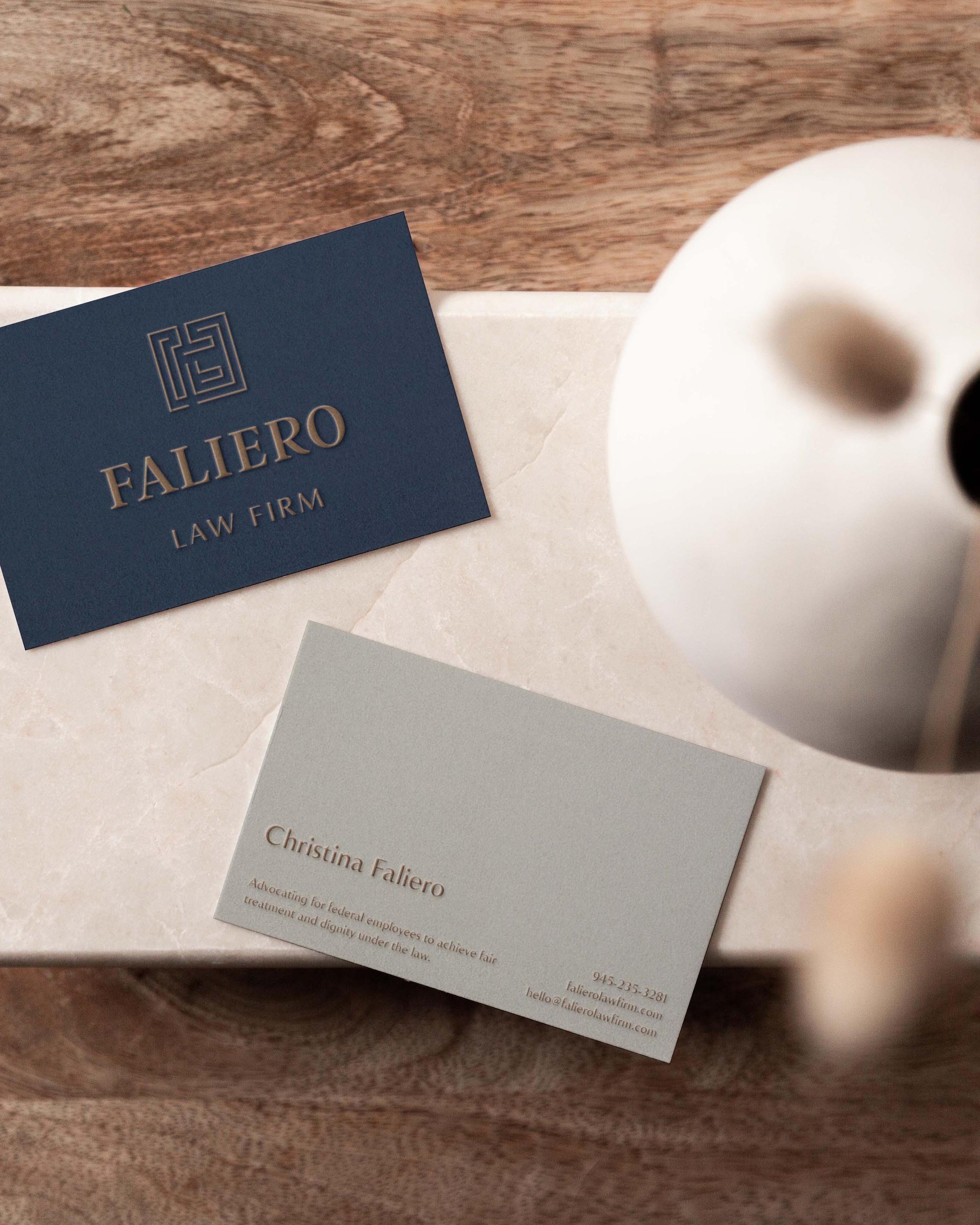
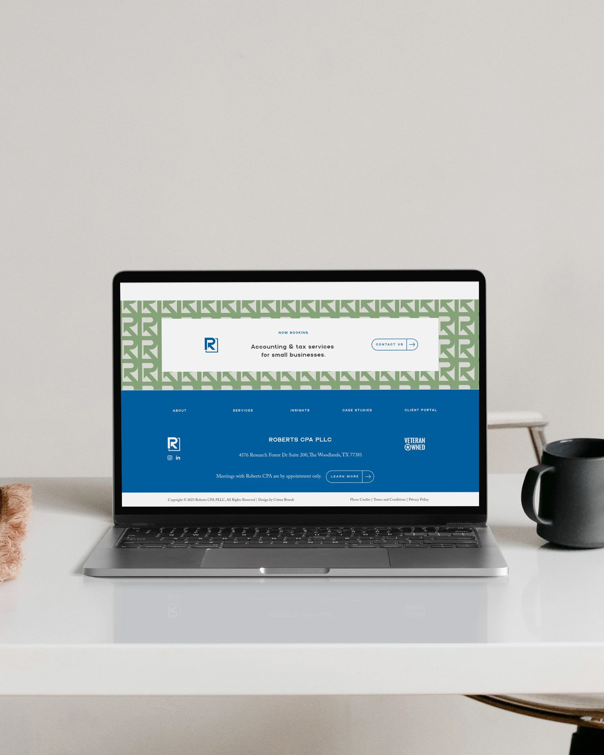
Accounting Client - Roberts CPA
Roberts CPA, our accounting client, wanted something different from the typical color schemes in the CPA world. Harsh colors like red and black can bring negativity to a topic that's already associated with stress for many. Roberts CPA’s innovative approach to accounting inspired us to create a fresh and distinctive color palette. We blended soothing and professional colors to convey confidence and calmness to clients. Adding a soft natural green as an accent, a subtle nod to cash flow, and anchoring the scheme with steel gray made the brand feel solid and dependable and also brought an energizing and soothing vibe.
Brand Identity Color Palette for Beverage Packaging
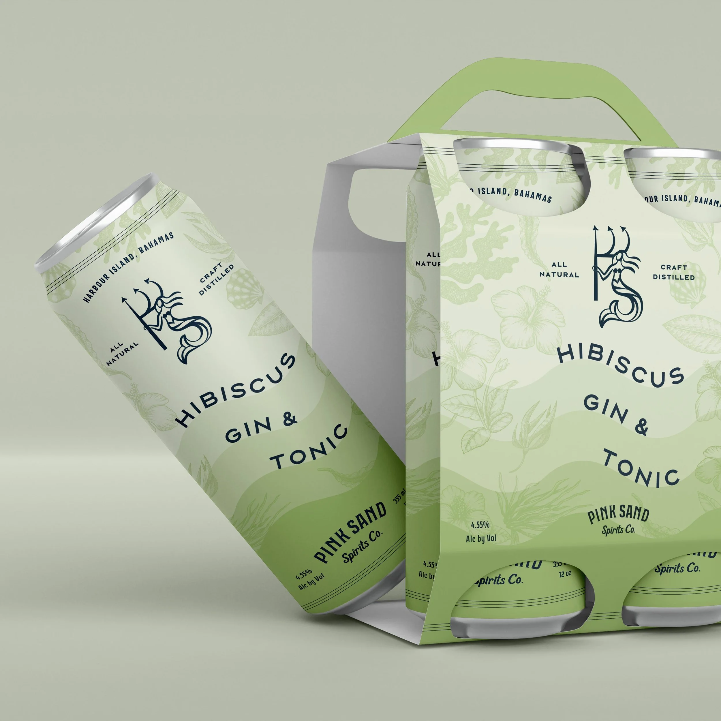
Spirits and Packaging Client - Pink Sand Spirits Co.
Our client Pink Sand Spirits Co., from Harbor Island Bahamas, desired a vibrant, tropical vibe without losing the iconic pastels synonymous with Harbor Island. To achieve this, we crafted different colorways for each product line, using diverse tones. Adopting a monochromatic approach for background colors on cans and labels expanded the brand's color system for versatile applications. Illustrations showcased the colorful palette, and a custom wave pattern on the cans blended seamlessly with the brand colors, resulting in a refreshing and fun palette, perfect to quench people's thirst.

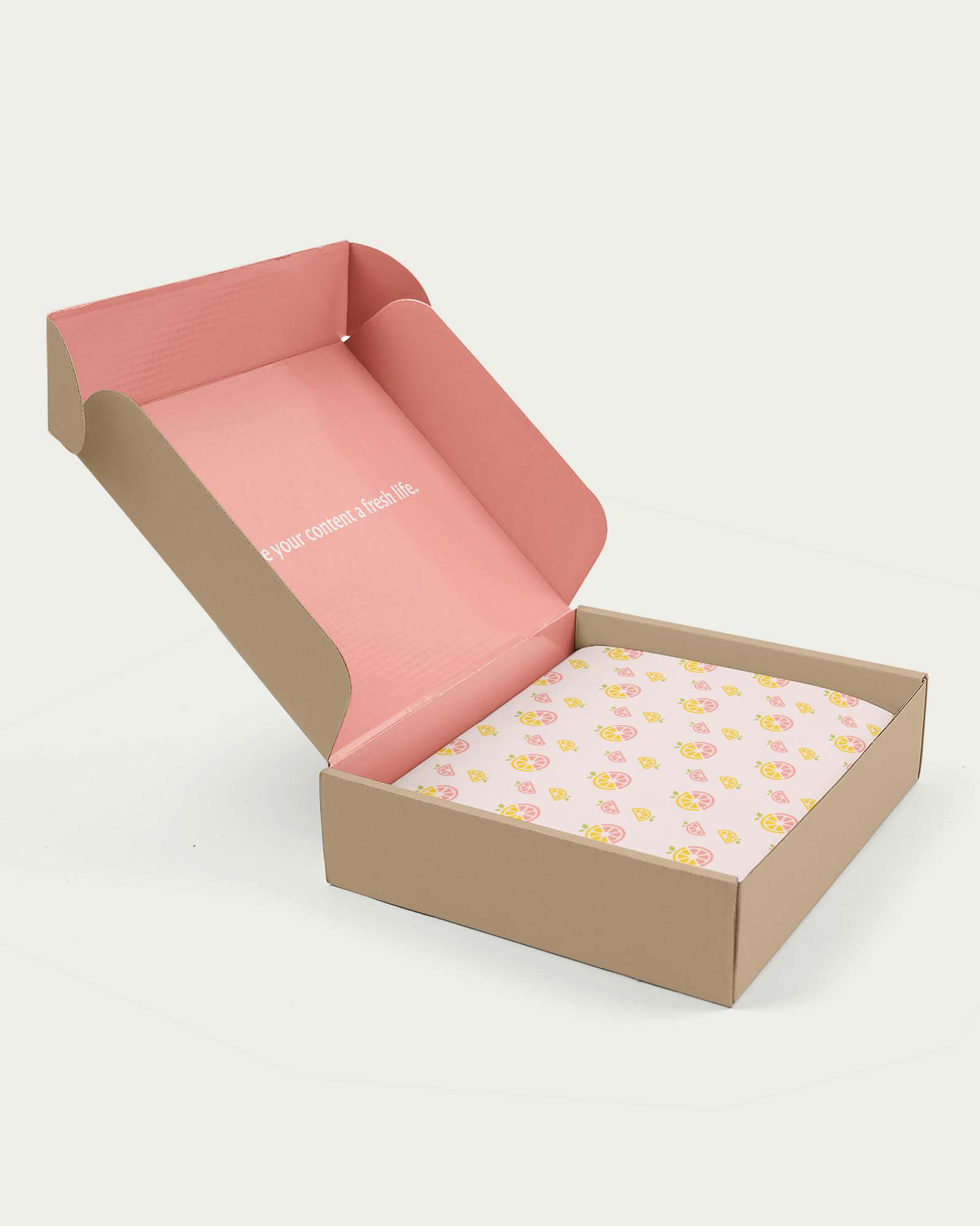
Color Selection for Food & Hospitality Brands for Brand Appeal
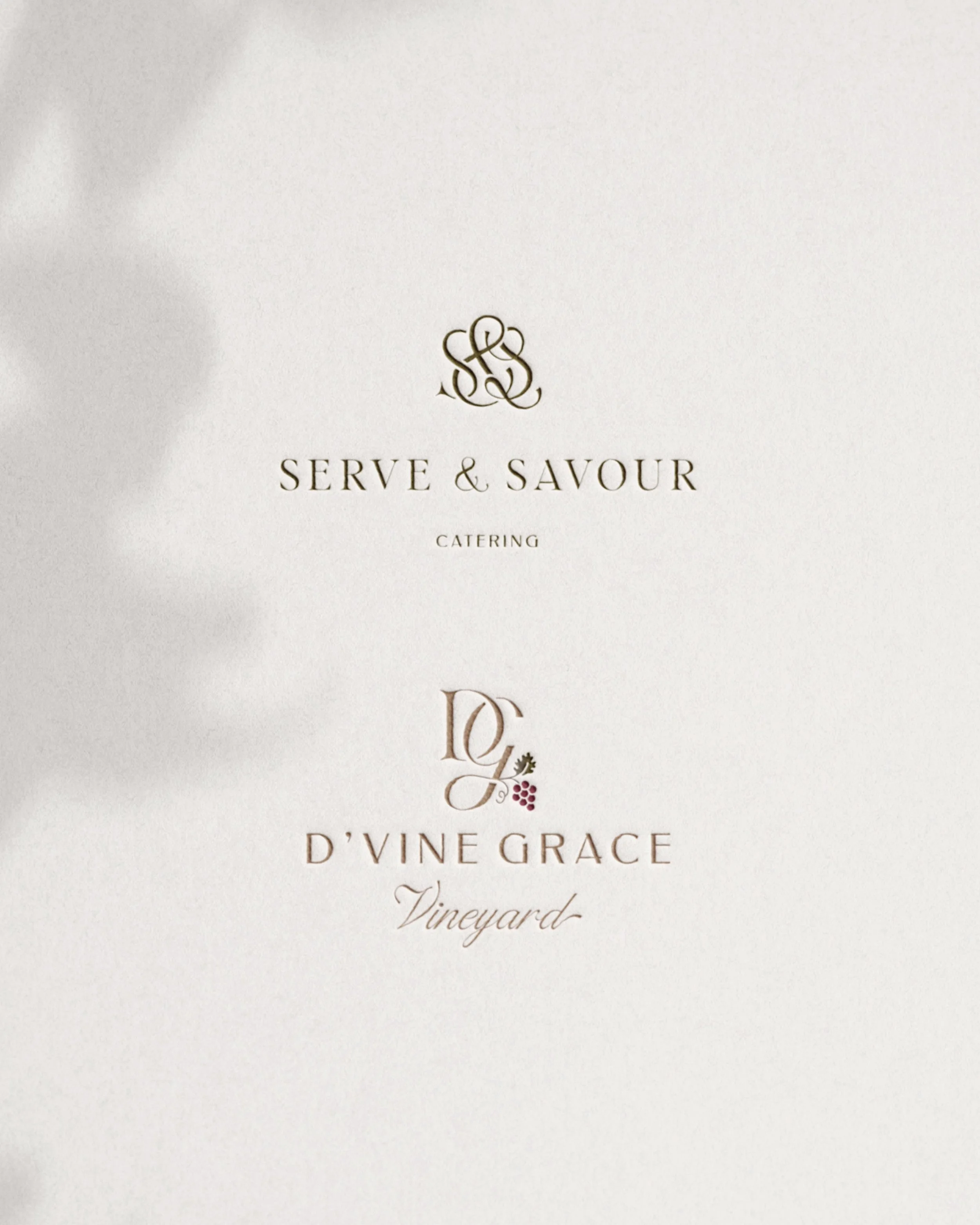
Catering Client - Serve & Savour
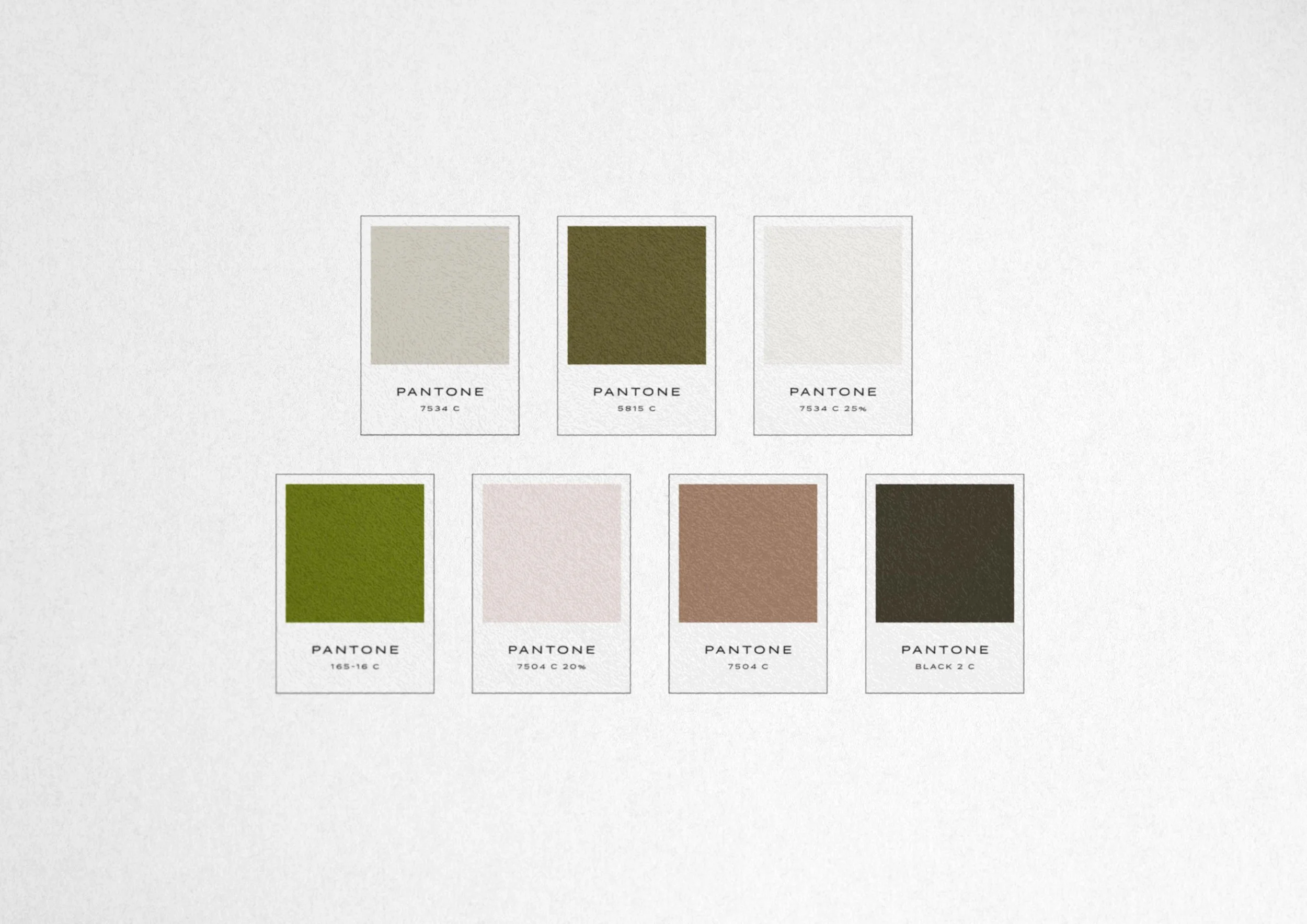
Serve & Savour, our catering clients, faced a unique challenge: standing out with their color palette while maintaining a connection to their sister company, Event Venue D’Vine Grace Vineyard. For their branding, we leaned into creams with accents of green and burgundy. We picked one of the sister brand's accent colors and elevated it to the primary brand color. The deep neutral green became a key brand color, complementing a variety of food colors. It felt reminiscent of the sister brand yet stood out distinctly, carving its own identity.
Looking for a color palette that’s crafted to resonate with your ideal clients? Explore our services to learn more about how we can help you shine.
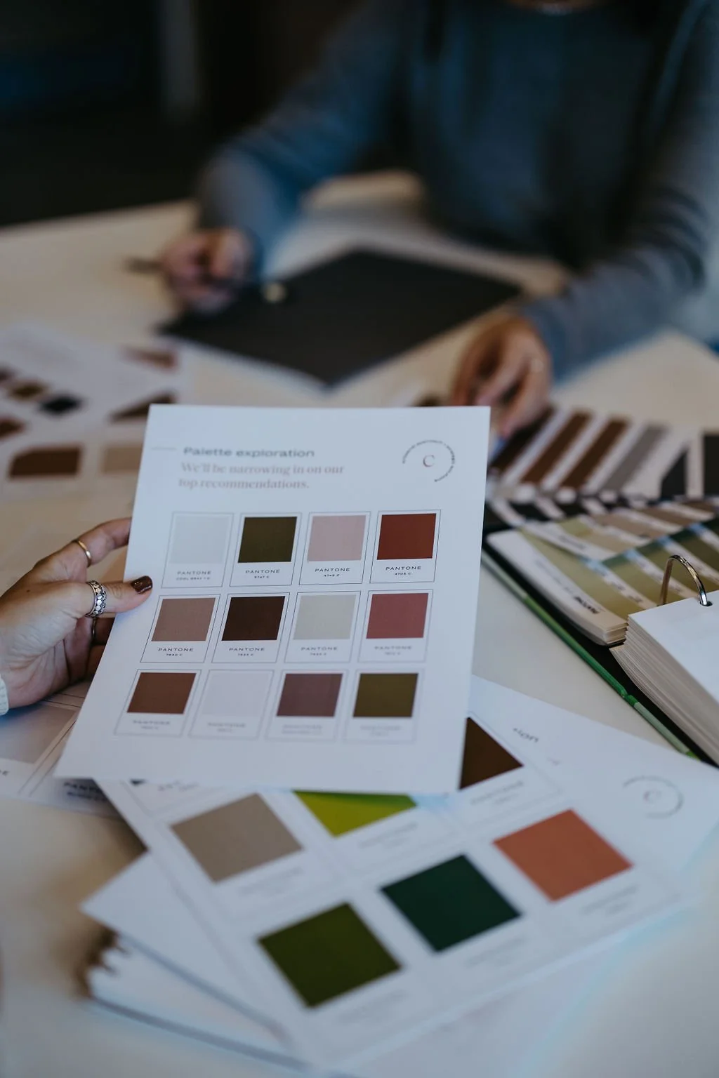
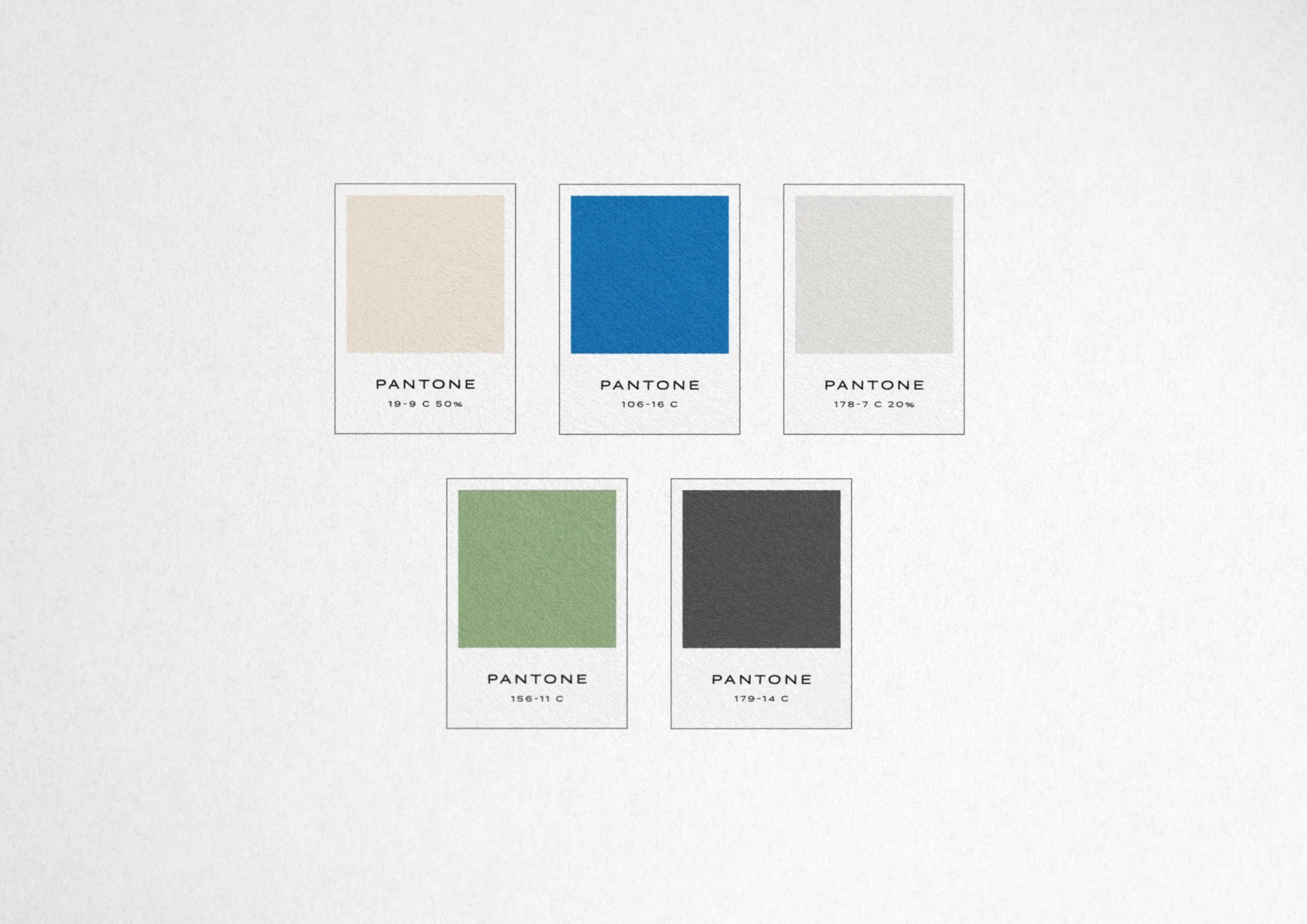
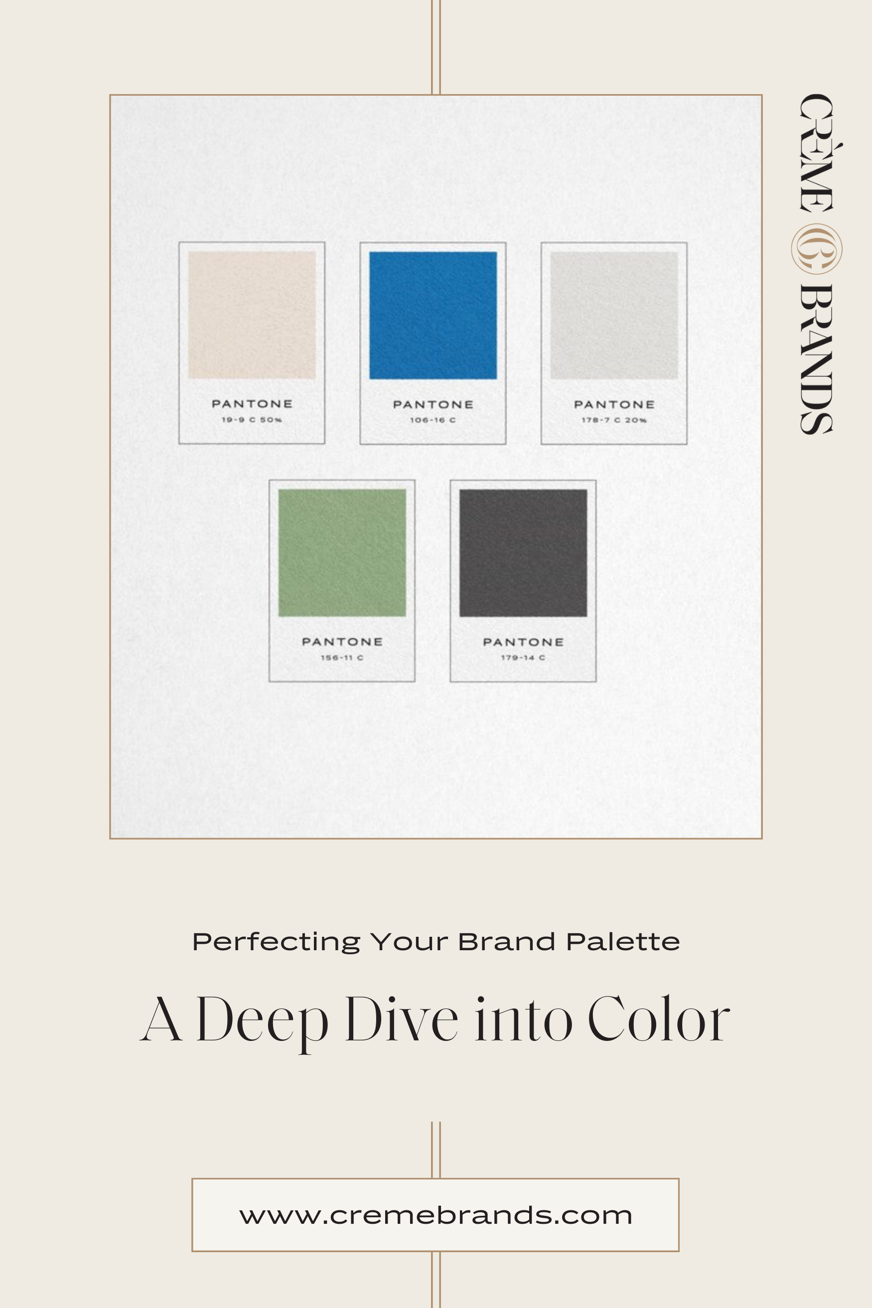
Photoshop Color Palette Tutorial: An Easy Method for Choosing Pantone Swatches
Sometimes, choosing the right color palette for your brand can be a bit overwhelming, especially after meticulously curating a mood board filled with inspiring visuals. But fear not, as there’s a simple and swift method using Photoshop to select Pantone swatches directly from your mood board! Yes, it can be this straightforward.
Tutorial:
Open Your Moodboard in Photoshop
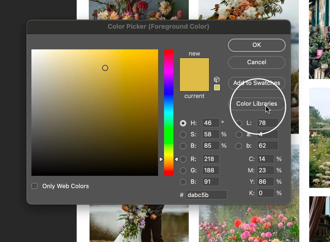
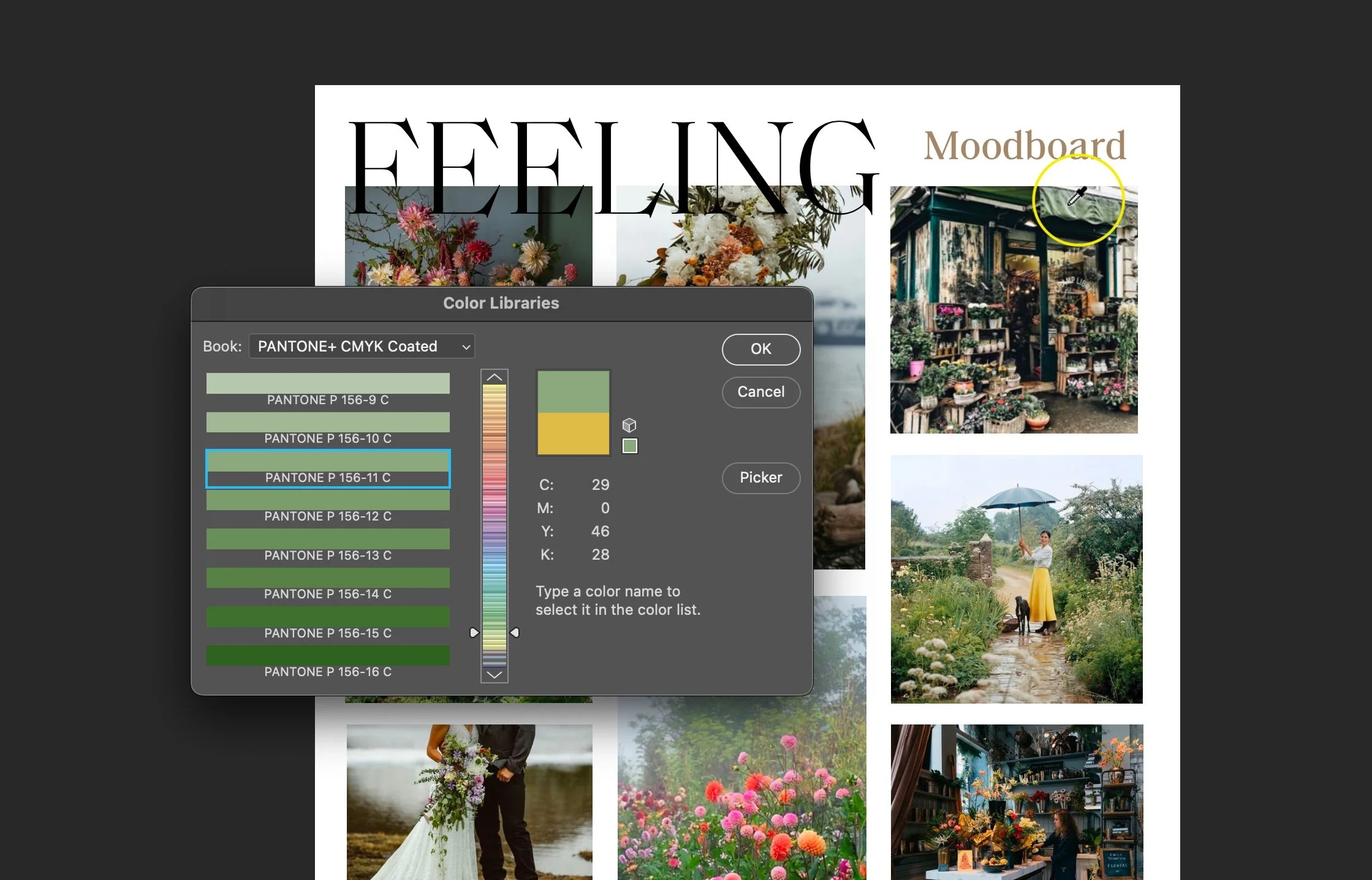
Launch your moodboard in Photoshop and grab the eyedropper tool.
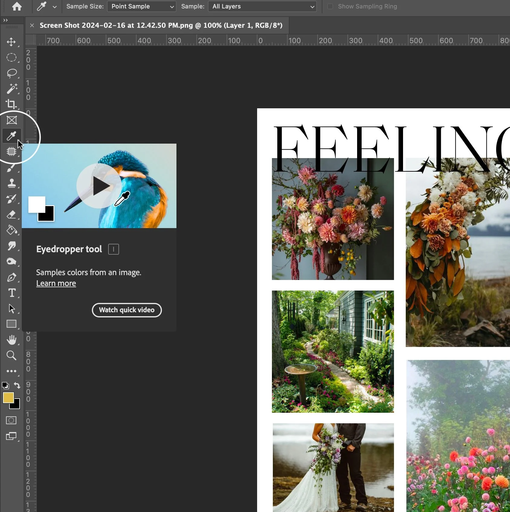
Click on a color in your mood board that resonates with your brand.
Next, double-click on the two color squares at the bottom left of the screen to open the colors the eyedropper picked.

This action will display a lightbox containing the selected color.
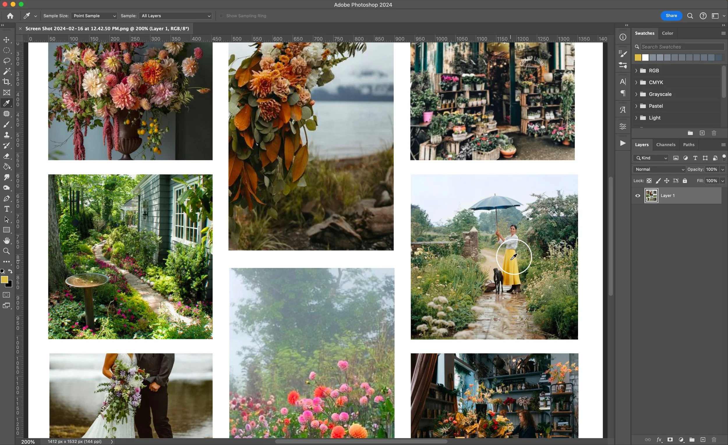
Choose Pantone Swatches from the Color Panel
Within the lightbox, select the appropriate Pantone swatches by default.
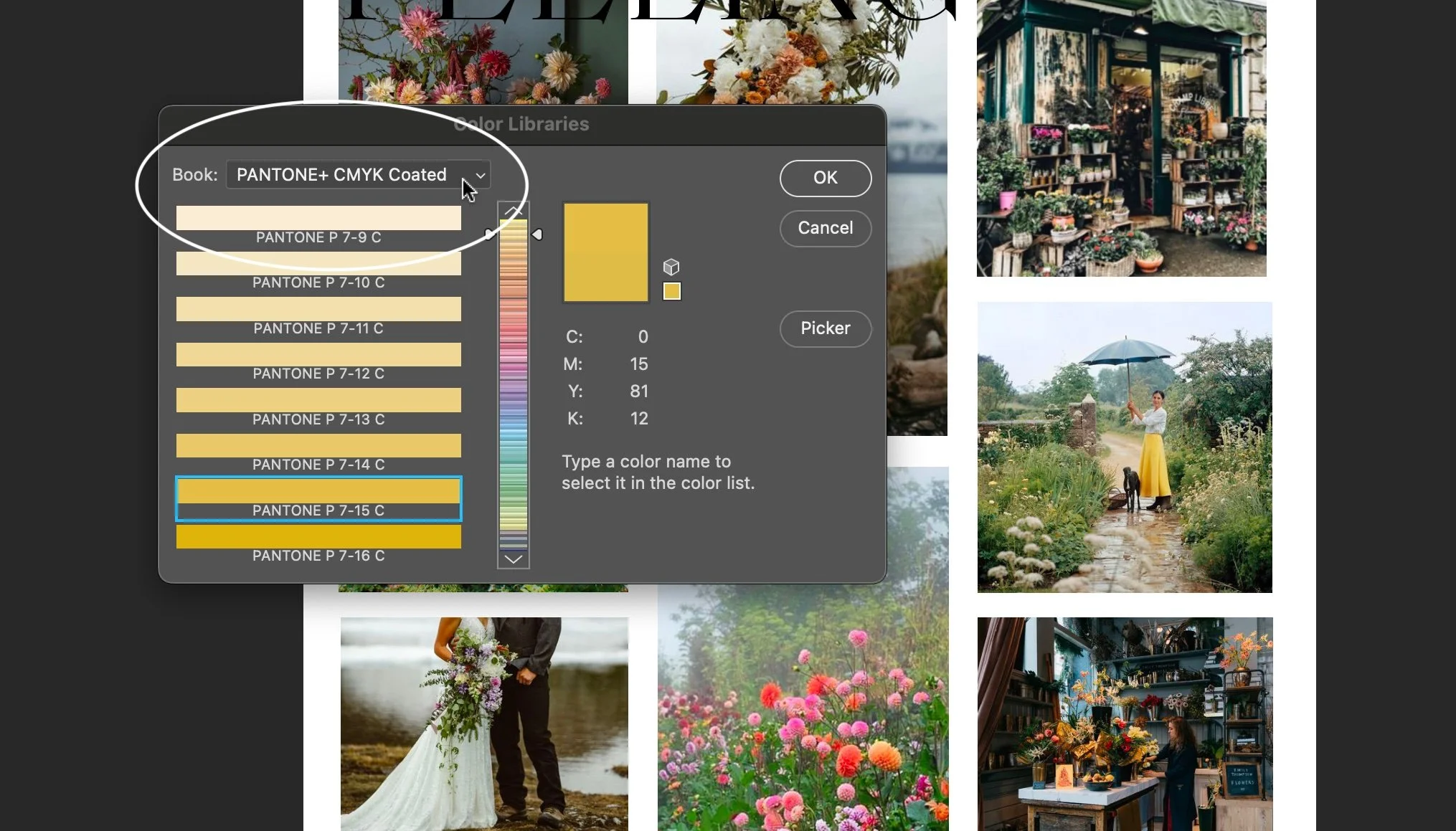
Now, whenever you click on a new color in the mood board, Photoshop will automatically suggest the closest Pantone swatch.
Check Colors in Print
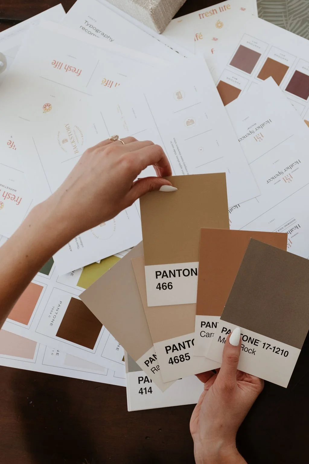
To ensure accuracy in print, it's beneficial to verify colors using a Pantone chips book (as shown in the picture below) obtained, for example, through platforms like eBay. This approach allows you to match and mail the exact swatches to your clients. Remember, colors on-screen may differ from printed versions, and even Pantone's precise print color can have variations.

This step-by-step tutorial simplifies the process of selecting Pantone swatches, making it easier to translate the colors from your mood board into a cohesive brand palette that accurately represents your vision.
Want to skip Photoshop and try a free online tool instead? Here’s how to pick hex colors in Canva. You can still use a swatch book afterward to find the closest universal color matches if you wish, but the hues and tones won’t be exact.
Canva Color Palette Generator Tutorial: Crafting Vibrant Color Palettes from Photos
How can Canva be used to choose brand colors from mood boards or images? Canva's color palette generator offers a swift solution to craft color combinations that seamlessly complement your visuals. Follow these simple steps to generate your palette:
Upload Your Photo to Canva
Begin by uploading your preferred photo to Canva’s Color Palette Generator.
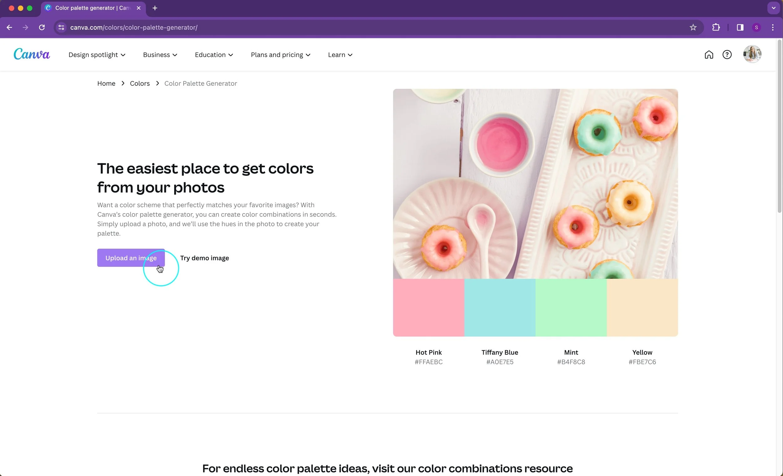
Let Canva Work its Magic
Canva’s color palette generator does the heavy lifting for you! Upon uploading your photo, Canva identifies and extracts the dominant hues from the image to formulate a coordinated color palette.
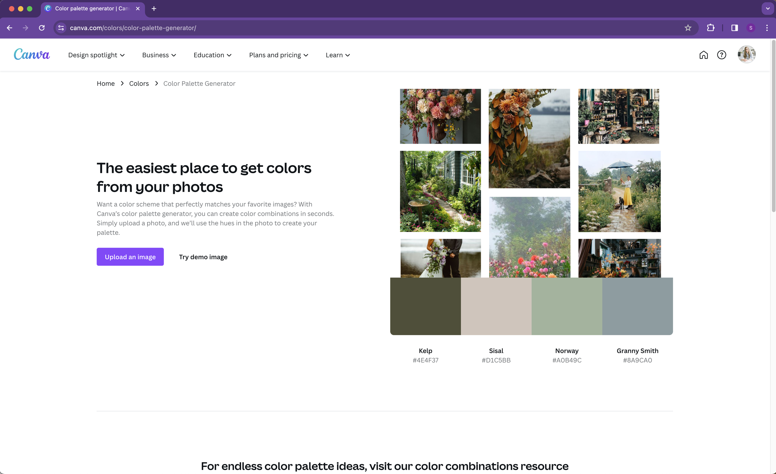
Explore and Customize
Review the generated color palette and explore the various hues extracted from your image. Canva allows you to customize and tweak the colors according to your preferences. Experiment by adjusting the shades or swapping colors to create your ideal palette.
Apply Your Custom Palette
Once you’ve finalized your color palette, Canva enables you to apply these colors across your designs effortlessly. Utilize these hues in your branding materials, graphics, social media posts, and more to maintain a consistent and visually appealing aesthetic.
Canva’s user-friendly color palette generator simplifies the process of deriving a palette directly from your photos, ensuring that your color choices align perfectly with your images, and enhancing the overall visual appeal of your designs.
Commonly Asked Questions on Color for Effective Branding
What are the key considerations when selecting colors for a brand's visual identity?
1. Why are colors important for branding?
Color can immediately identify a brand and make it pop off the shelf. Colors play a crucial role in branding as they evoke emotions, set moods, and establish connections with audiences. They communicate the essence of a brand, reflecting its identity, values, and unique propositions.
2. How can I choose the right colors for my brand?
It’s not just about choosing what you like color-wise. To select suitable colors for your brand, consider aspects like how they complement your products/services, evoke the desired emotions, and resonate with your brand's values and offerings.
3. How can I tell if my current brand colors need an update?
Wondering if your current color palette effectively represents your brand? Thinking it might be time for a refresh? A rebrand is a big decision, but there are helpful frameworks that can guide your thought process. A great place to start is by reading our article on 2 clear signs it’s time for a rebrand.
Looking generic and like your business could be anyone or anything is exactly what you don't want for your business logo!
4. Can colors impact consumer behavior and decision-making?
Yes, colors significantly influence consumer behavior and purchasing decisions. They can evoke specific emotions, create perceptions about a brand, and affect how products/services are perceived.
5. What considerations should I keep in mind while creating a brand color palette?
When creating a brand color palette, think about harmonizing colors that visually support your offerings, evoke desired emotions, and align with your brand's identity. Consider using a mix of hues that resonate with your audience and convey your brand's message effectively.
6. How can I use tools like Photoshop or Canva to pick colors for my brand?
Photoshop and Canva offer efficient ways to select colors for your brand. In Photoshop, utilize the eyedropper tool to choose colors from your mood board and match them with Pantone swatches. Canva's color palette generator extracts dominant hues from uploaded images, allowing customization and application across various design materials.
In conclusion, the art of selecting brand colors goes beyond just aesthetics; it's a strategic decision that can profoundly impact brand communication and consumer perception. Through the Flatter, Feeling, and Finesse Method, we've carefully considered how colors harmonize with offerings, evoke desired emotions, and drive purchase decisions.
Whether through minimalist choices like Apple's iconic white or innovative approaches like those seen with our clients Roberts CPA, Pink Sand Spirits Co., and Serve & Savour, crafting a tailored color palette can elevate brand identity and resonate with target audiences. With user-friendly tools like Photoshop and Canva, selecting a color palette from your moodboard is incredibly straightforward.
So, as you choose colors for your brand, remember the power of thoughtful color selection in conveying your message and connecting with your audience.
Get a strong color palette that communicates effectively for your brand!
If you're looking for a brand palette that captures the feeling of your brand, and communicates effectively with your audience, we're here to help.
Book a free consultation
Our creative director and founder Kathryn Joachim specializes in guiding businesses through strategic and custom crafted branding. Schedule a discovery call with her today and let's explore the possibilities of creating an elevated color palette that will make your business shine.
Book a call with Kathryn here. Let’s embark on this together!