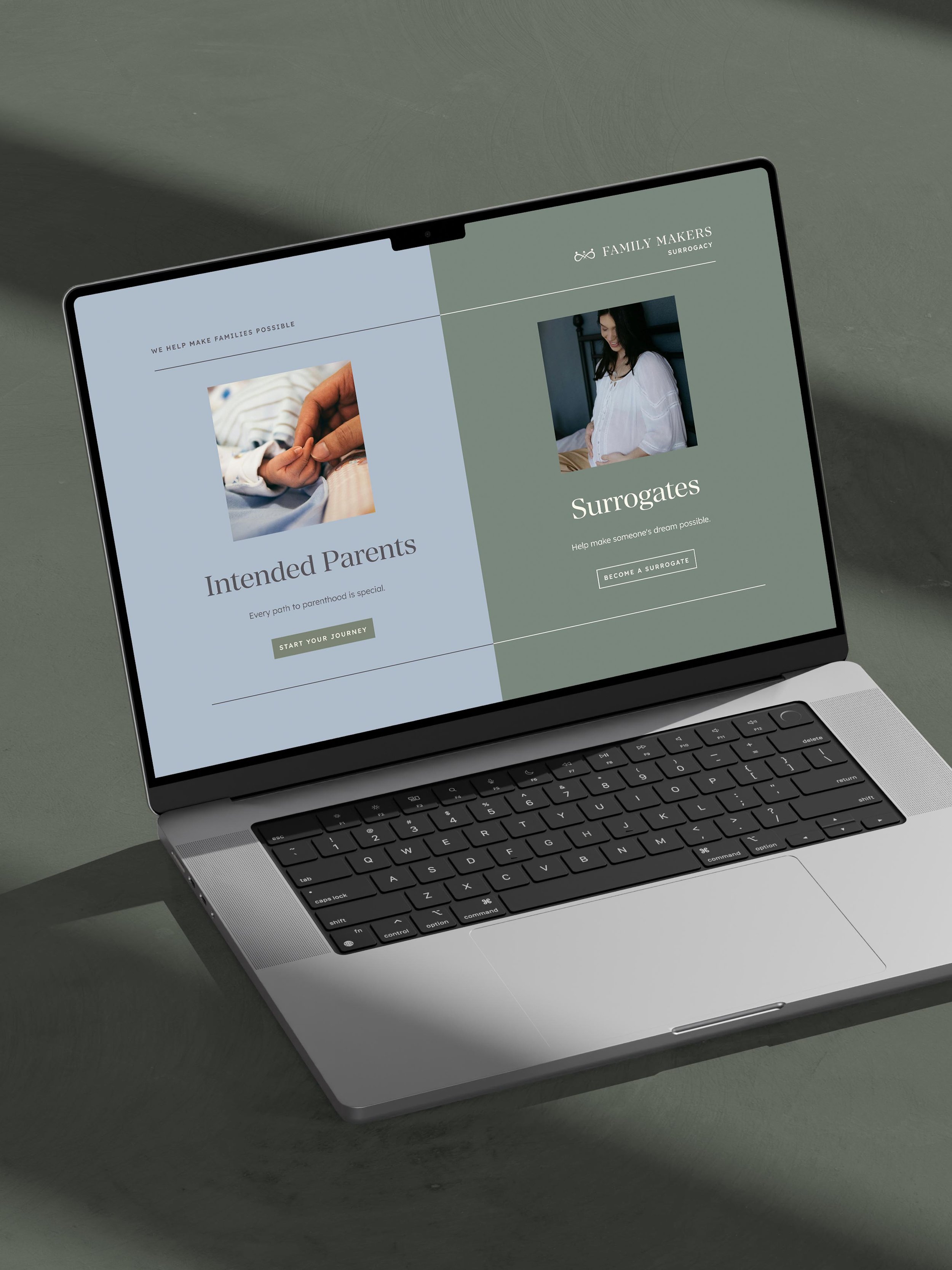
Serve & Savour Catering Branding
Time is of the essence when you’re a business owner!
This is especially true for emerging ventures like Serve & Savour. The new catering business approached us with a unique challenge: to create a sister brand for their event venue D’Vine Grace Vineyard, a previous client Creme Brands has been honored to work with.
The Serve & Savour branding needed to be elegant and enticing with earthy undertones, executed in the most refined and high-end way. It also needed to be designed in just one day!
Here's how we crafted an elegant catering brand design for Serve & Savour in just ONE day
01. We come prepared!
Prior to day, we whipped up a creative direction overview with our team’s brainstorm of ideas. We had the client review it ahead of the day so we were totally ready to start designing that day.
As always, we started by understanding what makes Serve & Savour different. Drawing inspiration from Colombian and Venezuelan cuisine, family recipes, and personalized client preferences, Serve & Savour is intent on delivering memorable culinary experiences at every event.
Moreover, they’re the only catering company in Dallas offering synchronized service, serving food in a coordinated manner almost like a dance. Founder Brandon Rojas characterized Serve & Savour’s level of service as “unreasonable hospitality.”
Another key part of this high-end catering brand development was aligning Serve & Savour’s branding as a sister brand to D’Vine Grace Vineyard. D’Vine Grace Vineyard is a treasured family estate re-envisioned as an event venue with the spirit of Tuscany and a refined touch of Texas hospitality. Serve & Savour’s brand needed to fit within this world AND the corporate world, since these are the main clients they aim to serve.
Here’s a peek into the components of our creative direction presentation for Serve & Savour:
Ideal Client
Gianna, the VP of a prominent Dallas company, seeks a consistent catering partner for both corporate events and carefully curated personal celebrations. She travels the world and loves to experience delicious food and new dining experiences. So Serve & Savour needed a solution that looked appropriate for both corporate catering branding and high end private events.
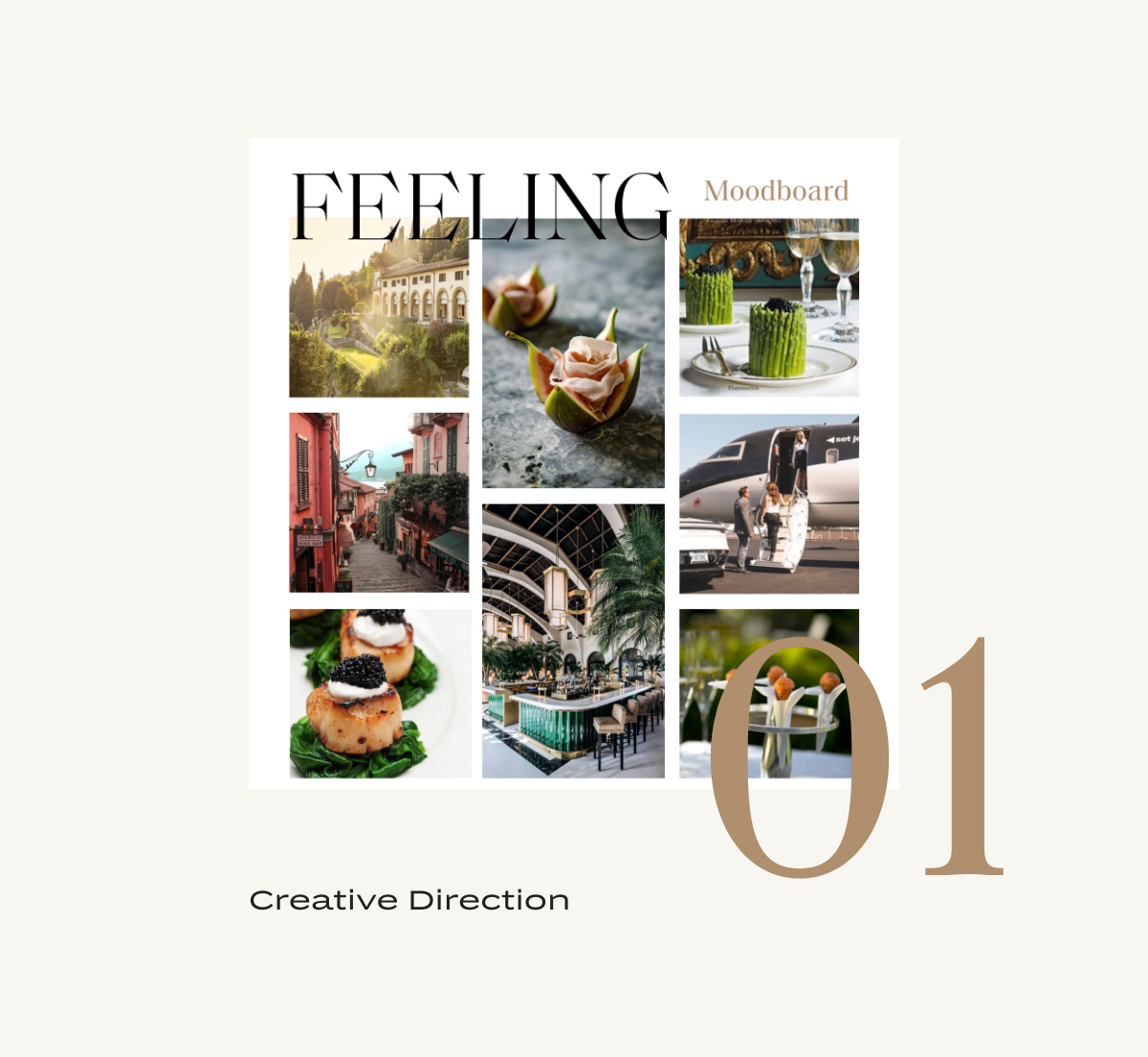
Moodboard
We curated images of Mediterranean landscapes, inventive food displays, and glimpses into Gianna’s sophisticated lifestyle.
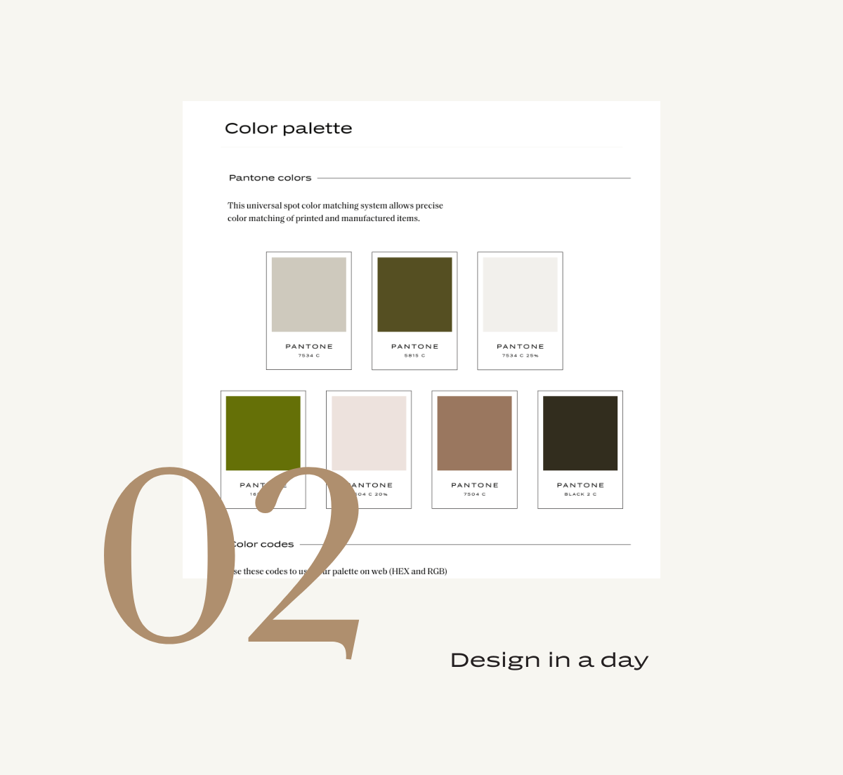
Color Exploration
Our initial color explorations included a range of rich, earthy neutrals and greens to harmonize with D’Vine Grace’s brand maroon.
Font Exploration
Similarly, the fonts needed to work with D’Vine Grace’s typography hierarchy. We pulled complimentary options that leaned more corporate than D’Vine Grace, to work for the Serve & Savour clientele.
02. We dedicate the day to you!
We block off time to bring the design to life. We find our inspiration really flows with our brand in a day service. On that day, we hone in on our #1 logo recommendation, we create the digital semi-custom mark (typically modifying a font or illustration to align with our custom sketch), create the logo configurations, and bring the brand standards to life with a custom curated color palette and type hierarchy.
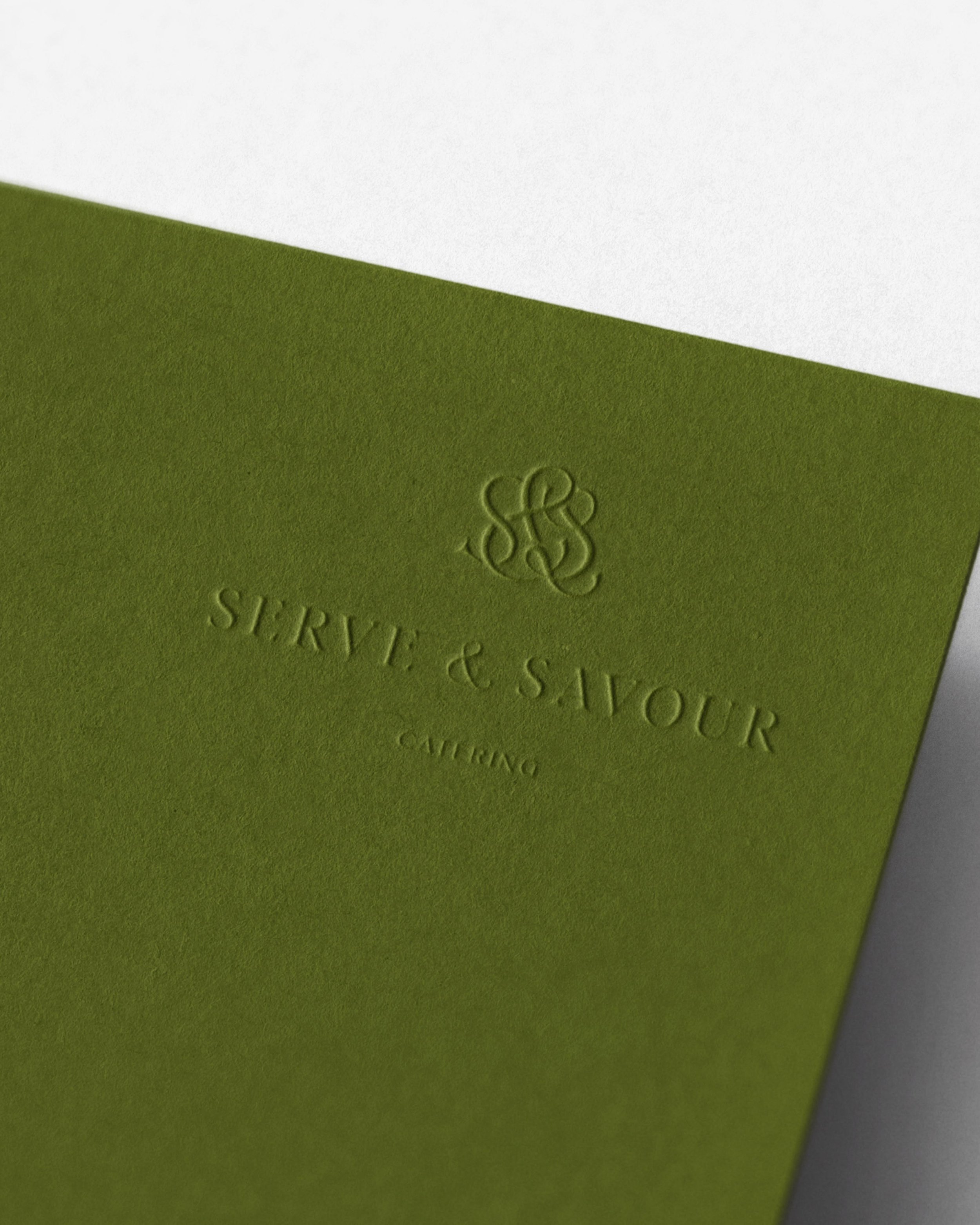
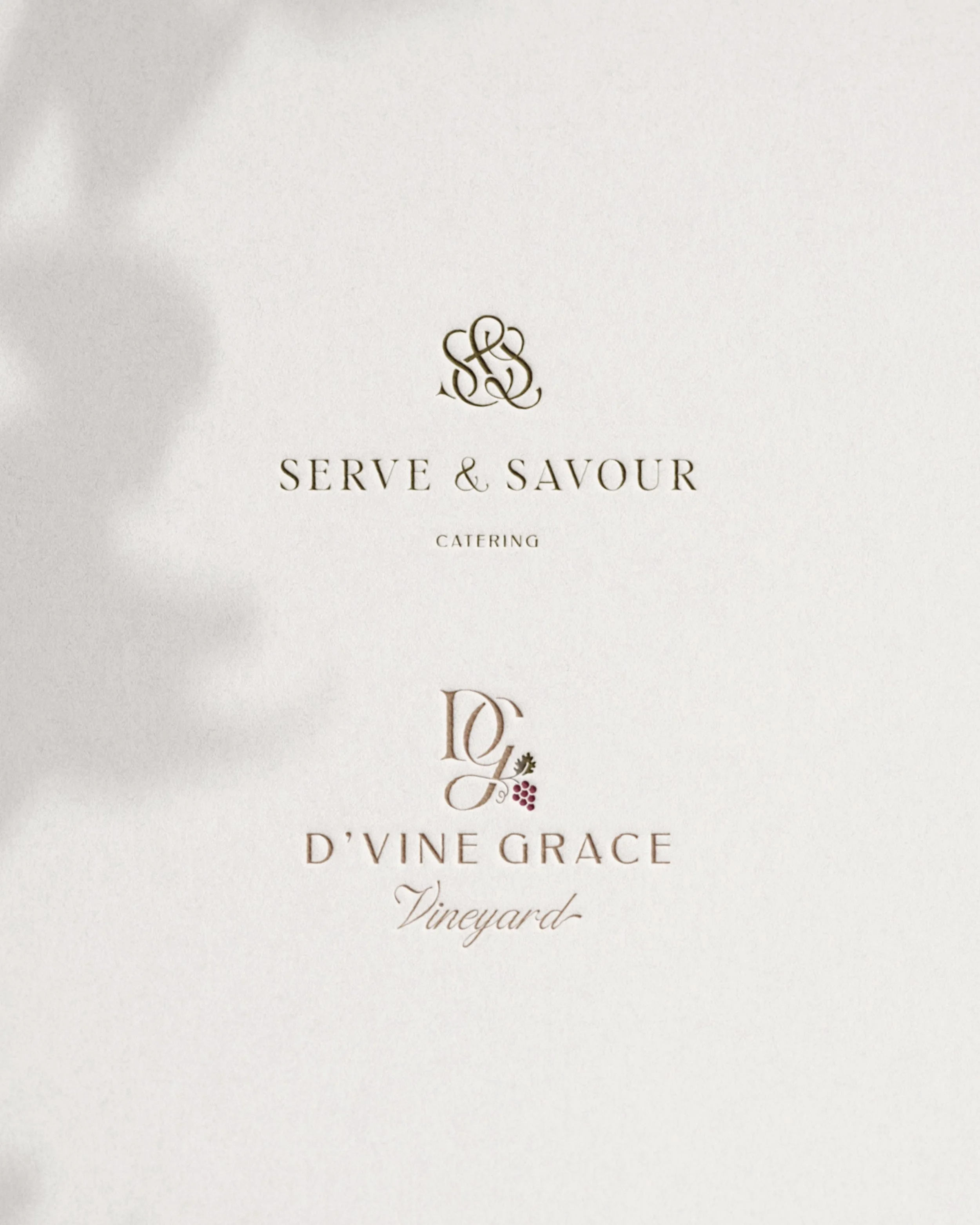
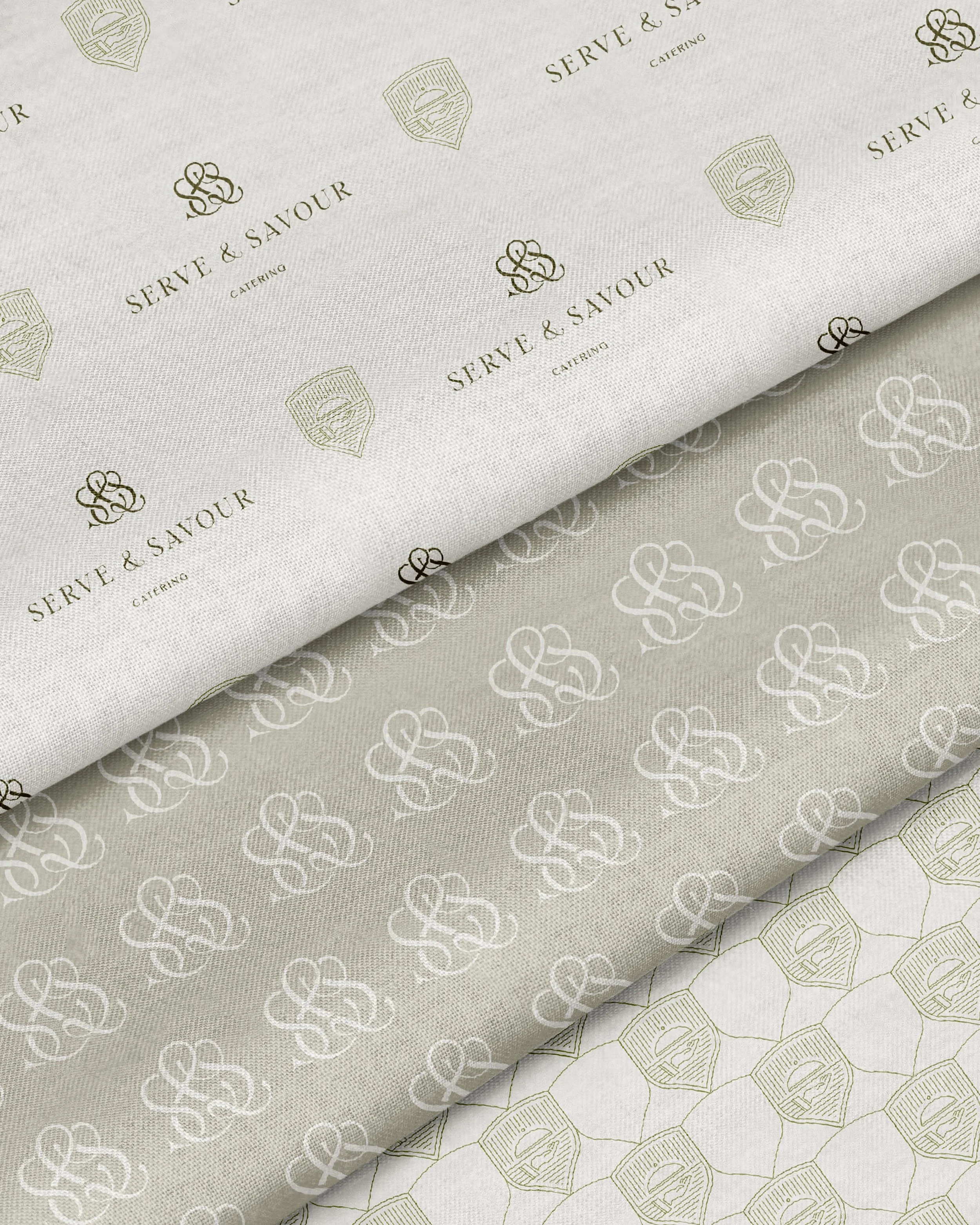
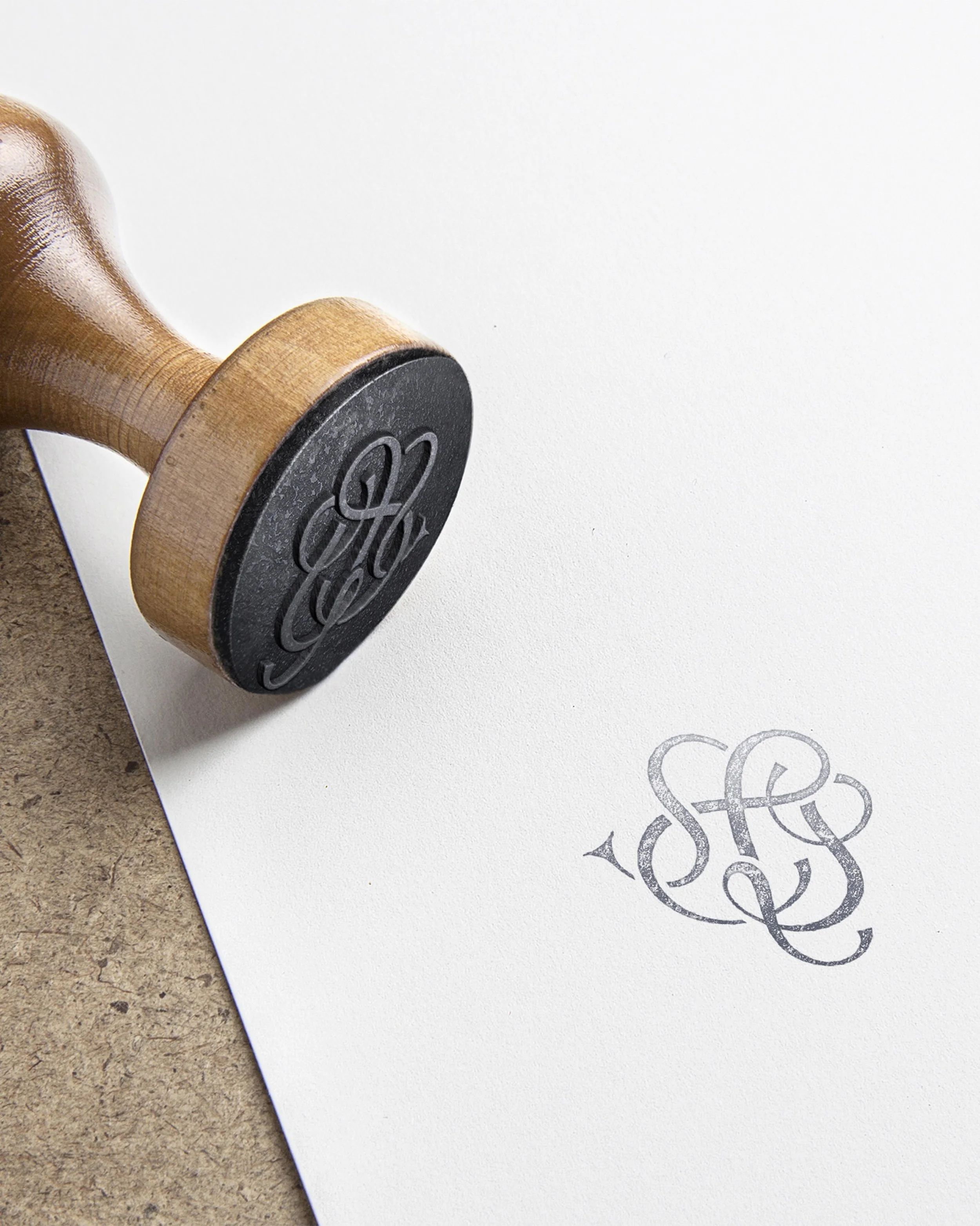
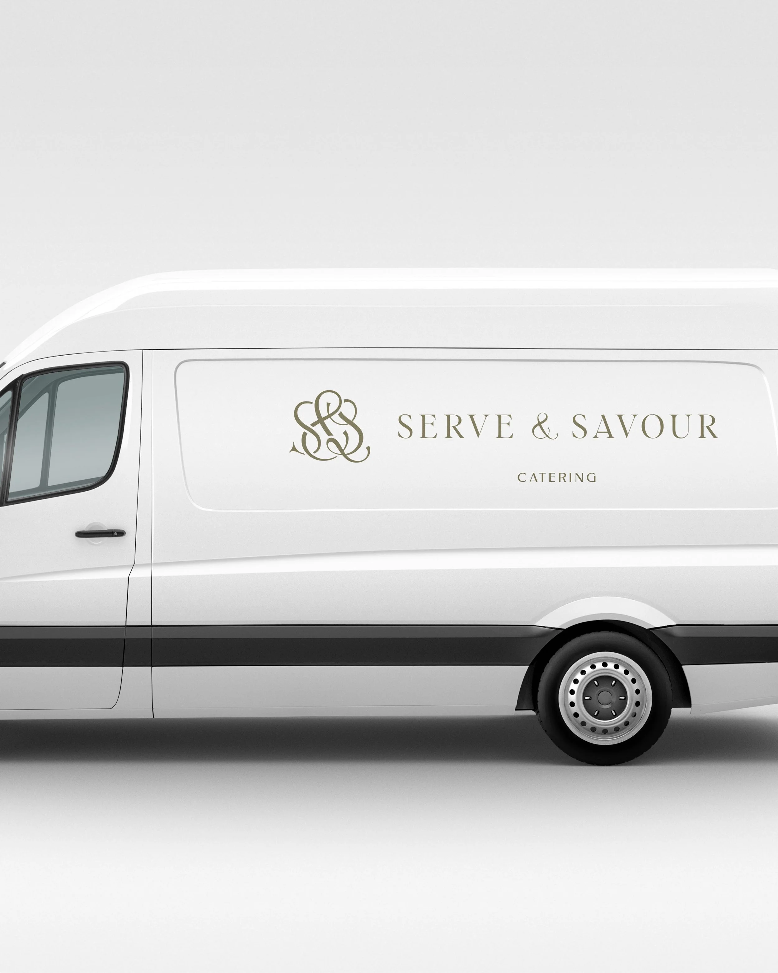
Custom Logo Design for Catering
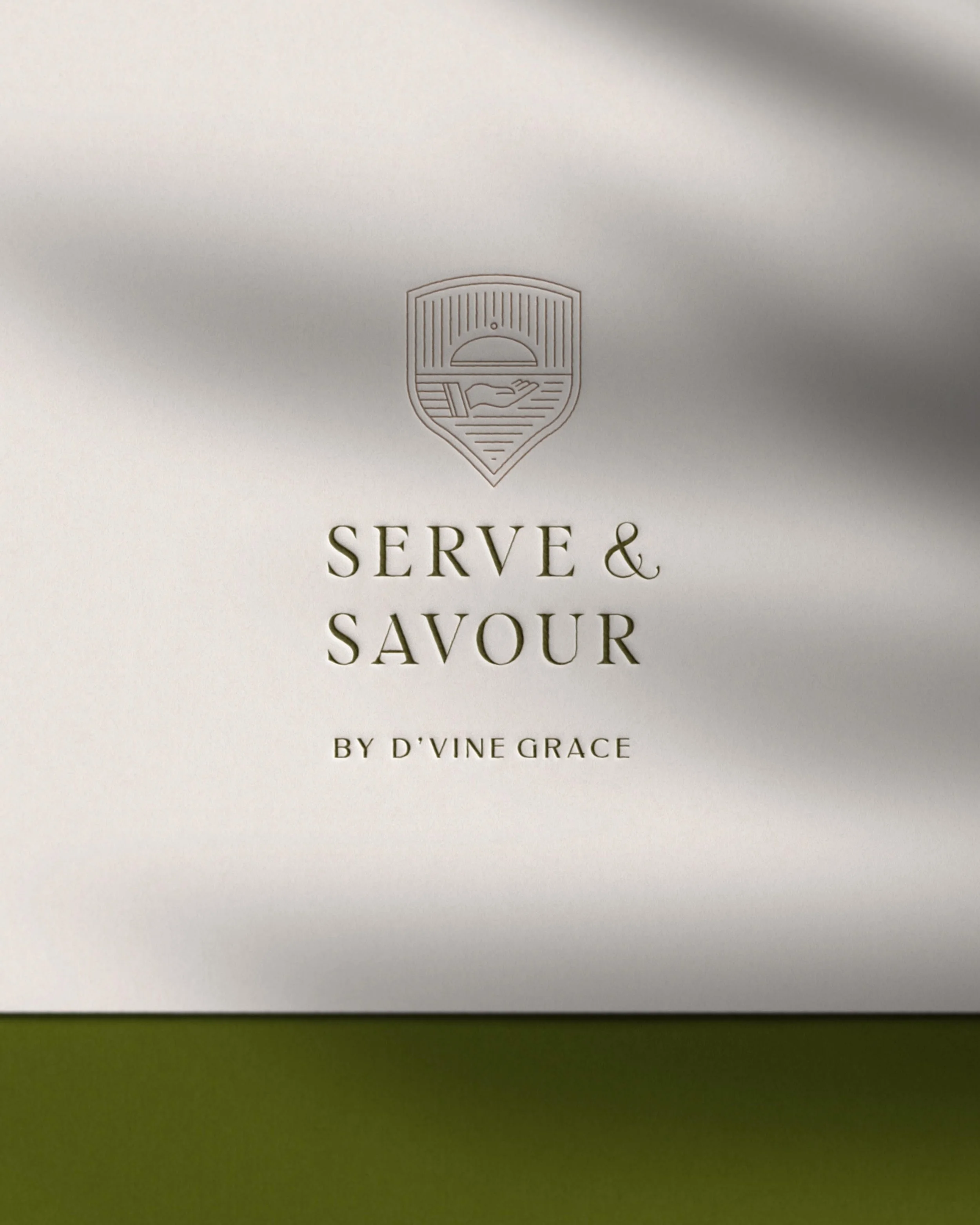
D’Vine Grace’s logo icon features a script “G” interlocking with a serif “D” – we decided to mirror the concept for Serve & Savour, creating an interlocking “S & S” monogram executed in a similar style. We customized the wordmark to match proportions from D’Vine Grace’s logo and feature a custom ampersand.
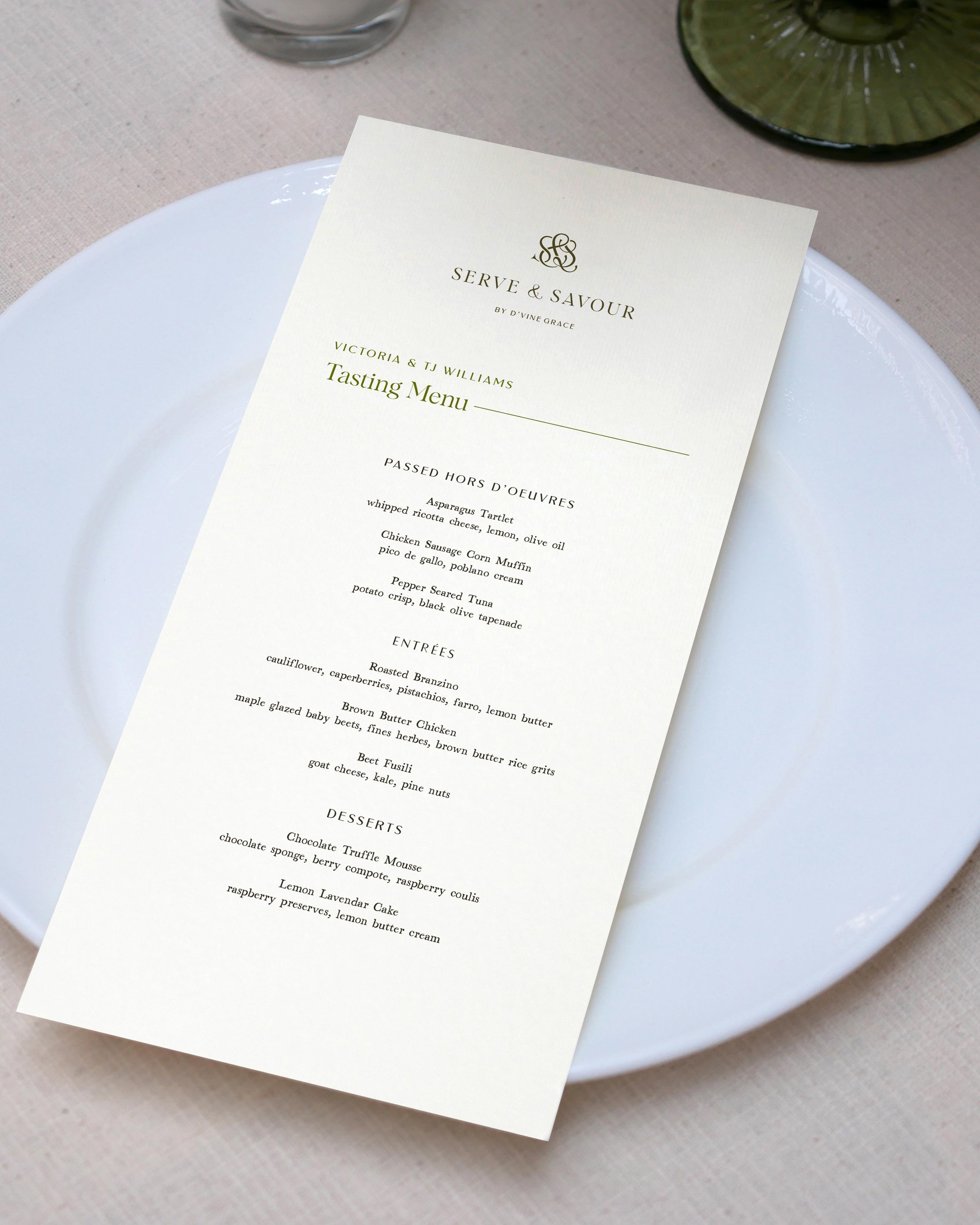
The final result is classic and high end look with warm, earthy undertones that will look just as fitting when placed next to the D’Vine Grace logo as it will at the top of a business document for a corporate client.
Color & Type:
The final color palette uses neutrals from the D’Vine Grace palette infused with warm, earthy greens. Similarly, the final type hierarchy mixes some D’Vine Grace fonts with new ones more suited for corporate settings.
The result? A sophisticated culinary brand, exuding the highest level of service and cuisine.
03. You get time to review.
We don’t put you on the spot requiring approval or feedback within that 7 hour window. You get 2-3 business days to review and then we finalize the files for you, all ready to be used immediately!
We were thrilled when Serve & Savour founder Brandon Rojas got back with his approval:
"WOO!! This is perfect, and exquisite!! We lovvvvve the crest and the Logo. 😄 No changes or feedback are necessary!"
We then got to work finalizing all the files for Serve & Savour, so they could start using their new logos, color palette, type hierarchy, and patterns right away.
As Serve & Savour exemplifies, our one-day branding service follows a seamless process to capture the essence of your unique identity as efficiently as possible. Ready to quickly launch to the world with a polished brand?
Schedule a call to discuss if our VIP Day mini branding is a good fit for you.