Picking Out Colors for your Brand
Curious to know how to find the perfect colors for your brand? Create a moodboard!
Find several images on Pinterest (or anywhere else!) that you love and are drawn to, and pick the colors straight from those inspiration images. Pulling your colors from your inspiration is the best way to build a visual brand that matches your heart and mission!
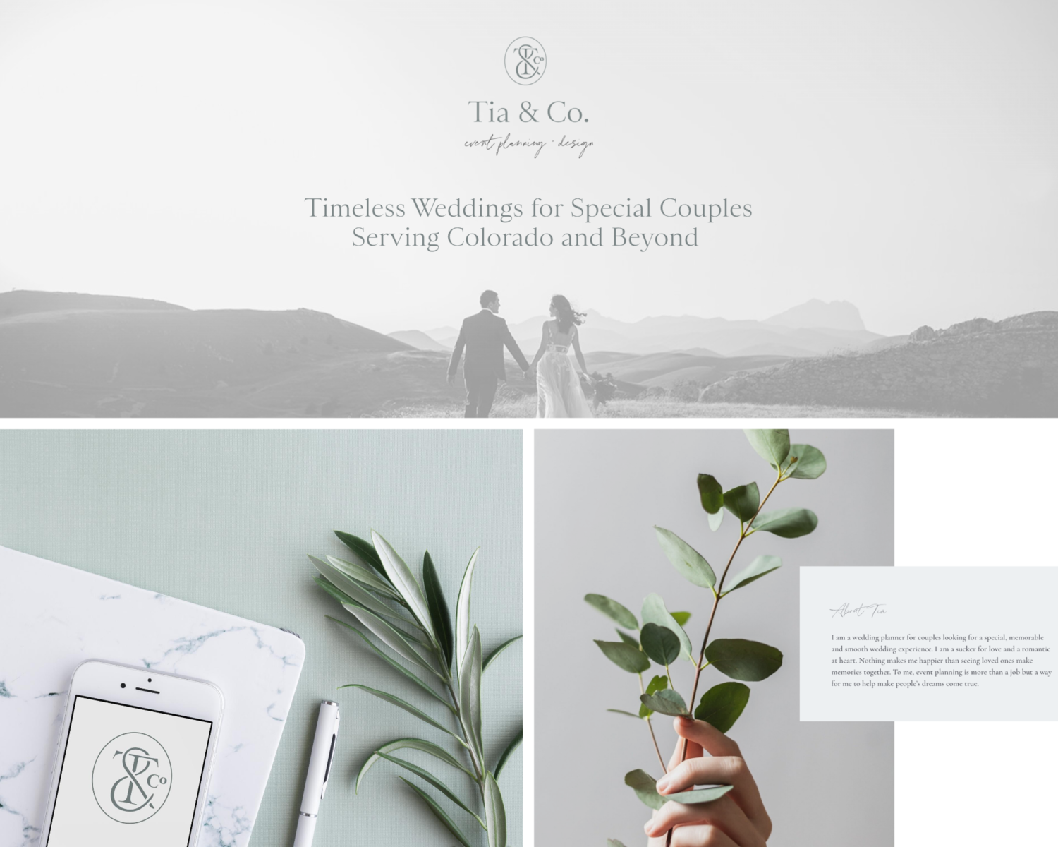
Here's how we did that for Tia Jurkiw of Tia & Co. Events. First, we picked the top six moodboard images:

Next, we grabbed colors from these images and translated them into the beautiful blue and grey tones we chose for her site and logo:
A FEW TIPS ON PICKING COLORS:
The logo color should be dark enough to be legible.
Lighter tones are great for background color fills—bold colors can be overwhelming when you're using them as big blocks of color!
Body text should always be black or grey.
Make sure you're using the right tint and tone in the right place—when you’re painting a room, the color will look and feel very different on the little paint swatch than it will once it’s on all four walls.
Similarly, on your website, a color that you may love might not look right when you’re using it in larger doses. A button fill or background color can look very bold and overwhelming compared to just seeing it on the swatch, so test it out before committing to make sure it's not too overwhelming!
AND ONE FINAL TIP...
Use the right color types for the right projects!
RGB/Hex codes should be used for anything created for web use
CMYK/Pantone codes should be used for anything created for print use